Master Addons
  • Widgets
    • Changelogs
      Source Code NEW PRO
      Caldera Forms
      Logo Slider
      Table of Contents
      Gravity Forms
      Transforms PRO
      Restrict Content PRO
      Pricing Table
      Ninja Form
      Mailchimp
      Tooltip
      Popup Trigger NEW PRO
      Which Element NEW
      Creative Button
      Creative Links NEW
      Domain Search HOT PRO
      Dual Heading HOT
      Flipbox
      Animated Gradient BG HOT PRO
      Image Hotspot PRO
      Infobox
      News Ticker PRO
      Particles
      Progress Bar
      Off-Canvas Content NEW PRO
      Reading Progress Bar HOT
      Custom JS
      Blockquote
      Counter Up
      Image Hover Effects
      Reveal NEW PRO
      Rellax PRO
      Positioning
      Image Comparison
      Tabs
      Toggle Content HOT PRO
      Post/Page Duplicator FREE
      Floating Effects PRO
      Mega Menu HOT
      Custom CSS HOT
      Gradient Headline
      Advanced Image
      Nav Menu
      Tooltips
      Comparison Table PRO
      Glassmorphism
      Featured Product PRO
      Image Carouse
      Gallery Slider NEW PRO
      Dynamic Tags NEW
      Countdown Timer
      Current Time
      Patterns
      Wrapper Link
      Timeline
      Team Member
      Contact Form 7
      Advanced Accordion
      Animated Headlines
      Blog
      Business Hours
      Call To Action
      Progress Bars
      Background Slider
      Team Slider
      Dynamic Table
      Grid Line PRO
      WP Forms
      Search
      We Form
      Entrance Animation NEW PRO
      Display Conditions PRO
      Filterable Image Gallery
      WP Forms
      Custom Breakpoints NEW
  • Features
    • Theme Builder

      Design site-wide templates for a consistent look across every page of your website.

      Popup Builder

      Create engaging popups, modals, and announcement bars - to capture leads.

      Widget Builder

      Expand Elementor with advanced custom widgets to build more dynamic layouts.

      Mega Menu Builder

      Create multi-column menus with icons and images for superior navigation.

      Custom Css

      Apply your own CSS for pixel-perfect styling beyond default design options.

      Dynamic Tags

      Insert dynamic content like post titles and custom fields directly into designs.

      Display Conditions

      Control element visibility based on user role, device, time, and other rules.

      Icons Library

      Choose from thousands of built-in icons to enhance visuals and consistency.

      Animation

      Add scroll, hover, entrance, and much more animations to bring designs to life.
  • Template Kits
    • Template Kits

      Professionally designed full-page template Kit. Import and customize in seconds.

      Ready Sections

      Pre-built content sections and rows. Drag, drop, and customize instantly.

      Ready Popups

      Different types of High-converting popup designs. Import and launch quickly.

      Ready Pages

      Complete page layouts for any purpose. Start editing immediately.

      Ready Header

      Multiple modern header designs. Import and adapt to your brand.

      Ready Footer

      Fully designed footers for different websites. Add functionality and style in clicks.
  • Brands
    • WP Adminify

      Take control of your WordPress dashboard. Customize the admin experience.

      Admin Bar Editor

      Customize the WordPress admin bar for a cleaner, more personalized workspace.

      Loginfy

      Customize your WordPress login page with branding, styles, and security enhancements.

      Rolemaster Suite

      Manage user roles and permissions with precision for better security and workflow.

      Master Blocks

      Expand the Gutenberg editor with advanced custom blocks for more creative layouts.

      WP Spotlight

      Instantly search and access admin features, posts, and settings from anywhere.
  • Themes
  • Help
    • Get Support
    • Documentation
    • Facebook Community
    • Changelogs
  • Blog
  • Widgets
    • Changelogs
      Source Code NEW PRO
      Caldera Forms
      Logo Slider
      Table of Contents
      Gravity Forms
      Transforms PRO
      Restrict Content PRO
      Pricing Table
      Ninja Form
      Mailchimp
      Tooltip
      Popup Trigger NEW PRO
      Which Element NEW
      Creative Button
      Creative Links NEW
      Domain Search HOT PRO
      Dual Heading HOT
      Flipbox
      Animated Gradient BG HOT PRO
      Image Hotspot PRO
      Infobox
      News Ticker PRO
      Particles
      Progress Bar
      Off-Canvas Content NEW PRO
      Reading Progress Bar HOT
      Custom JS
      Blockquote
      Counter Up
      Image Hover Effects
      Reveal NEW PRO
      Rellax PRO
      Positioning
      Image Comparison
      Tabs
      Toggle Content HOT PRO
      Post/Page Duplicator FREE
      Floating Effects PRO
      Mega Menu HOT
      Custom CSS HOT
      Gradient Headline
      Advanced Image
      Nav Menu
      Tooltips
      Comparison Table PRO
      Glassmorphism
      Featured Product PRO
      Image Carouse
      Gallery Slider NEW PRO
      Dynamic Tags NEW
      Countdown Timer
      Current Time
      Patterns
      Wrapper Link
      Timeline
      Team Member
      Contact Form 7
      Advanced Accordion
      Animated Headlines
      Blog
      Business Hours
      Call To Action
      Progress Bars
      Background Slider
      Team Slider
      Dynamic Table
      Grid Line PRO
      WP Forms
      Search
      We Form
      Entrance Animation NEW PRO
      Display Conditions PRO
      Filterable Image Gallery
      WP Forms
      Custom Breakpoints NEW
  • Features
    • Theme Builder

      Design site-wide templates for a consistent look across every page of your website.

      Popup Builder

      Create engaging popups, modals, and announcement bars - to capture leads.

      Widget Builder

      Expand Elementor with advanced custom widgets to build more dynamic layouts.

      Mega Menu Builder

      Create multi-column menus with icons and images for superior navigation.

      Custom Css

      Apply your own CSS for pixel-perfect styling beyond default design options.

      Dynamic Tags

      Insert dynamic content like post titles and custom fields directly into designs.

      Display Conditions

      Control element visibility based on user role, device, time, and other rules.

      Icons Library

      Choose from thousands of built-in icons to enhance visuals and consistency.

      Animation

      Add scroll, hover, entrance, and much more animations to bring designs to life.
  • Template Kits
    • Template Kits

      Professionally designed full-page template Kit. Import and customize in seconds.

      Ready Sections

      Pre-built content sections and rows. Drag, drop, and customize instantly.

      Ready Popups

      Different types of High-converting popup designs. Import and launch quickly.

      Ready Pages

      Complete page layouts for any purpose. Start editing immediately.

      Ready Header

      Multiple modern header designs. Import and adapt to your brand.

      Ready Footer

      Fully designed footers for different websites. Add functionality and style in clicks.
  • Brands
    • WP Adminify

      Take control of your WordPress dashboard. Customize the admin experience.

      Admin Bar Editor

      Customize the WordPress admin bar for a cleaner, more personalized workspace.

      Loginfy

      Customize your WordPress login page with branding, styles, and security enhancements.

      Rolemaster Suite

      Manage user roles and permissions with precision for better security and workflow.

      Master Blocks

      Expand the Gutenberg editor with advanced custom blocks for more creative layouts.

      WP Spotlight

      Instantly search and access admin features, posts, and settings from anywhere.
  • Themes
  • Help
    • Get Support
    • Documentation
    • Facebook Community
    • Changelogs
  • Blog
Purchase Now

Getting Started

  • Can’t see the Master Addon Element inside Elementor Page editor?
  • How To Apply For an Affiliate Account?
  • Active Pro version
  • Installing Plugin

Addons

  • Off-Canvas Content
  • Logo Slider
  • Progress Bars
  • Image Carousel
  • Featured Product
  • Comparison Table
  • Source Code
  • Advanced Image
  • Gradient Headline
  • Gallery Slider
  • Toggle Content
  • Infobox
  • Timeline
  • Dynamic Table
  • Mailchimp
  • Blockquote
  • Changelogs
  • Countdown Timer
  • Current Time
  • Search
  • Filterable Image Gallery
  • Team Slider
  • Counter Up
  • Restrict Content
  • Table of Contents
  • Image Hotspot
  • Image Comparison
  • News Ticker
  • Image Hover Effects
  • Tabs
  • Pricing Table
  • Navigation Menu
  • Domain Search
  • Flipbox
  • Tooltip
  • Creative Links
  • Business Hours
  • Contact Form 7
  • Creative Button
  • Animated Headlines
  • Advanced Accordion
  • Call to Action
  • Progress Bar
  • Blog
  • Team Member
  • Dual Heading

Extensions

  • Which Element
  • Post Duplicator
  • Grid Line
  • Glassmorphism
  • Tooltip
  • Wrapper Link
  • Floating Effects
  • Dynamic Tags
  • Display Conditions
  • Entrance Animation
  • Custom Breakpoints
  • Animated Gradient Background
  • Reveal
  • Particles
  • Background Slider
  • Transforms
  • Rellax
  • Positioning
  • Custom CSS

Widget Builder

  • Widget Builder Settings Panel Introduction
  • Divider
  • Text Shadow
  • Select2
  • Border
  • Heading
  • Tabs
  • Repeater
  • Visual Choice
  • Background
  • Dimensions
  • Box Shadow
  • Slider
  • Icons
  • Gallery
  • Media
  • Popover Toggle
  • Widget Builder URL Field
  • Date Time
  • Typography
  • Font
  • Widget Builder Color Field
  • Choose
  • Select
  • Switcher
  • Hidden
  • Code
  • WYSIWYG
  • Widget Builder Textarea Field
  • Number
  • Widget Builder Text Field

Theme Builder

  • Comment Form
  • 404
  • Search
  • Archive
  • Single
  • Footer
  • Header

Popup Builder

  • How to Open a Popup After Inactivity in Elementor
  • How to Show an Exit Intent Popup in Elementor
  • How to Open a Popup on Scroll to a Specific Element in Elementor
  • How to Open a Popup on Scroll in Elementor
  • How to Open a Popup on Click in Elementor
  • How to open a popup on page load?
  • Popup Settings & Options

Template Kit

  • How to Import Template Kits in Master Addons
  • How to Disable Elementor Default Fonts and Colors
  • Import Elementor Template Kits
View Categories
  • Home
  • Docs
  • Widget Builder
  • Widget Builder Textarea Field

Widget Builder Textarea Field

Roy
Updated on June 14, 2026

7 min read

When a custom widget needs more than a single line, the Textarea field is the one to use. It gives editors a multi-line box for paragraphs, descriptions, and any longer block of plain text. Inside the Master Addons Widget Builder, you drop a Textarea field into your widget panel, name it, and its shortcode prints whatever the user types into your HTML, CSS, or JS.

It works like the Text field, with one extra control: Rows, which sets how tall the input box is. Use the Text field for short single-line strings like a headline, and the Textarea field for the paragraph that sits under it.
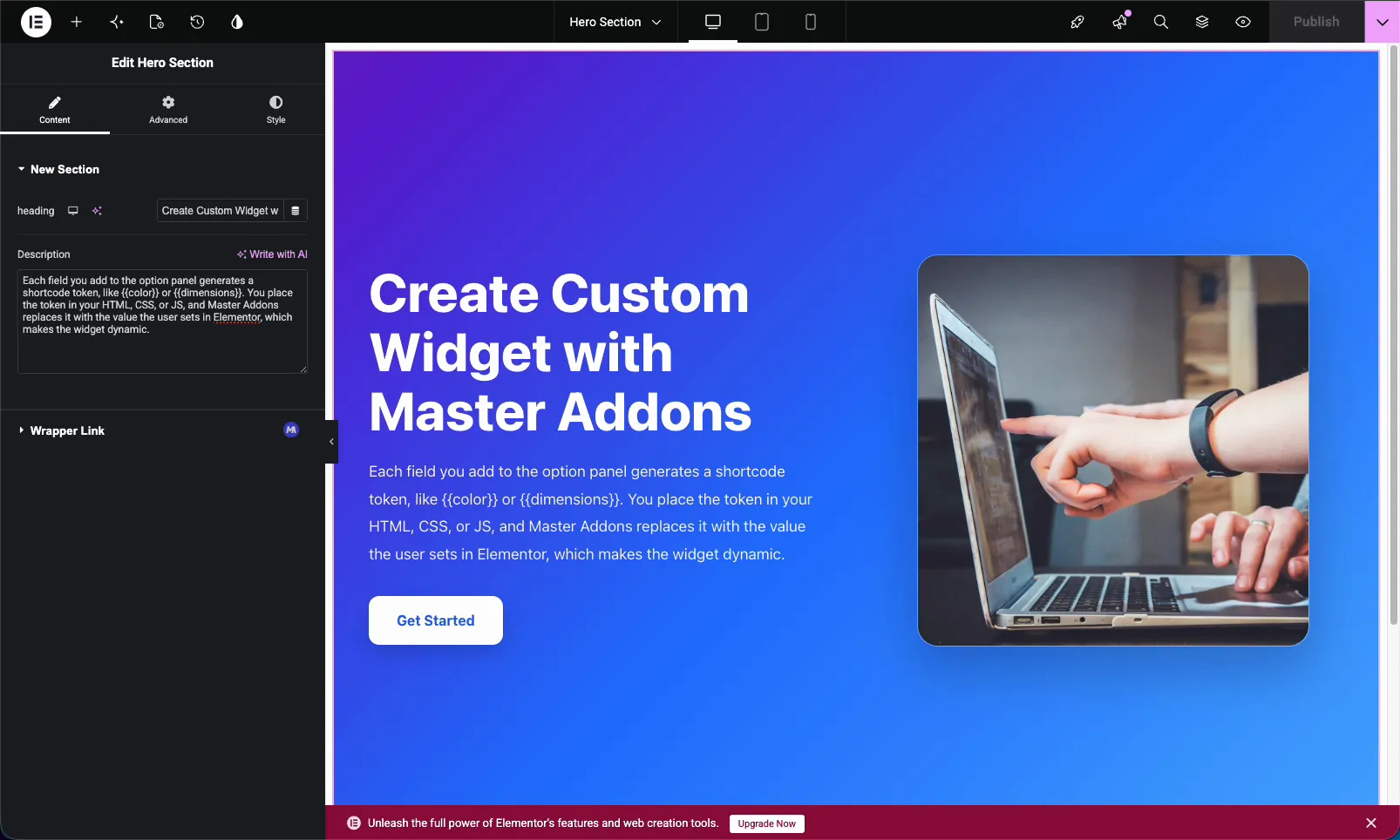
Custom Elementor widget built with the Master Addons Widget Builder Textarea field showing a hero description paragraph

What the Textarea field does #

The Textarea field renders a multi-line text input in the widget’s option panel. When someone edits your custom widget in Elementor, they type into that box and your widget outputs the text wherever you placed the matching shortcode. Line breaks and longer copy are no problem, which is what sets it apart from the single-line Text field.

For text that needs formatting like bold, links, or lists, use the WYSIWYG field instead. The Textarea field is for plain multi-line text. New to building widgets? Start with the Widget Builder overview.

Before you start #

  • WordPress with Elementor installed and active.
  • Master Addons for Elementor installed and active. New to the plugin? See the installation guide.
  • A custom widget open in the Widget Builder editor.

How to add a Textarea field #

In the Widget Builder editor, find the fields panel on the left and drag the Textarea field into a section under the Content, Style, or Advanced tab. Description and paragraph fields usually belong under Content. Once the field is in place, its options open on the left and its shortcode appears in the Documentation sidebar next to the code editor.
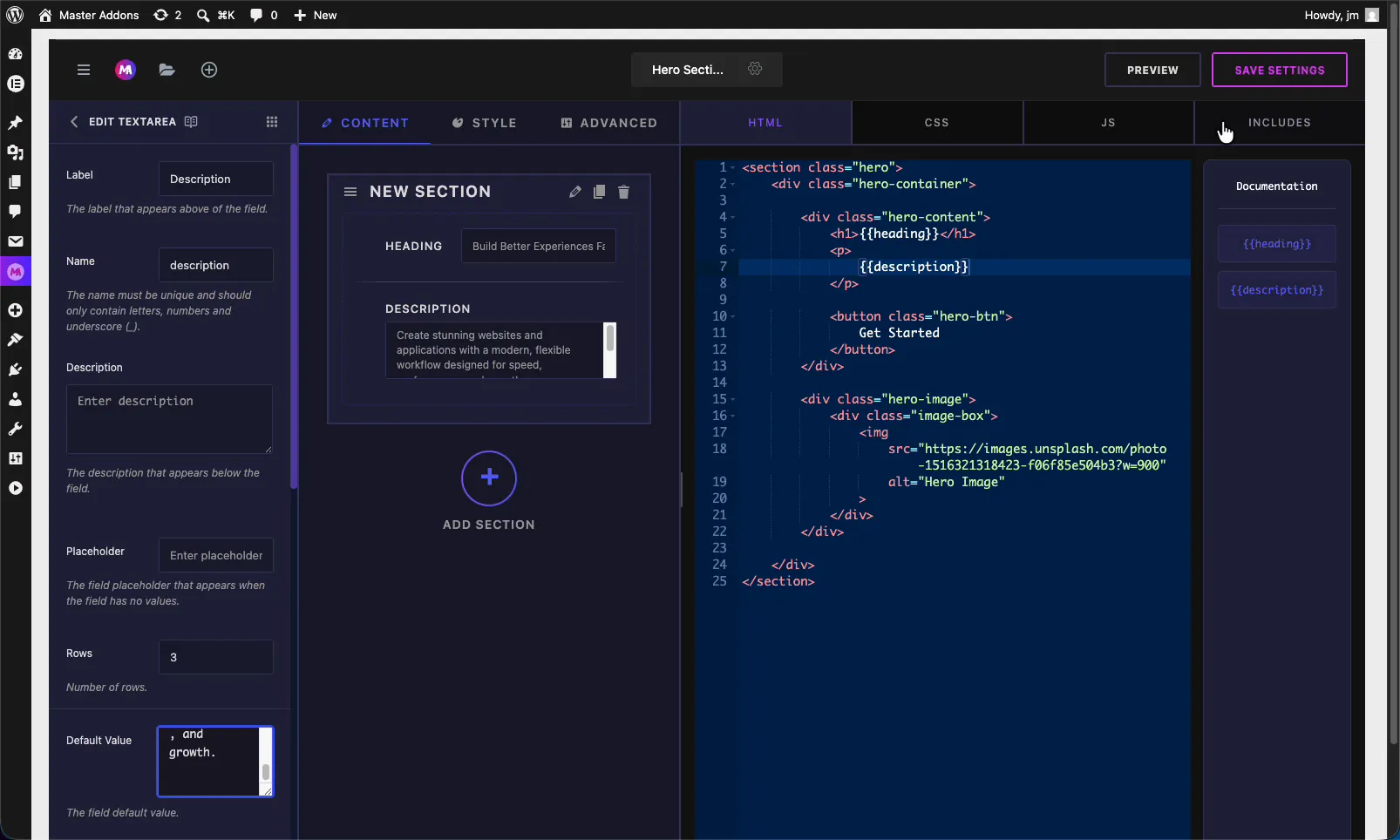
Master Addons Widget Builder with a Textarea field added to a section alongside a Heading field and the HTML editor

Textarea field options explained #

Select the Textarea field to open its settings. These options control how the input looks and behaves in Elementor.
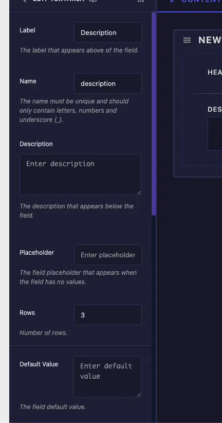
Textarea field options in the Master Addons Widget Builder including Label, Name, Rows, Placeholder, and Default Value
  • Label: the text shown above the field in Elementor, for example “Description”.
  • Name: the unique identifier for the field. It must contain only letters, numbers, and underscores. This name becomes your shortcode, so a field named description gives you {{description}}.
  • Description: optional helper text shown below the field to explain what it controls.
  • Placeholder: the faint hint shown when the box is empty. It guides the editor without setting a real value.
  • Rows: how many lines tall the input box is. The default is 3. Bump it up for longer copy so editors can see more text at once.
  • Default Value: the starting text. Set a sample paragraph here so the widget looks finished before anyone edits it.

Common settings: responsive, dynamic, and more #

Below Default Value you get the same Common Settings as every other field in the builder. The ones you will reach for most:

  • Show Label and Label Block: control whether the label shows and where it sits.
  • Responsive Control: let editors set different text for desktop, tablet, and mobile.
  • Dynamic Support: enable Elementor dynamic tags so the field can pull its value from a source like the post excerpt.
  • Frontend Available: expose the value to frontend JavaScript when your widget’s JS needs to read it.
  • Separator and Conditions: add a divider, or show and hide the field based on another control.

These behave the same way they do on the Text field, so the Text field documentation covers each one in detail.

Connect the field to your code #

Every Textarea field generates a shortcode from its Name. A field named description produces the token {{description}} in the Documentation sidebar. Drop that token into your HTML where the paragraph belongs, usually inside a <p> tag.
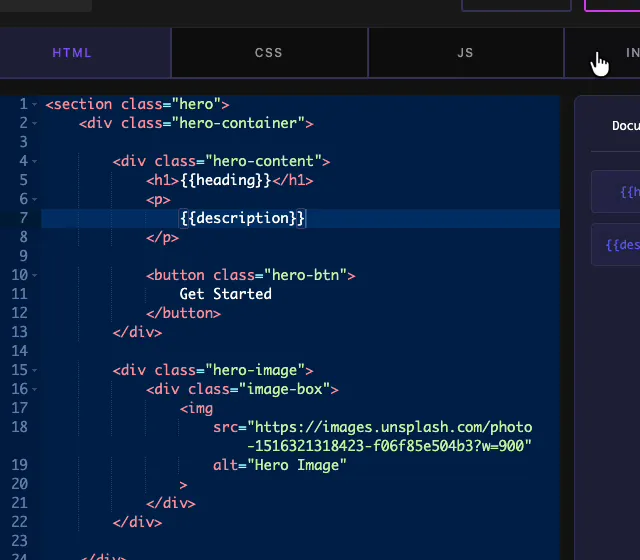
The description shortcode placed inside a paragraph tag in the Widget Builder HTML editor with the token in the documentation panel

In a hero layout, the pattern is simple: the Text field token sits in the <h1>, and the Textarea token sits in the <p> below it. Save the widget, and both lines print whatever values the user enters in Elementor. The same token works in your CSS or JS too if you need the text there.

Use the Textarea control in Elementor #

Drag your custom widget onto a page and open it in the Elementor editor. The Textarea field shows up as a multi-line box with your label, placeholder, and default value already filled in. Type or paste your copy and the widget updates live on the canvas.
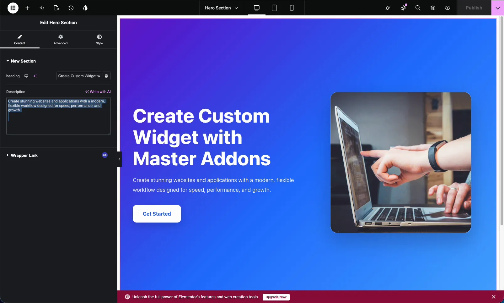
Multi-line Textarea control for a custom Elementor widget showing a hero description in the Elementor editor

Because it is a standard Elementor control, it sits right alongside the rest of your widget’s fields. If you turned on Dynamic Support, the dynamic tags icon shows up next to the box so editors can pull the text from a source instead of typing it. One small thing to remember: the Textarea outputs plain text, so a line break in the box becomes a line break, not a new paragraph. If you need real paragraph tags, that is a job for the WYSIWYG field.

Textarea vs Text vs WYSIWYG #

The builder gives you three text inputs. Pick the one that matches the content:

FieldBest forFormatting
TextShort single-line strings (headlines, labels, button text)Plain text, one line
TextareaMulti-line plain text (paragraphs, descriptions)Plain text, multiple lines
WYSIWYGRich content that needs stylingBold, links, lists, headings

Common use cases #

  • Hero descriptions under a headline.
  • Section intros and feature blurbs.
  • Card or testimonial body text.
  • Short bios and about-us copy.
  • Any plain paragraph an editor should be able to change without code.

Tips for working with the Textarea field #

  • Set Rows to fit the content. Three rows suit a short blurb. Use five or more for longer descriptions so editors are not fighting a tiny box.
  • Always add a Default Value. It keeps the widget looking complete the moment it is dropped on a page.
  • Name the field clearly. description reads better in your code than field_2, and it becomes the shortcode.
  • Reach for WYSIWYG only when you need formatting. Plain paragraphs stay cleaner in a Textarea.
  • Build the field before referencing its shortcode. The token exists only after the field is on the panel.

Frequently Asked Questions #

What is the Textarea field in the Master Addons Widget Builder?

The Textarea field adds a multi-line text box to a custom Elementor widget. You name the field, place its shortcode in your code, and whatever a user types in Elementor prints into your widget. It suits paragraphs and longer plain text.

What is the difference between the Text field and the Textarea field?

The Text field is a single-line input for short strings like headlines and labels. The Textarea field is a multi-line box for paragraphs and descriptions, and it adds a Rows option to control the height of the input.

What does the Rows option do?

Rows sets how many lines tall the Textarea box appears in the Elementor panel. The default is 3. Increasing it gives editors a taller box so they can see more of a long paragraph while typing. It does not limit how much text they can enter.

Can the Textarea field use dynamic tags?

Yes. Turn on Dynamic Support in the field’s Common Settings. In Elementor, the dynamic tags icon then appears next to the box, so the field can pull its text from a dynamic source like the post excerpt instead of static content.

Should I use a Textarea or the WYSIWYG field?

Use the Textarea field for plain multi-line text with no formatting. Use the WYSIWYG field when the content needs bold, italics, links, lists, or headings, since it gives editors a full visual editor instead of a plain box.

Wrapping up #

The Widget Builder Textarea field is the easiest way to make a paragraph in a custom Elementor widget editable. Name it, set the rows, add a default, and drop its shortcode in your code. After that, anyone can update the copy from Elementor without touching the markup. Have a look at the rest of the Master Addons widgets and extensions, and check the pricing page for what each plan includes.

What are your Feelings

Share This Article :

  • Facebook
  • X
  • LinkedIn
  • Pinterest
Still stuck? How can we help?

How can we help?

Updated on June 14, 2026
WYSIWYGNumber
Table of Contents
  • What the Textarea field does
  • Before you start
  • How to add a Textarea field
  • Textarea field options explained
  • Common settings: responsive, dynamic, and more
  • Connect the field to your code
  • Use the Textarea control in Elementor
  • Textarea vs Text vs WYSIWYG
  • Common use cases
  • Tips for working with the Textarea field
  • Frequently Asked Questions
    • What is the Textarea field in the Master Addons Widget Builder?
    • What is the difference between the Text field and the Textarea field?
    • What does the Rows option do?
    • Can the Textarea field use dynamic tags?
    • Should I use a Textarea or the WYSIWYG field?
  • Wrapping up

Join 40,000+ Web Creators Who Trust Master Addons

Get all the premium widgets and templates you desire, built with clean code that keeps your site fast. Ditch the bloat, not the features.

Try Live Demo
Join The Community
Master Addons for Elementor
Master Addons Logo

110+ Premium Widgets & Lifetime Updates – Build Beyond Limits. An Exclusive Creation by Pixar Labs

Facebook-f Twitter Youtube Wordpress
Features
  • Template kits
  • Template Library
  • Widget Builder
  • Theme Builder
  • Mega Menu Builder
  • Template kits
  • Template Library
  • Widget Builder
  • Theme Builder
  • Mega Menu Builder
Support
  • Support Forum
  • Contact US
  • Join Community
  • Blog
  • Support Forum
  • Contact US
  • Join Community
  • Blog
Resources
  • Apply For Affiliate
  • Documentation
  • Video Tutorials
  • My Account
  • Change Log
  • Apply For Affiliate
  • Documentation
  • Video Tutorials
  • My Account
  • Change Log
Navigate
  • Terms of Use
  • Refund Policy
  • Privacy Policy
  • Terms of Use
  • Refund Policy
  • Privacy Policy