Free Elementor Call to Action Widget
Elementor’s Call to Action widget is part of Elementor Pro. The Call to Action widget in Master Addons is free. It builds a CTA banner with a headline, a short description and one button, and a Style Preset dropdown gives you five layouts: Default, Center, Quote, Quote 2 and Left Icon. You can give the box a color, gradient or image background and style the title, description and button, including separate hover colors for the button. It suits promo banners, end of post prompts, launch announcements and upgrade nudges.
How to Add a Call to Action in Elementor
The widget comes with the free Master Addons plugin, so all you need is Elementor and Master Addons.
- Install and activate Master Addons from WordPress.org.
- Edit your page with Elementor and search the widgets panel for Call to Action. Pick the one with the Master Addons badge.
- Drag it into a full width section or wherever the offer belongs.
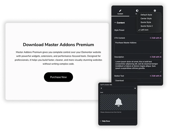
- Choose a Style Preset, then fill in CTA Content (the headline), Description and Button Text.
- Add the Call To Action URL for the button.
- In the Style tab, set the background in Presets Style, then the title, description and button colors, including the Hover tab.
Every setting is covered in the Call to Action widget settings guide.
Five CTA Banner Presets
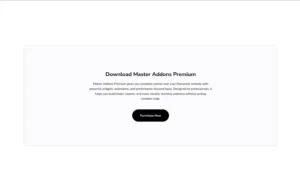
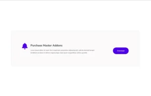
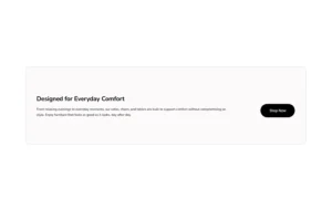
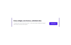
Pick a layout in Style Preset and your text stays as it is. Default Style puts the title and description on the left with the button on the right. Center Style stacks everything in the middle at up to 650px wide, with a white title meant for a dark background. Quote Style adds a thick accent bar on the left, Quote Style 2 frames the text with borders on both sides, and Left Icon places an icon beside the headline.
- Border Color recolors the bars on the two Quote presets.
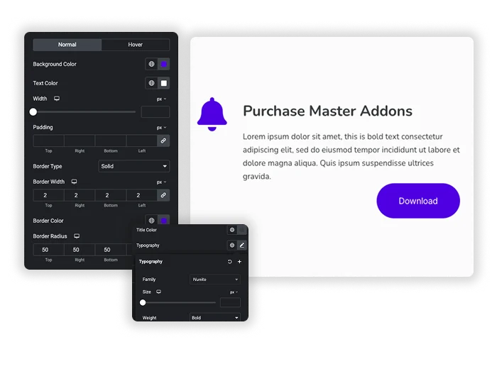
- Icon, Icon Color and Size appear only on Left Icon, which starts with a bell icon.
- The title is output as an H3 and the button is a single link with a URL, new tab and nofollow options.
Background, Text and Button Styling
In Presets Style, set the box background to a solid color, a gradient or an image, with position, attachment, repeat and size controls for the image. Title Style and Description Style each have a color and typography. Button Style has Normal and Hover tabs for background color, text color, width, padding and border radius, plus a border and typography for the button.
- Without a hover color of your own, the button turns green on hover, so set one to match your brand.
- Center Style and Left Icon use white text or icons, so give them a dark or image background.
- To make the whole banner clickable, add the free Wrapper Link extension to the widget.
Elementor Pro Call to Action vs Master Addons Call to Action
Elementor Pro’s Call to Action widget is built around an image, with a Classic or Cover skin, a ribbon and hover effects. Master Addons is a lighter text banner that costs nothing. Here is how they compare.
| Feature | Elementor Pro Call to Action | Master Addons Call to Action |
|---|---|---|
| Price | Needs Elementor Pro | Free with Master Addons |
| Layouts | Classic (image beside or above) and Cover (image behind) skins | Default, Center, Quote, Quote 2 and Left Icon presets |
| Image | Main image plus an optional image or icon graphic | Background image on the box, icon on Left Icon only |
| Background | Image with overlay color and CSS filters | Color, gradient or image |
| Heading tags | Title and description HTML tag choices | Title fixed as H3 |
| Link | Button only or whole box | Button, or whole box with the Wrapper Link extension |
| Extras | Ribbon, content hover animations, background zoom and move on hover | Button hover colors and sizes |
If you want image cards with ribbons and hover motion and already have Elementor Pro, its widget does more. For a quick text banner with one button, the free Master Addons widget covers it. Related free widgets: Creative Button, Pricing Table and Infobox.





Frequently Asked Questions For Call To Action
Is the Master Addons Call to Action widget free?
Yes. It is part of the free Master Addons plugin on WordPress.org, and all five presets are included. Elementor’s own Call to Action widget needs Elementor Pro.
Which preset should I use?
- Default Style: a banner with text on the left and the button on the right.
- Center Style: a centered block over a dark color or image background.
- Quote Style and Quote Style 2: text framed by accent bars, good for an announcement inside an article.
- Left Icon: an icon beside the headline to signal what the offer is about.
Can I make the whole call to action box clickable?
The widget links only its button. Add the free Wrapper Link extension to the widget if you want the whole banner to be clickable.
Can I add an image or a ribbon to the CTA?
You can set an image as the box background in Presets Style, but there is no separate image element and no ribbon. For image cards with a ribbon, Elementor Pro’s Call to Action widget is the better fit.
Trending Elementor Widgets & Extensions
Build sophisticated websites in less time.
Glassmorphism
Container Extras
Patterns
![Master Addons Post/Page Duplicator extension for Elementor: MA Duplicator row link in the WordPress Pages list creating a Landing Page - [Duplicated #128] draft](https://d1asvmc6qcowgk.cloudfront.net/wp-content/uploads/2026/09/15102930/post-page-duplicator-768x403.webp)
Post/Page Duplicator