

Sometimes a design needs a short explanation without giving it a full line on the page. That is a tooltip’s job: a small bubble that appears on hover, says its piece, and gets out of the way. The Tooltip widget in Master Addons for Elementor attaches that bubble to an icon, a piece of text, or an image, with control over placement, animation, trigger, and styling.
This guide walks through the widget from the first drag to a styled tooltip on the live page.
What the Tooltip widget does #
The widget places a small target element on your page, an icon, text, or image, and binds a tooltip bubble to it. When visitors hover or click the target, the bubble appears with your message. Placement, animation, timing, and offsets are all configurable, and the Style tab covers both the target and the bubble.
This is a standalone widget: the target and its tooltip are the whole point. If you want to add tooltips to widgets you already have on the page, Master Addons also ships a Tooltip extension that attaches to any Elementor element. The widget is the right pick when the tooltip target is its own small design element, like an info icon beside a price or a team avatar with a name bubble.
Before you start #
- WordPress with Elementor installed and active.
- Master Addons for Elementor installed and active. New to the plugin? See the installation guide.
- The Tooltip widget enabled in the Master Addons option panel, under Basic Widgets.
How to add the Tooltip widget #
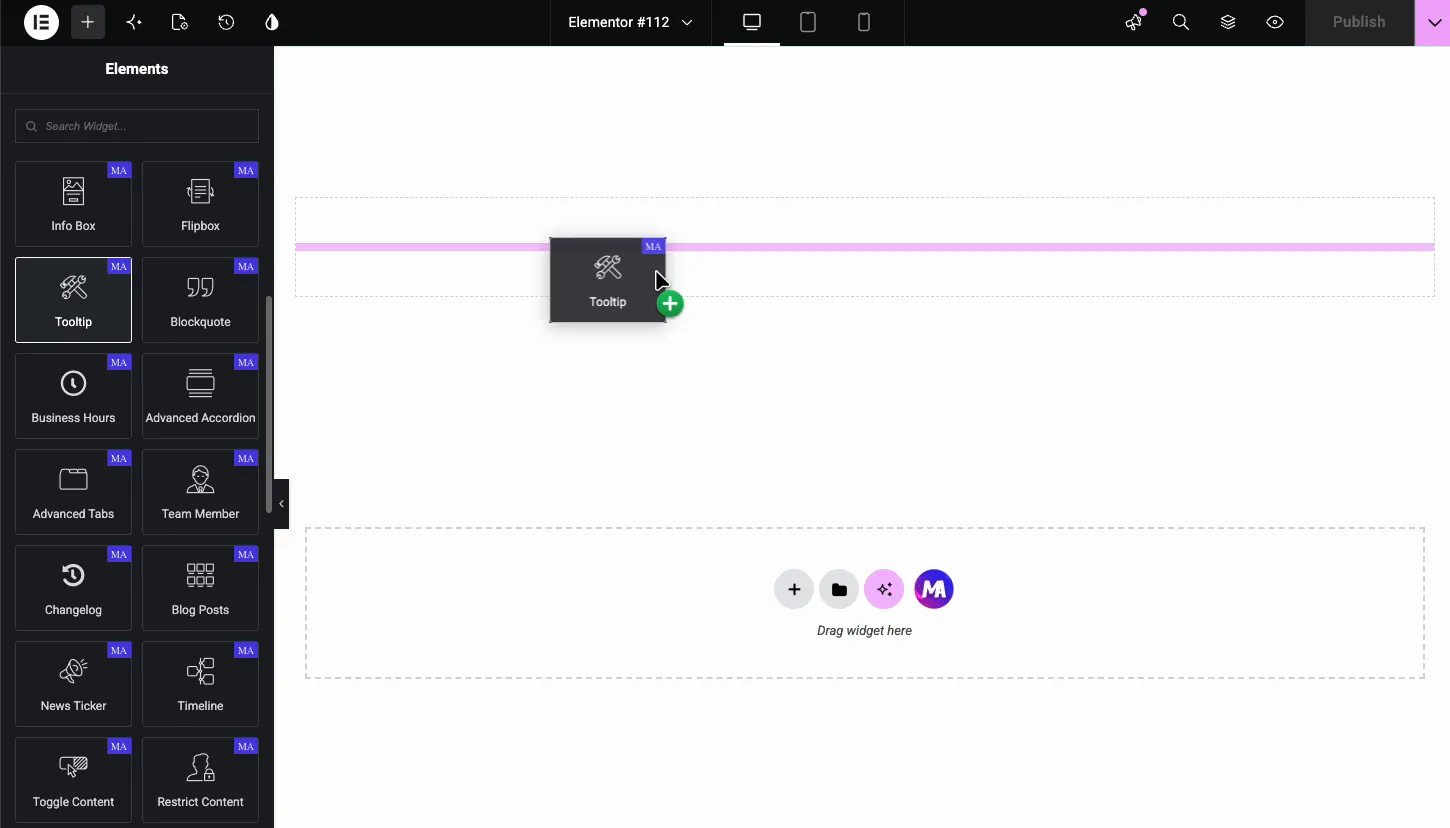
In the Elementor editor, search the Elements panel for Tooltip and drag the widget onto your page. It loads with an info icon as the default target and a placeholder tooltip already wired up, so hovering the icon on the canvas shows the bubble right away.
Choose the content type: icon, text, or image #
Open Content Settings in the Content tab. The Content Type switcher at the top offers three targets:
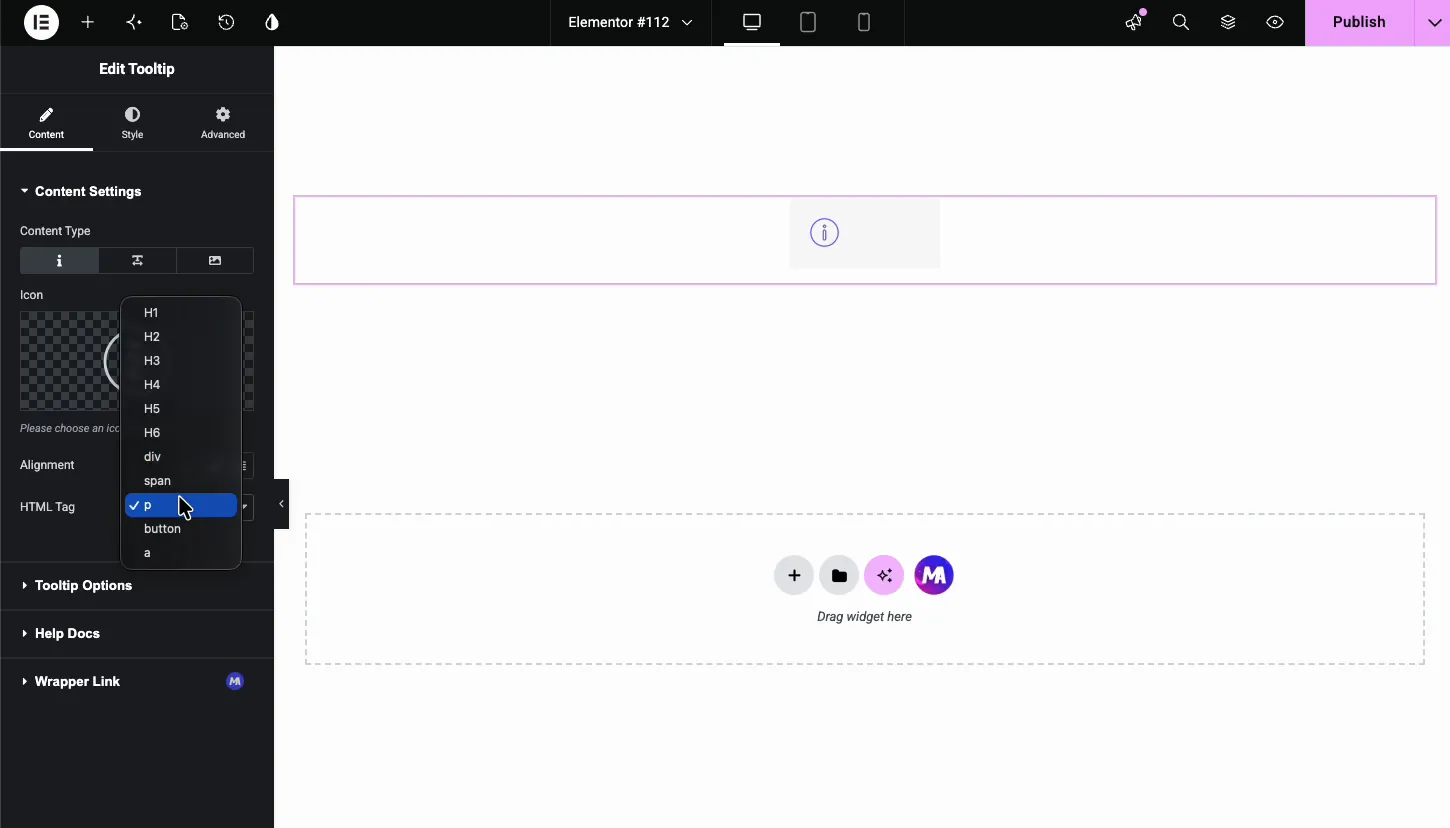
- Icon: pick any icon from the Elementor library. The classic info circle is the default.
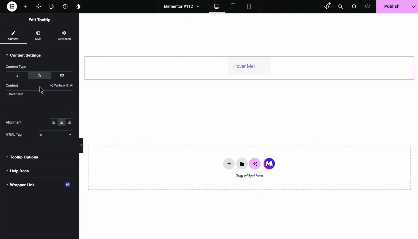
- Text: type a word or phrase, like “Hover Me!”, and the tooltip attaches to it.
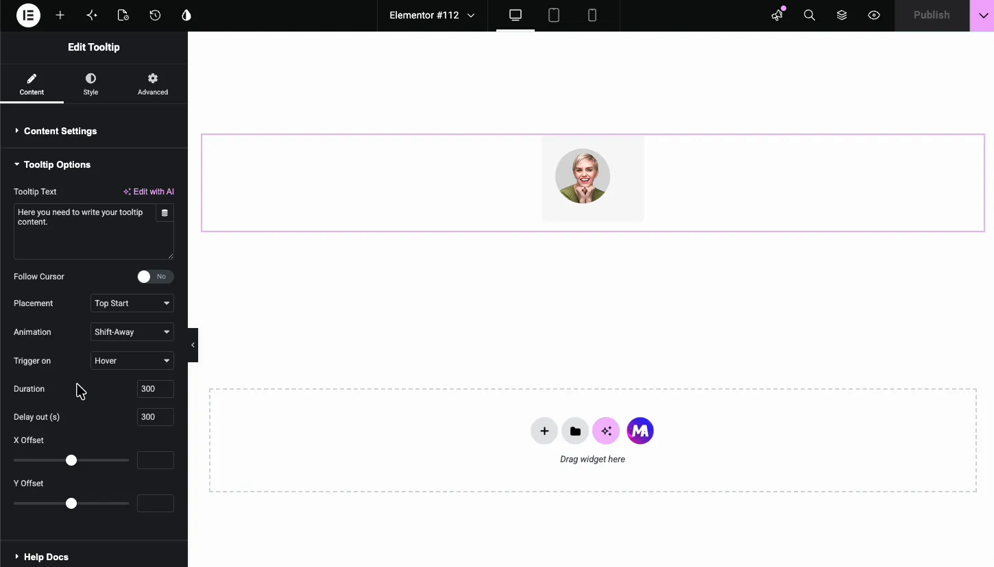
- Image: choose an image from the media library, useful for avatars and product thumbnails.
Two controls apply to every type. Alignment places the target left, center, or right. HTML Tag wraps the target in the markup you pick: H1 through H6, div, span, p, button, or a. Stick with p or span for plain tooltips; use button when the target should act like a control for accessibility.
With Text selected, a Content field replaces the icon picker:
With Image selected, the media library opens and the chosen image becomes the hover target:
Write the tooltip and set its behavior #
The Tooltip Options section controls the bubble itself.
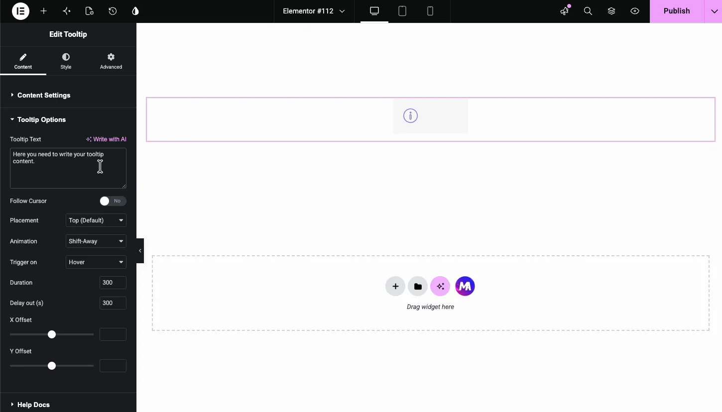
- Tooltip Text: the message inside the bubble. Keep it to a line or two; tooltips are for hints, not paragraphs.
- Follow Cursor: let the bubble trail the mouse instead of staying pinned to the target.
- Placement: where the bubble sits relative to the target. Top is the default, with Top Start, Bottom, and the other edges available.
- Animation: how the bubble enters, Shift-Away by default.
- Trigger on: Hover shows the bubble on mouseover; Click waits for a tap, which also works better on touch screens.
- Duration and Delay out: animation speed and how long the bubble lingers after the cursor leaves, both 300 milliseconds by default. The defaults feel right for most pages; only slow them down if the tooltip carries something visitors need a beat longer to read.
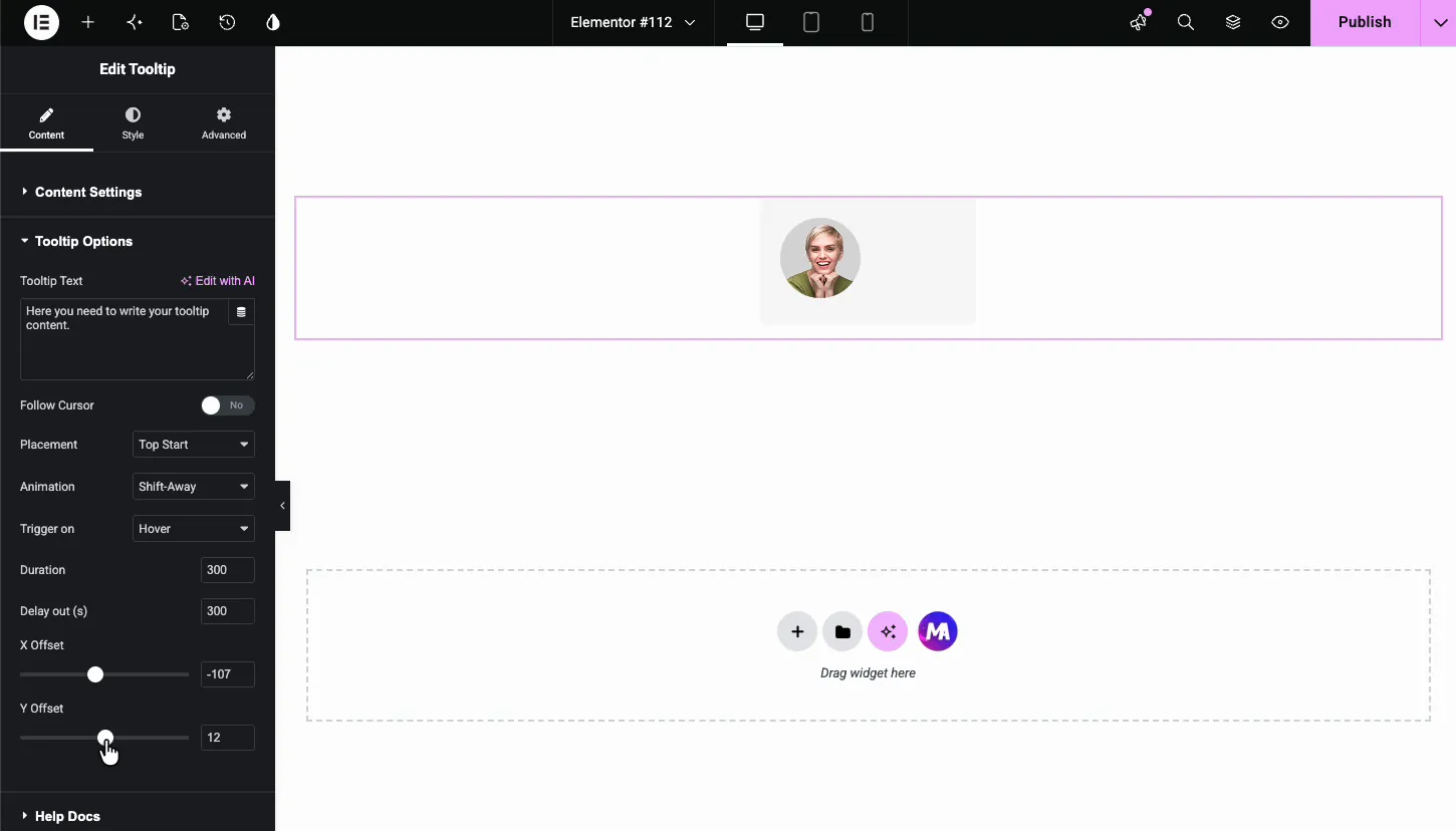
The X Offset and Y Offset sliders nudge the bubble away from its default spot. Useful when the tooltip needs to clear a border or sit beside an oddly shaped target.
Style the target #
In the Style tab, General Styles covers the target element on the page.
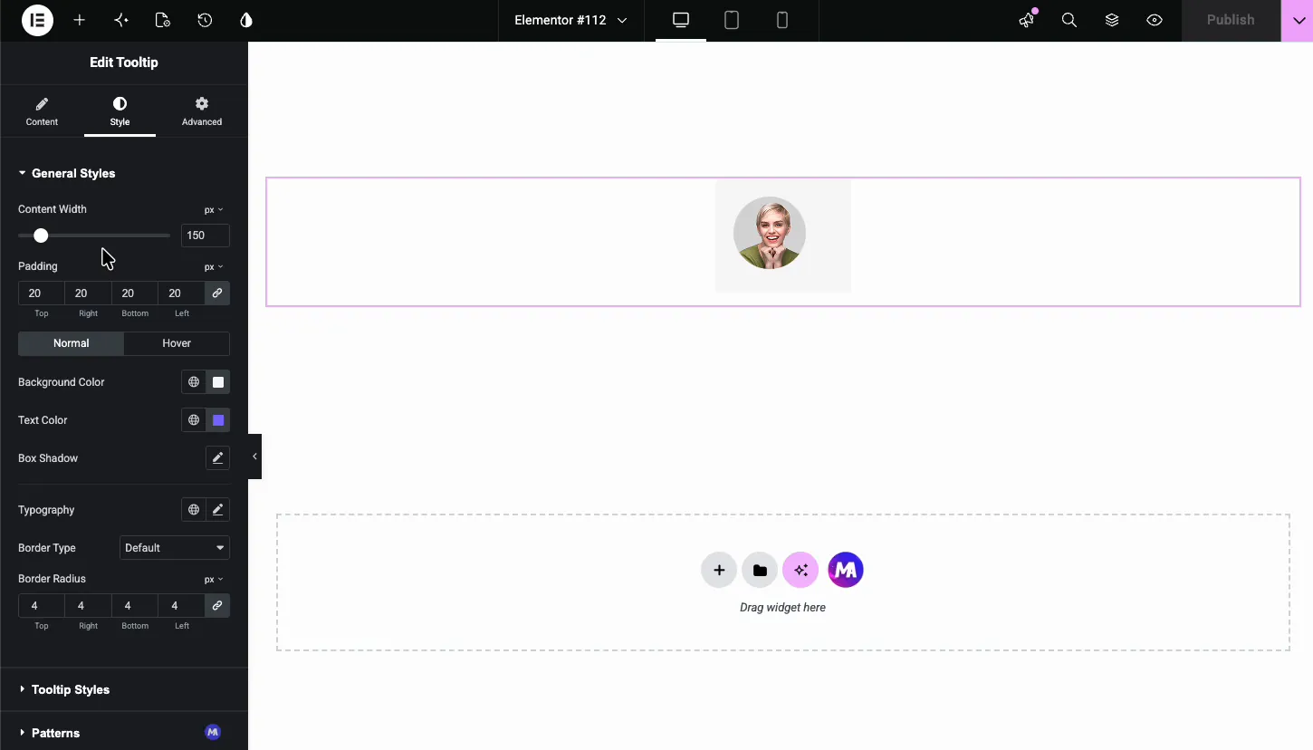
- Content Width and Padding: the size of the target block. The demo widens it from 150 to 215 pixels to give the avatar room.
- Normal and Hover states: Background Color, Text Color, Box Shadow, and Typography for each state.
- Border Type and Border Radius: frame the target; a 4 pixel radius keeps corners soft.
Style the tooltip bubble #
The Tooltip Styles section styles the bubble, and the canvas previews it live while you work.
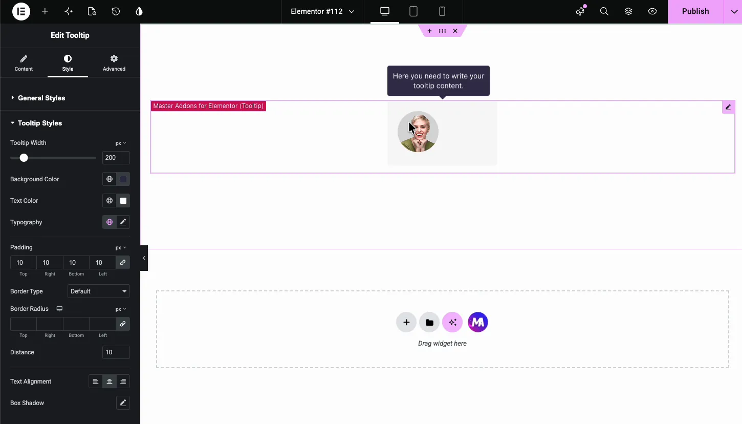
- Tooltip Width: the bubble’s maximum width, 200 pixels by default. Text wraps inside it.
- Background Color and Text Color: the demo goes dark navy with white text, the classic high-contrast tooltip look.
- Typography, Padding, Border: the text and frame of the bubble.
- Distance: the gap between bubble and target, 10 pixels by default.
- Text Alignment and Box Shadow: the last touches. A soft shadow helps the bubble read as floating above the page.
The result on the page #
On the live page, the target sits quietly until a visitor hovers it. Then the bubble animates in at your chosen placement, holds while the cursor stays, and fades out after the delay you set.

Common use cases #
- Info icons beside pricing rows, form labels, and feature lists.
- Team avatars that reveal a name and role on hover.
- Glossary terms in text, with a short definition in the bubble.
- Product thumbnails with a spec or note that doesn’t deserve page space.
- Icon-only buttons where the tooltip names the action.
Tips for better tooltips #
- Keep the text short. One or two lines. If the message needs more, it belongs in the layout, not a tooltip.
- Use Click trigger for touch visitors. Hover doesn’t exist on phones; a click-triggered tooltip works everywhere.
- Mind the contrast. Dark bubble, light text, or the reverse. The default width of 200 pixels with 10 padding reads well at typical font sizes.
- Check placement near screen edges. A Top tooltip on the first element of a page can clip; switch it to Bottom or use the offsets.
- Don’t hide critical info in tooltips. Anything visitors must read belongs on the page; the bubble is for extras.
Video Tutorial #
If you’d rather watch the tooltip in action, this short video covers the whole setup, from dragging the widget in to the styled bubble on the live page.
Frequently Asked Questions #
What is the Tooltip widget in Master Addons?
It is an Elementor widget that places an icon, text, or image on the page and attaches a tooltip bubble to it. The bubble appears on hover or click, and you control its placement, animation, timing, offsets, and full styling from the Elementor panel.
Can the tooltip target be an image?
Yes. Set Content Type to Image in Content Settings and pick any image from the media library. The tooltip then appears when visitors hover or click the image, which suits team avatars and product thumbnails.
Can I show the tooltip on click instead of hover?
Yes. In Tooltip Options, change Trigger on from Hover to Click. Click triggering also behaves better on phones and tablets, where hover doesn’t exist.
How do I change where the tooltip appears?
Use the Placement dropdown in Tooltip Options to pick Top, Bottom, or a start or end variant of each edge. The X Offset and Y Offset sliders then fine-tune the exact position, and Distance sets the gap from the target.
Can I style the tooltip bubble?
Yes. The Tooltip Styles section in the Style tab controls the bubble’s width, background color, text color, typography, padding, border, distance from the target, text alignment, and box shadow. The editor previews changes live.
Wrapping up #
The Tooltip widget handles the whole hint-bubble pattern in one place: pick an icon, text, or image target, write the message, set the trigger and placement, and style both halves from the Elementor panel. Browse the full set of Master Addons widgets and extensions for the Tooltip extension and everything else in the box, and see the pricing page for what Pro adds.


