Some content earns a place on the page. The rest, a menu, an FAQ list, a contact form, works better tucked away until someone asks for it. The Off-Canvas Content widget in Master Addons for Elementor hides any Elementor template behind a button and slides it in from the side, top, or bottom of the screen when visitors click.
You pick a saved template, place the trigger button, and choose how the panel enters. This guide follows the widget from the Elements panel to a working slide-out FAQ panel on the live page.
What the Off-Canvas Content widget does #
The widget places a trigger button on your page and links it to a hidden panel. The panel’s content is any template from your Elementor library, so a mobile menu, a mega FAQ, a cart summary, or a signup form all work the same way. When a visitor clicks the button, the panel slides or fades in over the page with a dimmed overlay behind it and a close icon in its header.
Everything happens in one widget: the trigger, the panel, the animation, and the styling. No separate popup plugin, no template shortcodes.
Before you start #
- WordPress with Elementor installed and active.
- Master Addons for Elementor installed and active. New to the plugin? See the installation guide.
- A saved Elementor template to show inside the panel. Build one under Templates in your dashboard first; the demo here uses a ready-made FAQ section.
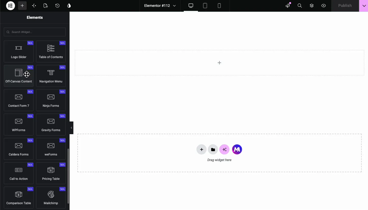
How to add the Off-Canvas Content widget #
In the Elementor editor, search the Elements panel for Off-Canvas Content, or scroll to the Master Addons section, and drag it onto the page. A blue trigger button labeled Click Here appears on the canvas. The panel itself stays hidden until you pick a template and open it.
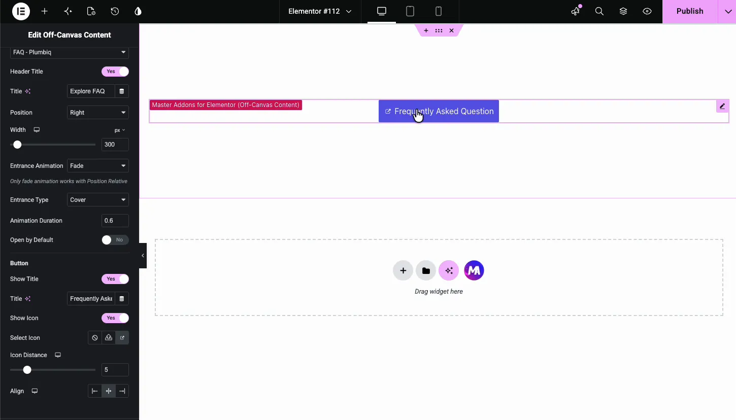
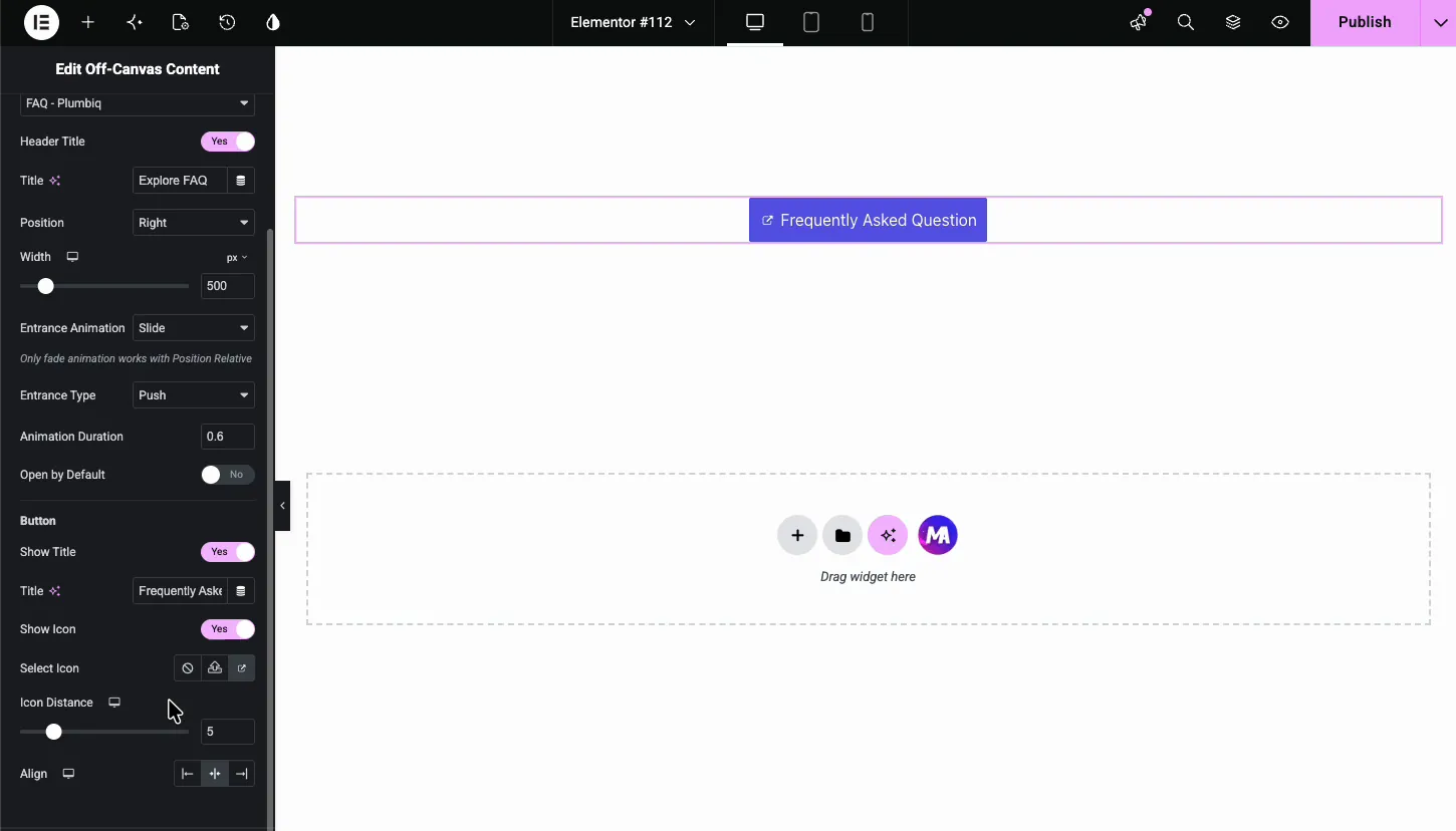
Pick the template and set up the panel #
The Content section holds the core settings for the panel.
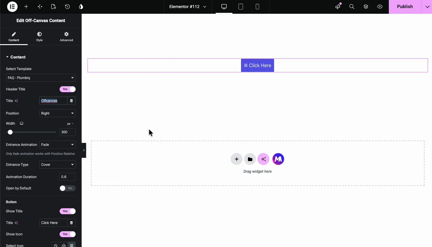
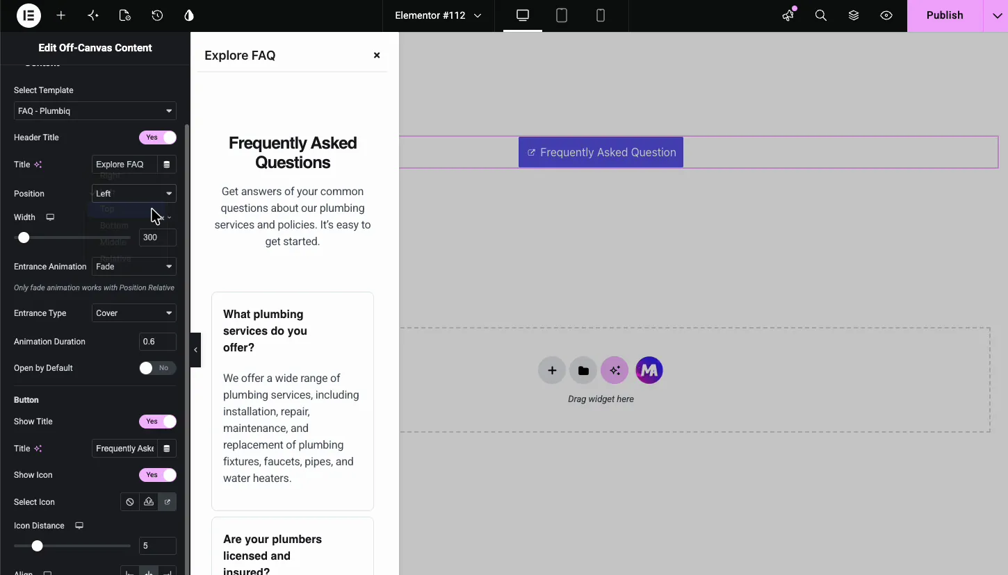
- Select Template: the Elementor template the panel shows. Any saved section or page template appears in this dropdown.
- Header Title and Title: switch on the panel header and type its label, such as “Explore FAQ”. The close icon lives in the same header.
- Position: which edge the panel comes from. More on this below.
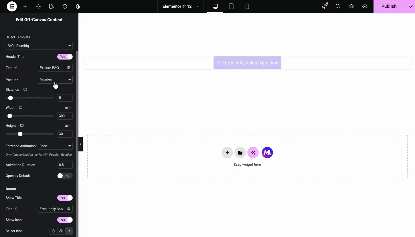
- Width: how wide the panel is in pixels, 300 by default. Panels from the top or bottom use a Height control in viewport height instead.
- Entrance Animation and Entrance Type: how the panel arrives. Fade or Slide for the animation, Cover or Push for the type. Cover lays the panel over the page; Push shoves the page aside to make room.
- Animation Duration: the entrance speed in seconds, 0.6 by default.
- Open by Default: start the page with the panel already open. Handy while designing, since you can style the panel without clicking the trigger after every change.
Configure the trigger button #
The Button group in the same tab controls the trigger. Show Title and Title set the label; the demo renames it from Click Here to Frequently Asked Question. Align places the button left, center, or right in its column.
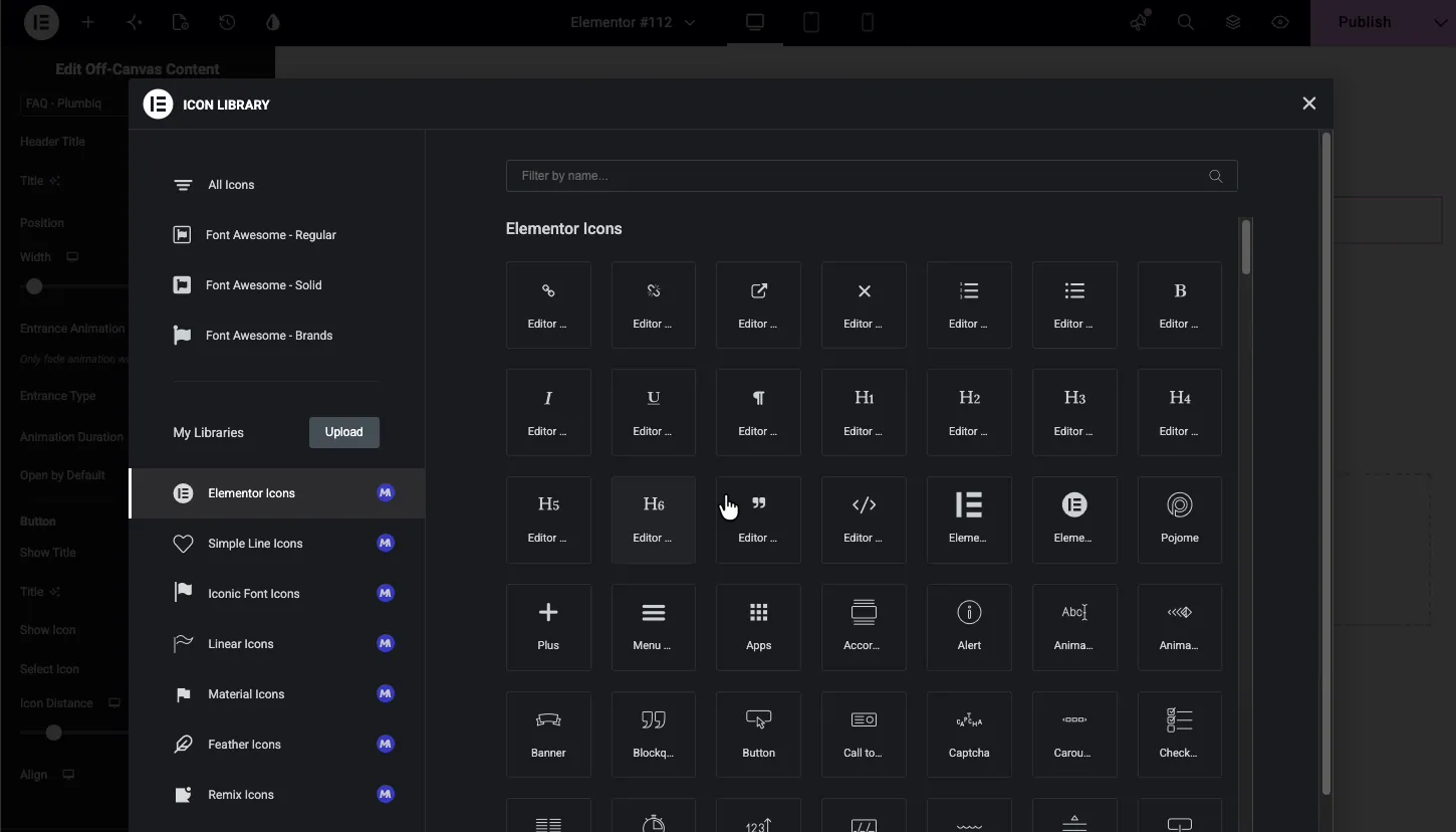
Show Icon adds an icon beside the label, and Select Icon opens the Elementor icon library so you can pick from Font Awesome or any icon set you have installed. Icon Distance sets the gap between icon and text.
Choose where the panel slides from #
The Position dropdown offers six options: Right, Left, Top, Bottom, Middle, and Relative.
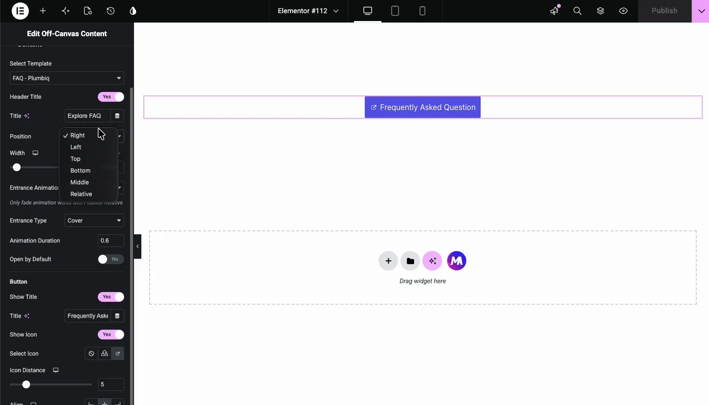
Right and Left are the classic drawer panels. Pick one and the editor previews it immediately: the panel slides in with your template inside, header on top, close icon ready.
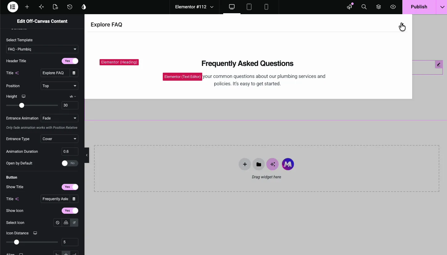
Top and Bottom swap the Width control for a Height slider measured in viewport height. A top bar at 30vh works like a slim announcement drawer.
Middle centers the panel like a modal. Relative anchors the panel to the trigger button itself, with a Distance control for the gap, which turns the widget into a dropdown-style reveal. One note from the panel itself: only the Fade animation works with the Relative position.
Set the width and entrance animation #
Back on a side position, the demo widens the panel to 500 pixels and switches the Entrance Animation to Slide with the Entrance Type on Push. With Push, the page content shifts over as the panel enters instead of being covered. Keep the duration around half a second; slower starts to feel like waiting.
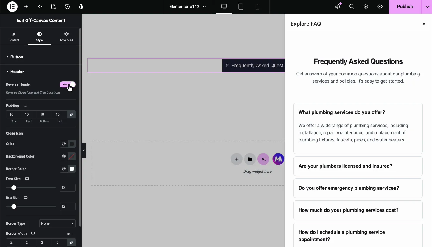
Style the panel #
The Style tab has three sections: Button, Header, and Container.
Button #
Styles the trigger: background, text color, typography, border, and padding, with Normal and Hover states. The demo turns the default blue into a dark navy that matches the page.
Header #
Styles the strip at the top of the open panel.
- Reverse Header: swaps the title and close icon sides, so the X moves from right to left.
- Padding: space around the header content.
- Close Icon: color, background, border color, font size, box size, and border for the X button. Keep the box size at 24 or more if your audience is mostly on phones; a 12 pixel tap target is easy to miss.
Container #
Styles the panel body and what surrounds it.
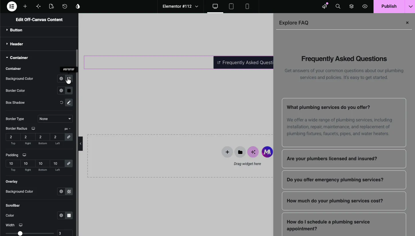
- Background Color, Border Color, Box Shadow, Border Type, Border Radius, Padding: the panel surface itself.
- Overlay Background Color: the tint over the rest of the page while the panel is open. A dark overlay pulls focus to the panel.
- Scrollbar: color and width of the scrollbar for panels taller than the screen.
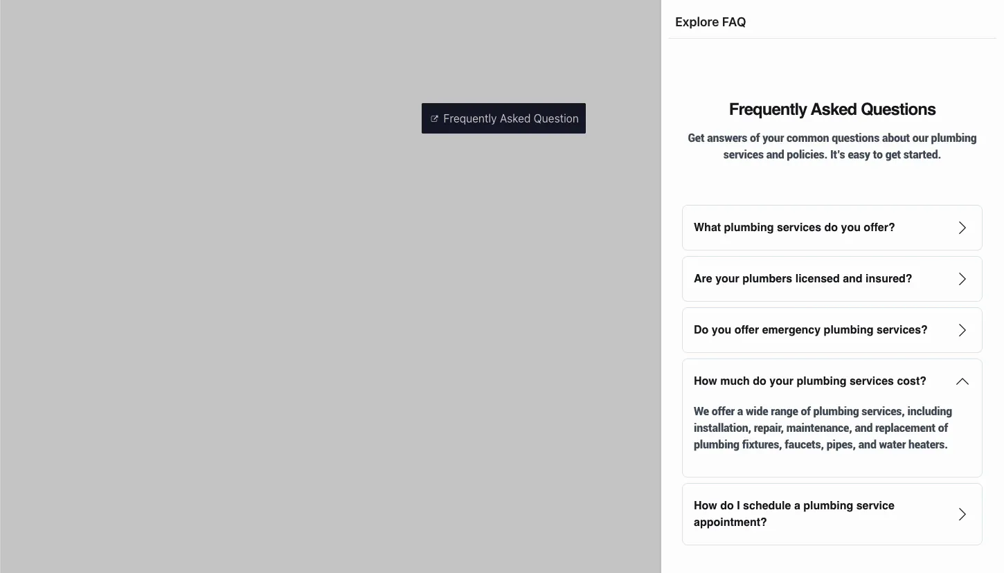
The result on the page #
On the live page, the button sits where you placed it. A click slides the panel in from the chosen edge, dims the page behind it, and shows your template with the header and close icon on top. Visitors close it with the X or by clicking the overlay, both work.
Common use cases #
- Mobile and secondary menus that slide in from the side without crowding the header.
- FAQ and help panels like the demo, keeping answers one click away on landing pages.
- Contact or quote forms that open over the page instead of living on a separate one.
- Cart and account drawers on shop pages.
- Announcement bars from the top edge using the Top position with a small height.
Tips for a better off-canvas panel #
- Build the template first. The widget only lists saved templates, so design the panel content under Templates before you drag the widget in.
- Match Width to the content. 300 pixels suits a menu; forms and FAQ lists breathe better around 450 to 500.
- Use Push sparingly. It looks striking, but shifting the whole page can feel jumpy on long content. Cover with a dark overlay is the calmer default.
- Remember the Relative rule. Only the Fade animation works when Position is set to Relative.
- Check the panel on mobile. A 500 pixel panel is wider than many phones; set a smaller width for the mobile breakpoint with the responsive control.
Frequently Asked Questions #
What is the Off-Canvas Content widget in Master Addons?
It is an Elementor widget that hides a saved template behind a trigger button and slides it in as a panel when clicked. It handles the button, the panel position, the entrance animation, the overlay, and the close icon in one widget.
Can I show any Elementor template in the panel?
Yes. The Select Template dropdown lists every saved template in your Elementor library. Menus, FAQ sections, forms, and full custom layouts all load inside the panel exactly as designed.
Which directions can the panel open from?
Six positions are available: Right, Left, Top, Bottom, Middle, and Relative. Side panels use a pixel Width, top and bottom panels use a viewport Height, and Relative anchors the panel to the trigger button with a Distance control.
What is the difference between Cover and Push?
Cover slides the panel over the page while an overlay dims the background. Push moves the page content aside to make room for the panel. Cover is the safer default; Push is more dramatic but shifts the entire layout.
Can the off-canvas panel open automatically?
Yes. Switch on Open by Default in the Content settings and the panel starts open when the page loads. Visitors can close it with the close icon or by clicking the overlay, and reopen it with the trigger button.
Wrapping up #
The Off-Canvas Content widget turns any saved template into a slide-out panel: pick the template, place the trigger button, choose the edge and animation, and style everything from the button to the scrollbar. It pairs naturally with the Nav Menu widget for mobile navigation and with form widgets for click-to-contact panels. Browse the full set of Master Addons widgets and extensions to see what else ships in the box, and check the pricing page for the Pro extras.


