Free Elementor Positioning: Relative and Absolute Position for Any Element
The Positioning extension in Master Addons is free and adds a Positioning panel to the Advanced tab of every widget, column, section and container. Pick Relative or Absolute, then set Top, Right, Bottom and Left offsets in px, em or %, with separate values for desktop, tablet and phone. Use it for badges that overlap a photo, shapes that break out of a section, or labels nudged into place.

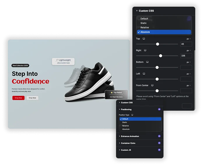
Relative, absolute and static positioning
Choose the position type that matches the job. Relative moves an element from its normal spot without shifting its neighbours. Absolute places it at exact offsets inside the nearest positioned parent. Static and Default keep the normal page flow. The position type can differ per device, so an element can overlap on desktop and sit in the flow on a phone.
- Relative positioning: fine-tune alignment, like shifting an icon a few pixels to the left.
- Absolute positioning: place badges, decorative shapes or labels anywhere inside a section.
- Need something pinned to the screen while visitors scroll? Use the Fixed option in Elementor’s own Position setting on widgets and containers.
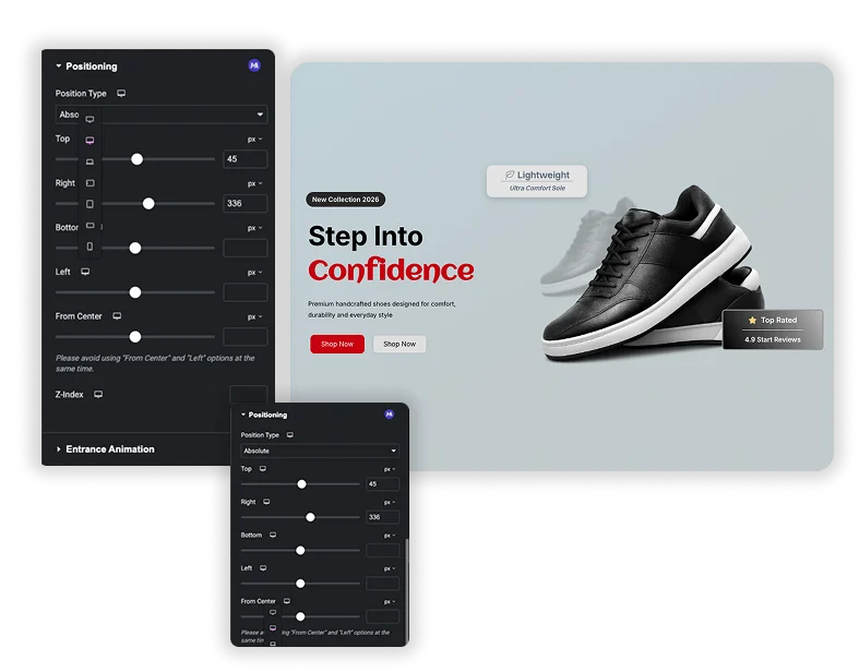
Offsets from every side, plus From Center
Set Top, Right, Bottom and Left in px, em or %, including negative values that push an element past its parent’s edge. Place a “NEW” badge 10px from the top and 15px from the right of a product card. The From Center option offsets an element from the horizontal center of its parent, which helps with centered overlapping effects.
- Four-sided control: set distances from all four edges of the parent.
- From Center: position from the middle of the parent instead of the left edge.
- Z-Index per device: decide which element sits on top when things overlap.
- The panel warns you not to combine Left and From Center on the same element.
Elementor's Position setting vs Master Addons Positioning
Both are free, and they solve slightly different problems. Use this table to pick the right one for an element. For more layout control, pair Positioning with Container Extras, or add movement with Transforms (Pro).
| Elementor Position | Master Addons Positioning | |
|---|---|---|
| Price | Free | Free |
| Position types | Default, Absolute, Fixed | Default, Static, Relative, Absolute |
| Offsets | One horizontal and one vertical | Top, Right, Bottom, Left and From Center |
| Position type per device | No | Yes |
| Works on | Widgets and containers | Widgets, containers, sections and columns |
| Stays on screen while scrolling | Yes, with Fixed | No |
How to overlap elements in Elementor with Positioning
This example puts a “Sale” badge over the top right corner of a product image. The same steps work for shapes, icons and labels.
- Make sure the Positioning extension is turned on in the Master Addons dashboard.
- Put the image and the badge widget in the same container.
- Select the container, go to Advanced > Positioning and set Position Type to Relative.
- Select the badge, set Position Type to Absolute, then set Top and Right to 10px.
- Set the badge’s Z-Index to 2 so it stays above the image.
- Switch to tablet and mobile view and adjust the offsets for each screen.
Want the whole card to be clickable? Add Wrapper Link to the container. For anything the panel doesn’t cover, write your own rules with Custom CSS.
Frequently Asked Questions For Positioning
How is this different from Elementor's own Position setting?
Elementor’s Position setting on widgets and containers offers Default, Absolute and Fixed, with one horizontal and one vertical offset. The Master Addons extension adds Relative and Static, lets you set all four sides, adds a From Center offset, lets the position type change per device, and also works on classic sections and columns. It does not include Fixed, so use Elementor’s setting for elements that should stay on screen while scrolling.
When I use Absolute positioning, what is it positioned "relative" to?
An absolutely positioned element is placed inside the nearest parent whose position is not static. If no parent has a position set, the offsets are measured from a parent further up the page, and the element can end up somewhere unexpected. To avoid that, select the container or column that holds the element and set its Position Type to Relative first.
Will this work properly on mobile and tablet?
Yes. Position Type, all four offsets, From Center and Z-Index each accept separate values for desktop, tablet and mobile. An element placed 100px from the left on desktop can fall off a phone screen, so switch to the tablet and mobile views and adjust the numbers there. You can also set Position Type to Static on mobile to put the element back into the normal layout.
Can I use this to make a unique-shaped section or break out of a container?
Yes. Set the container to Relative, place an image or shape inside it, set that element to Absolute, and give it a negative offset such as Left: -50px. The element hangs over the container’s edge, which is how most overlapping hero and card designs are built.
Trending Elementor Widgets & Extensions
Build sophisticated websites in less time.
Glassmorphism
Container Extras
Patterns
![Master Addons Post/Page Duplicator extension for Elementor: MA Duplicator row link in the WordPress Pages list creating a Landing Page - [Duplicated #128] draft](https://d1asvmc6qcowgk.cloudfront.net/wp-content/uploads/2026/09/15102930/post-page-duplicator-768x403.webp)
Post/Page Duplicator