

The Choose field adds a row of icon buttons to a custom widget you build with the Master Addons Widget Builder. It’s the same kind of control Elementor uses for text alignment: a few buttons, one active at a time. Use it when there are only two to four options and an icon explains each one faster than a word.
Choose is one of the fields you can use in the free version’s Widget Builder. The free plugin includes a limited Widget Builder, and the full set of fields comes with Master Addons Pro.
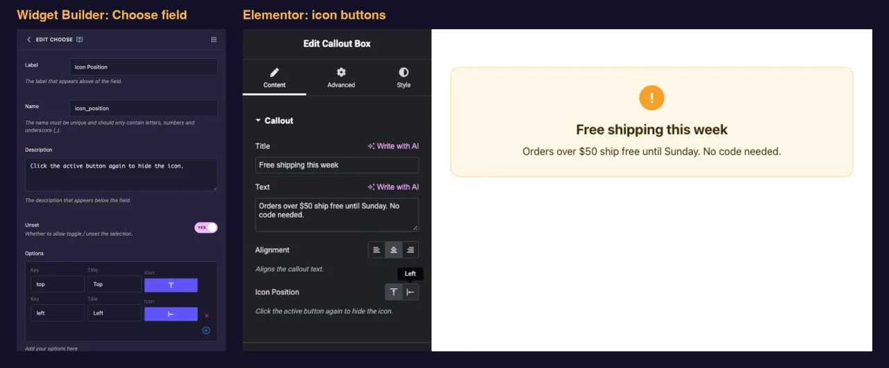
What the Choose field does #
- Adds a row of icon buttons to your widget’s panel in Elementor, one button per option.
- Shows each option’s title as a tooltip when an editor hovers a button.
- Saves the key of the picked option, such as
center, not its title. - Prints that key wherever you place its token, like
{{ align }}. The usual approach is to turn it into a CSS class.
New to the builder? Read the Widget Builder overview first, then come back with a widget open.
Before you start #
- WordPress with Elementor installed and active.
- Master Addons for Elementor installed and active. The installation guide covers setup.
- A widget open in the Widget Builder. The example in this guide is a “Callout Box” widget with two Choose fields:
align(left, center, right) andicon_position(top or left).
How to add a Choose field #
- Go to Master Addons > Widget Builder and open your widget.
- Add a section on the Content tab, for example “Callout”. Layout choices also fit well on the Style tab.
- Type
choosein the field search box on the left. - Drag Choose into the section. Click the pencil on the field to open its settings.
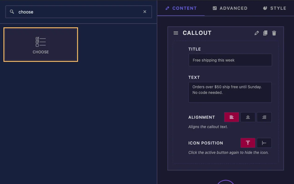
A new Choose field isn’t empty. It comes with three alignment options (left, center and right) and Center as the default, so for a simple alignment control you only need to change the label and name.
Choose field options explained #
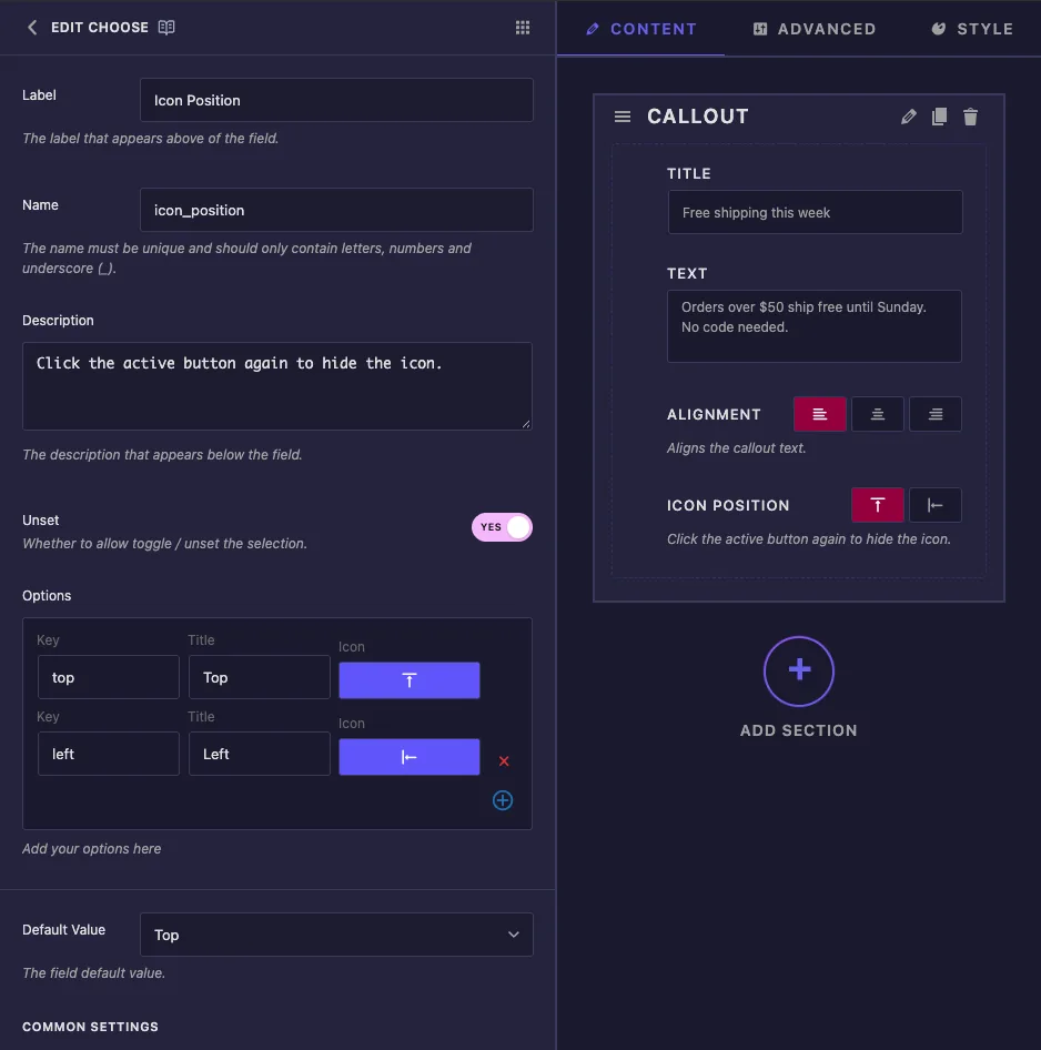
- Label: the text next to the buttons in Elementor, for example “Icon Position”.
- Name: the field’s unique ID and the name of its token. Use letters, numbers and underscores only, for example
icon_position. - Description: a hint shown under the buttons in Elementor.
- Unset: lets editors click the active button again to clear the choice. See the note below before you rely on it.
- Options: one row per button. Key is the value your template gets, Title is the tooltip, and Icon opens the icon picker. Use the red cross to remove a row and the plus button to add one.
- Default Value: the option a new copy of the widget starts with. The dropdown shows titles, but the field stores the key.
Under Common Settings you’ll find Show Label, Label Block, Separator and Conditions, which work the same as on other fields.
Pick icons that show up in Elementor #
Clicking an option’s icon opens the Master Addons Icon Picker. Open the Elementor Icons tab and search, for example align, to find alignment and position icons.
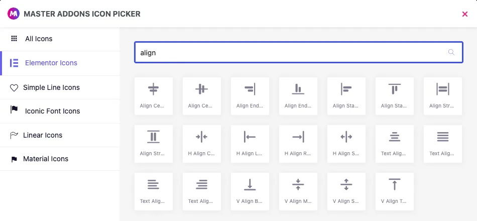
Stick to that tab. The picker also lists Simple Line, Iconic Font, Linear and Material icons, but in our tests those buttons showed up blank in the Elementor panel. Only Elementor Icons displayed.
Keys, titles and Unset #
- Keep keys short, lowercase and without spaces, such as
leftortop. They end up in class names. - You can rename a title at any time. Changing a key breaks pages that already saved the old one.
- In our tests, clicking the active button cleared the value even with Unset set to No. Plan for an empty value either way, as shown in the template below.
Use the choice in your template #
The token prints the key, so the cleanest setup is a modifier class. This is the Callout Box HTML:
<div class="callout{% if align %} callout--{{ align }}{% endif %}{% if icon_position %} callout--icon-{{ icon_position }}{% endif %}">
  {% if icon_position %}<span class="callout-icon">!</span>{% endif %}
  <div class="callout-body">
    <p class="callout-title">{{ callout_title }}</p>
    <p class="callout-text">{{ callout_text }}</p>
  </div>
</div>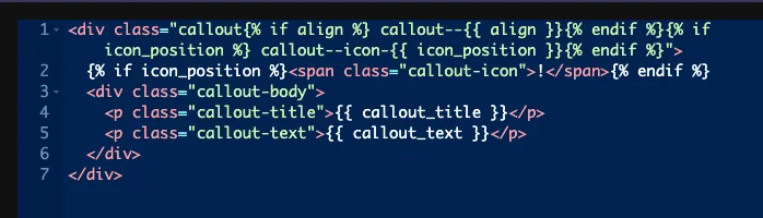
Each {% if %} skips the class when the value is empty. For Icon Position, an empty value also hides the icon, which is why that field has Unset on. The CSS panel then styles each class:
.callout--left { text-align: left; }
.callout--center { text-align: center; }
.callout--right { text-align: right; }
.callout--icon-top .callout-icon { margin-bottom: 14px; }
.callout--icon-left { display: flex; gap: 18px; align-items: flex-start; }
You can also compare the value directly, for example {% if icon_position == 'left' %}. Compare against the key, never the title.
Leave Selector and Responsive Control off #
- Selector: for this field it writes
color: {{VALUE}};. In our tests, a Selector of.callout-titleproducedcolor:center;, which browsers ignore. Unlike some other fields, Choose has no CSS Selectors rows where you could write your own property. Use classes as shown above. - Responsive Control: adds device icons so editors can pick a different option on tablet and mobile, but the token only prints the desktop choice. The per-device picks never reach your template.
Use the Choose control in Elementor #
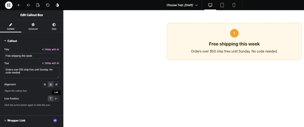
Add the widget to a page, or reload the editor if the page was already open. The buttons sit under your label with the default option highlighted. Hover a button to see its title, and click to switch. The preview updates right away.
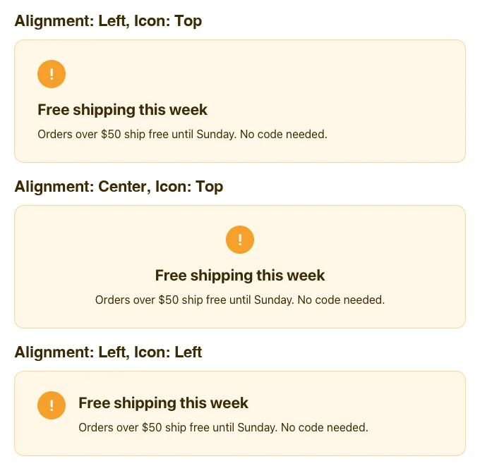
Here is the same callout with different choices:
Common use cases #
- Text alignment for headings, quotes and cards.
- Image or icon position: top, left or right.
- Layout direction, such as a row or a column.
- Small visual variants, such as a light or dark style, when each has a clear icon.
Tips for working with the Choose field #
- Keep it to four options or fewer. For longer lists, use the Select field.
- Always handle an empty value. Wrap classes and markup in
{% if %}, and give the base class sensible default styles. - Write clear titles. The tooltip is the only text editors see for each button.
- Use Elementor Icons only, so every button has a visible icon.
- Decide on keys before editors use the widget. Titles and icons can change later, keys can’t.
Frequently Asked Questions #
Is the Choose field available in the free version?
Yes. Choose is one of the fields you can use in the free version’s Widget Builder. The full set of Widget Builder fields comes with Master Addons Pro.
What does the Choose token print?
The key of the picked option, for example center. It prints nothing when no option is selected.
Why are some of my Choose buttons blank in Elementor?
The icon probably comes from a library other than Elementor Icons. In our tests only icons from the Elementor Icons tab showed in the panel. Pick a replacement icon from that tab.
Can I use the Selector option for alignment?
Not for this field. The Selector writes color: {{VALUE}};, so an alignment key becomes an invalid color. Print the key as a class and style that class in the CSS panel.
Why can editors clear the choice when Unset is off?
In our tests, clicking the active button cleared the value even with Unset set to No. Treat an empty value as possible and handle it with {% if %}.
Wrapping up #
Add a Choose field, set short keys with Elementor icons and clear titles, then print the key as a class in your HTML and style each class in the CSS panel. Handle the empty value and the widget stays tidy when an editor clears a choice. For longer lists of options, see the Select field, and check pricing for what each plan includes.


