

When shoppers weigh two or three options, a side-by-side table answers their questions faster than scrolling between separate pages. The Comparison Table widget, a Pro widget in Master Addons for Elementor, builds that table: a column of features down the side, a column per product across the top, and a price plus buy button on each. You fill it in from the Elementor panel, no HTML tables required.
Each cell can hold text, a tick, or a cross, so it reads at a glance. Four layout styles, an adjustable number of product columns, and full color control mean the table can match any page. This guide covers every setting, from the feature rows to the zebra striping.
Prefer to watch first? This short tutorial walks through the Comparison Table widget end to end:
What the Comparison Table widget does #
The widget lays out a grid: feature names run down the first column, and each product gets its own column with a title, price, per-feature value, and a call-to-action button. Change the product count and the columns adjust to match.
You type everything in by hand, so it does not depend on WooCommerce. That makes it just as useful for comparing plugins, service tiers, or hardware as it is for store products.
Before you start #
- WordPress with Elementor installed and active.
- Master Addons Pro installed with an active license, since Comparison Table is a Pro widget. New to the plugin? See the installation guide.
- The products and the feature list you want to compare.
How to add the Comparison Table widget #
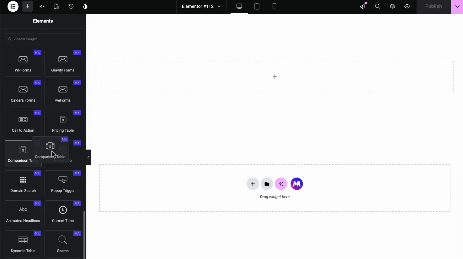
In the Elementor editor, open the Elements panel and search for Comparison Table, or scroll to the Master Addons section. Drag it onto your page and a sample table appears, already filled with placeholder products and features so you edit from a working layout instead of a blank grid.
General settings: layout and product count #
Open the Content tab and the General section holds the two settings that shape the whole table.
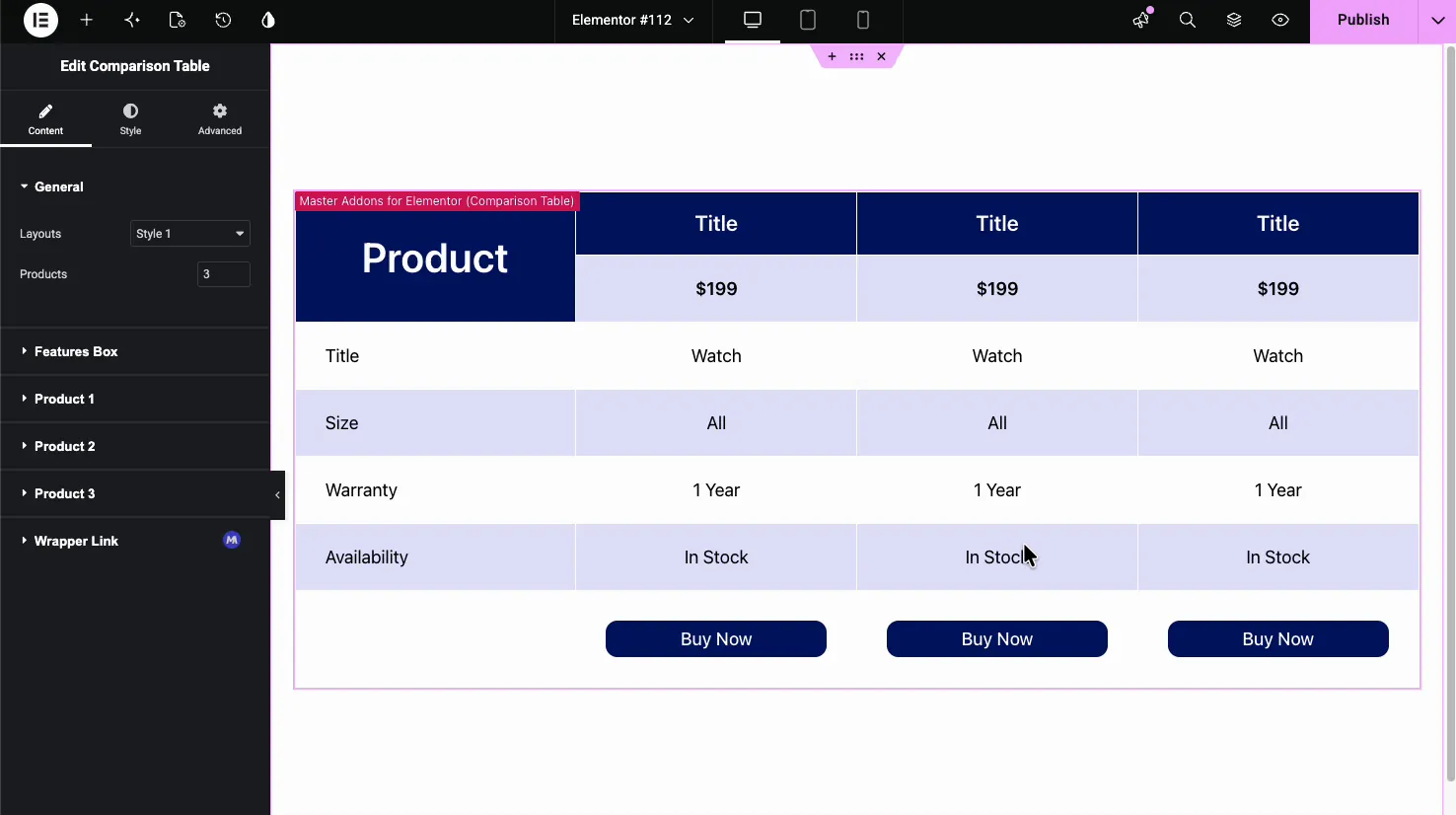
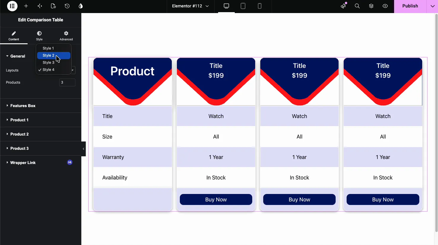
- Layouts: pick Style 1, 2, 3, or 4. Each rearranges the header, price, and columns into a different look.
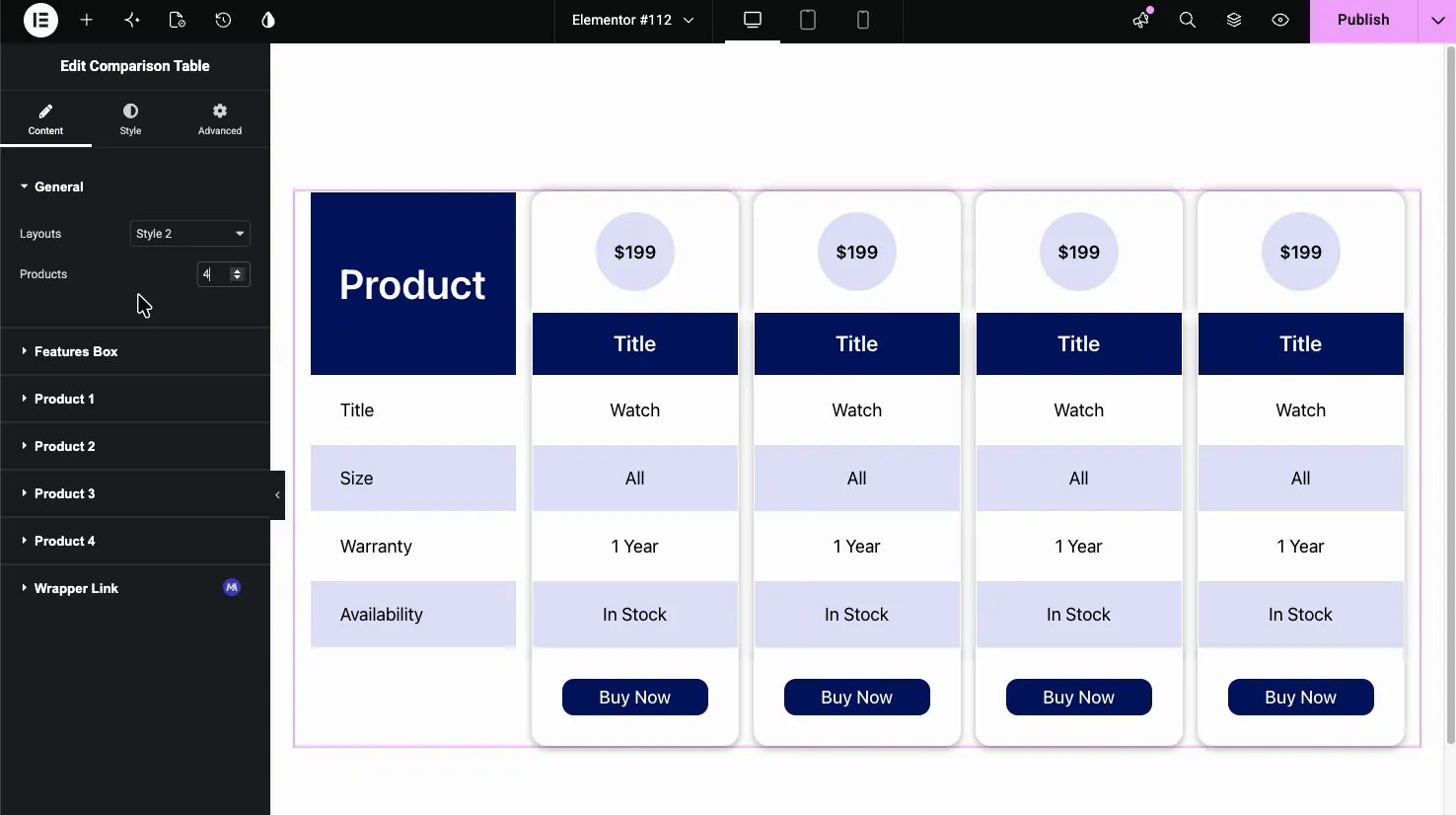
- Products: set how many product columns the table shows, from 2 to 6. Raise the number and a matching Product section appears below for each new column.
Set the feature rows #
The Features Box section defines the left column, the list of things you are comparing. The Heading is the label at the top (like “Features” or “Product”), and the Features repeater holds one item per row.
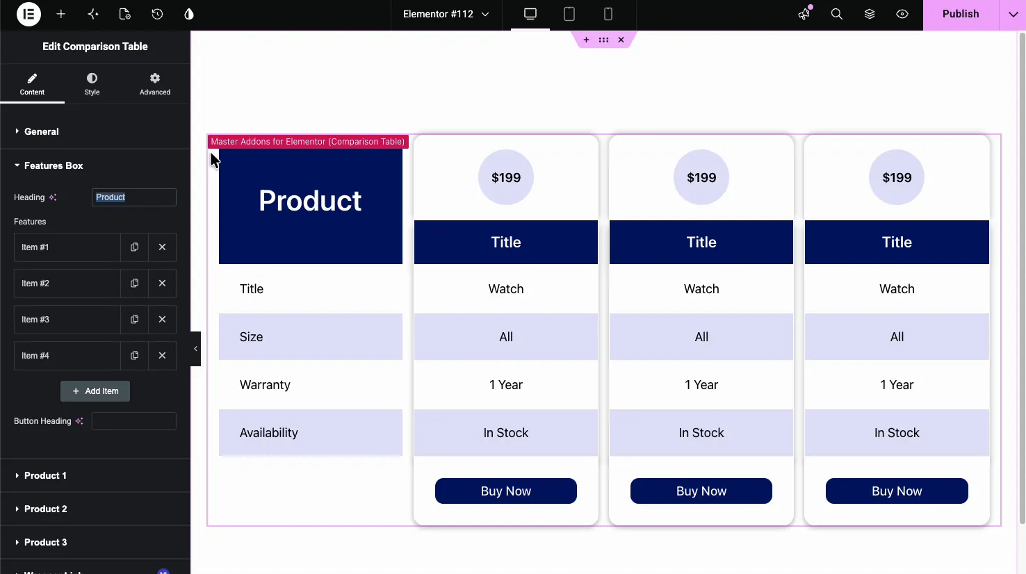
Each feature item is a row label such as Size, Warranty, or Availability. Use Add Item to add rows, the copy icon to duplicate one, and the X to remove it. There is also a Button Heading field for the row that holds the buy buttons.
Fill in each product column #
Every product gets its own section (Product 1, Product 2, and so on). Inside, you set the column’s title, price, image, button text, and link, then the value for each feature row.
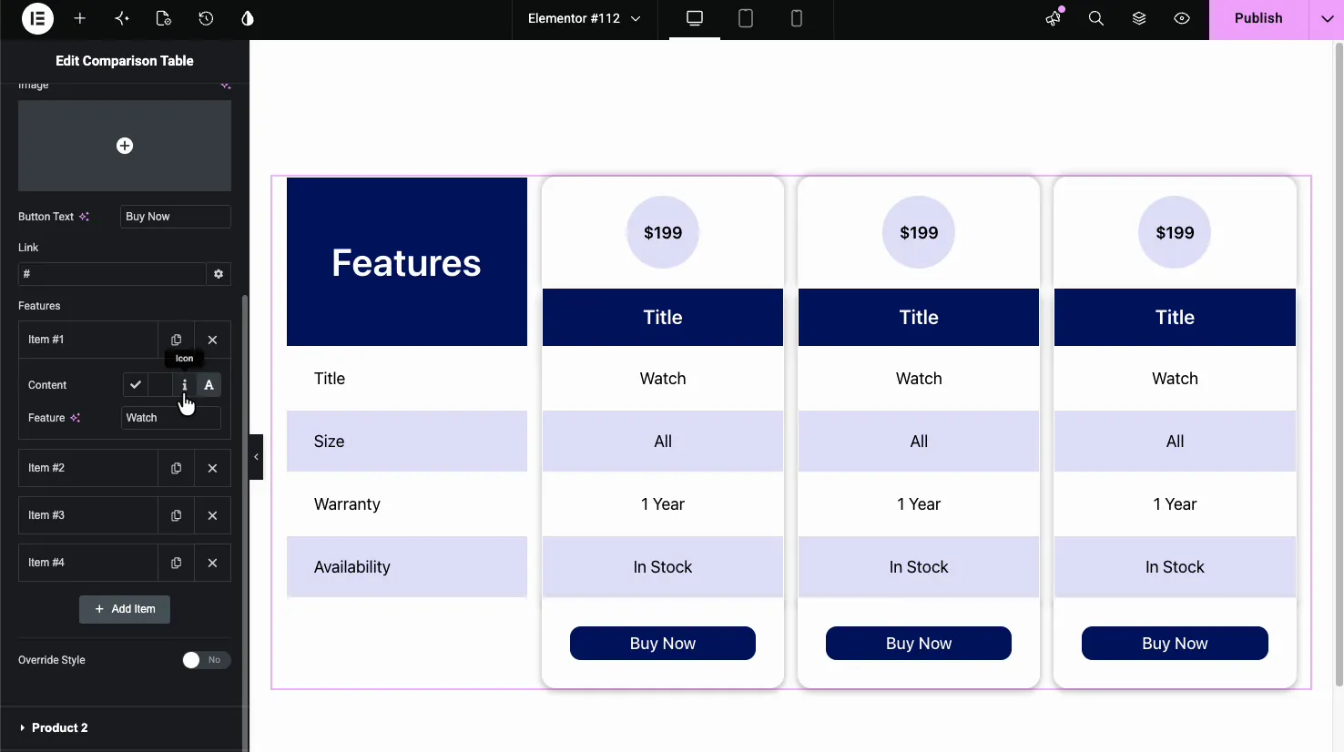
The handy part is the per-row Content control. For each feature you choose a check, a cross, an icon you pick, or plain text. A tick-and-cross grid reads instantly, while text fields suit specs like “1 Year” or “All sizes.” An Override Style toggle lets a single column stand out, which is useful for highlighting your recommended pick.
Choose a layout style #
The four layouts change how the table looks without touching your content. Switching between them is a one-click way to find the style that fits the page.
Style 4 turns the columns into separate cards with curved, colored headers, a bolder look for a featured comparison.
Style 2 floats a circular price badge above each column with a colored title bar below it. Here the table is set to four products, showing how the columns scale.
Style the table #
The Style tab controls color and spacing. The General section sets the table-wide look, with the rest split into Feature Box, Products, Button, and Patterns when the free Patterns extension is switched on.
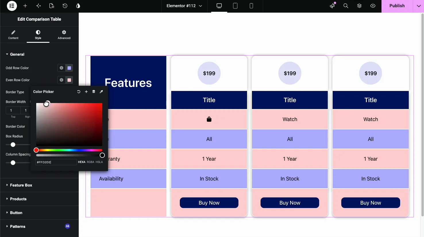
- Odd Row Color and Even Row Color: the zebra striping that makes long tables easier to read.
- Border Type, Width, and Color: the lines between cells.
- Box Radius, Column Spacing, and Row Spacing: rounded corners and the gaps between columns and rows.
- Feature Box, Products, Button: typography, colors, alignment, and padding for each part of the table.
The result on the page #
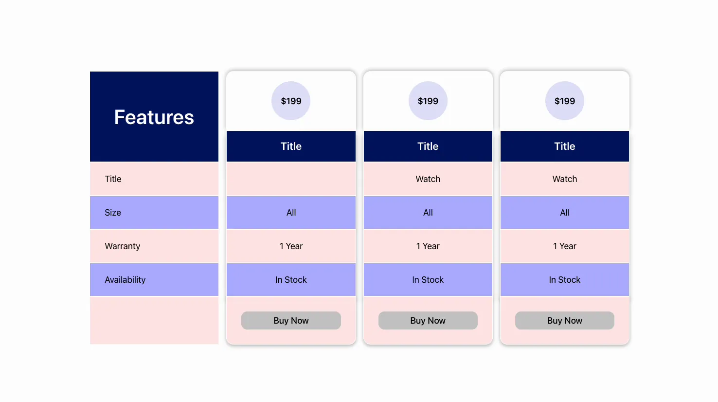
Publish or preview and the table renders with your features, products, prices, and buttons in place, zebra rows and all. Below is a Style 2 table with three products.
Common use cases #
- Product comparisons putting two or three models side by side.
- Plan or pricing tiers when you want a grid instead of stacked pricing tables.
- Plugin or software feature matrices with tick-and-cross rows.
- Service packages comparing what each tier includes.
- Us-versus-them tables highlighting your product with the Override Style toggle.
Tips for working with the Comparison Table widget #
- Use ticks and crosses for yes/no features. They scan faster than the words “Yes” and “No” and keep the table tidy.
- Keep feature labels short. One or two words per row stops the first column from getting wide.
- Highlight one column with Override Style. A different color guides the eye to your recommended option.
- Set zebra colors with enough contrast. Alternating row colors are what make a long table readable.
- Match the product count to the screen. Three columns fit most layouts; four or more can get cramped on smaller screens. Below the Start Tab Format From width (767px by default) some layouts switch to product tabs, so check mobile view.
Frequently Asked Questions #
What is the Comparison Table widget in Master Addons?
It is a Master Addons Pro widget for Elementor that builds a side-by-side comparison grid. Feature names run down the first column and each product gets its own column with a title, price, per-feature value, and a button. You enter everything by hand, so it needs no WooCommerce.
How many products can I compare in the table?
You set the number, from 2 to 6, in the Products field under General. Raise it and a new Product section appears for each column you add. Three columns suit most page widths, while four or more work best on wider layouts.
Can I show tick and cross marks instead of text?
Yes. In each product section, every feature row has a Content control where you pick a check, a cross, an icon of your choice, or plain text. Tick-and-cross marks make yes/no features scannable, while text suits specs like warranty length.
How many layout styles does the Comparison Table have?
Four. Style 1 is a classic table, Style 2 adds circular price badges, and Style 4 turns the columns into cards with curved headers. Switching layouts rearranges the same content, so you can try each without redoing your data.
Can I highlight one product column?
Yes. Each product section has an Override Style toggle that lets you give one column its own colors. Use it to make your recommended option stand out from the others in the table.
Wrapping up #
The Comparison Table widget turns a list of products and features into a clear, side-by-side grid: pick a layout, set the number of columns, add your feature rows, and fill each column with values, prices, and buttons. Since it does not rely on WooCommerce, it drops onto any page. For layout examples and when to pick a pricing table instead, see the Elementor comparison table widget page. Pair it with the Pricing Table widget for plan pages, browse the full Master Addons widgets and extensions, and see the pricing page for what each plan includes.


