

When you want to push one product, a single eye-catching card beats a full shop grid. The Featured Product widget in Master Addons Pro builds that card: an image, a title, a price with an optional strike-through original price, a rating, a corner ribbon, and a call-to-action button, all set from the Elementor panel.
You type the details in yourself, so it works on any page with or without WooCommerce. That makes it handy for a promo block, an affiliate pick, a launch announcement, or a deal you want front and center. This guide covers every setting, from the three layout designs to the ribbon and rating controls.
Prefer to watch first? This short tutorial walks through the Featured Product widget end to end:
What the Featured Product widget does #
The widget outputs a self-contained product card. You give it an image, a name, a description or feature list, a price, and a button, and it lays them out in one of three ready-made designs. A ribbon and a star rating sit on top to draw attention.
Nothing here pulls from your WooCommerce catalog. You enter the content by hand, which means you can feature a product, a service, a bundle, or an external offer without setting up a store first.
Before you start #
- WordPress with Elementor installed and active.
- Master Addons Pro installed with an active license, since Featured Product is a Pro widget. New to the plugin? See the installation guide.
- A product image and the details you want to show (name, price, button link).
How to add the Featured Product widget #
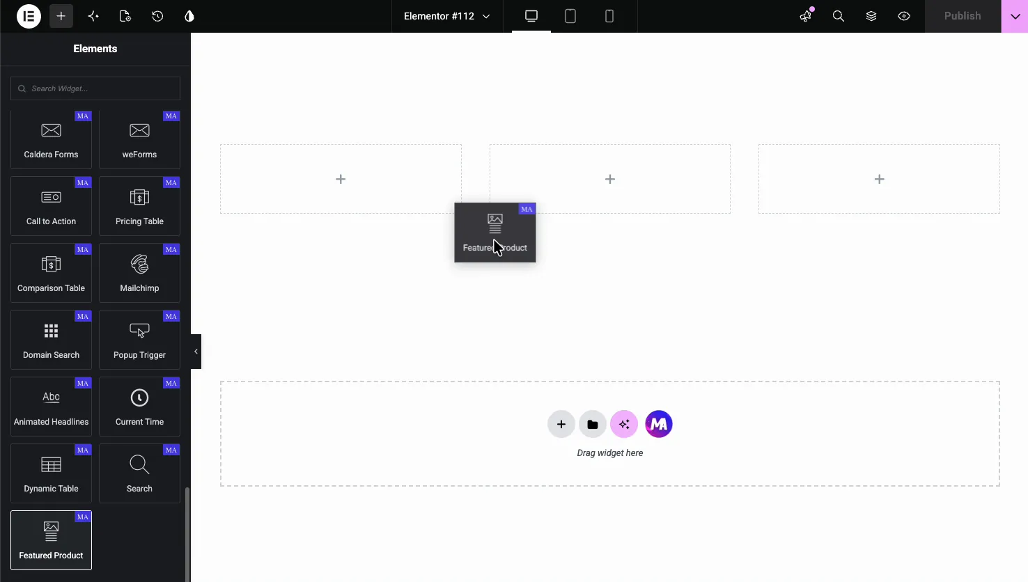
In the Elementor editor, open the Elements panel and search for Featured Product, or scroll to the Master Addons section. Drag it onto your page and a sample card shows up right away, so you edit from a working starting point instead of a blank one.
Fill in the product details #
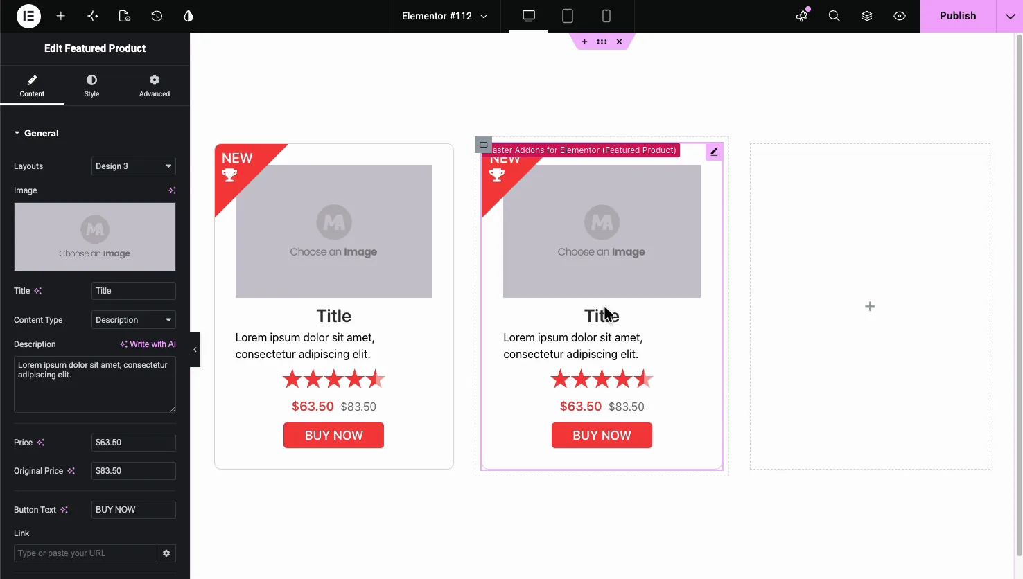
Open the Content tab and the General section holds the main fields. This is where the card gets its content.
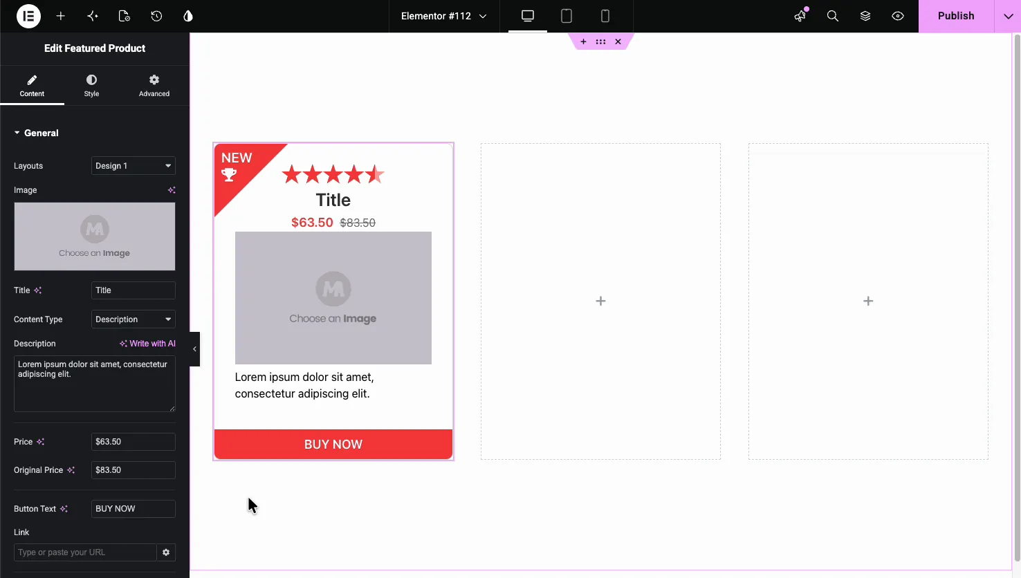
- Layouts: pick Design 1, Design 2, or Design 3. More on these below.
- Image: choose the product image from the Media Library.
- Title: the product name. It supports dynamic tags if you want to pull it from a field.
- Content Type: switch between a plain Description and a List of features.
- Price and Original Price: the current price plus an optional original price that shows struck through, which reads as a discount.
- Button Text and Link: the call-to-action label and where it sends people. Design 2 uses a button icon instead of text.
Description or a feature list #
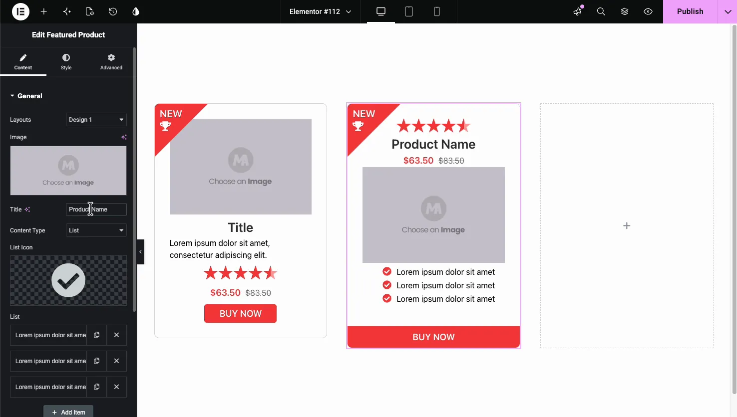
Set Content Type to List and the description box turns into a repeater. You pick a List Icon (a checkmark by default) and add as many feature lines as you want, each with a duplicate and delete control. It is a quick way to turn a card into a mini sales pitch with bullet-point benefits.
Pick a layout design #
The widget ships with three layouts, and switching between them rearranges the same content without you redoing anything.
Design 2 stacks the image on top, then puts an icon badge next to the title and description, with the rating and price on one row. The button shows as an icon here.
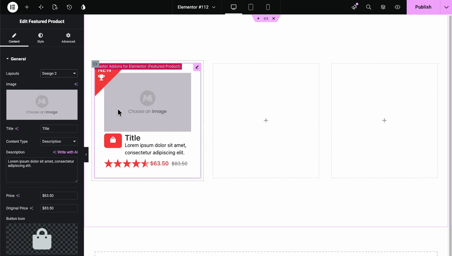
Design 3 leads with the image, then centers the title, description, rating, price, and a full-width button below it. It is the cleanest of the three for a simple promo.
Design 1 (the default) puts the rating and title at the top, the price under it, then the image, description, and a full-width button at the bottom.
Add a ribbon and a rating #
Scroll past the Link field and you reach the Ribbon and Rating controls. The ribbon is the corner banner that calls out “NEW” or “HOT,” and the rating is the row of stars.
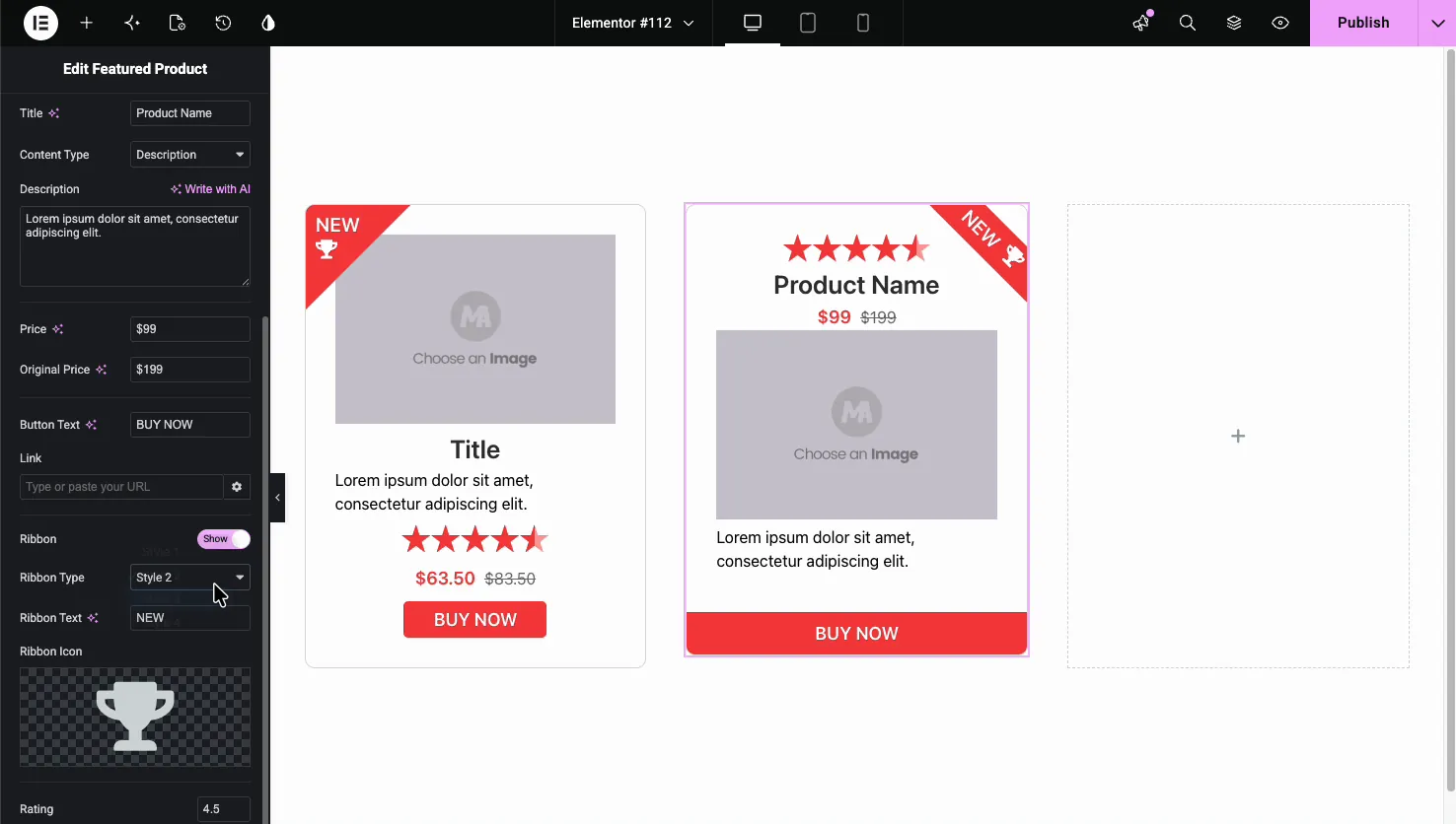
- Ribbon (Show): turn the corner banner on or off.
- Ribbon Type: choose a ribbon style. The styles change the shape and position, from a diagonal corner to a flag or quote tag.
- Ribbon Text and Ribbon Icon: the label (like NEW or HOT) and an optional icon such as the trophy.
- Rating: set the star value, for example 4.5, and the card shows partial stars to match.
Style the card #
The Style tab is split into sections that match the parts of the card: Box, Title, Content, Price, Button, Rating, Ribbon, and Patterns (from the free Patterns extension).
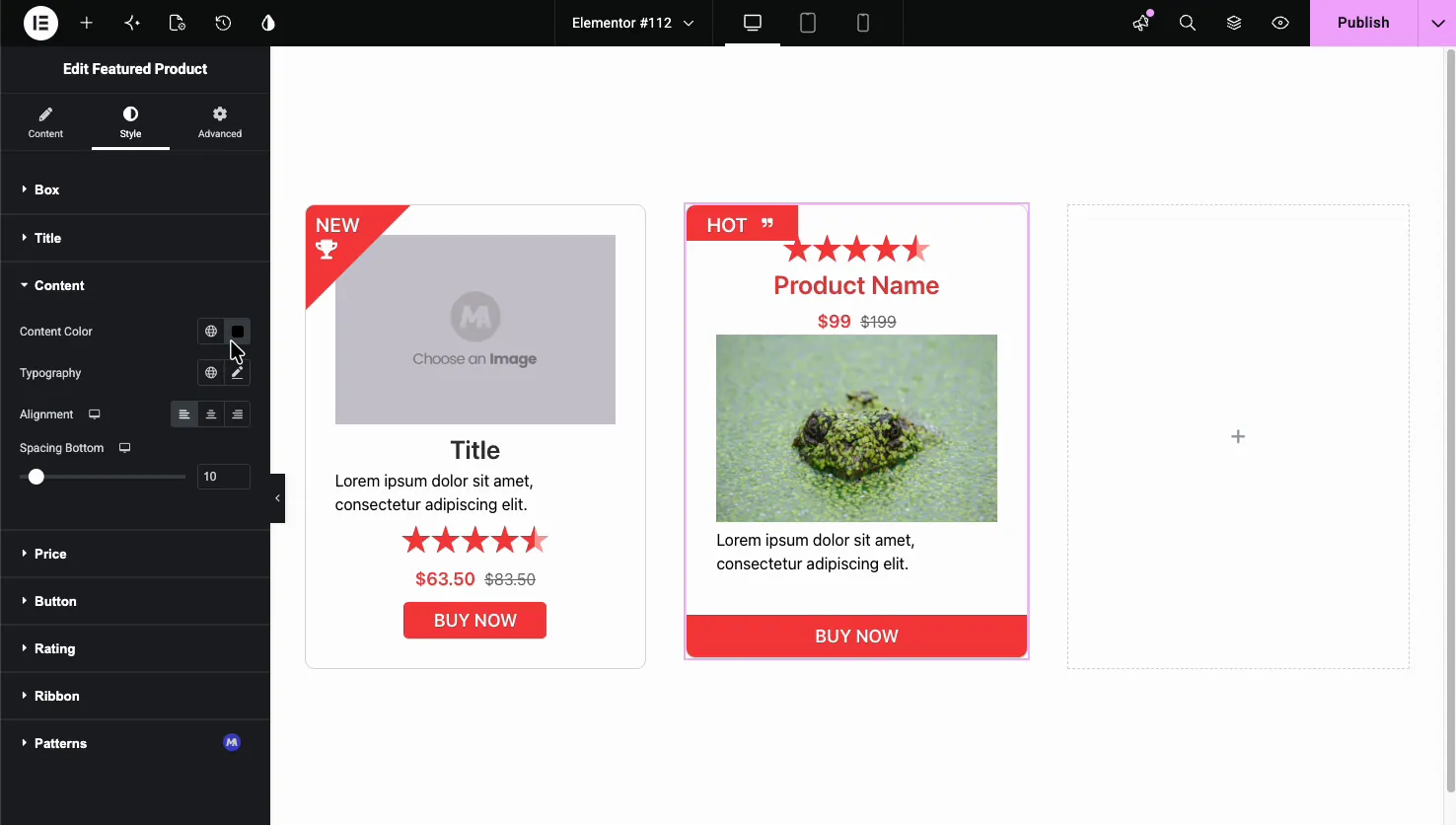
- Box: background, border, radius, and shadow for the whole card.
- Title, Content, Price: color, typography, alignment, and spacing for each text block.
- Button: colors, typography, padding, and hover state for the call to action.
- Rating and Ribbon: star color and the ribbon’s color and text styling.
The result on the page #
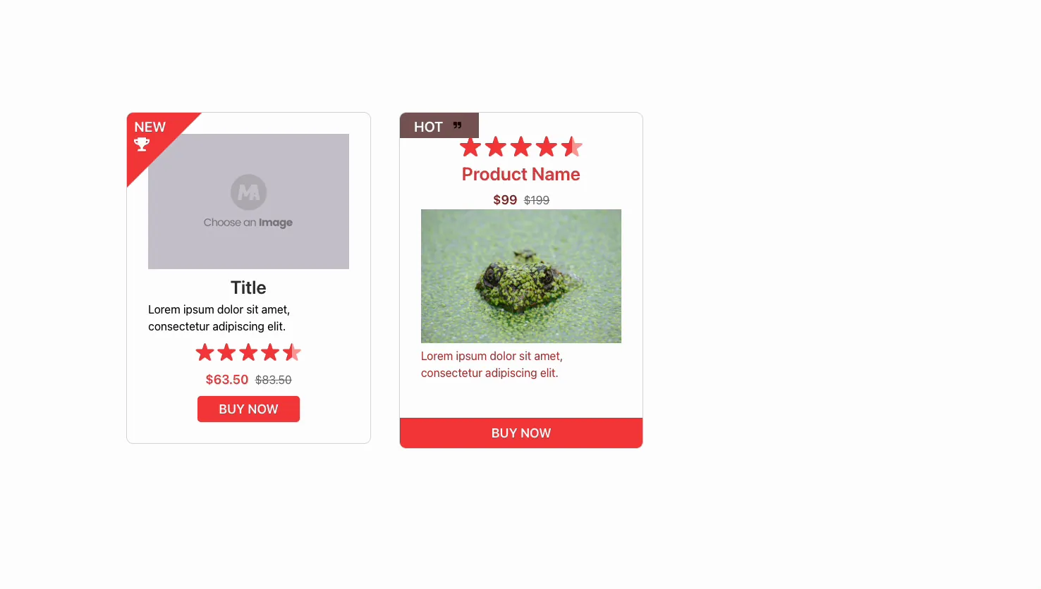
Publish or preview and the card renders with everything in place: the ribbon in the corner, the rating, the price with its struck-through original, your image, and the button linked where you set it. Below is the same widget in two of its designs.
Common use cases #
- Promo blocks highlighting one product on a landing page.
- Affiliate picks with a rating, price, and an outbound buy link.
- Launch or deal callouts using the NEW or HOT ribbon.
- Service packages with the List content type showing what is included.
- Featured item alongside a pricing table or a call-to-action section.
Tips for working with the Featured Product widget #
- Set an Original Price to show a discount. The struck-through number next to the current price reads as a deal at a glance.
- Use the List content type for benefits. Short feature lines convert better than a paragraph on a promo card.
- Keep ribbon text to one word. NEW, HOT, or SALE fit the corner banner without wrapping.
- Match the design to the layout around it. Design 3 suits a clean grid; Design 1 fills a sidebar or narrow column well.
- Point the button somewhere real. Set the Link to the checkout, product page, or affiliate URL before you publish.
Frequently Asked Questions #
What is the Featured Product widget in Master Addons?
It is a Master Addons Pro widget for Elementor that builds a single product card with an image, title, price, rating, ribbon, and a call-to-action button. You enter the details by hand and pick one of three layout designs. It works on any page, with or without WooCommerce.
Does the Featured Product widget need WooCommerce?
No. The widget does not pull from a WooCommerce catalog. You type in the product name, price, image, and button link yourself, so you can feature a product, service, or external offer on any page without running a store.
How many layouts does the Featured Product widget have?
Three. Design 1 leads with the rating and title above the image, Design 2 puts an icon badge beside the title with an icon button, and Design 3 centers the content under a top image. Switching designs rearranges the same content automatically.
How do I show a discount price on the card?
Fill in both the Price and the Original Price fields in the General section. The current price shows in the accent color and the original price appears next to it with a strike-through, which signals a discount to visitors.
Can I show a feature list instead of a description?
Yes. Set Content Type to List in the General section. The description box becomes a repeater where you add feature lines, each with a list icon. Use it to turn the card into a short, scannable benefits list.
Wrapping up #
The Featured Product widget turns a handful of details into a polished Elementor product card: choose a design, add an image and price, switch on a ribbon and rating, and link the button. Since nothing depends on WooCommerce, it drops onto any page as a promo or affiliate block. Pair it with the Pricing Table widget or a Call to Action section, browse the full Master Addons widgets and extensions, and see the pricing page for what each plan includes. See the Featured Product widget page for demos.


