A gallery slider pairs a large preview image with a clickable set of thumbnails, so visitors can jump straight to the photo they want instead of clicking through one slide at a time. The Gallery Slider widget in Master Addons for Elementor builds this layout in a few minutes. You pick the images, choose a thumbnail grid or carousel, and style every part from the Elementor panel.
This guide walks through every setting, so you can build an Elementor gallery slider without guessing what each control does.
What the Gallery Slider widget does #
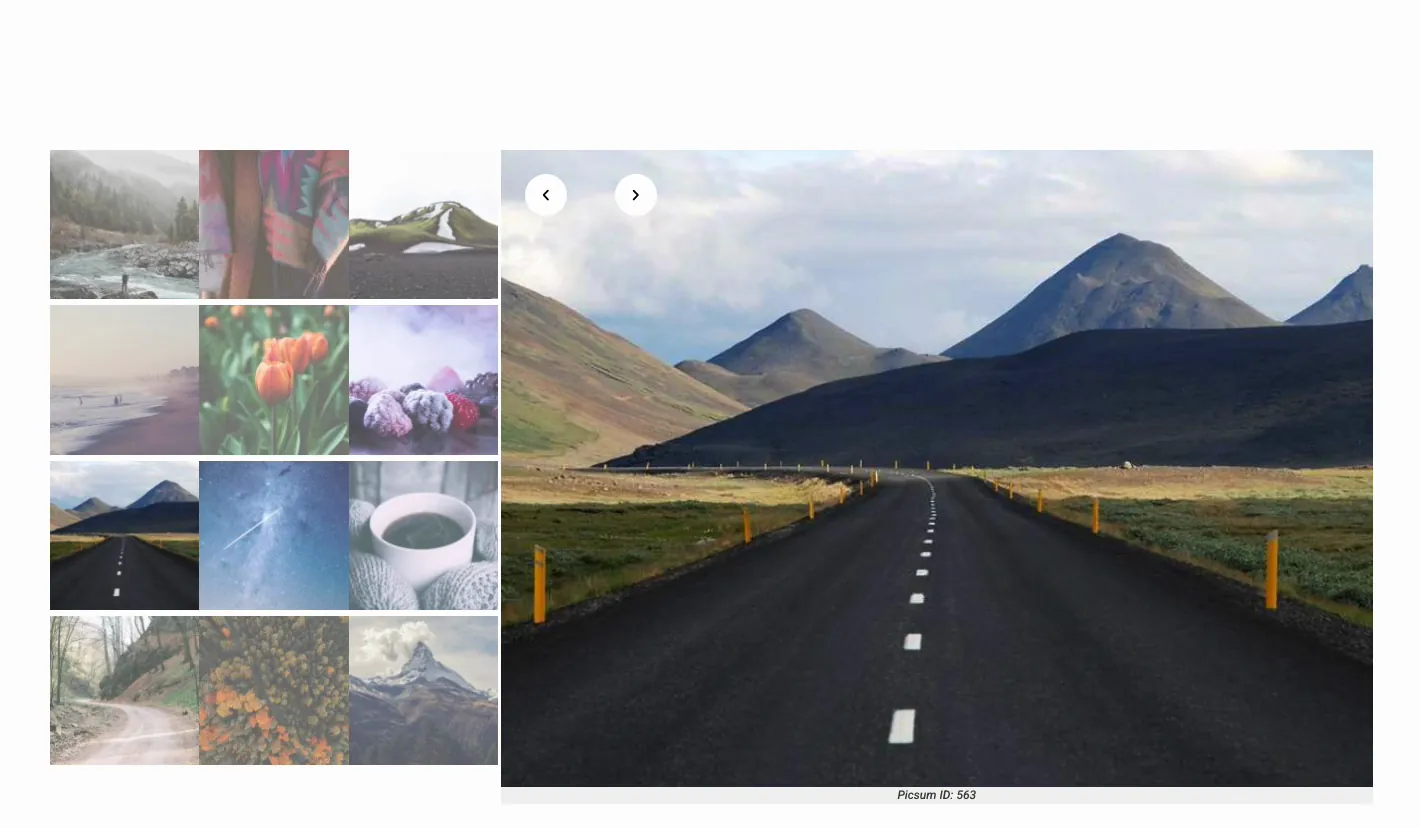
The widget shows one large preview slide next to a grid or carousel of thumbnails. Clicking a thumbnail or an arrow changes the preview. Captions, autoplay, infinite loop, fade or slide transitions, and separate hover states for the preview and thumbnails are all built in. It fits portfolios, product photos, real estate listings, event albums, or any page where visitors need to browse a set of images quickly.
Before you start #
- WordPress with Elementor installed and active.
- Master Addons for Elementor installed and active. Need help? See the installation guide.
- A set of images uploaded to your Media Library, ideally at similar aspect ratios.
How to add the Elementor Gallery Slider widget #
Open the Elementor editor and search for Gallery Slider in the Elements panel, or scroll down to the Master Addons section. Every Master Addons widget carries a small MA badge, which helps when you have several addon packs installed. Drag the widget into your section.
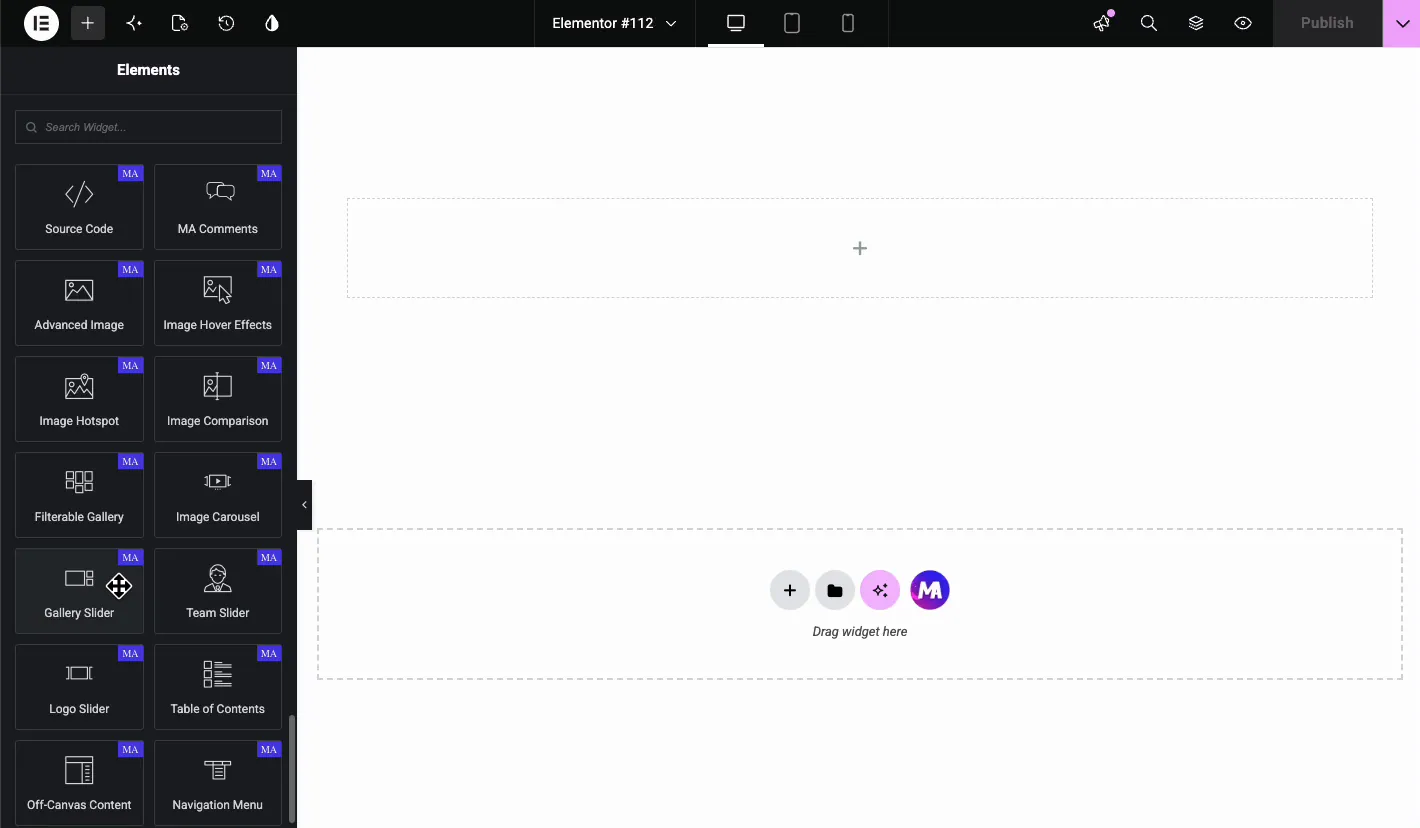
Add images in the Content tab #
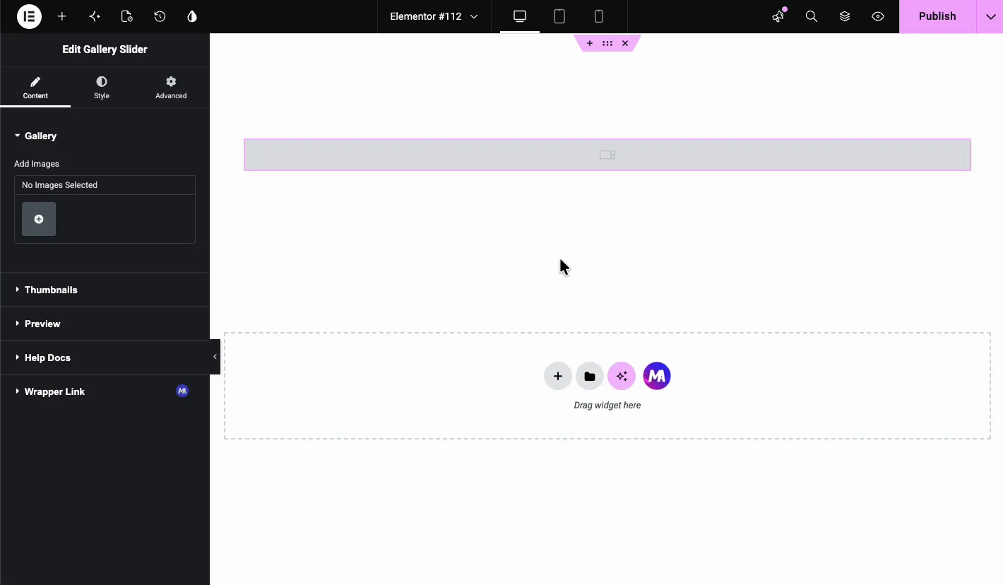
Gallery #
The widget starts empty. In the Content tab, open the Gallery section and click the plus button under Add Images.
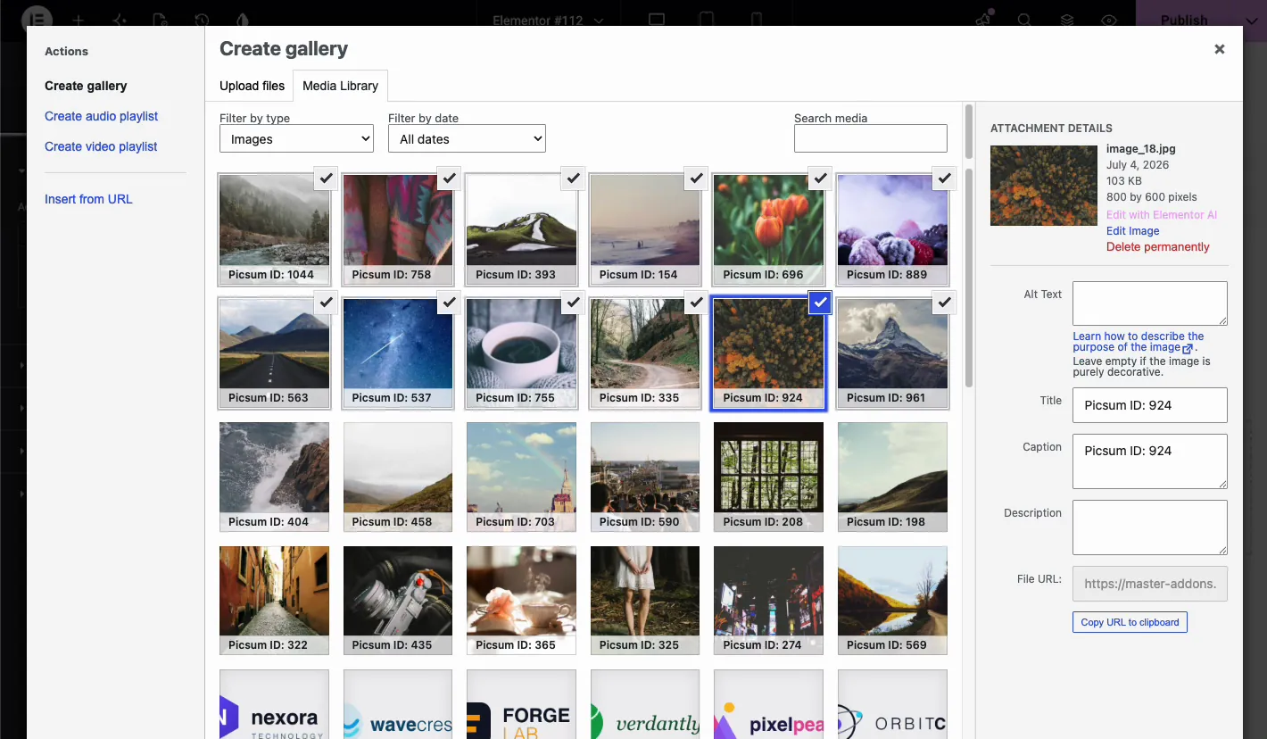
The WordPress media window opens on the Create gallery screen. Select the images you want in the slider, then click through to insert the gallery. Take a minute here to fill in alt text and captions for each image. The caption field matters more than it looks: the widget can print it under the preview image later, and if a caption is missing on the frontend, this screen is the first place to check.
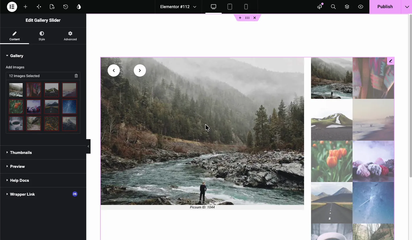
After you insert the gallery, the editor shows the full layout right away: the large preview on the left with navigation arrows, and the thumbnail grid on the right. The selected images also appear inside the Gallery section, where you can reorder or remove them.
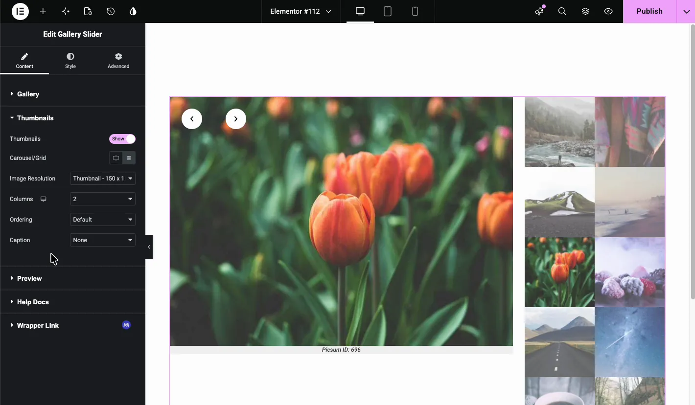
Thumbnails #
The Thumbnails section controls the small images beside the preview.
- Thumbnails: show or hide the thumbnail area entirely.
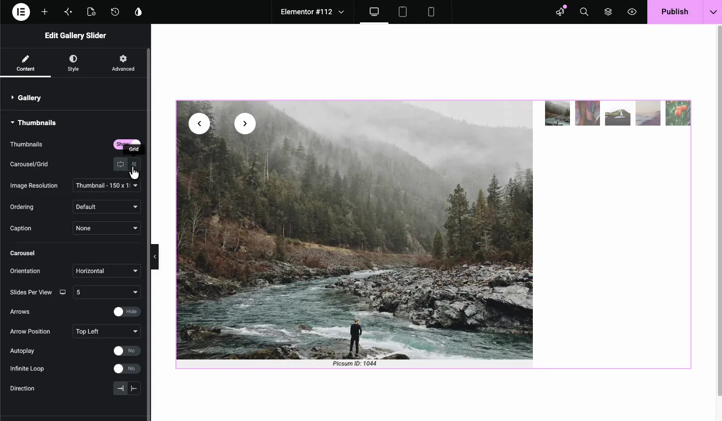
- Carousel/Grid: switch between a static grid and a scrolling carousel.
- Image Resolution: the size WordPress serves for thumbnails. Thumbnail (150 x 150) keeps the page light.
- Columns: pick 1 to 12 columns for the grid. Moving from 2 to 3 columns changes the grid from tall and narrow to a tighter block.
- Ordering: keep the default order or change how images are sorted.
- Caption: show a caption on thumbnails, or leave it at None.
Switching to Carousel mode replaces the grid with a strip of thumbnails and adds its own group of settings: Orientation (horizontal or vertical), Slides Per View, an Arrows toggle with an Arrow Position dropdown, plus Autoplay, Infinite Loop, and Direction controls just for the thumbnail strip. Grid works better for a dozen images or fewer; past that, the carousel saves a lot of vertical space.
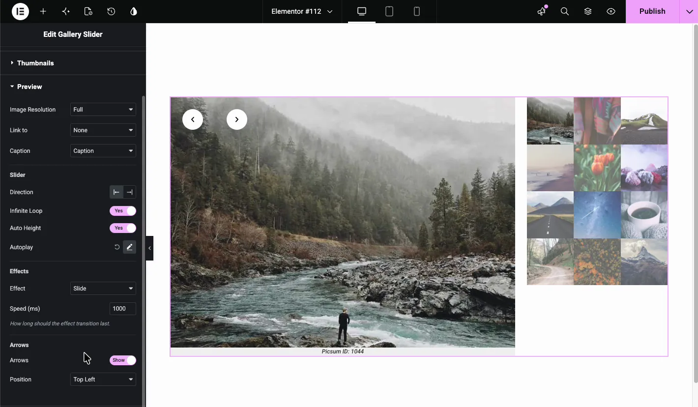
Preview #
The Preview section manages the large slide and how it behaves.
- Image Resolution: the size served for the big image. Full looks best but weighs the most, so compress your originals.
- Link to: link the preview image to a URL or media file, or keep it at None.
- Caption: display the image caption below the preview.
- Direction: slide left to right or right to left.
- Infinite Loop: return to the first slide after the last one.
- Auto Height: let the slider adjust its height to each image. Handy for mixed ratios, though the page will shift a little as slides change.
- Autoplay: advance slides automatically. Click the edit icon to adjust it.
- Effect: choose the Slide or Fade transition.
- Speed (ms): how long the transition lasts. The default is 1000.
- Arrows: show or hide the navigation arrows, and pick their Position, such as Top Left.
Design the slider in the Style tab #
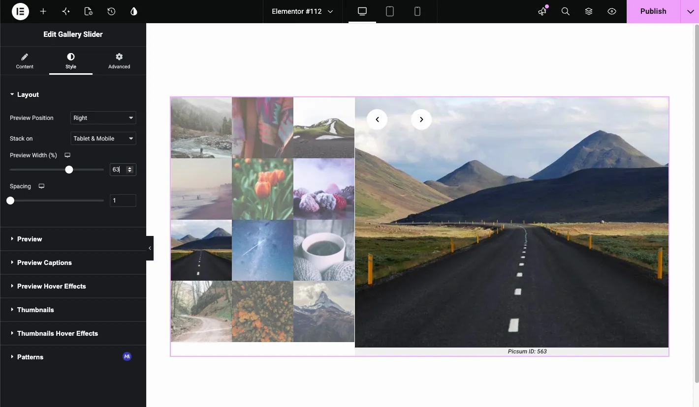
Layout #
The Layout section decides where the preview sits relative to the thumbnails. Preview Position offers Top, Right, Bottom, and Left. With Top or Bottom, the thumbnails line up under or above the preview and a Horizontal Align control appears with a Carousel Width slider. With Left or Right, you get a Preview Width (%) slider instead.
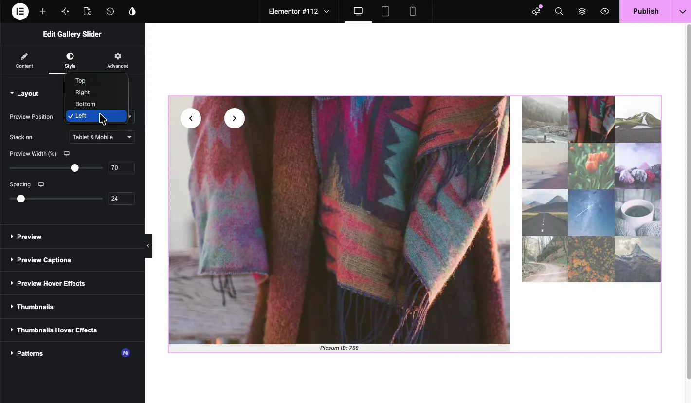
- Stack on: choose when the layout stacks vertically, such as Tablet & Mobile.
- Preview Width (%): how much horizontal space the preview takes. Somewhere between 60 and 70 percent sits nicely next to a three-column grid.
- Spacing: the gap between the preview and the thumbnails.
Preview #
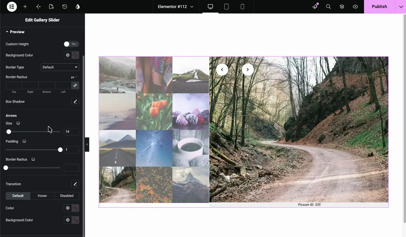
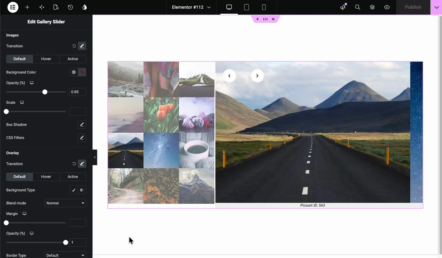
The Style tab’s Preview section styles the big slide container.
- Custom Height: override the automatic height.
- Background Color: fills the area behind the image.
- Border Type: Default, None, Solid, Double, Dotted, Dashed, or Groove, with width and color controls when active.
- Border Radius and Box Shadow: round the corners and lift the slide off the page.
- Arrows: a dedicated group with Size, Padding, Border Radius, Transition, and separate Default, Hover, and Disabled states, each with its own color and background color.
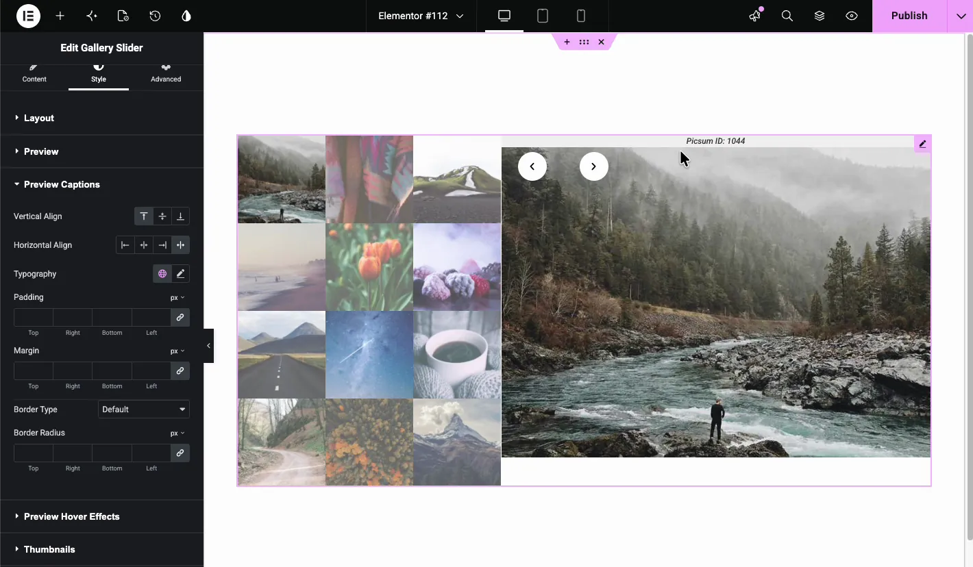
Preview Captions #
If you enabled captions in the Content tab, this section positions and styles them. Vertical Align places the caption at the top, middle, or bottom of the slide, and Horizontal Align offers left, center, right, and justify. You also get Typography, Padding, Margin, Border Type, and Border Radius controls.
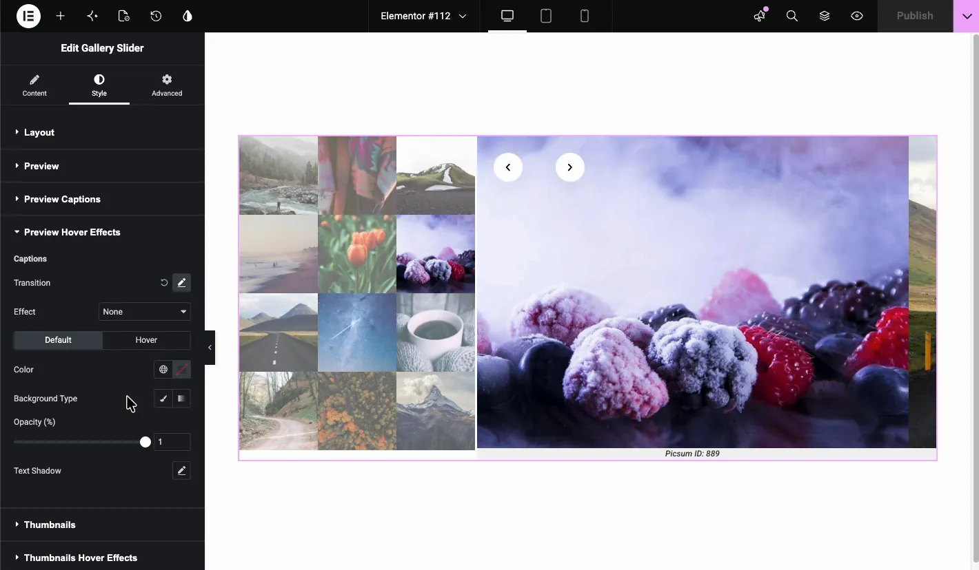
Preview Hover Effects #
Preview Hover Effects animates the caption when visitors hover over the slide. Pick an Effect, set the Transition, then style the Default and Hover states with color, background type, opacity, and text shadow.
Thumbnails #
The Style tab’s Thumbnails section handles the small images: Vertical Align for the whole block, Horizontal spacing and Vertical spacing between thumbnails, plus Border Type and Border Radius.
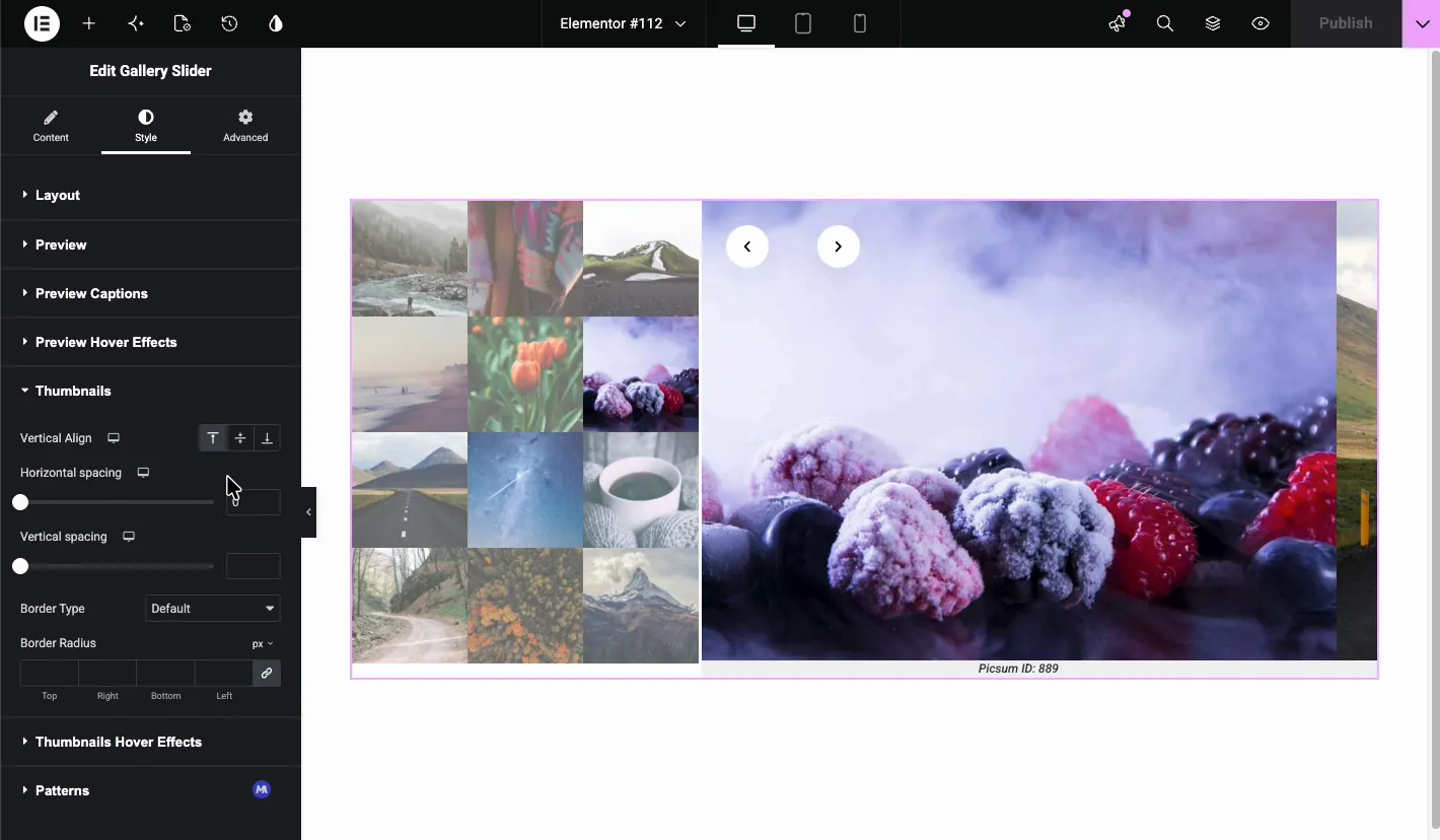
Thumbnails Hover Effects #
This section styles thumbnails across three states: Default, Hover, and Active (the thumbnail matching the current slide). The Images group covers background color, Opacity, Scale, Box Shadow, and CSS Filters. Out of the box, inactive thumbnails sit at 0.65 opacity so the active one stands out. The Overlay group adds a color or gradient layer with Blend mode, Margin, Opacity, and border controls.
There’s also a Patterns section at the bottom of the Style tab with ready-made style presets. The same section shows up in many Master Addons widgets.
See the live result #
Click the eye icon to preview the page. Visitors see the thumbnail grid beside the large preview. Clicking a thumbnail swaps the preview right away, the arrows step through slides in order, and the caption follows each image.
Common use cases #
- Portfolio showcases: one large hero image with the rest of the project a click away.
- Product pages: the classic shop layout with a zoomed preview and thumbnail picker.
- Real estate listings: let buyers flip through rooms without leaving the page.
- Event or wedding albums: highlight one photo while keeping the full set visible.
Tips for a better gallery slider #
- Match image aspect ratios. Auto Height prevents cropping surprises, but consistent ratios look cleaner and stop the layout from jumping.
- Serve the right resolutions. Full for the preview, Thumbnail (150 x 150) for the grid. Compress before uploading; see our guide to the best WordPress image optimizer plugins.
- Write captions in the Media Library before inserting the gallery so every slide is ready.
- Keep autoplay speed reasonable. Give visitors time to actually see each image.
- Use the Active state. The default 0.65 opacity on inactive thumbnails already guides the eye; a border or slight scale on the active thumbnail makes it even clearer.
Video Tutorial #
Prefer to watch the setup instead? This video covers the whole process, from dragging the widget in to the finished slider on the live page:
Frequently Asked Questions #
How do I create a gallery slider in Elementor?
Install Master Addons for Elementor, drag the Gallery Slider widget onto your page, and click Add Images in the Gallery section. Select your images in the media window and insert the gallery. The slider with preview and thumbnails appears immediately.
Can I show thumbnails as a carousel instead of a grid?
Yes. In the Thumbnails section of the Content tab, switch the Carousel/Grid control to Carousel. You then get orientation, slides per view, arrows, autoplay, and infinite loop settings for the thumbnail strip.
Can I change where the preview image appears?
Yes. In the Style tab under Layout, set Preview Position to Top, Right, Bottom, or Left. With left or right layouts you control the preview width; with top or bottom you control the carousel width and alignment.
Does the Gallery Slider support autoplay?
Yes. Turn on Autoplay in the Preview section of the Content tab. You can combine it with Infinite Loop, choose a Slide or Fade effect, and set the transition speed in milliseconds.
How do I display image captions on the slider?
Add captions to your images in the WordPress Media Library, then set Caption to Caption in the Preview section. Style and position the text from the Preview Captions section in the Style tab.
Wrapping up #
The Master Addons Gallery Slider widget covers the whole preview-plus-thumbnails pattern: grid or carousel thumbnails, the preview on any side, captions, and per-state styling, all from one panel and with no custom code.
For more ways to display images, check the Image Carousel, Filterable Gallery, and Advanced Image docs, or compare options in our Elementor image carousel guide. To see everything else in the plugin, browse the Master Addons widgets and extensions collection or the pricing plans.


