

A plain heading is one block of text in one style. A dual heading splits that headline into two parts you can style on their own, so the first words and the second words each get their own color, background, and typography. That’s how you build a two-tone title like Master Addons in one color next to For Elementor in another, without touching custom CSS.
The Dual Heading widget in Master Addons for Elementor packs both parts, an optional subheading, and an optional icon into a single widget. This guide covers every setting in the Content and Style tabs, using the same widget that ships free with Master Addons.
Here’s what you’ll end up with, a two-color heading with an icon above it and a subheading underneath:

Before You Start #
- Elementor installed and active
- Master Addons for Elementor installed and active (installation guide)
- A page or template open in the Elementor editor
Step 1: Add the Dual Heading Widget #
In the Elementor editor, open the widget panel and search for Dual Heading. Drag it onto your page. Master Addons widgets carry the “MA” badge, so they’re easy to spot in the list. Once it’s on the page, the editor opens the Edit Dual Heading panel on the left with three tabs: Content, Style, and Advanced.
Step 2: Set the Content #
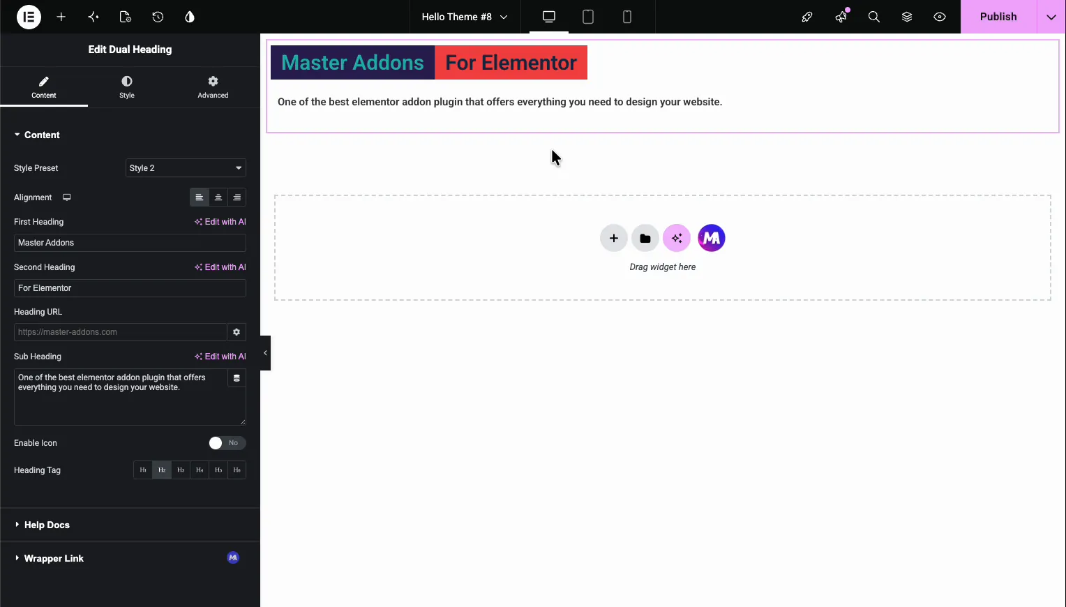
The Content tab is where you type the text and pick the basic layout. What each field does:
- Style Preset picks a ready-made look for the two parts. Switching presets changes how the first and second headings sit together.
- Alignment sets the whole block to left, center, or right.
- First Heading is the first part of the title (for example, “Master Addons”).
- Second Heading is the second part (“For Elementor”). This is usually the part you highlight with a different color.
- Heading URL makes the whole heading a link, handy for hero sections.
- Sub Heading is the description line that sits under the title.
- Enable Icon turns on an icon above the heading.
- Heading Tag sets the HTML tag, H1 through H6. Use H1 for a page’s main title and H2 for section titles so the page keeps a clean heading structure.
Step 3: Add an Icon (Optional) #
Flip Enable Icon to Yes and an Icon field shows up. Pick any icon from the library, or upload your own SVG. Master Addons bundles 8 premium icon libraries, so there are thousands to choose from without leaving Elementor. The icon sits above the heading and follows the same alignment you set earlier.
Step 4: Style the First and Second Heading #
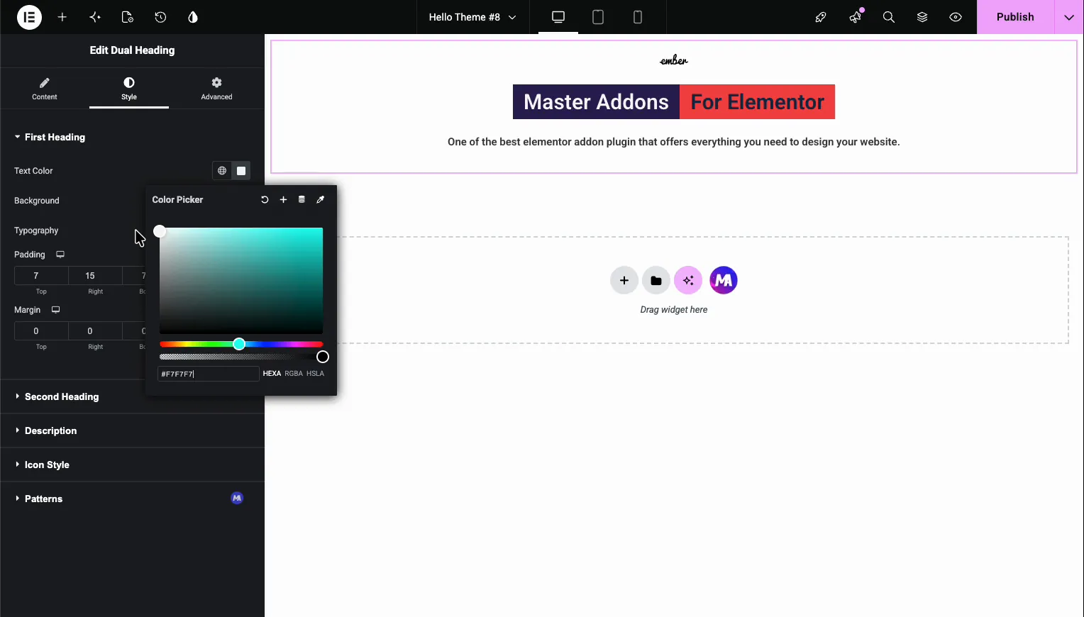
Switch to the Style tab. This is where the dual heading earns its name. You get separate sections for First Heading and Second Heading, each with its own controls:
- Text Color for that part of the title
- Background color behind that part (this is what creates the boxed two-tone look)
- Typography for font family, size, weight, and spacing
- Padding and Margin to control the spacing around each part
Since the two sections are independent, you can give the first part a dark background and the second a red one, or match your brand colors exactly. Set the Second Heading background to a brand accent and you get the highlighted-word effect people use in hero sections. One thing to watch: if the two parts use different padding, they can look uneven, so set both sides to the same value when you want the boxes to line up.
Step 5: Style the Subheading #
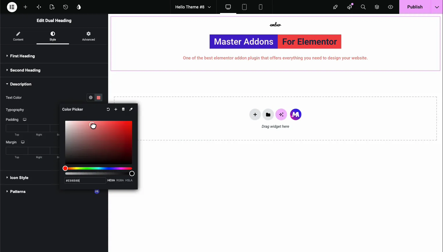
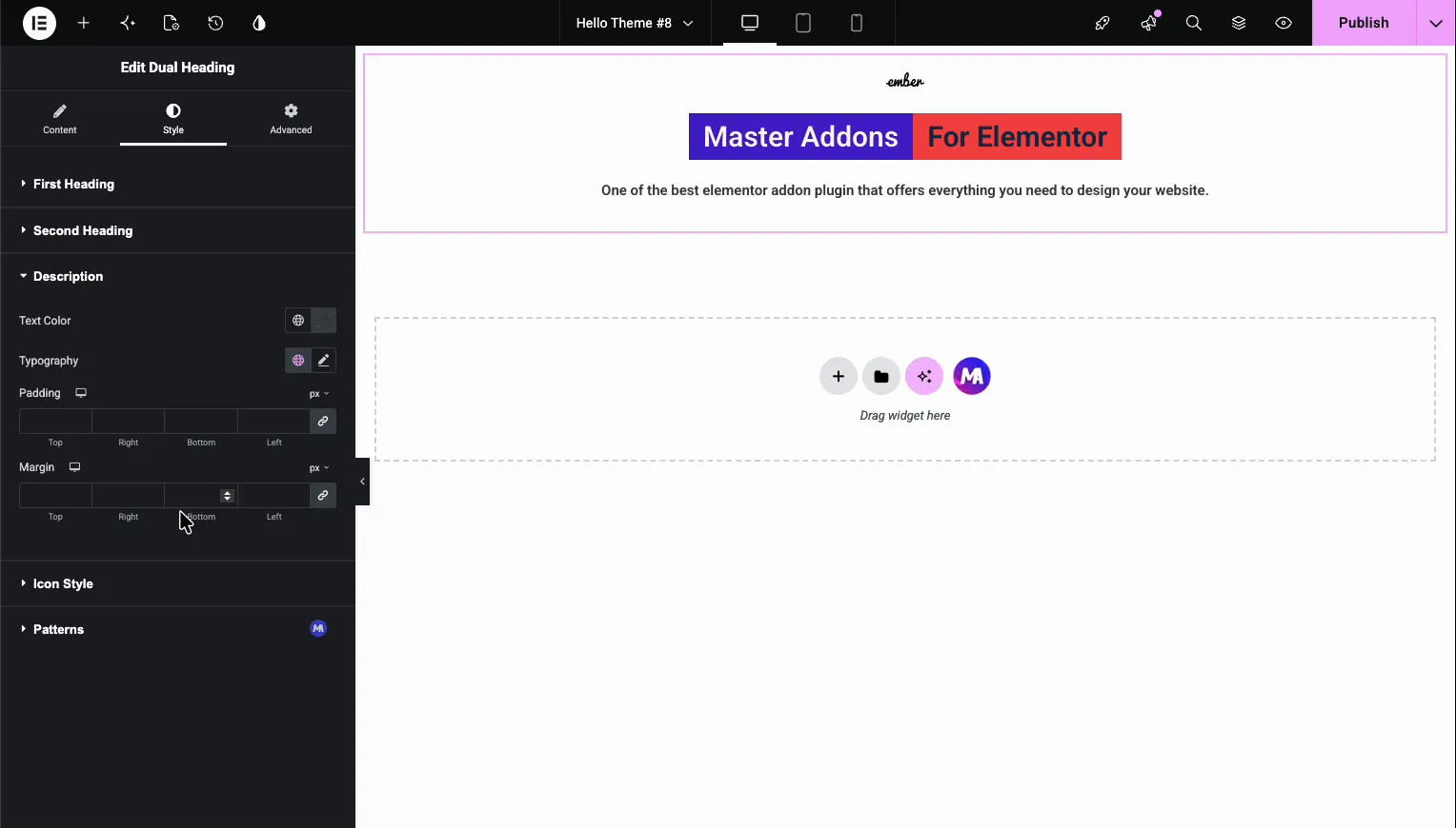
The Description section styles the subheading line under the title. You get Text Color, Typography, and the same Padding and Margin controls. Drop the color to a softer gray for a normal subtitle, or match it to one of the heading colors to tie the block together.
Step 6: Style the Icon #
If you turned the icon on, the Icon Style section controls it. Set the Icon Size in pixels with the slider, and pick an Icon Color for both the Normal and Hover states. A separate hover color is a nice touch when the whole heading is a link.
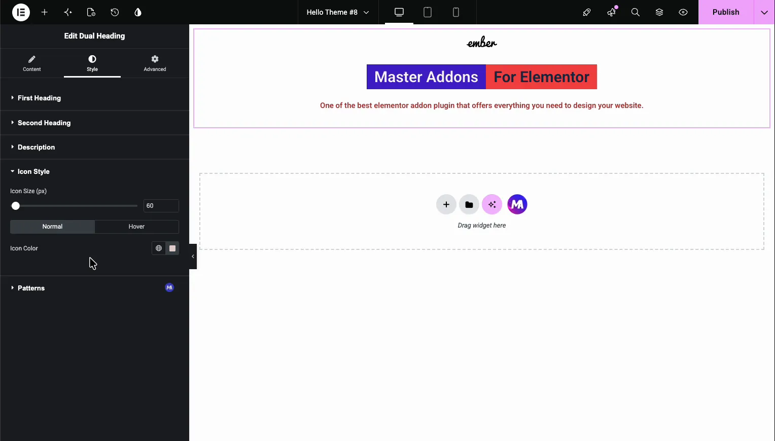
When the heading looks right, click Publish (or Update) to save the page.
Where the Dual Heading Widget Helps #
- Hero sections, where a two-color title pulls the eye to the part that matters.
- Section titles that need one highlighted word, like “Our Best Work”.
- Landing pages, pairing a bold title with a supporting subheading in one widget.
- Pricing or feature blocks, where the boxed two-tone style frames the headline.
Frequently Asked Questions #
What is the Dual Heading widget in Elementor?
It’s a Master Addons widget that splits a heading into two parts you can style separately. Each part gets its own color, background, and typography, so you can build a two-color title without writing any CSS.
How do I make a two-color heading in Elementor?
Add the Master Addons Dual Heading widget, type your text into First Heading and Second Heading, then open the Style tab and set a different Text Color or Background for each part. That gives you a two-color heading.
Can I add a subheading and an icon to the heading?
Yes. The Sub Heading field adds a description line under the title, and the Enable Icon toggle places an icon above it. Both have their own style controls in the Style tab for color, size, and typography.
Which heading tag should I use?
Set the Heading Tag to H1 for a page’s main title and H2 for section titles. Matching the tag to the heading’s role keeps your page structure clean, which helps both readers and search engines.
Do I need Elementor Pro for the Dual Heading widget?
No. The Dual Heading widget works with the free version of Elementor, so all of its content and style settings are available without Elementor Pro.


