Elementor Filterable Gallery Widget - Make Images Filterable

Turn a flat image grid into something visitors actually interact with. Pick categories, click a filter, and the grid rearranges itself. Hover effects, tilt animations, and two call-to-action buttons on every item come built in.

A static gallery shows images. A filterable gallery lets people find what they care about. The Filterable Image Gallery widget gives your portfolio, product catalogue, or photo collection a category bar at the top. Visitors click a tab, the grid filters instantly, and every item can carry a title, subtitle, and two styled buttons for “View Details” or “Live Demo”.

The widget is free in the Master Addons plugin and works without Elementor Pro.

What you can do with the filterable gallery widget

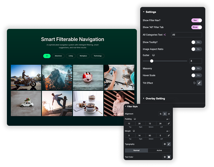
Smart Filterable Navigation System

Category filtering with full control

Enable the filter bar and visitors see category buttons above the gallery: “All”, “Branding”, “Photography”, “Web Design”, whatever labels you set. Rename the “All” tab, align the bar left, center, or right, and style active tabs with separate colors, backgrounds, and borders so people always know what they’ve selected.

  • Assign each image to a category using the Filter Label field. Comma-separate for multiple categories.
  • Active state styling makes the selected tab stand out from the rest.
  • Typography and spacing on the filter bar are fully customizable.

Gallery layout and 3D effects

Choose the number of columns, enable Masonry for a Pinterest-style staggered grid, and control spacing with Gutter settings. Then layer on interactive effects: Hover Scale makes items enlarge on mouseover, and the Tilt Effect adds a 3D perspective that follows the cursor with optional glare. It’s the kind of detail that makes a gallery feel considered instead of default.

  • Masonry layout for dynamic, uneven image heights.
  • 3D tilt with adjustable perspective, speed, and glare intensity.
  • Hover scale with configurable transition speed.
  • Responsive columns that stack cleanly on mobile.
Dynamic Gallery Grids & Advanced Effects
Proper Styling for Every Element

Styled text overlays and dual CTAs

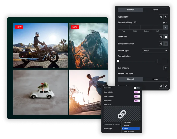
Every gallery item can show a title, subtitle, and category label, each with independent typography and color. On hover, an overlay color fades in and two buttons appear: “Details” and “Demo” (or whatever text you write). Both buttons have full Normal and Hover state controls for background, text color, border, radius, and shadow.

  • Separate Title Style, Subtitle Style, and Category Style sections.
  • Two buttons per item, each styled independently.
  • Hover icon size and color to match your brand.
  • Image overlay color with smooth transition.
  • Want more hover animations on single images? Try the Image Hover Effects widget.

Filterable gallery examples and use cases

  • Portfolios: let visitors filter by project type, branding, web, photography, illustration.
  • Product catalogues: category tabs for “All”, “New Arrivals”, “Sale”, “Best Sellers”.
  • Restaurant menus: filter by “Starters”, “Mains”, “Desserts”, “Drinks”.
  • Real estate listings: “Apartments”, “Houses”, “Commercial”, “Land”.
  • Wedding photography: “Ceremony”, “Reception”, “Portraits”, “Details”.
  • Agency case studies: filter by client industry or service type.
Template Viewer
Facebook
Twitter
WhatsApp
Copy Link
Buy Now
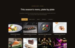
Restaurant menu on a dark four column grid
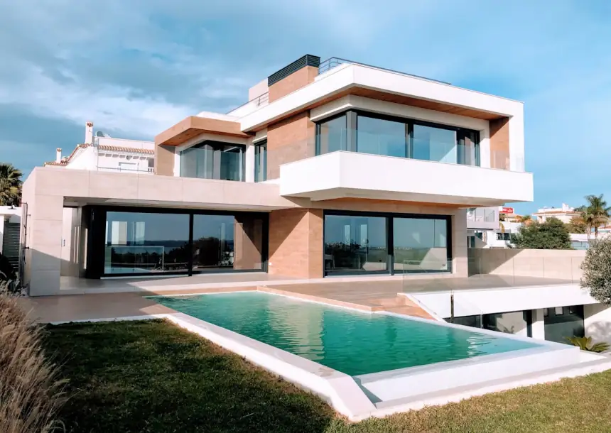
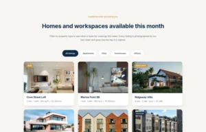
Real estate listings with ribbons and hover buttons
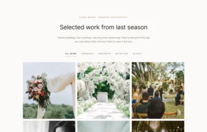
Wedding photography portfolio with lightbox
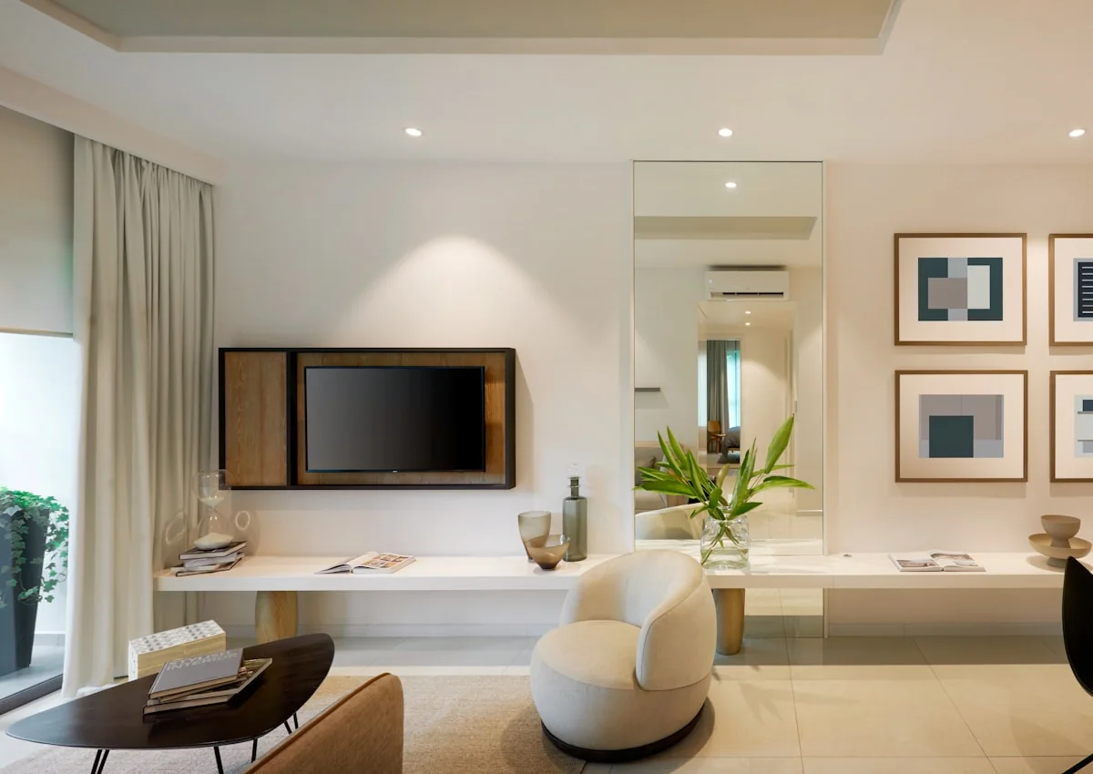
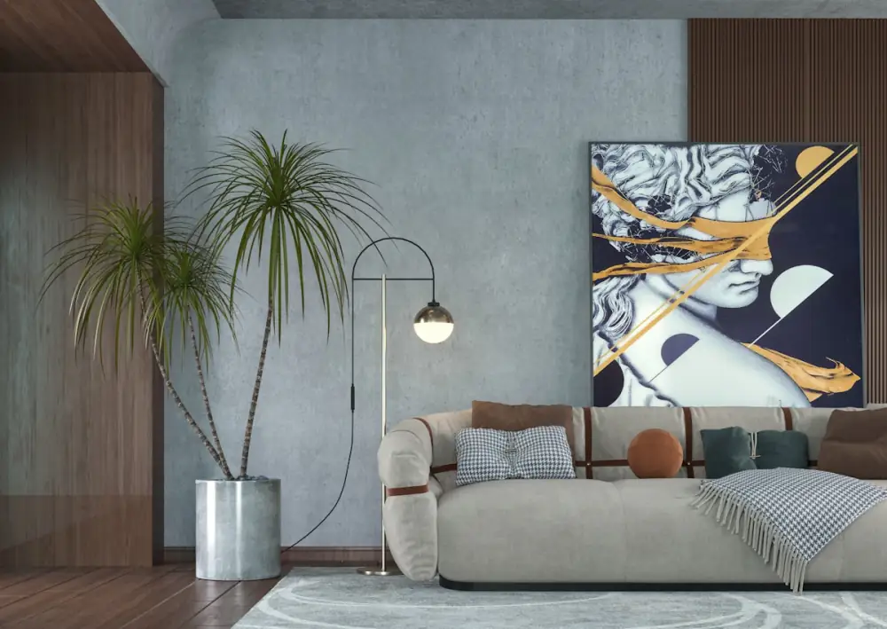
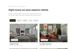
Interior design case studies in two columns
Product catalogue with sale and discount badges
Travel destinations on a dark themed grid
Smart Filterable Navigation System
Image Gallery Showcase

How to create a filterable gallery in Elementor

  • Drop the widget. In Elementor, search “Filterable Image Gallery” under Master Addons and drag it into your section.
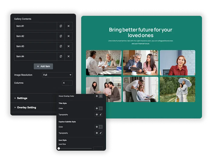
  • Add gallery items. Click + Add Item for each image. Upload the image, write a title and subtitle, set the Filter Label (category name), and add button text and links if needed.
  • Enable the filter bar. Turn on Show Filter Nav, set your column count, pick Masonry or regular grid, and adjust Gutter spacing. Enable Hover Scale and Tilt Effect for interactivity.
  • Style everything. In the Style tab, design the filter bar, item cards, text overlays, buttons, and hover states. Publish when done.

Frequently Asked Questions For Filterable Image Gallery

Learn the most asked queries users have about Filterable Image Gallery and find answers in one place.
What is the Filterable Image Gallery widget?

A standalone Elementor widget that turns any image grid into a category-filtered gallery. Visitors click filter tabs to show only relevant items. Each item can display a title, subtitle, and two styled call-to-action buttons.

Yes. It comes with the free Master Addons plugin, so you can build a filterable gallery without Elementor Pro or a Master Addons Pro license. You can add as many gallery items as you need.

In the Gallery Contents section for each item, find the Filter Label field and enter the category name (“Technology”, “Branding”, “Photography”). All items with the same label group under one filter button. Comma-separate to assign an item to multiple categories.

Can visitors open images in a lightbox?

Yes. Each button can link to a lightbox popup, an external URL, or a page on your site. Set the link destination per item in the gallery contents section.

Yes. Columns stack automatically, four columns become two or one on smaller screens. Filter buttons wrap to fit. Use Elementor’s responsive mode to adjust Gutter and font sizes for mobile specifically.

A carousel or slider shows one image at a time and cycles through them. A filterable gallery shows everything at once and lets visitors narrow the grid by category. Use the Image Carousel for hero sections and logo rows, or Gallery Slider (Pro) when you want one large image with thumbnails. Use a filterable gallery for portfolios, catalogues and collections where browsing matters.

Trending Elementor Widgets & Extensions

Build sophisticated websites in less time.

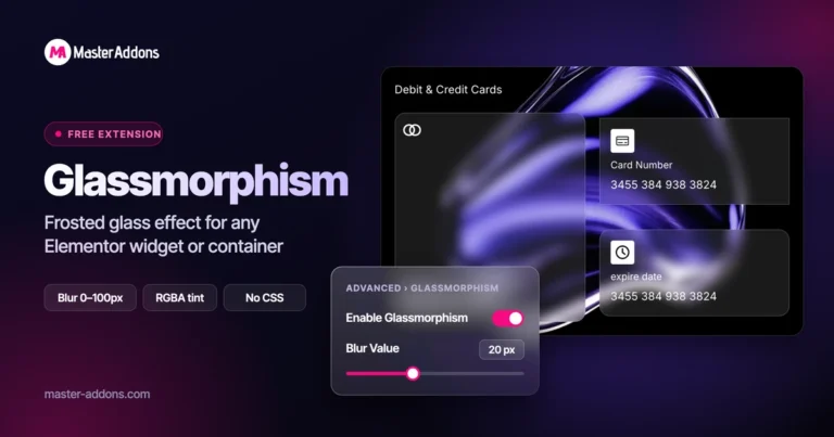
Master Addons Glassmorphism extension for Elementor: frosted glass cards with the Blur Value control set to 20px

Glassmorphism

Home Free Elementor Glassmorphism Extension: Frosted Glass Effect in One Toggle Glassmorphism is the frosted...
View Details
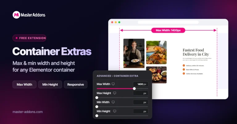
Master Addons Container Extras extension for Elementor: container capped at a 1400px Max Width, with Max Width, Max Height, Min Width and Min Height controls

Container Extras

Home Elementor Container Max Width and Max Height Controls Container Extras is a free Master...
View Details

Master Addons Patterns extension for Elementor: hero with the Purple Gradient Grid Left style, three more pattern styles and the Enable Pattern panel

Patterns

Home 70+ Free Elementor Background Patterns Patterns is a free Master Addons extension that adds...
View Details
Master Addons Post/Page Duplicator extension for Elementor: MA Duplicator row link in the WordPress Pages list creating a Landing Page - [Duplicated #128] draft

Post/Page Duplicator

Home Duplicate Elementor Pages and Posts in One Click Post/Page Duplicator is a free Master...
View Details
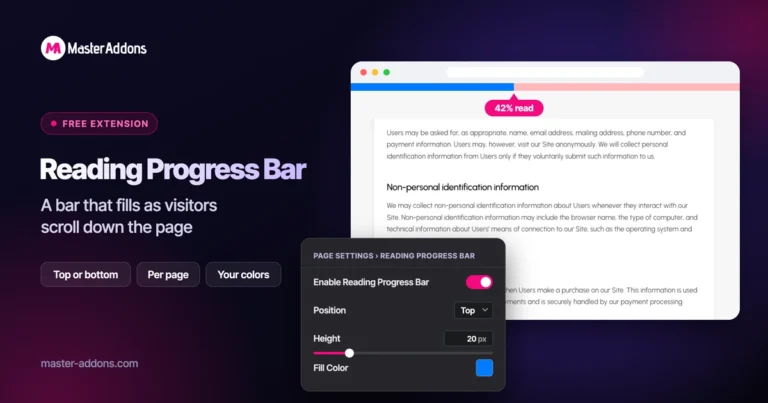
Master Addons Reading Progress Bar extension for Elementor: blue bar 42% filled across the top of a privacy policy page, with enable, position, height and fill color settings

Reading Progress Bar

Home Add a Reading Progress Bar in WordPress (Elementor) Reading Progress Bar is a free...
View Details