

The Box Shadow field adds Elementor’s box shadow control to a custom widget built with the Master Addons Widget Builder. Editors set the color, offsets, blur, spread and position from a small popover, and the shadow is applied to the element your CSS selector points at. It’s the field for lifting cards off the page, softening buttons or giving a panel a pressed-in look.
Box Shadow is a Pro field. The free plugin includes a limited Widget Builder, and the full set of fields comes with Master Addons Pro.
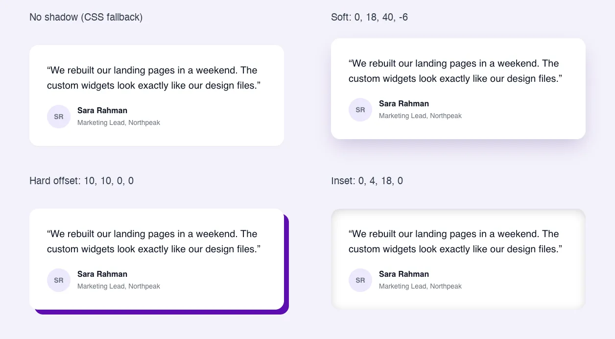
What the Box Shadow field does #
- It adds one control to your widget’s Style tab: your label and a pencil icon that opens the shadow settings.
- The settings are Color, Horizontal, Vertical, Blur, Spread and Position (Outline or Inset).
- Elementor writes the
box-shadowCSS to the element in the Selector, so you don’t need a token in your HTML or CSS.
If you haven’t built a widget yet, read the Widget Builder overview first.
Before you start #
- WordPress with Elementor installed and active.
- Master Addons for Elementor and Master Addons Pro, both active. The installation guide covers setup.
- A widget open in the Widget Builder. The example in this guide is a “Testimonial Card” widget whose card has the class
quote-card.
How to add a Box Shadow field #
- Go to Master Addons > Widget Builder and open your widget.
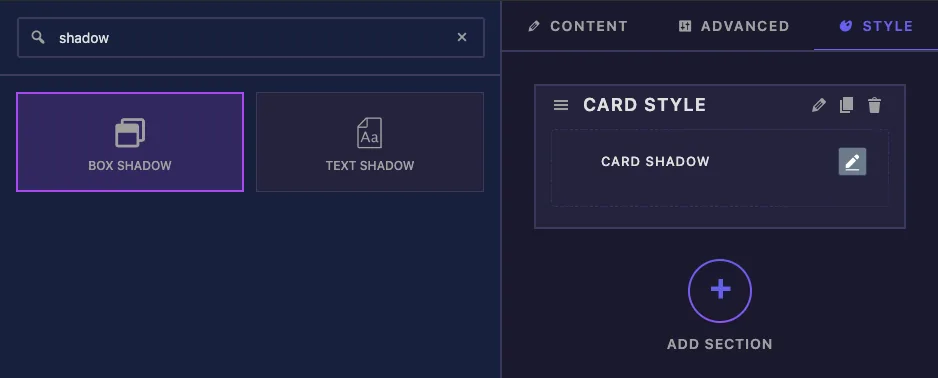
- Click the Style tab and add a section, for example “Card Style”.
- Type
shadowin the field search box on the left. Box Shadow and Text Shadow come up. - Drag Box Shadow into the section. Its settings open in the left sidebar.
Box Shadow field options explained #
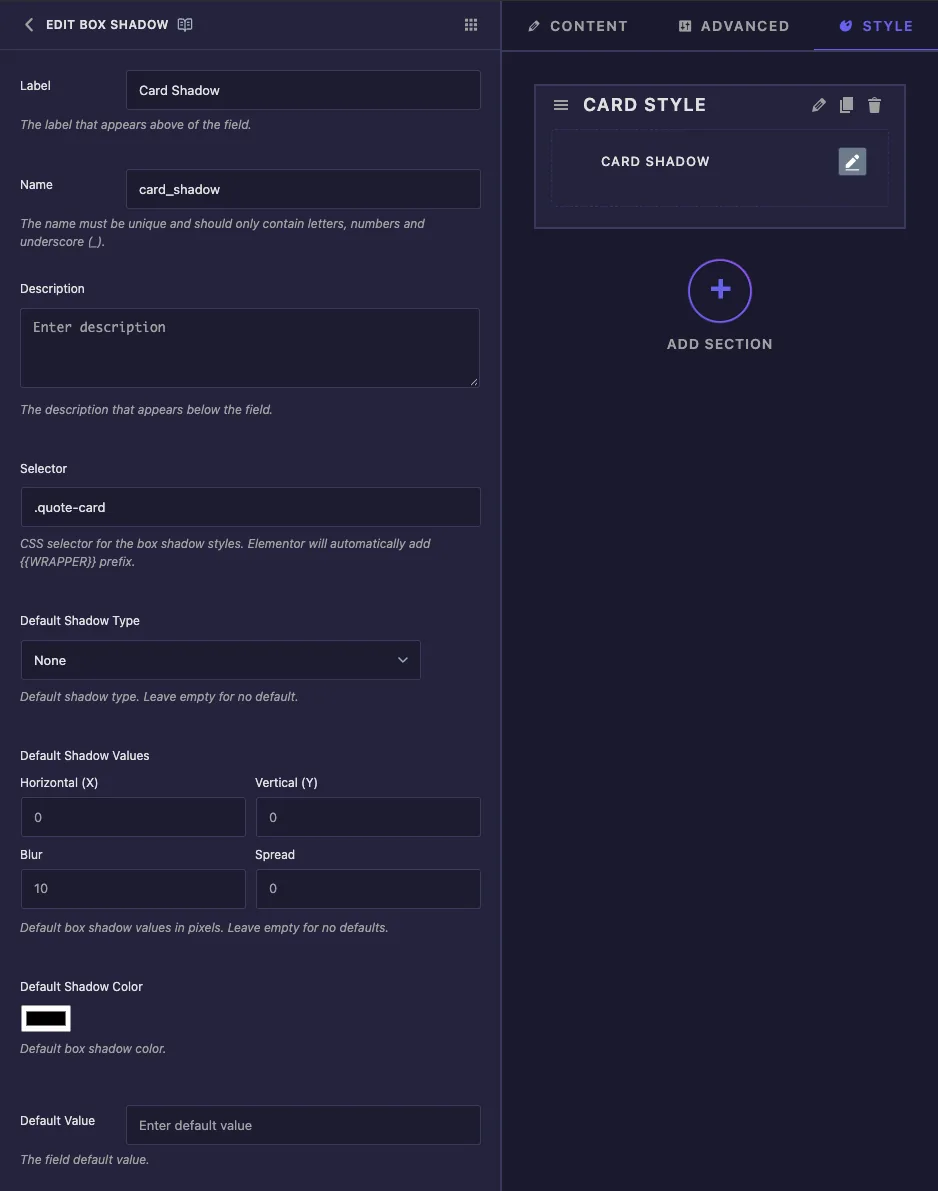
- Label is the text next to the control in Elementor, for example “Card Shadow”.
- Name is the field’s unique ID. Letters, numbers and underscores only.
- Description is a note for you inside the builder.
- Selector, Default Shadow Type, Default Shadow Values and Default Shadow Color appear under the description. In our tests, changes typed into these boxes weren’t saved and the builder logged an error, so don’t rely on them for now. Set the selector in the common settings instead (next section) and give the card a starting shadow in the CSS tab.
- Default Value isn’t used by this field.
Set the Selector #
Scroll to the bottom of the sidebar and type the element’s class into the Selector box under Control Classes. For the testimonial card:
.quote-card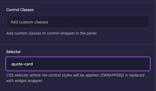
You don’t have to type {{WRAPPER}}. The builder adds it in front of your selector, so the rule becomes {{WRAPPER}} .quote-card and only affects this widget. Separate several selectors with commas if one shadow should apply to more than one element. If the Selector is empty, the shadow goes on the widget’s outer wrapper.
After you save, the Selector box near the top of the sidebar shows the same value.
Add a fallback shadow #
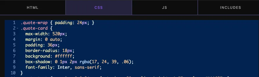
Put the starting shadow in the CSS tab. It shows until an editor turns the control on, and the control’s shadow replaces it after that:
.quote-card {
  box-shadow: 0 1px 2px rgba(17, 24, 39, .06);
}
Click Save Settings when you’re done.
Use the Box Shadow control in Elementor #
Add the widget to a page, or reload the editor if the page was already open. Select the widget and open the Style tab. Your label appears with a pencil icon.
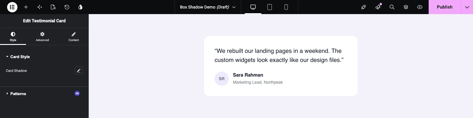
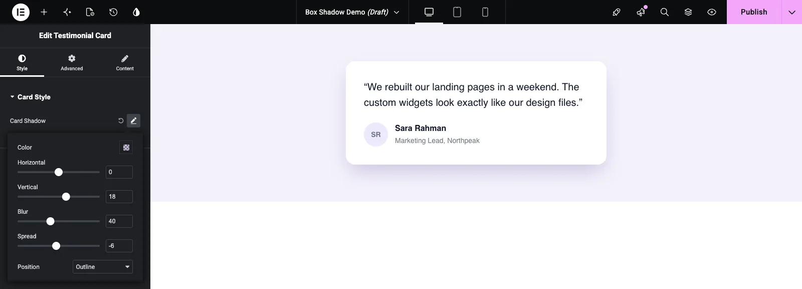
Click the pencil to open the popover. That turns the shadow on with Elementor’s starting values: Horizontal 0, Vertical 0, Blur 10, Spread 0 and black at 50% opacity. Adjust them and the card updates as you drag:
- Color sets the shadow color and opacity. A tinted, semi-transparent color looks softer than black.
- Horizontal and Vertical move the shadow sideways and up or down.
- Blur softens the edge. 0 gives a hard shadow.
- Spread grows or shrinks the shadow. A small negative value keeps a big blur from spilling out to the sides.
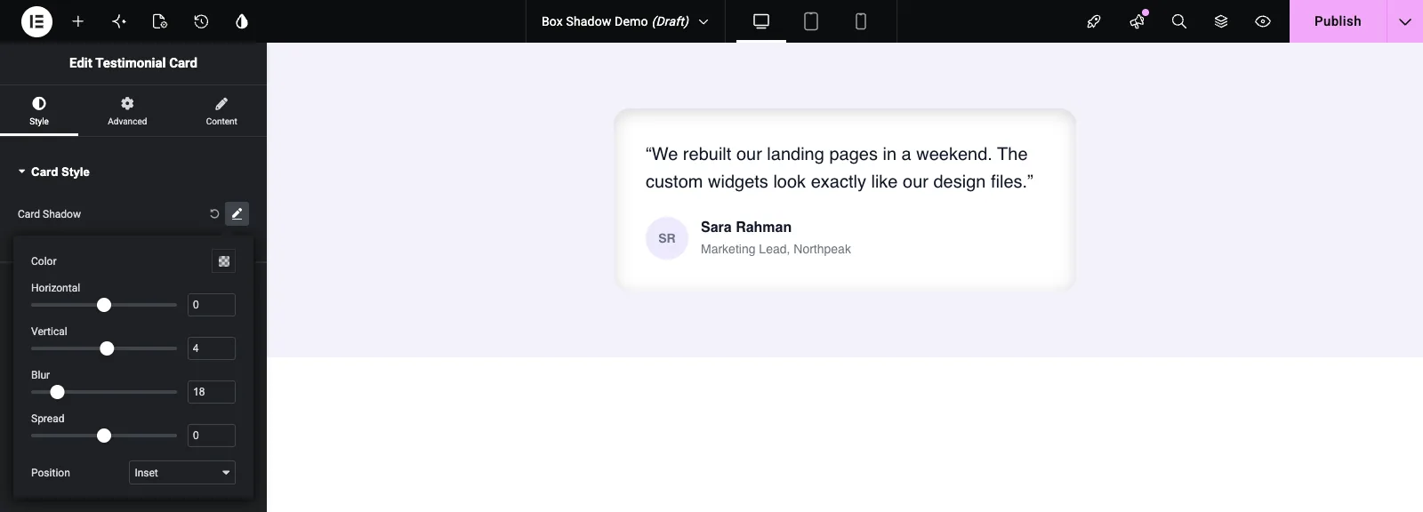
- Position switches between Outline (outside the box) and Inset (inside it).
Set Position to Inset for a pressed-in look, useful for input fields and quiet panels:
The circular arrow next to the pencil resets the control and removes the shadow.
Common use cases #
- Cards in testimonial, pricing, team and blog widgets.
- Buttons that need a little depth, often paired with a hover style.
- Hard offset shadows for bold, flat designs.
- Inset shadows on input fields, search bars and recessed panels.
Tips for working with the Box Shadow field #
- Use the Selector at the bottom of the sidebar, and type only the class.
{{WRAPPER}}is added for you. - Keep a fallback
box-shadowin the CSS tab so new widgets don’t look flat. - For soft card shadows, try a large Blur, a Vertical offset of about half the blur, and a small negative Spread.
- Give the element a border radius. Shadows follow the corners, so rounded cards get rounded shadows.
- For shadows on text, use the Text Shadow field instead.
Frequently Asked Questions #
Is the Box Shadow field free?
No. Box Shadow is one of the Pro fields in the Widget Builder, so Master Addons Pro has to be active before you can add it to a widget.
Do I need to add {{WRAPPER}} to the selector?
No. The builder adds {{WRAPPER}} in front of the Box Shadow selector for you, so .quote-card is enough.
Why doesn’t my Default Shadow Type or Default Shadow Values save?
In our tests those boxes didn’t keep their changes. Set the starting shadow with a box-shadow rule in the CSS tab instead. Editors can then change it with the control.
Where is the box shadow token for my CSS?
There isn’t one to use. A shadow is several values in one CSS property, so Elementor writes the rule to the Selector for you.
What’s the difference between Box Shadow and Text Shadow?
Box Shadow draws around the element’s box and has Spread and Inset. Text Shadow follows the letters of the text. Use Box Shadow for cards and buttons, Text Shadow for headings.
Wrapping up #
Add the Box Shadow field to a Style section, type your element’s class into the Selector at the bottom of the sidebar, and keep a light fallback shadow in the CSS tab. Editors then control the shadow from one popover. For the rest of the card’s styling, see the Border and Dimensions fields, and check pricing for what each plan includes.


