A wall of client logos pushes the rest of your page down and still only shows a handful of brands. A logo slider fits the whole list into one compact strip that rotates on its own. The Logo Slider widget in Master Addons for Elementor builds that strip from any set of logo images, then adds hover effects, tooltips, autoplay, and navigation arrows without a separate slider plugin.
Each logo can link to the client’s site, swap to a second image on hover, or reveal the brand name and a short description. This guide walks through the widget from the first drag onto the canvas to the finished carousel on the live page.
What the Logo Slider widget does #
The widget takes a list of logo images and turns it into a responsive, auto-playing carousel. You control how many logos show at once, how fast they rotate, and what happens when a visitor hovers over one. It runs on the Swiper engine, so the slider is touch friendly on phones and tablets from the start.
It sits in the Slider Widgets group of Master Addons, next to the Image Carousel and Gallery Slider widgets. Those two are built for photos and galleries. The Logo Slider is built for brand marks: logos stay small, evenly spaced, and aligned in a single row.
Before you start #
- WordPress with Elementor installed and active.
- Master Addons for Elementor installed and active. New to the plugin? See the installation guide.
- Your client or partner logos ready as image files. Logos with the same dimensions look best; something around 300 by 150 pixels with a transparent or white background works well.
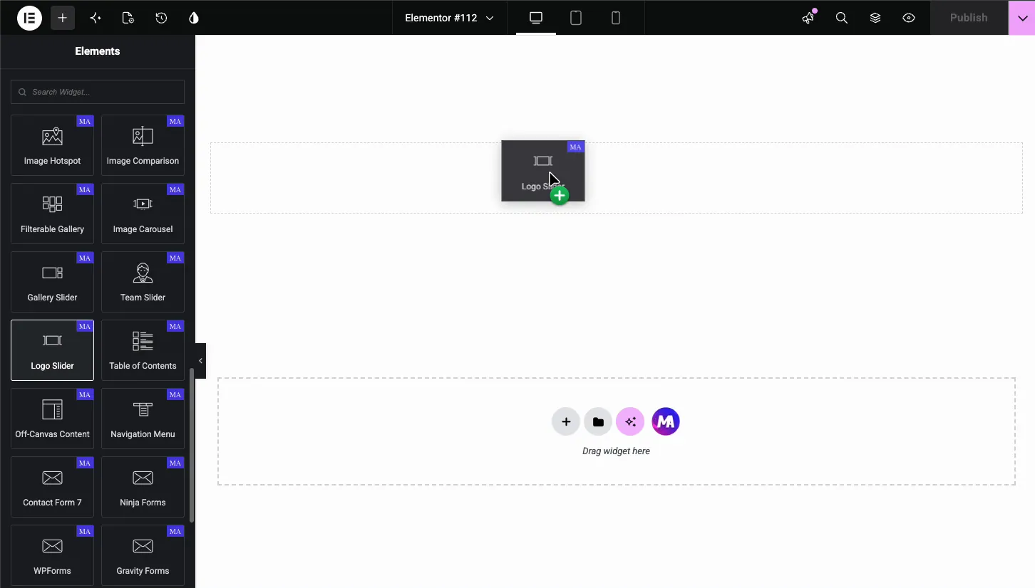
How to add the Logo Slider widget #
In the Elementor editor, open the Elements panel and search for Logo Slider, or scroll to the Master Addons section. Drag the widget onto your page. It loads with six placeholder items named Brand Name, so you see the slider shape right away and replace the placeholders one by one.
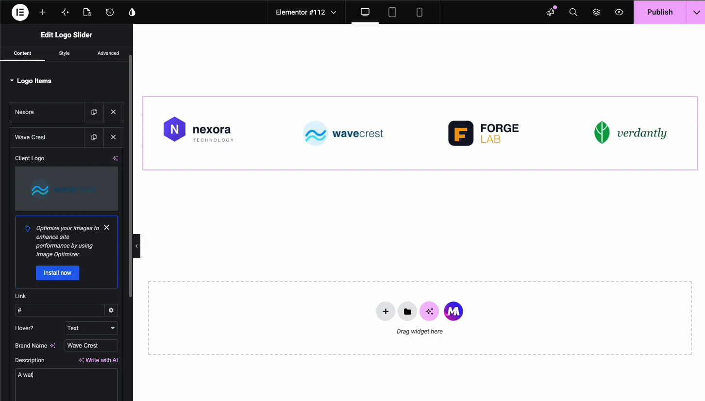
Add your logos in the Logo Items section #
In the Content tab, open Logo Items. Each entry in the list is one logo. Click an item to expand it, or use the copy and delete icons on the right of each row. The Add Item button at the bottom extends the list to as many logos as you need.
Under the item list sit three settings that apply to the whole slider:
- Image Resolution: the size WordPress serves for every logo, from Thumbnail up to Full. Logos are small files, so Full is usually fine.
- Title HTML Tag: the heading tag wrapped around the brand name on hover, H5 by default. Pick a tag that fits your page’s heading structure.
- Select Event: what triggers the hover effect. As the panel notes, this only fires when a hover type is enabled on the Client Logo.
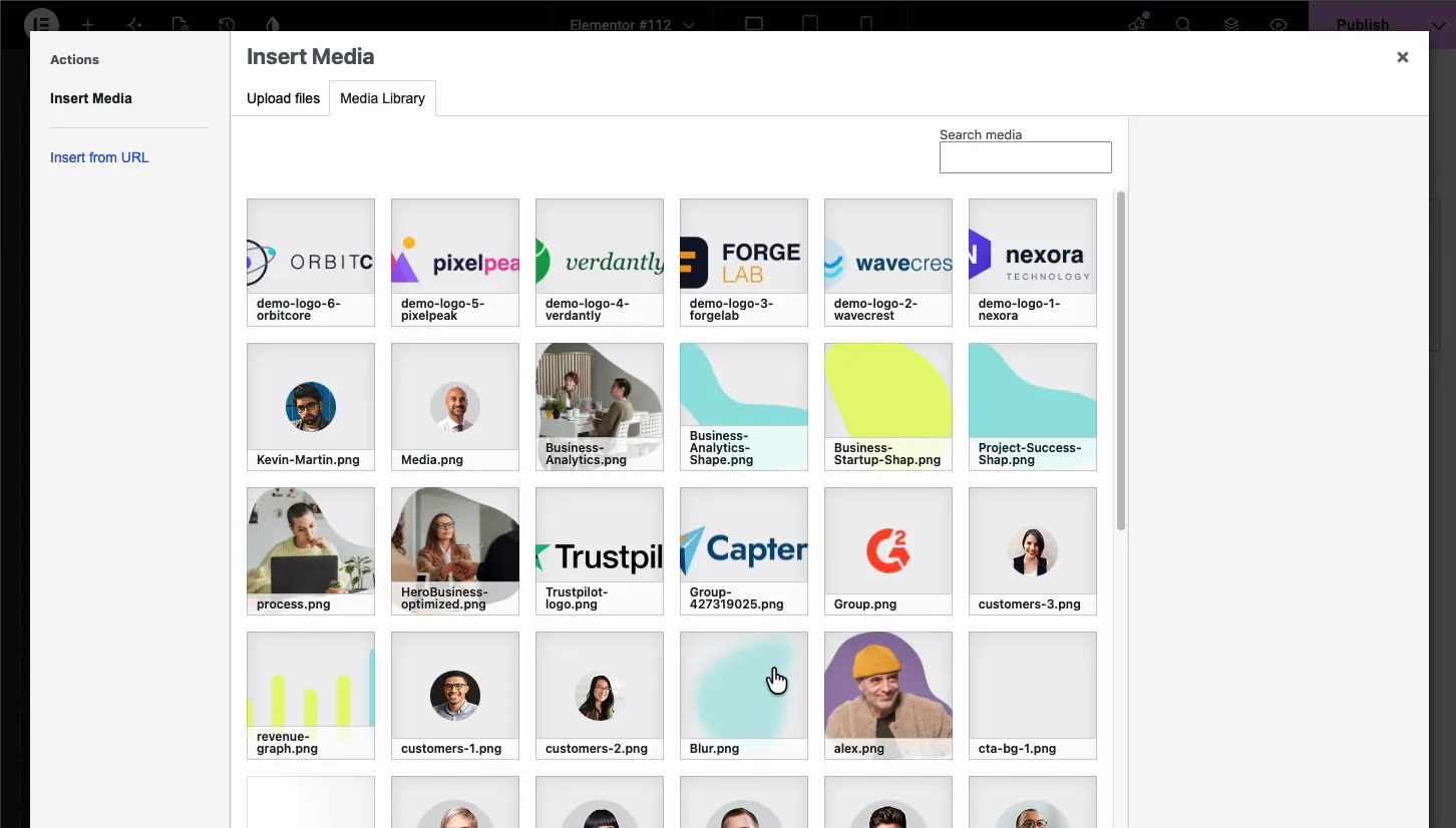
Inside each item, click the Client Logo field to open the WordPress media library. Upload your logo files or pick ones already there. The attachment panel shows the file dimensions, handy for checking that all logos share the same size.
Set the link and hover effect for each logo #
Every logo item carries its own Link field. Paste the client’s URL and the logo becomes clickable on the live page. The gear icon opens the usual Elementor link options, such as opening in a new tab.
The Hover? dropdown decides what happens when a visitor moves the mouse over the logo. It has three modes:
- None: the logo just sits there. Clean and simple.
- Text: the logo fades and a Brand Name plus short Description appear in its place.
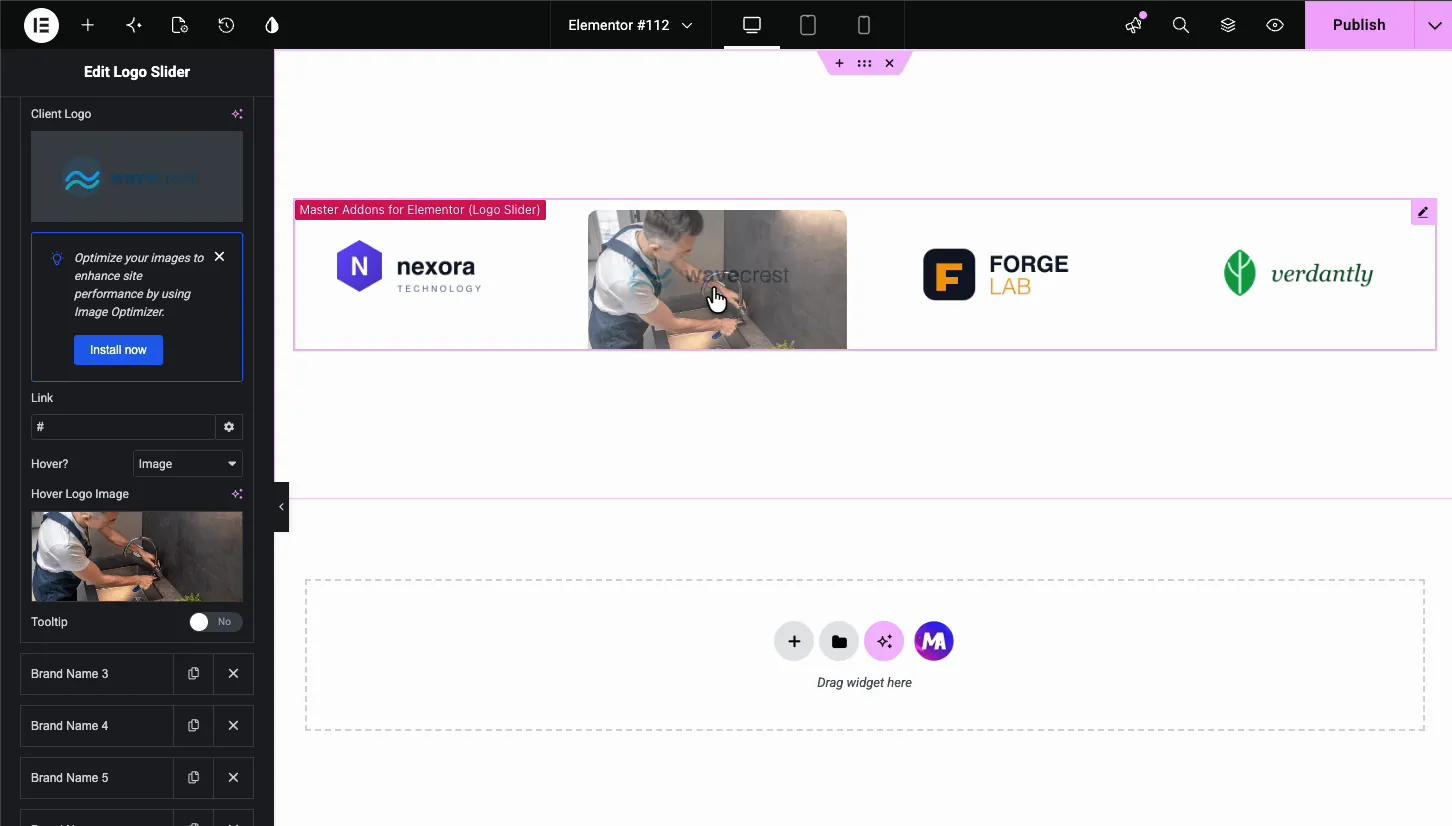
- Image: the logo swaps to a second image you pick.
With Text selected, two fields appear. Type the brand name and a one-line description, and the widget shows them over the logo on hover. This suits agencies that want to say what they did for each client without leaving the slider.
With Image selected, a Hover Logo Image field appears instead. A common trick: use a grayscale logo as the main image and the full-color version as the hover image, so logos light up as visitors move across the strip.
Add a tooltip to a logo #
Each item also has a Tooltip toggle. Switch it on and a small bubble appears when visitors hover over that logo. The Settings tab controls the behavior:
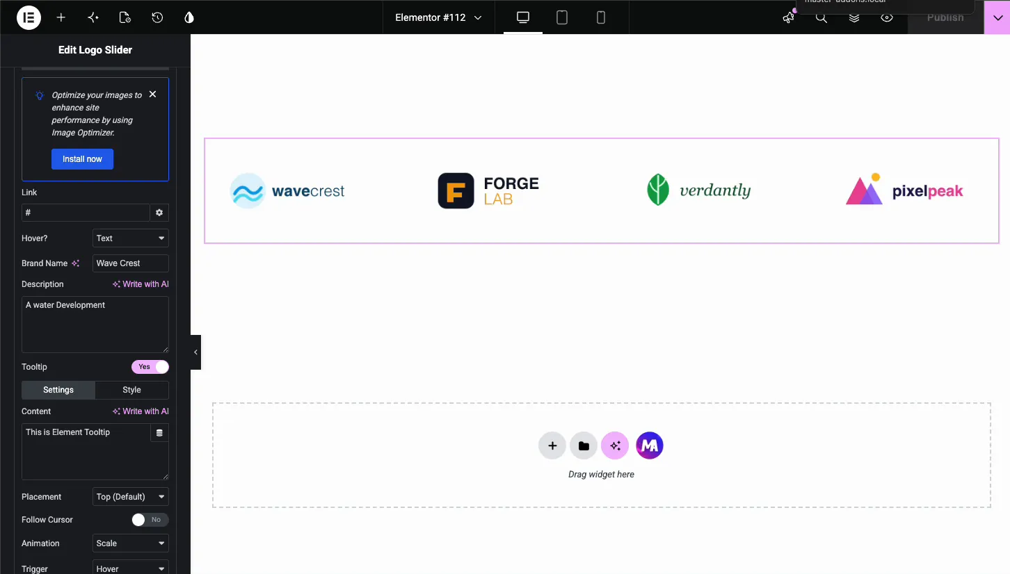
- Content: the text inside the tooltip.
- Placement: where the bubble sits, Top by default.
- Follow Cursor: let the tooltip trail the mouse instead of staying fixed.
- Animation and Trigger: how the tooltip appears, Scale on Hover by default.
The Style tab beside Settings styles the bubble itself: colors, typography, and spacing. Tooltips work well for short labels like “Partner since 2019” that don’t need the full text hover mode.
Set up the navigation arrows #
Open the Navigation section to control how visitors move the slider by hand. The Navigation dropdown sets the control type, with arrows as the standard choice.
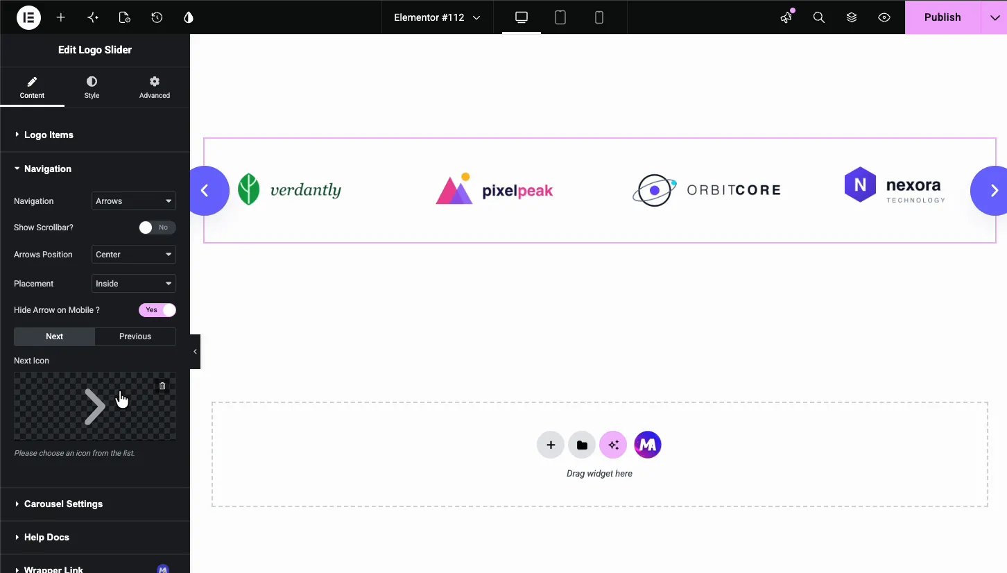
- Show Scrollbar?: adds a draggable bar under the slider.
- Arrows Position: Center puts one arrow on each side of the slider. Top Center or Bottom Center groups both arrows above or below it.
- Placement: keeps the arrows Inside the slider box or moves them Outside it.
- Hide Arrow on Mobile?: drops the arrows on small screens, where swiping does the job.
- Next Icon and Previous Icon: swap the default chevrons for any icon in the Elementor library.
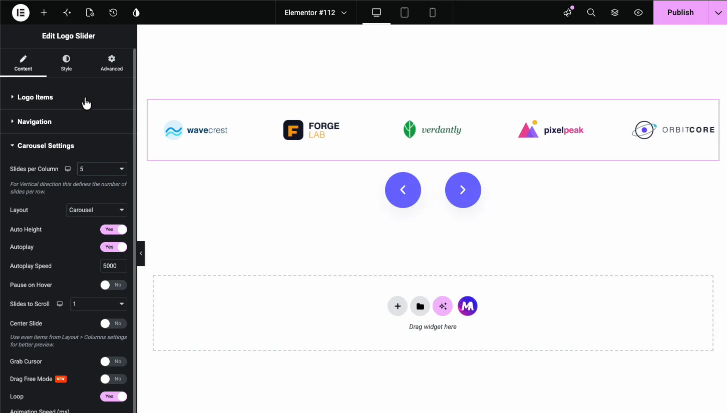
Tune the carousel behavior #
The Carousel Settings section drives the motion of the slider. This is where a static row of logos becomes the rotating strip visitors expect.
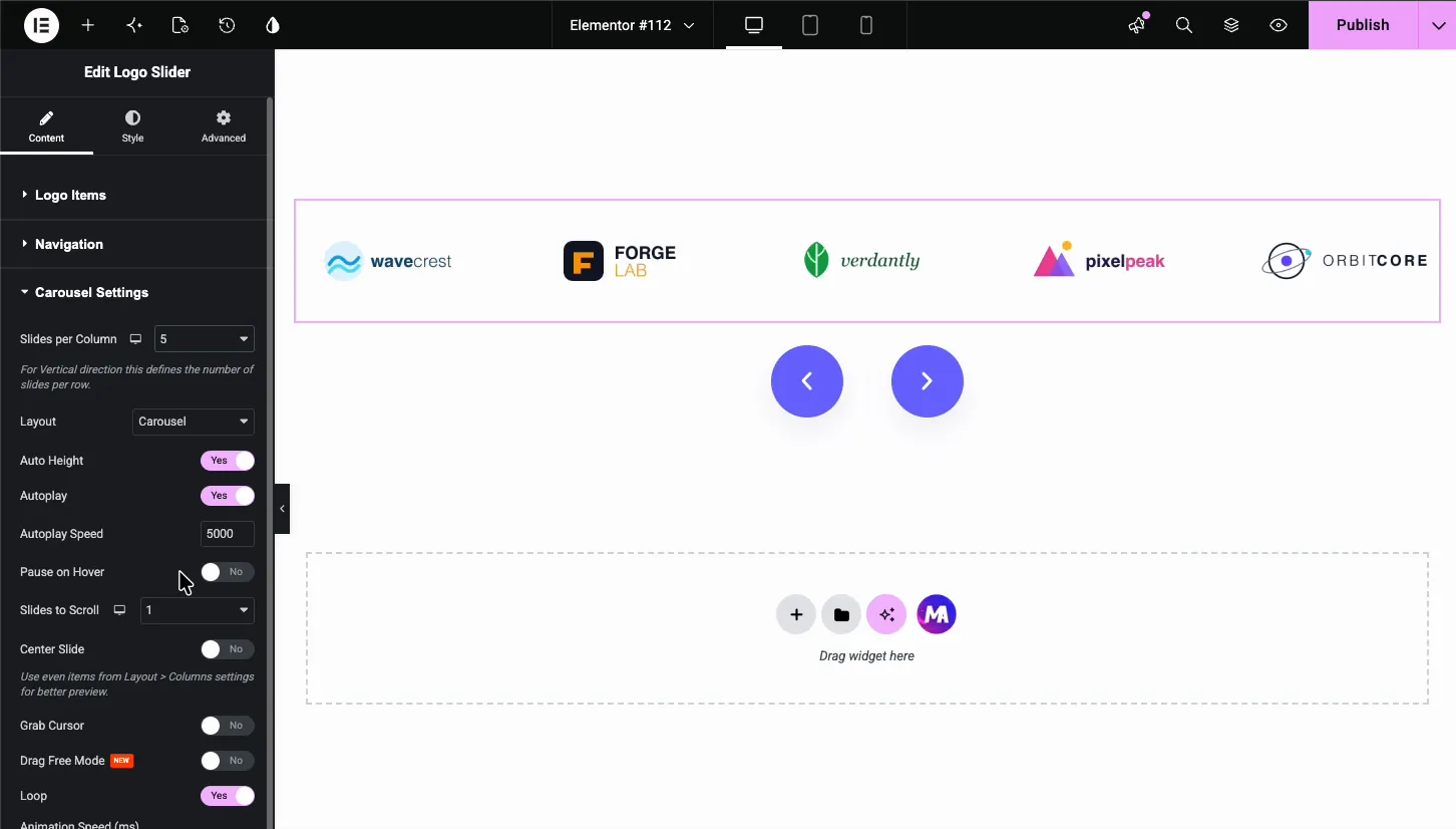
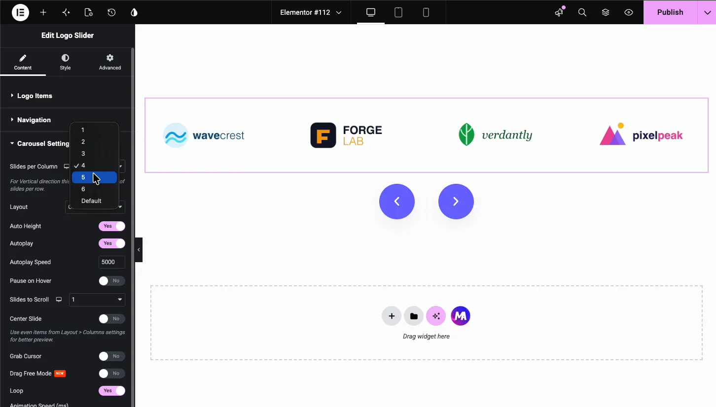
- Slides per Column: how many logos show at once, from 1 to 6. Four or five suits most desktop layouts, and the responsive icon lets you set a smaller count per device.
- Layout: Carousel is the standard flat slider.
- Auto Height: lets the slider height follow the logo row.
- Autoplay and Autoplay Speed: rotate the logos automatically. The speed is the delay in milliseconds, so 5000 means a new set every five seconds.
- Pause on Hover: stops the rotation while the cursor is over the slider, which pairs well with hover effects and tooltips.
- Slides to Scroll: how many logos advance per step.
- Center Slide, Grab Cursor, Drag Free Mode: center the active logo, show a grab cursor, or let visitors fling the strip freely.
- Loop: runs the slider endlessly, which is what a logo strip almost always wants. One thing to watch: loop needs more logos than the Slides per Column count. With five columns and only five logos, there is nothing extra to rotate in.
Style the logo slider #
Switch to the Style tab. Four sections cover the look of the slider: Carousel Items, Carousel Items Hover, Icon, and Navigation.
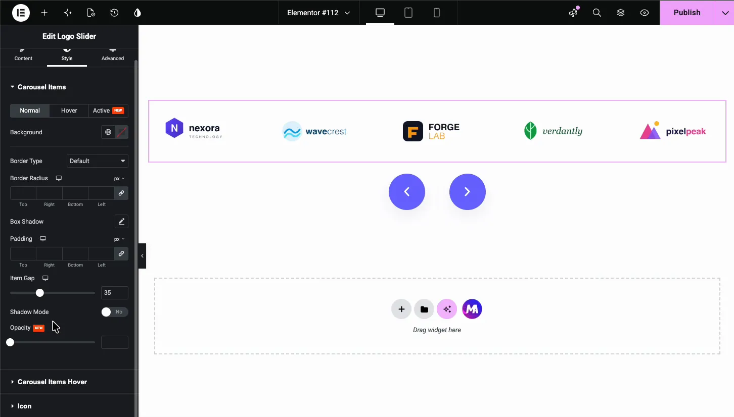
Carousel Items #
This section frames each logo cell, with Normal, Hover, and Active states.
- Background, Border Type, Border Radius, Box Shadow: give each logo a card-style frame, or leave everything empty for a clean strip.
- Padding and Item Gap: space inside each cell and the distance between logos. The gap is the fastest way to make a crowded strip breathe.
- Shadow Mode and Opacity: soft edge shadows and transparency for the logos.
Carousel Items Hover #
This section styles the hover state you picked in the Content tab, including the text overlay.
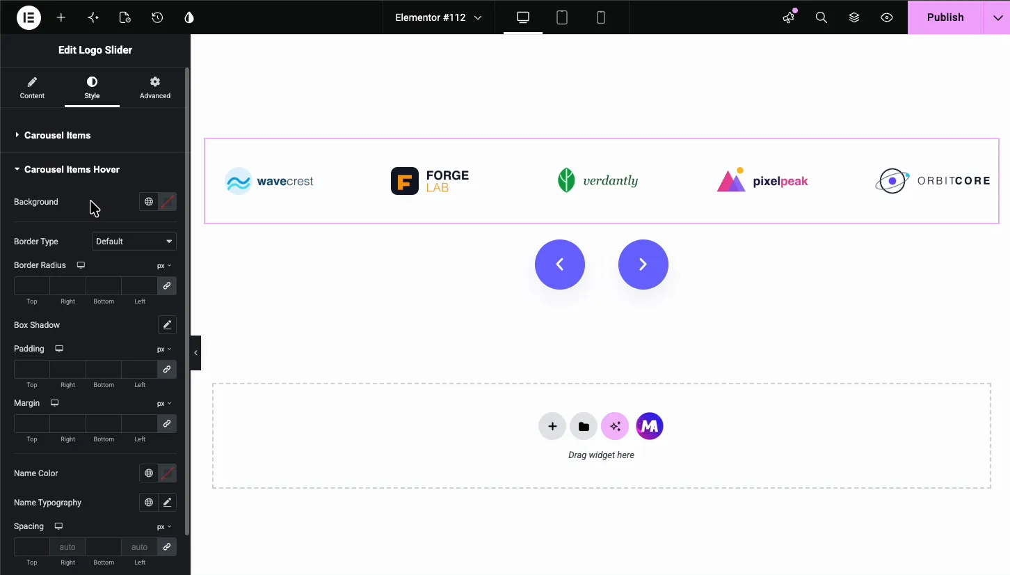
- Background, Border, Box Shadow, Padding, Margin: the frame around a hovered logo.
- Name Color, Name Typography, Spacing: the brand name text that appears in Text hover mode.
Icon #
The Icon section styles the small icon shown with hover content: its color, background, border, padding, margin, and font size.
Navigation arrows #
The Navigation section styles the arrow buttons, with separate Normal and Hover states.
- Color and Background: the arrow glyph and the button behind it.
- Border Type, Border Radius, Padding, Size: shape the buttons; a full radius makes the round buttons you see on most modern sites.
- Space Between Arrows: the gap between the two buttons when they sit together above or below the slider.
The result on the page #
Preview or publish, and the slider runs live: logos rotate on the autoplay timer, respond to the arrows, and fire their hover effects and tooltips. Here is the finished strip with five logos per view and an arrow on each side.
Common use cases #
- Client logo strips on agency and freelancer homepages, with each logo linking to a case study.
- Partner and sponsor carousels for events, nonprofits, and SaaS integration pages.
- “As featured in” press bars with publication logos linking to coverage.
- Brand showcases on distributor and retailer sites listing the labels they carry.
- Technology stacks on portfolio sites, using tooltips to name each tool.
Tips for a better logo slider #
- Keep every logo the same size. Mixed dimensions make the row jump as it slides. Exporting all logos on identical canvases, such as 300 by 150, keeps the strip steady.
- Use the grayscale-to-color hover. Set a grayscale main image and the color version as the Hover Logo Image. The strip stays quiet until visitors interact with it.
- Turn on Pause on Hover with autoplay. Nobody can read a tooltip on a moving target.
- Hide arrows on mobile. Swiping replaces them, and the strip stays clean on small screens.
- Match Slides per Column to logo width. Wide wordmark logos need fewer columns than compact icon marks. If a logo looks squeezed, drop the count by one before touching the image files.
Frequently Asked Questions #
How do I add a logo slider in Elementor?
Install Master Addons for Elementor, then drag the Logo Slider widget onto your page. Open Logo Items in the Content tab, add one item per logo, and upload each image from the media library. Autoplay, loop, and navigation arrows are configured in the same panel.
Can each logo link to a different website?
Yes. Every logo item has its own Link field. Paste the client or partner URL there and the logo becomes clickable. The gear icon beside the field adds the standard Elementor link options, including opening the link in a new tab.
Can the logo change on hover?
Yes. Set the Hover? option inside a logo item to Image and pick a second image, a common choice for grayscale-to-color effects. Choose Text instead to show the brand name and a short description over the logo on hover.
Does the logo slider autoplay and loop?
Yes. In Carousel Settings, switch on Autoplay and set the Autoplay Speed in milliseconds, with 5000 meaning five seconds per step. Enable Loop so the strip rotates endlessly, and add Pause on Hover so it stops while visitors look.
Is the Logo Slider widget free?
The Logo Slider ships with Master Addons and appears in the Slider Widgets group of the option panel. Install the plugin, make sure the widget is enabled there, and it shows up in your Elementor Elements panel under Master Addons.
Wrapping up #
The Logo Slider widget covers the whole job of a client logo carousel in Elementor: a repeater for the logos, per-logo links and hover effects, tooltips, autoplay with loop, and styling down to the arrow buttons. For photo and gallery sliders, look at the Image Carousel and Gallery Slider widgets. Browse the full set of Master Addons widgets and extensions, and see the pricing page for what Pro adds on top.


