

Skill bars, funding goals, and project status all read better as a visual than as a number buried in a sentence. The free Progress Bar widget in Master Addons for Elementor gives you an animated bar with a title and a percentage, plus a Style Presets dropdown that switches between a plain line, a line with a bubble, a full circle, and a half-circle gauge.
You set a title and a value, pick a preset, then color the front bar, back bar, and value to match your brand. This guide covers every setting in the widget.
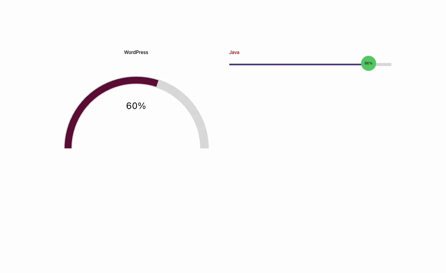
What the Progress Bar widget does #
The widget renders one progress indicator: a title, a percentage value, and a bar that fills to that value when the page loads. The Style Presets dropdown changes the shape, so the same value can show as a horizontal line, a line with a floating bubble, a donut circle, or a semicircle gauge.
It has three tabs. Content holds the title and the value. Style controls the preset, the front and back bar colors, the bubble, the title, and the value text. Advanced carries the usual Elementor spacing and visibility options.
Before you start #
- WordPress with Elementor installed and active.
- Master Addons for Elementor installed and active. New to the plugin? See the installation guide.
- The labels and percentages you want to show, like WordPress 60% or Java 85%.
How to add the Progress Bar widget #
In the Elementor editor, open the Elements panel and search for Progressbar, or scroll to the Master Addons section (the widgets carry a purple MA badge). Drag it onto your page and it loads with a single bar ready to edit.
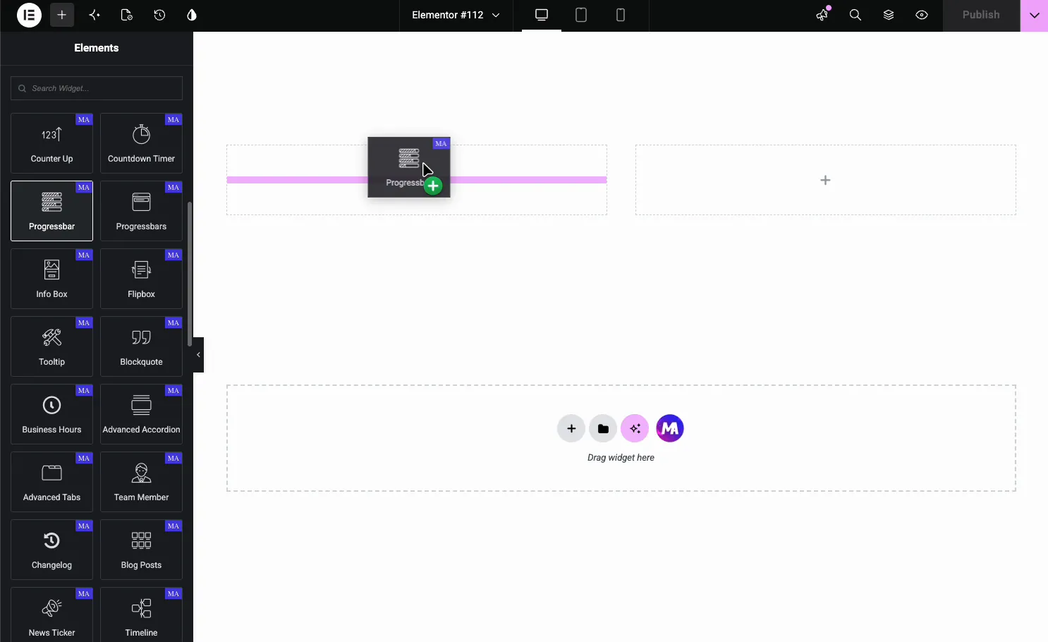
Heads up: there are two similar widgets. Progressbar is a single bar (this guide), and Progressbars (the Progress Bars widget) stacks several bars inside one widget. For a few independent bars in different styles, the single Progressbar is the flexible pick.
Set the title and value #
Open the Content tab. There are only two fields, which keeps setup quick.
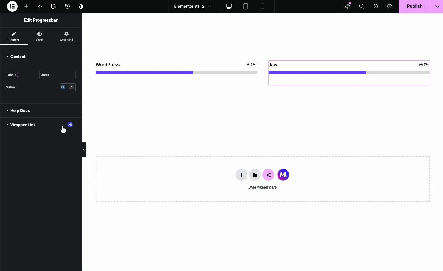
- Title: the label above the bar, like WordPress or Design.
- Value: the percentage the bar fills to, from 0 to 100.
Since each Progressbar is one bar, you build a set by duplicating the widget. Right-click it and choose Duplicate (or press Ctrl/Cmd + D), then change the title and value on each copy. That is how the WordPress and Java bars above ended up side by side.
Pick a style preset #
Switch to the Style tab and open General Styles. The Style Presets dropdown is where you choose the shape. The Line Bubble preset adds a floating bubble that shows the percentage and rides at the end of the fill.
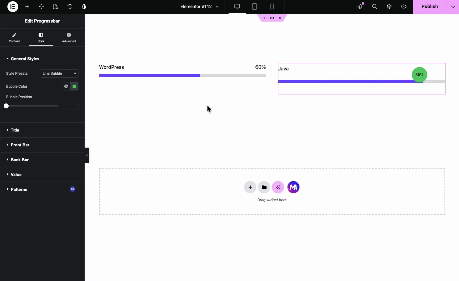
- Style Presets: Line, Line Bubble, Circle, and Fan (a half-circle gauge).
- Bubble Color: the color of the percentage bubble on the bubble preset.
- Bubble Position: move the bubble up or down against the bar.
Circle and half-circle gauge presets #
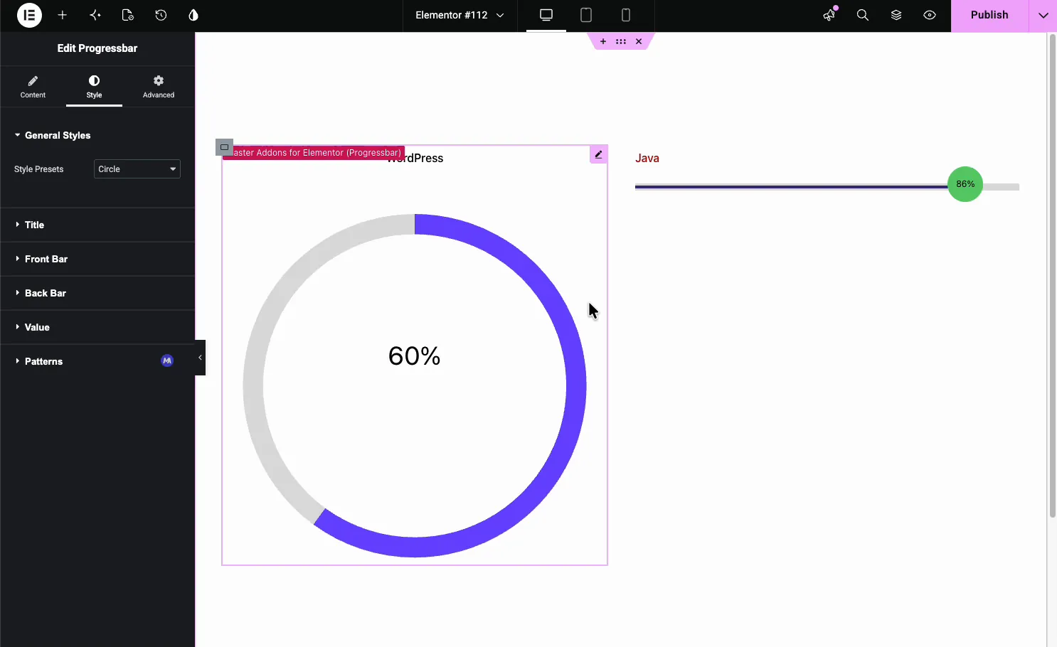
The Circle preset draws a full donut with the percentage in the middle, which suits a compact stat block.
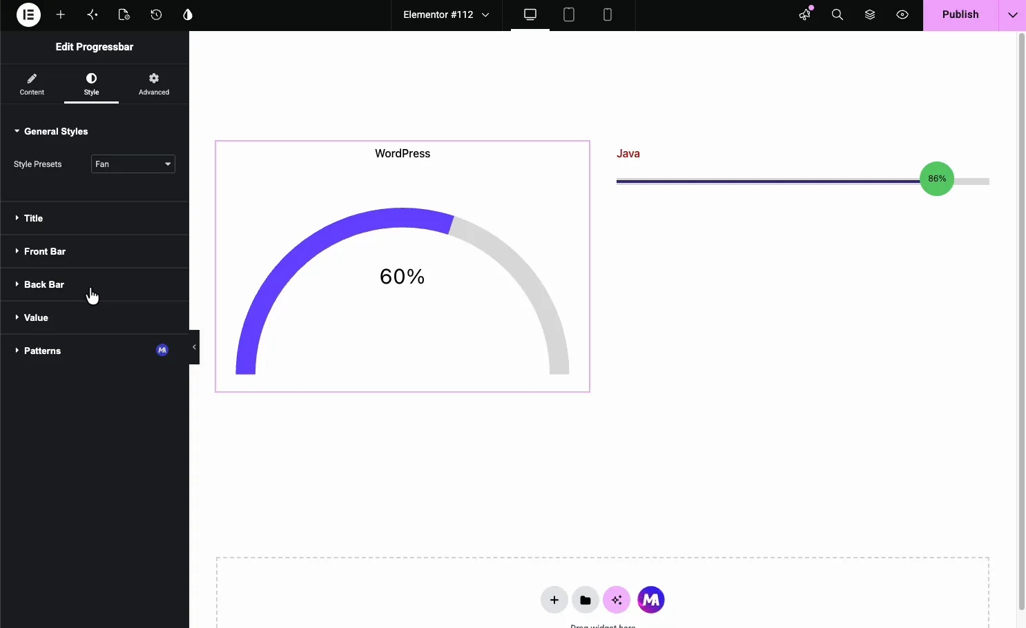
The Fan preset draws a half-circle gauge, a good fit for a dashboard-style rating or a speedometer look.
Style the bar parts #
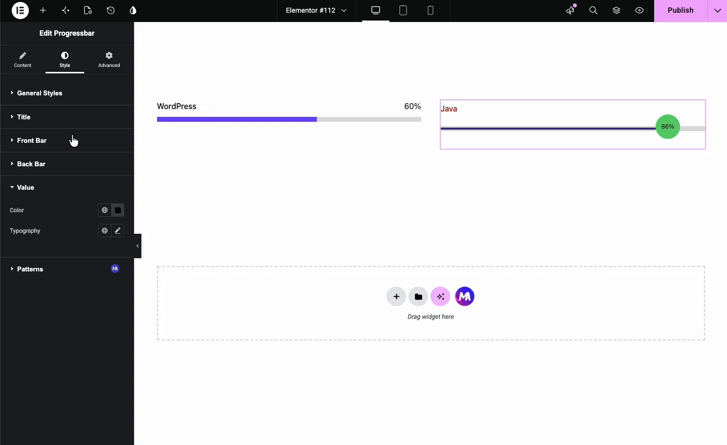
The Style tab breaks the widget into parts you can style on their own: General Styles, Title, Front Bar, Back Bar, and Value. If the free Patterns extension is switched on, a Patterns section for decorative overlays appears in this tab too.
- Title: color and typography for the label.
- Front Bar: the color and width of the filled part.
- Back Bar: the color and width of the unfilled track behind it.
- Value: color and typography for the percentage text.
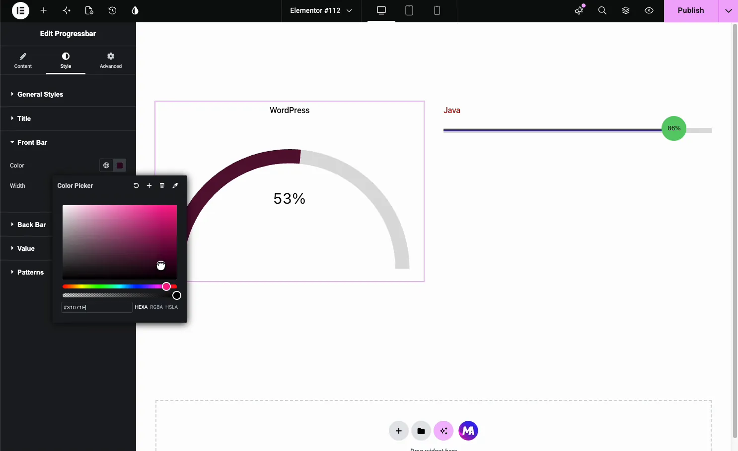
Open Front Bar to set the fill color and width. This is what carries your brand color across the whole bar or gauge.
Common use cases #
- Skill bars on an about or resume page (WordPress 90%, Design 75%).
- Funding or goal meters showing how close a campaign is.
- Circle stats in a services or results block.
- Half-circle gauges for scores, ratings, or dashboard widgets.
- Project status bars on a client or portfolio page.
Tips for working with the Progress Bar widget #
- Duplicate, then edit. Style one bar the way you want, then copy it and change the title and value.
- Keep the scale honest. The value is a percentage, so 60 means 60 percent full.
- Match front and back bar contrast. A light track behind a brand-color fill reads clearly.
- Use the bubble for exact numbers. The Line Bubble preset puts the percentage right on the fill.
- Pick the shape for the context. Lines for skill lists, circles and fans for single standout stats.
Watch the video tutorial #
Prefer to follow along on screen? The video tutorial below walks through the Progress Bar element from start to finish, showing how each style preset, color, and value works in the Elementor editor.
Frequently Asked Questions #
What is the Progress Bar widget in Master Addons?
It is an Elementor widget that shows an animated progress indicator with a title and a percentage. A Style Presets dropdown switches between a line, a line with a bubble, a full circle, and a half-circle gauge, and you color every part from the Elementor panel.
What progress bar styles does the widget include?
Four presets: Line, Line Bubble, Circle, and Fan. Line is a plain horizontal bar, Line Bubble adds a floating percentage bubble, Circle draws a full donut with the value in the center, and Fan draws a half-circle gauge. The value stays the same across all of them.
Can I make a circular or gauge progress bar in Elementor?
Yes. Set Style Presets to Circle for a full donut with the percentage in the middle, or to Fan for a half-circle gauge. Both animate to the value you set and can be colored through the Front Bar and Back Bar sections in the Style tab.
How do I add several progress bars?
Each Progressbar widget is one bar, so duplicate the widget and change the title and value on each copy. Place the copies in columns for a row of skill bars. For several bars managed inside one widget, use the separate Progressbars widget instead.
Does the progress bar animate?
Yes, once. The bar fills from zero to its value in about a second when the page loads, not when it scrolls into view, so bars placed near the top show the motion best. It works the same on the line, circle, and fan presets.
Wrapping up #
The Progress Bar widget turns a plain percentage into an animated line, bubble, circle, or gauge. Set a title and value, pick a preset, then color the front bar, back bar, and value to match your design. For an overview and a comparison with Elementor’s own Progress Bar, see the Elementor circle progress bar widget page. For related widgets, see Progress Bars for skill bars, Reading Progress Bar for a scroll indicator, the Counter Up widget and the Info Box widget, browse the full Master Addons widgets and extensions, and check the pricing page for what each plan includes.


