

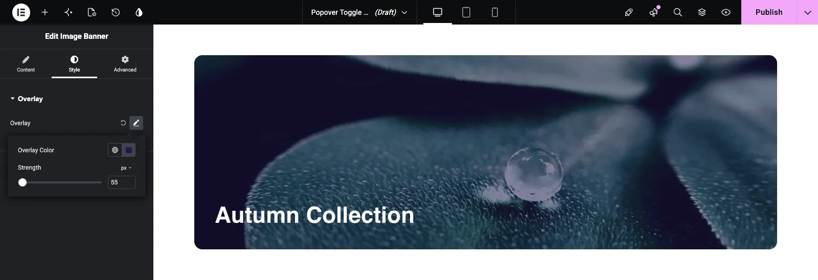
The Popover Toggle field groups a few related settings behind one on/off control in a custom widget built with the Master Addons Widget Builder. In Elementor it shows as a single row with a pencil icon. Clicking the pencil turns the option on and opens a small popover with the settings inside. It keeps optional extras, like an overlay or a badge, from filling up the panel.
Popover Toggle is a Pro field. The free plugin includes a limited Widget Builder, and the full set of fields comes with Master Addons Pro.

What the Popover Toggle field does #
- It adds one row to your widget’s panel: your label, a pencil icon and, once turned on, a reset arrow.
- The pencil turns the option on and opens a popover with the fields you defined.
- The toggle itself stores
yeswhen on and nothing when off, so your template can check it with{% if %}. - Each field inside the popover gets its own token, made from the toggle’s name and the field’s name joined by an underscore.
If you haven’t built a widget yet, read the Widget Builder overview first.
Before you start #
- WordPress with Elementor installed and active.
- Master Addons for Elementor and Master Addons Pro, both active. The installation guide covers setup.
- A widget open in the Widget Builder. The example in this guide is an “Image Banner” widget with an optional overlay: a Popover Toggle named
overlaywith two fields inside,colorandstrength.
How to add a Popover Toggle field #
- Go to Master Addons > Widget Builder and open your widget.
- Click the Style tab and add a section, for example “Overlay”.
- Type
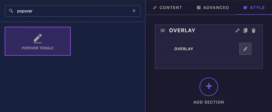
popoverin the field search box on the left. - Drag Popover Toggle into the section. Its settings open in the left sidebar.
Popover Toggle field options explained #
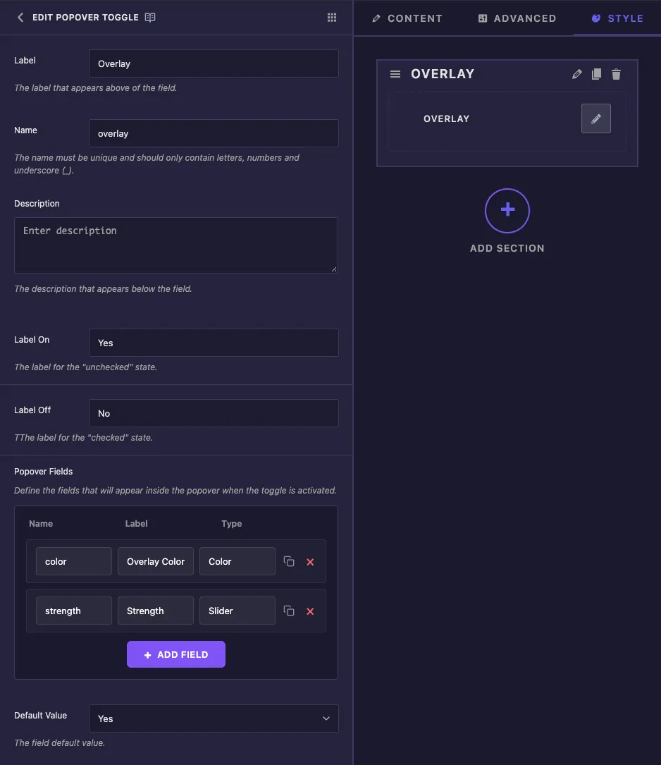
- Label is the text next to the pencil in Elementor, for example “Overlay”.
- Name is the field’s unique ID and the start of every token it creates, so keep it short, for example
overlay. Letters, numbers and underscores only. - Description is a note for you inside the builder.
- Label On and Label Off are saved with the field, but Elementor shows this control as a pencil icon, so these words don’t appear in the panel.
- Popover Fields lists the fields inside the popover. Each row has a Name, a Label and a Type. Click Add Field for another row, the copy icon to duplicate one, or the red cross to remove it.
- Default Value sets whether a new copy of the widget starts with the option on (Yes) or off (No).
The Type menu offers Text, Number, Textarea, WYSIWYG, Code, Hidden, Switcher, Color, Font, Typography, Date Time, URL, Media, Gallery, Icons, Slider, Dimensions and Background. Rows only have a name, label and type, so there’s nowhere to set a default value or a range for a field inside the popover. A Slider field here uses Elementor’s standard range, 0 to 1000 for px.
The common settings further down work as they do on other fields.
Read the toggle and its fields in your template #
Two rules cover everything this field gives you:
- The toggle’s own name prints
yeswhen it’s on and nothing when it’s off. Use it in{% if overlay %}. - A field inside the popover is read as the toggle’s name, an underscore, then the field’s name. The
colorfield becomes{{ overlay_color }}, and thestrengthslider becomes{{ overlay_strength.size }}.
<div class="img-banner">
  {% if overlay %}
    <div class="img-banner__overlay" style="background: {{ overlay_color }}; opacity: {{ overlay_strength.size }}%;"></div>
  {% endif %}
  ...
</div>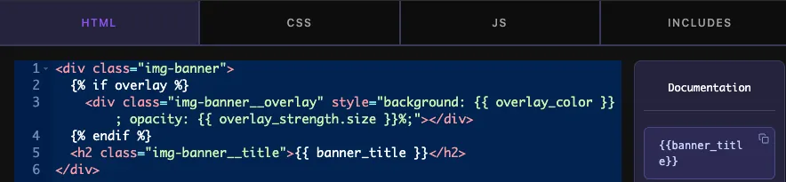
Dots don’t work for the fields inside the popover. In our tests {{ overlay.color }} printed nothing, while {{ overlay_color }} printed the color. The fields also keep their values when the toggle is switched off, so always wrap them in {% if overlay %}.
Click Save Settings when you’re done.
Use the Popover Toggle in Elementor #
Add the widget to a page, or reload the editor if the page was already open. Select the widget and open the tab where you placed the field. It shows as your label with a pencil icon.
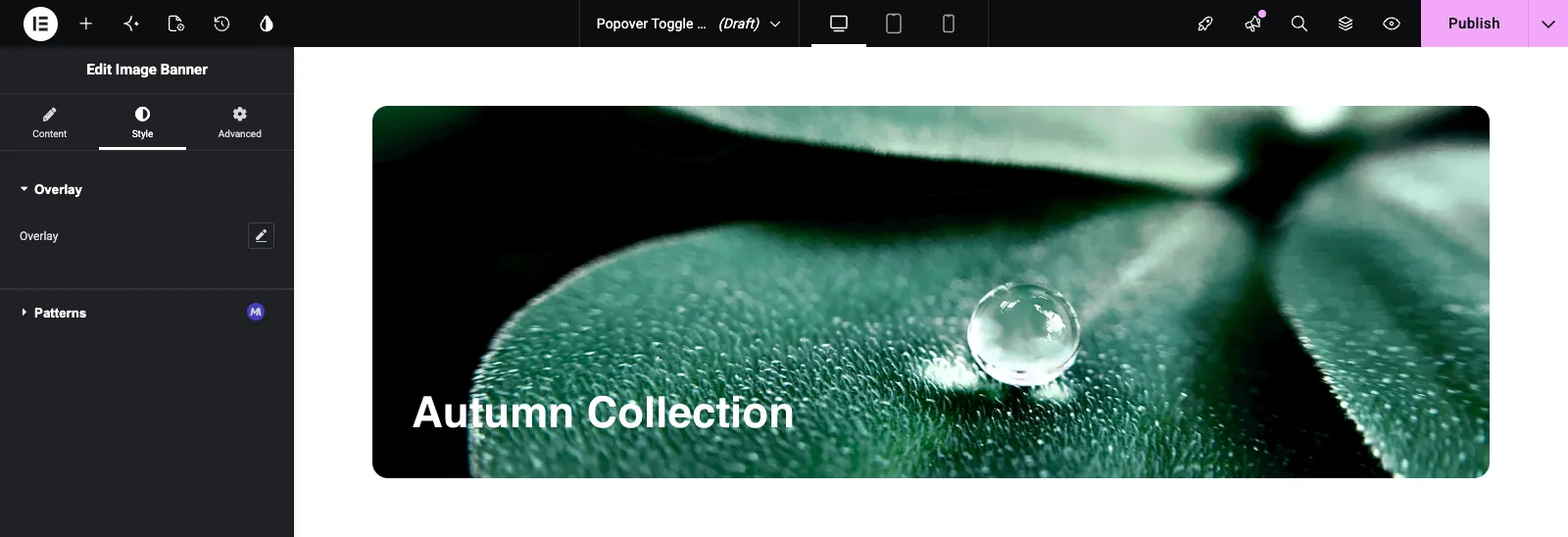
Click the pencil. The option turns on and the popover opens with your fields. Set them and the widget updates straight away. Click outside the popover to close it. To turn the option off again, click the circular reset arrow next to the pencil.
Common use cases #
- An optional color overlay on image and video banners.
- An optional badge or ribbon with its own text and color.
- Extra hover effects that most editors never need to see.
- Advanced spacing or border options kept out of the main panel.
Tips for working with the Popover Toggle field #
- Keep the toggle’s name short. Every field inside it starts with that name.
- Always check the toggle with
{% if %}before using its fields, because the values stay saved when it’s off. - Use two or three related fields per popover. More than that is easier to find in a normal section.
- Set default styles in the CSS tab. Fields inside the popover have no default values of their own.
- For a simple on/off with no settings inside, use the Switcher field.
Frequently Asked Questions #
Is the Popover Toggle field free?
No. Popover Toggle is one of the Pro fields in the Widget Builder, so Master Addons Pro has to be active before you can add it to a widget.
What does the toggle token print?
{{ overlay }} prints yes when the option is on and nothing when it’s off, so {% if overlay %} works as a check.
How do I print a field from inside the popover?
Join the toggle’s name and the field’s name with an underscore, for example {{ overlay_color }}. For a slider, add .size, as in {{ overlay_strength.size }}.
Why does {{ overlay.color }} print nothing?
Fields inside the popover aren’t nested under the toggle. Use the underscore form, {{ overlay_color }}, instead.
Why don’t my Label On and Label Off words show in Elementor?
Elementor shows a Popover Toggle as a pencil icon rather than a Yes/No switch, so those labels aren’t displayed.
Wrapping up #
Add the Popover Toggle, list its fields, check {% if toggle_name %} in your template and read each field as {{ toggle_name_field_name }}. Editors get a tidy panel, and the extra settings only appear when they turn the option on. For grouping settings into tabs instead, see the Tabs field, and check pricing for what each plan includes.


