A row of static images eats space and asks visitors to scroll past every one. A carousel shows the same set in a compact, swipeable slider that people actually touch. The Image Carousel widget in Master Addons for Elementor builds that slider from a normal WordPress gallery, then adds autoplay, a lightbox, several navigation styles, and a coverflow mode, all from the Elementor panel.
You pick the images, choose how many show at once, and decide how visitors move between them. No shortcodes, no separate slider plugin. This guide walks through every setting in the widget, from loading the gallery to styling the arrows.
Prefer to watch first? This short tutorial covers the Image Carousel from gallery to styling:
What the Image Carousel widget does #
The widget turns a selection of images into a sliding carousel. It shows one or several images per view, advances on its own or on click, and opens each image in a lightbox for a full-size look. Captions, borders, overlays, and arrow styling are all built in.
It runs on the Swiper engine, so the slider is touch friendly and responsive from the start. On a phone the same carousel reflows to fewer columns, and you can hide the arrows on mobile if they get in the way.
Before you start #
- WordPress with Elementor installed and active.
- Master Addons for Elementor installed and active. New to the plugin? See the installation guide.
- A handful of images uploaded to your Media Library, or ready to upload.
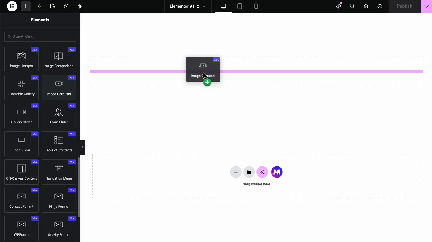
How to add the Image Carousel widget #
In the Elementor editor, open the Elements panel and search for Image Carousel, or scroll to the Master Addons section. Drag the widget onto your page. It loads empty until you add images, so the gallery is always the first step.
Add and order your images #
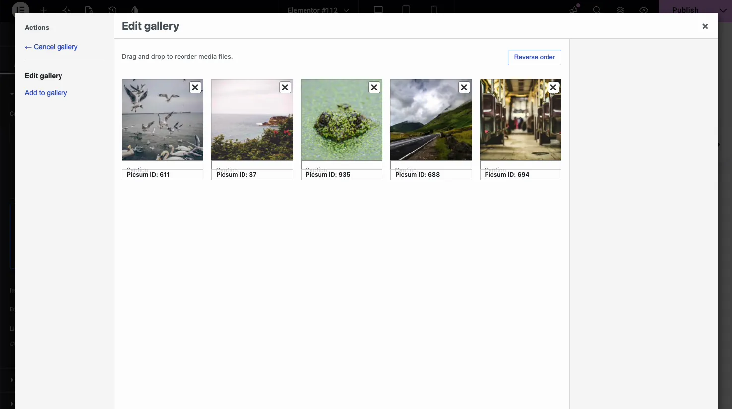
In the Content tab, open the Images section and click the gallery field to launch the WordPress media picker. Select the images you want, then use Edit gallery to drag them into order, add captions, or drop any with the X icon.
Back in the panel, the Images section gives you three more controls:
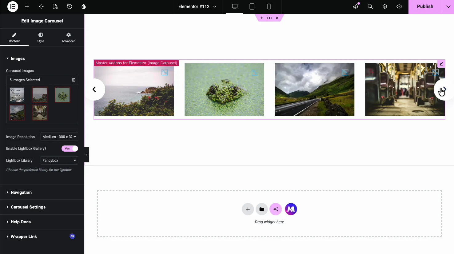
- Image Resolution: pick the size WordPress serves, from Thumbnail up to Full, or set a Custom size. Medium or Large keeps the page light while still looking sharp in the slider.
- Enable Lightbox Gallery: turn this on so visitors can click an image to open it full size in a popup. With it off, the images are display only.
- Lightbox Library: choose the popup engine, either Fancybox or Elementor’s own lightbox. Both group the carousel images so visitors can step through them inside the popup.
Set up navigation #
The Navigation section controls how people move through the slides. Start with the Navigation dropdown, which sets the control style: Arrows and Dots, Arrows and Fraction, Arrows, Dots, Progress, or None.
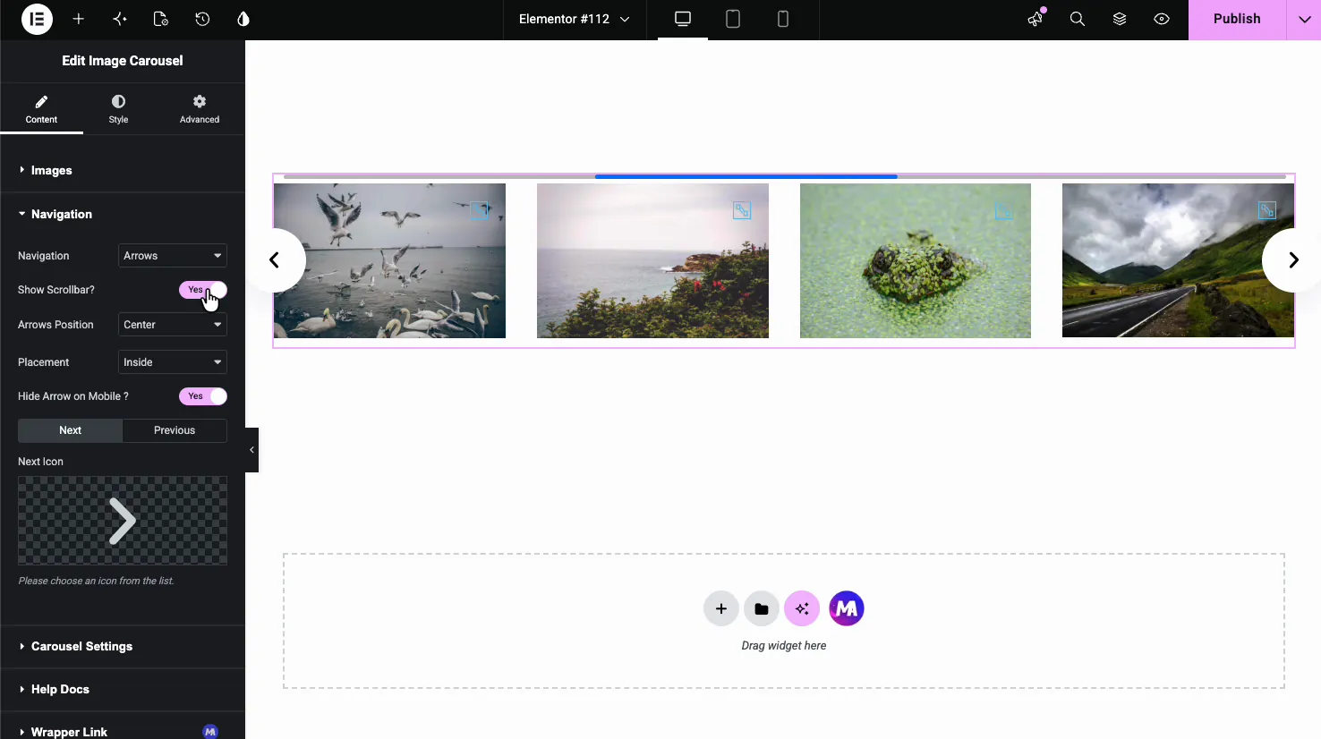
- Show Scrollbar: adds a draggable progress bar under the slider.
- Arrows Position: place the arrows Top, Center, or Bottom, and left, center, or right within that.
- Placement: set the arrows Inside the slider or Outside it.
- Hide Arrow on Mobile: drop the arrows on small screens where swiping is the natural gesture.
- Next Icon and Previous Icon: swap the default arrows for any icon from the Elementor icon library.
Tune the carousel behavior #
The Carousel Settings section is where the slider gets its motion. This is the part that decides how many images show, how fast they move, and whether the slider loops.
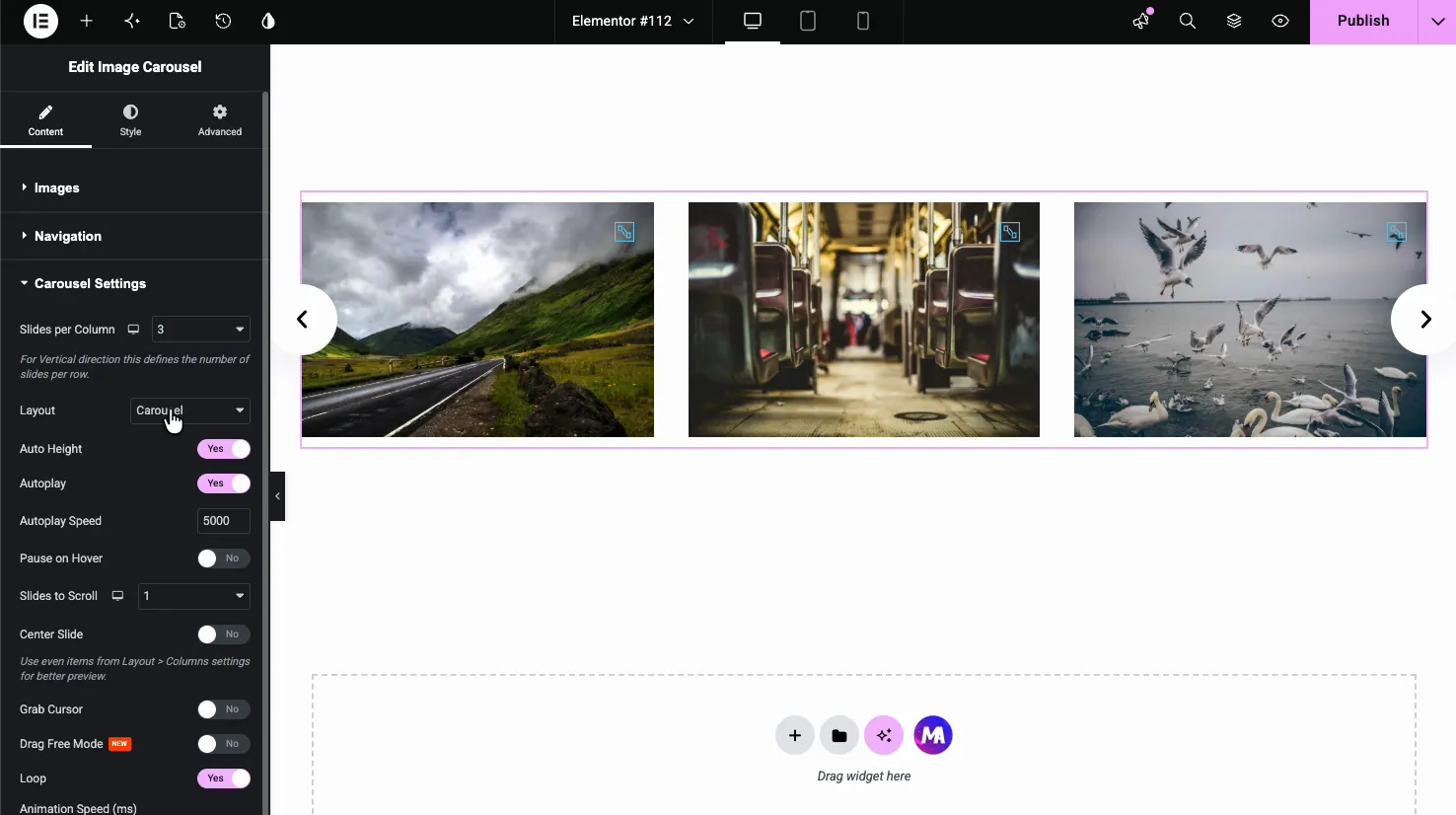
- Slides per Column: the number of rows when you run the slider in a vertical direction.
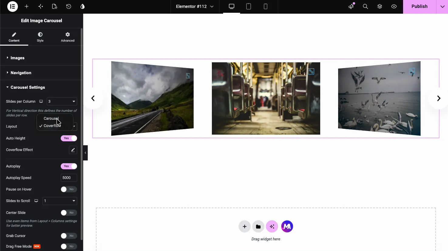
- Layout: choose Carousel for a standard flat slider or Coverflow for a 3D effect.
- Auto Height: let the slider height adapt to the current image.
- Autoplay and Autoplay Speed: turn on automatic sliding and set the delay between slides in milliseconds (5000 is five seconds).
- Pause on Hover: stop autoplay while the cursor is over the slider.
- Slides to Scroll: how many images advance per step.
- Center Slide, Grab Cursor, Drag Free Mode: options for centering the active slide, showing a grab cursor, and free-flowing drag scrolling.
- Loop: run the carousel as an endless loop instead of stopping at the last image.
Use the Coverflow layout for a 3D effect #
Switch Layout to Coverflow and the slides tilt into a 3D stack, with the active image flat in the center and the neighbors angled back. A Coverflow Effect control shows up so you can fine-tune the depth and rotation. It suits photography and portfolio sections where the slider itself is part of the design.
Style the carousel #
The Style tab breaks into four sections: Carousel Items, Lightbox, Navigation, and Patterns (a Pro option). Together they cover the look of the slides, the popup, and the arrows.
Carousel Items #
This section styles the image slides. It has Normal, Hover, and Active states, so you can make the centered slide stand out from the rest.
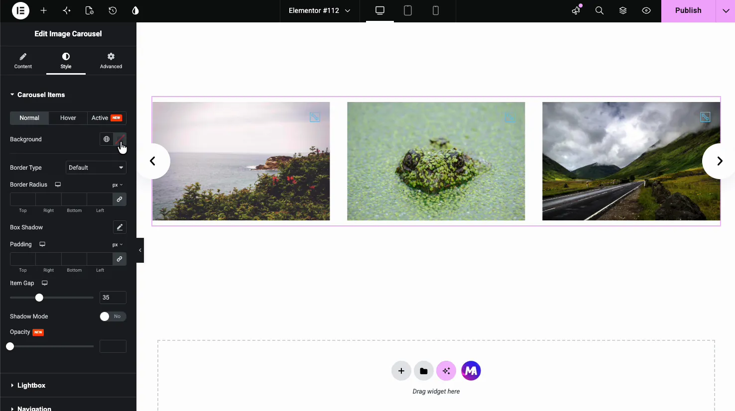
- Background, Border Type, Border Radius, Box Shadow: standard framing for each slide. Border Radius rounds the image corners.
- Padding and Item Gap: space inside each slide and the gap between slides.
- Shadow Mode and Opacity: extra depth and transparency for the inactive slides.
Lightbox, overlay, and captions #
The Lightbox section styles the preview icon that sits on each image and the overlay behind it, plus the caption text.
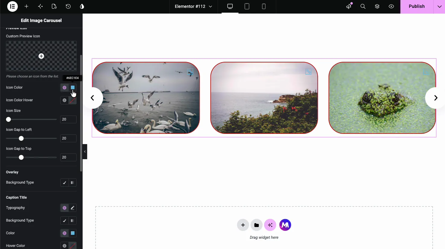
- Custom Preview Icon: replace the default zoom icon, and set its color, hover color, size, and position with Icon Gap to Left and Top.
- Overlay: add a background tint over the image, which helps when you want the icon and caption to stay readable.
- Caption Title: typography, background, color, and hover color for the captions you added in the gallery.
Navigation arrows #
The Navigation style section controls the look of the arrows, with Normal and Hover states.
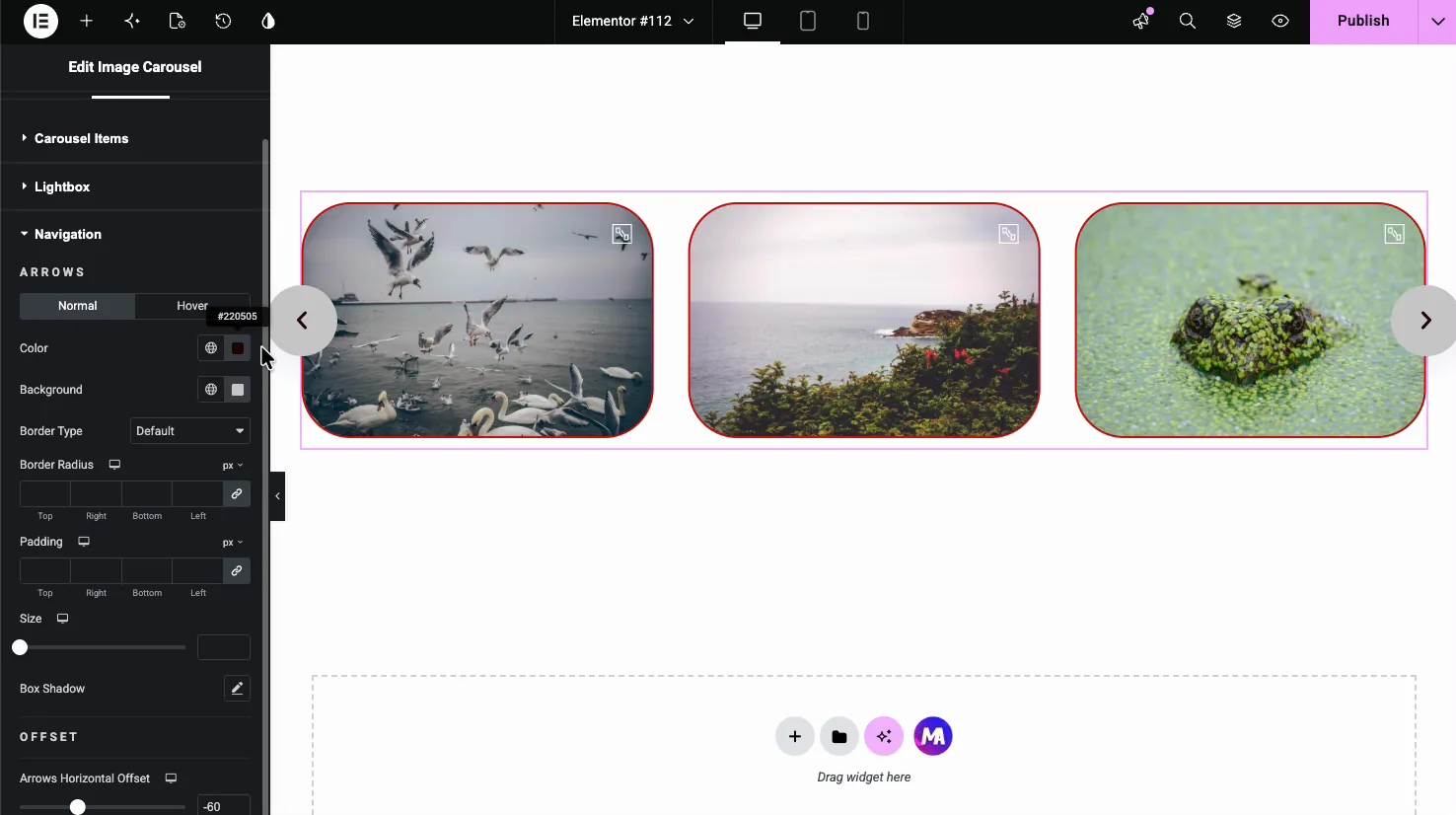
- Color and Background: arrow icon color and the button behind it.
- Border Type, Border Radius, Padding, Size: shape and size the arrow buttons, including round buttons with a full radius.
- Box Shadow and Offset: add depth and nudge the arrows in or out with the horizontal offset.
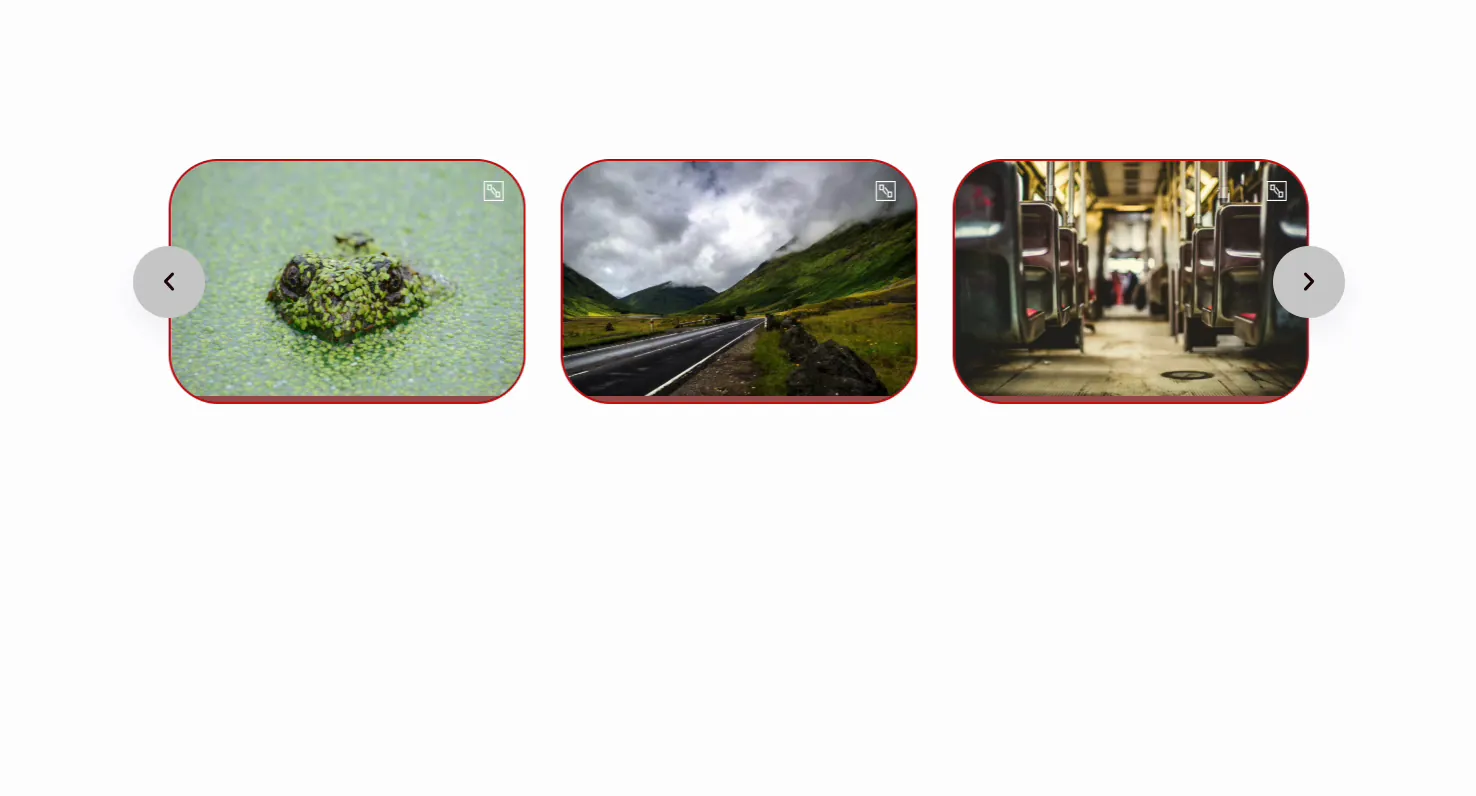
The result on the page #
Publish or preview and the carousel runs live: it autoplays through the images, loops if you turned that on, and opens each one in the lightbox on click. Your styling carries through, from rounded bordered slides to the custom arrow buttons.
Common use cases #
- Photography and portfolio galleries where the lightbox lets visitors view full-size shots.
- Product image sliders on a landing page, with autoplay drawing the eye.
- Logo or partner strips using several slides per view and a loop.
- Testimonial or event photos in a compact, swipeable block.
- Hero coverflow sliders for a design-forward section.
Tips for working with the Image Carousel #
- Match Image Resolution to the slide size. Serving Full-size files into small slides slows the page; Medium or Large is usually plenty.
- Keep autoplay speed comfortable. Around 4000 to 6000 ms gives people time to look without feeling rushed.
- Turn on Pause on Hover with autoplay. It stops the slider sliding out from under someone who is reading a caption.
- Hide arrows on mobile. Swiping is the natural gesture on touch screens, so the arrows are often just clutter there.
- Use the Active state to highlight the center slide. A subtle border or full opacity on the active slide guides the eye.
Frequently Asked Questions #
What is the Image Carousel widget in Master Addons?
It is an Elementor widget that turns a WordPress gallery into a responsive image slider. You select images, set how many show per view, and choose navigation and autoplay options. It includes a built-in lightbox, captions, a coverflow layout, and full styling controls.
How do I add a lightbox to the Elementor image carousel?
In the Content tab, open the Images section and turn on Enable Lightbox Gallery. Then pick a Lightbox Library, either Fancybox or Elementor. Visitors can click any image to open it full size in a popup and step through the rest of the carousel from there.
Can the image carousel autoplay and loop?
Yes. In Carousel Settings, turn on Autoplay and set the Autoplay Speed in milliseconds. Enable Loop to make the slider run endlessly instead of stopping at the last image. Turn on Pause on Hover so autoplay stops while someone is looking.
What is the coverflow layout?
Coverflow is a 3D layout option under Carousel Settings. The active image sits flat in the center while the neighboring slides tilt back in a stack. A Coverflow Effect control lets you adjust the depth and rotation. It suits photography and portfolio sliders.
Is the Image Carousel widget responsive?
Yes. It runs on the Swiper engine, so it is touch friendly and adapts to screen size automatically. You can set different slides per view per device and hide the navigation arrows on mobile, where swiping replaces them.
Wrapping up #
The Image Carousel widget builds a full-featured Elementor image slider without a separate plugin: load a gallery, set autoplay and loop, switch on the lightbox, and style the slides and arrows to match your design. For other ways to show images, look at the Gallery Slider and Filterable Gallery widgets. Browse the full Master Addons widgets and extensions to see what else is included, and check the pricing page for Pro features like carousel patterns.


