

The Switcher field adds an on/off toggle to a custom widget you build with the Master Addons Widget Builder. It’s the standard way to make part of a widget optional: a badge, an icon, a compact layout. Editors flip the toggle in Elementor and your template reacts.
Switcher is one of the fields you can use in the free version’s Widget Builder. The free plugin includes a limited Widget Builder, and the full set of fields comes with Master Addons Pro.
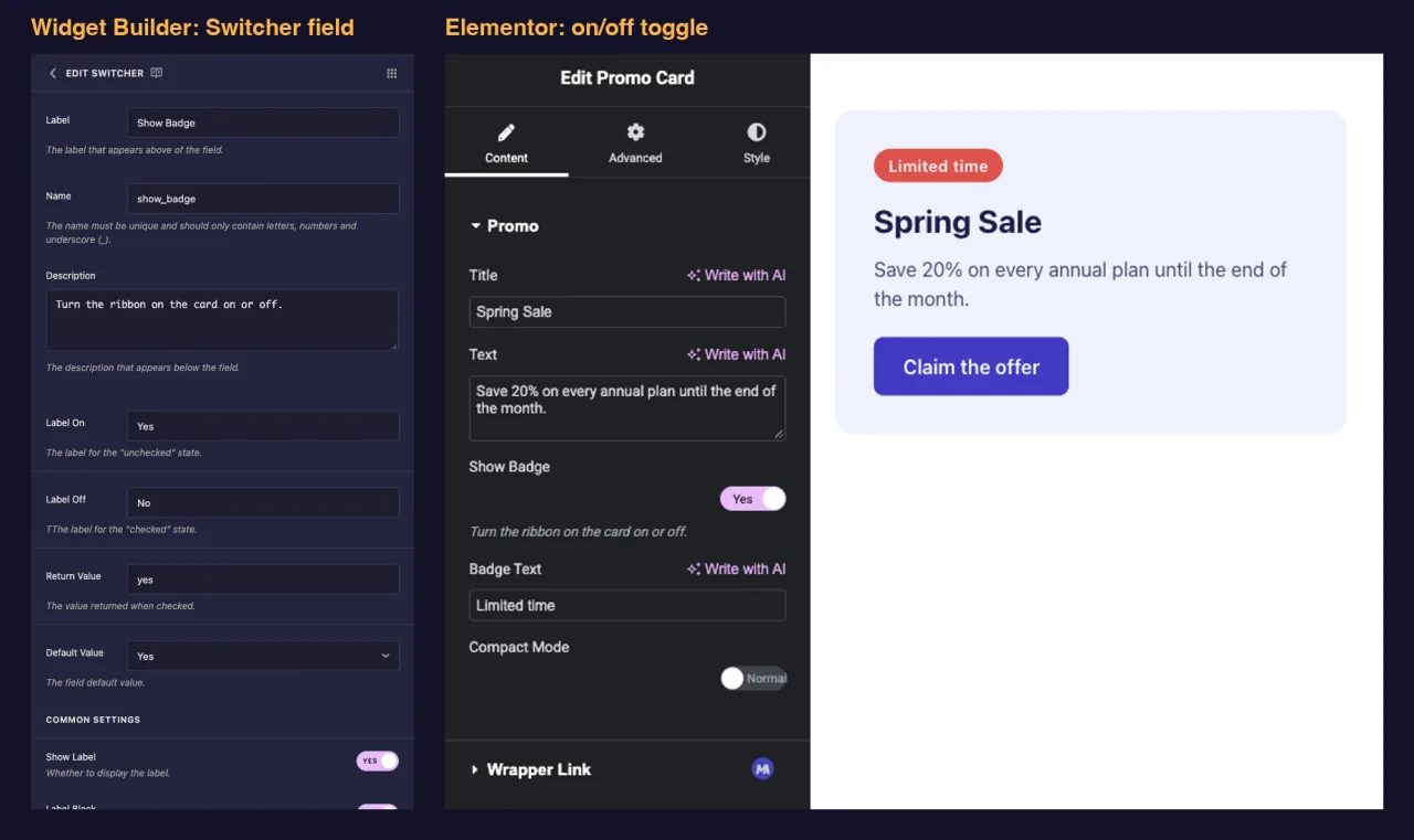
What the Switcher field does #
- Adds Elementor’s on/off toggle to your widget’s panel.
- Saves the Return Value (
yesby default) when on, and an empty value when off. - Works with
{% if %}in your template, so markup appears only when the toggle is on. - Can hide and show other fields in the panel through Conditions, which keeps the panel short until an option is in use.
New to the builder? Read the Widget Builder overview first, then come back with a widget open.
Before you start #
- WordPress with Elementor installed and active.
- Master Addons for Elementor installed and active. The installation guide covers setup.
- A widget open in the Widget Builder. The example in this guide is a “Promo Card” widget with two Switchers:
show_badge, which reveals a ribbon and a Badge Text field, andcompact_mode, which tightens the card.
How to add a Switcher field #
- Go to Master Addons > Widget Builder and open your widget.
- Add a section on the tab where the option belongs. A content option like Show Badge fits the Content tab.
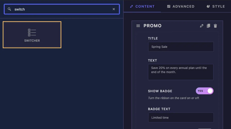
- Type
switchin the field search box on the left. - Drag Switcher into the section. Click the pencil on the field to open its settings.
Switcher field options explained #
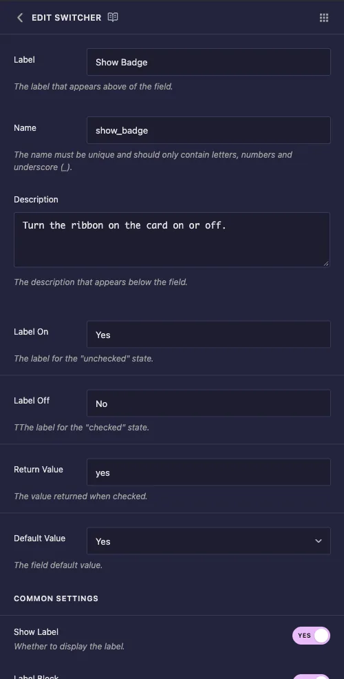
- Label: the text next to the toggle in Elementor, for example “Show Badge”.
- Name: the field’s unique ID and the name of its token. Use letters, numbers and underscores only, for example
show_badge. - Description: a hint shown under the toggle in Elementor.
- Label On and Label Off: the short words inside the toggle. Elementor shows Label On while the toggle is on and Label Off while it’s off, so “Compact” and “Normal” read better than Yes and No for a layout option.
- Return Value: the value the field holds while on. Leave it at
yesunless something in your code needs a different string. - Default Value: a dropdown with Yes and No. Yes means a newly added widget starts with the toggle on.
Two things worth knowing about this panel. The help text under Label On and Label Off is swapped, and the Label Off line starts with a stray extra T. Both labels still work the way you’d expect: Label On is the word shown while the toggle is on.
Keep Return Value and Default Value in step #
The Default Value dropdown always saves yes for Yes, whatever you typed in Return Value. That combination misfires. In our tests, a field with Return Value enabled and Default Value Yes came out like this:
- The toggle in Elementor showed as off.
- The saved value was still
yes, so{% if %}treated the field as on and the markup rendered. - The panel and the page only agreed again after an editor clicked the toggle once, which set the value to
enabled.
So change Return Value only when you also plan to start the field off (Default Value set to No). For everything else, leave Return Value at yes.
Use the toggle in your template #
A Switcher is empty when off, and an empty value is false in the template engine, so {% if %} is all you need. The Promo Card HTML uses one Switcher for markup and one for a class:
<div class="promo{% if compact_mode %} promo--compact{% endif %}">
  {% if show_badge %}
  <span class="promo-badge">{{ badge_text }}</span>
  {% endif %}
  <p class="promo-title">{{ promo_title }}</p>
  <p class="promo-text">{{ promo_text }}</p>
  <a class="promo-button" href="#">Claim the offer</a>
</div>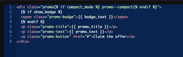
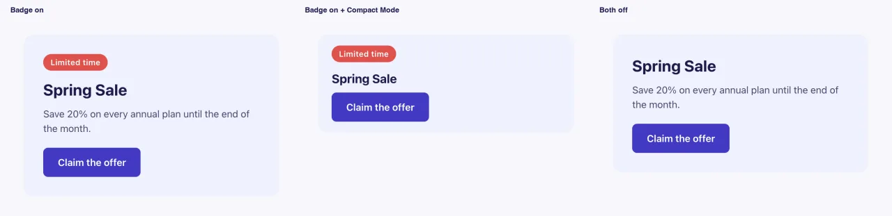
With the badge off, the whole span is gone from the page, not just hidden. The compact class switches a few rules in the CSS panel:
.promo--compact { padding: 18px 22px; }
.promo--compact .promo-title { font-size: 20px; }
.promo--compact .promo-text { display: none; }
You can compare the value too, as in {% if show_badge == 'yes' %}, but compare against the Return Value, not the Label On text. {% if show_badge == 'Yes' %} never matches. The plain {% if show_badge %} form avoids the problem.
Leave the Selector box empty for this field. A toggle value isn’t a CSS value, so styling belongs in the CSS panel behind a class like the one above.
Hide other fields until the toggle is on #
This is the second half of what a Switcher is for. On the field you want to hide, open its settings, scroll to Conditions and click Add Condition. For the Badge Text field:
- Control Name:
show_badge, the name of the Switcher. - Equality: Equal.
- Control Value:
yes, the Switcher’s Return Value.
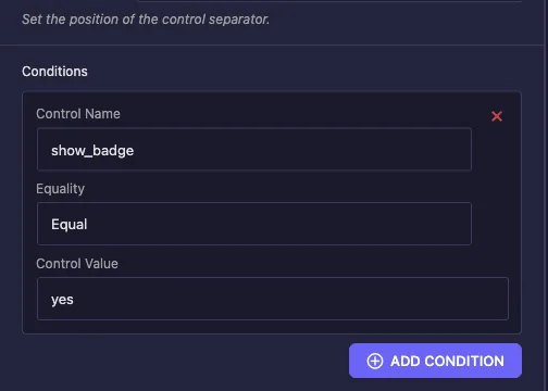
Badge Text now appears in Elementor only while Show Badge is on. See Conditions for the other operators.
Use the Switcher control in Elementor #
Add the widget to a page, or reload the editor if the page was already open. The toggle sits under your label with your Label On or Label Off word inside it. Click it and the preview updates right away, and any field with a condition on it appears or disappears at the same time.
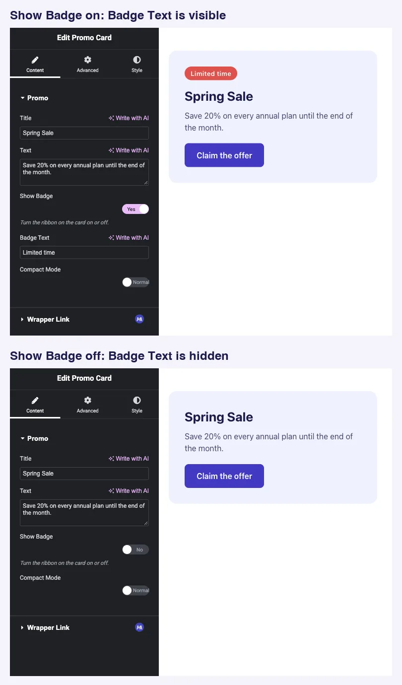
Here is the finished card on the front end with the badge on, with compact mode on as well, and with both switchers off:
Common use cases #
- Optional badges, ribbons and icons.
- A compact or dense layout variant.
- Show or hide a secondary button, a footer note or a divider.
- A master switch that reveals a group of related fields in the panel.
Tips for working with the Switcher field #
- Leave Return Value at
yes. It keeps the toggle, the default and your conditions in step. - Name the field after what it shows, such as
show_badgeorcompact_mode. The name reads like a question in{% if %}. - Write Label On and Label Off for the option, not just Yes and No, when the two states have names.
- Pair it with Conditions so the fields an option needs only show up when it’s on.
- More than two states? Use the Select field for a dropdown or the Choose field for icon buttons.
Frequently Asked Questions #
Is the Switcher field available in the free version?
Yes. Switcher is one of the fields you can use in the free version’s Widget Builder. The full set of Widget Builder fields comes with Master Addons Pro.
What value does a Switcher print?
The Return Value (yes by default) while the toggle is on, and nothing while it’s off. That makes {% if my_toggle %} the natural check.
How do I make a widget start with the toggle on?
Set Default Value to Yes and leave Return Value at yes. A custom Return Value with Default Value Yes leaves the panel and the page out of step until an editor clicks the toggle.
How do I show another field only when the toggle is on?
Add a condition on that field with Control Name set to the Switcher’s name, Equality Equal and Control Value yes.
Why doesn’t my {% if my_toggle == ‘Yes’ %} check work?
It compares against the Label On text. Compare against the Return Value instead, as in {% if my_toggle == 'yes' %}, or drop the comparison and use {% if my_toggle %}.
Wrapping up #
Add a Switcher, give it a clear name and labels, leave Return Value at yes, and wrap the optional part of your markup in {% if %}. Add a condition to the fields that option needs and the panel stays short until an editor turns it on. For three or more states, see the Select and Choose fields, and check pricing for what each plan includes.


