

Letting an editor recolor a widget without opening the CSS is one of the most useful things a custom widget can do. The Color field in the Master Addons Widget Builder drops Elementor’s color picker into your widget panel, complete with global colors and an optional alpha channel. You name the field, pick where it lives, and its shortcode feeds straight into your CSS.
Like every Widget Builder field, the Color field supports Conditions for panel visibility. Its token is rendered by the Twig-syntax template engine, which is what lets you print the picked color anywhere in your CSS. Both guides cover setup and limitations.
This is a style control, so in the demo it goes under the Style tab. The field works the same no matter which tab you put it in, though. Where it lives is your call, and it comes down to how you want to organize your custom widget’s controls.
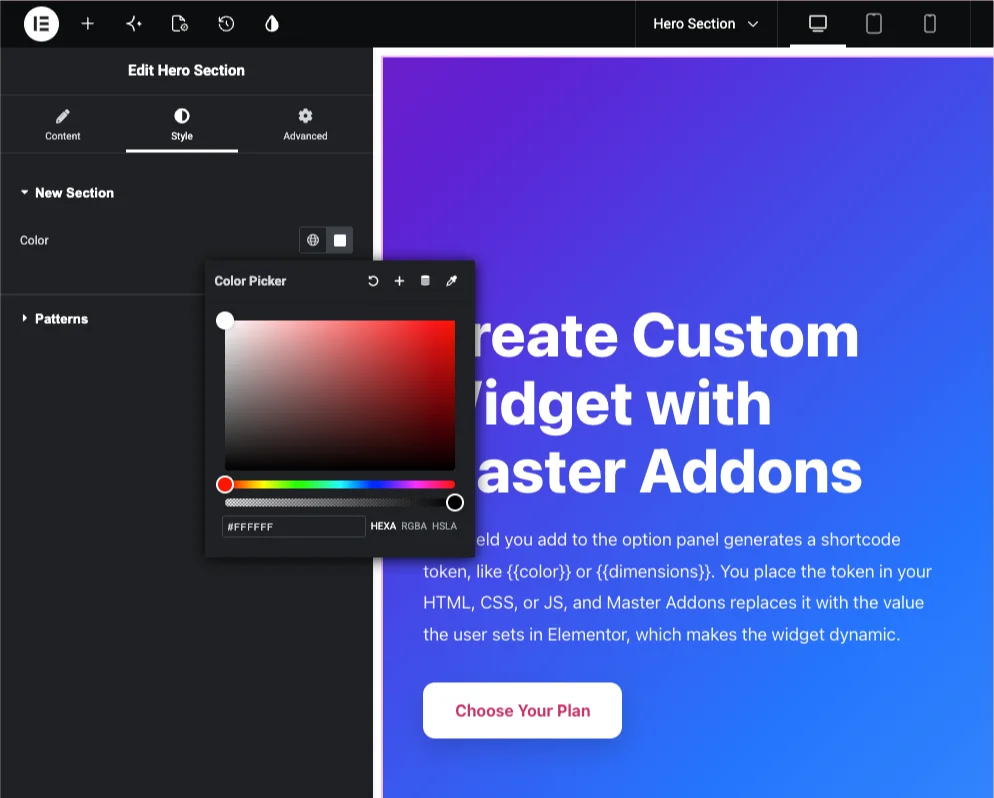
What the Color field does #
The Color field renders Elementor’s native color picker in your widget’s option panel. Editors click the swatch, choose a color (or a global color from the theme), and your widget outputs that value wherever you placed the matching shortcode. Most of the time that means a CSS property like color, background, or border-color.
Because it uses Elementor’s own picker, editors get the controls they already know: the swatch, the eyedropper, recent colors, and the global colors palette. Turn on the alpha channel and they can set transparency too.
Before you start #
- WordPress with Elementor installed and active.
- Master Addons for Elementor installed and active. New to the plugin? See the installation guide.
- A custom widget open in the Widget Builder editor. First one? Start with the Widget Builder overview.
How to add a Color field #
In the Widget Builder editor, find the fields panel on the left and drag the Color field into a section. Since color is a styling choice, the Style tab is the natural home, but the Content and Advanced tabs accept it just as well. Once the field is in place, its options open on the left and its shortcode appears in the Documentation sidebar next to the code editor.
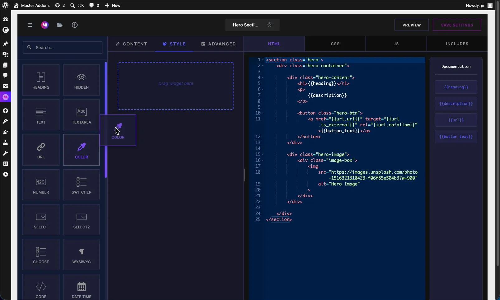
Color field options explained #
Select the Color field to open its settings. Most options match the other fields, plus one that is specific to color.
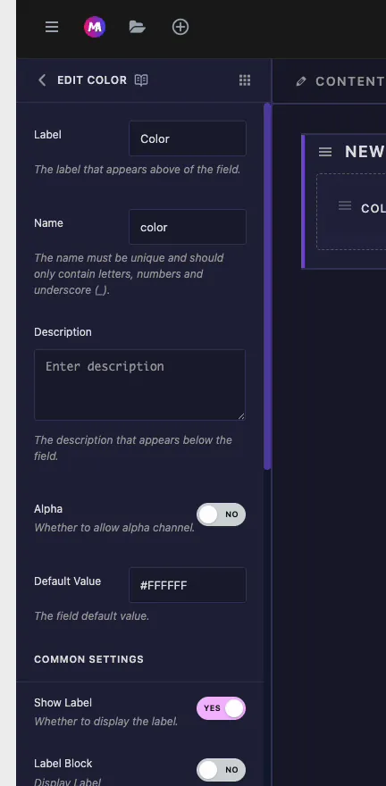
- Label: the text shown above the picker in Elementor, for example “Text Color”.
- Name: the unique identifier for the field. Letters, numbers, and underscores only. This becomes your shortcode, so a field named
colorgives you{{color}}. - Description: optional helper text shown below the control.
- Alpha: turn this on to allow transparency in the picker. With it off, editors can only choose solid colors. Enable it when you need rgba values, like a semi-transparent overlay.
- Default Value: the starting color as a hex value, such as
#FFFFFF. Set this so the widget looks finished before anyone touches it.
Common settings: responsive, dynamic, and more #
Below Default Value you get the same Common Settings as every field in the builder: Show Label, Label Block, Responsive Control, Dynamic Support, Frontend Available, Separator, and Conditions. Responsive Control is handy here if you want a different color per device. The Text field documentation covers each of these in detail.
Connect the field to your code #
A Color field named color produces the token {{color}} in the Documentation sidebar. Drop it into your CSS as the value of any color property. For example, to color the hero text:
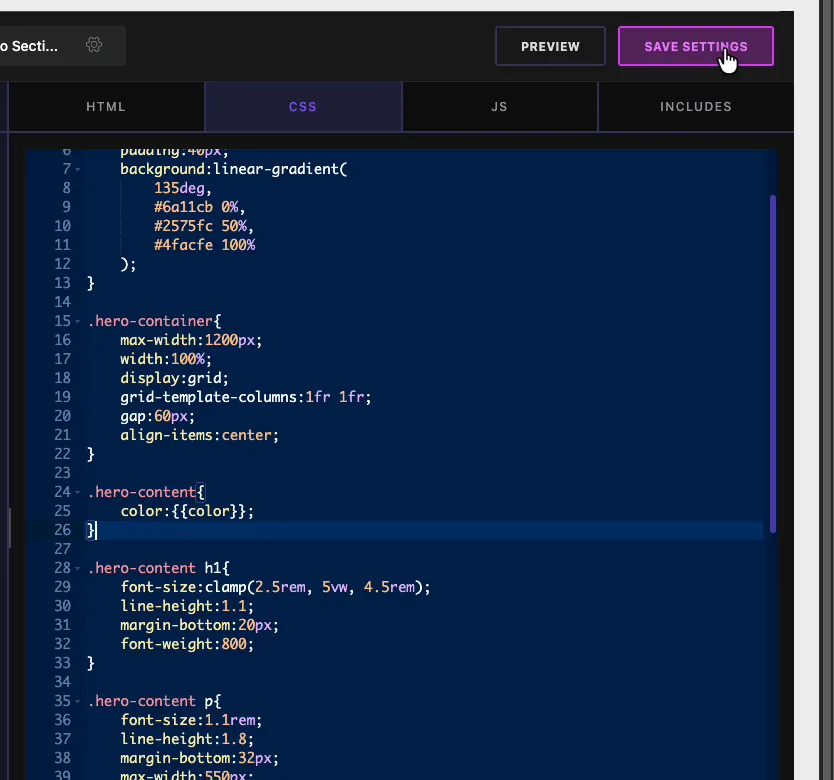
In the CSS editor you would write something like .hero-content { color: {{color}}; }. When the editor picks a color in Elementor, Master Addons swaps the token for that value and the text recolors live. The same token works for background, border-color, or anything that takes a color, and you can reuse it in as many rules as you need. One thing to watch: keep the token as the whole value, so color: {{color}};, not wrapped in quotes, or the CSS will not apply.
Use the Color control in Elementor #
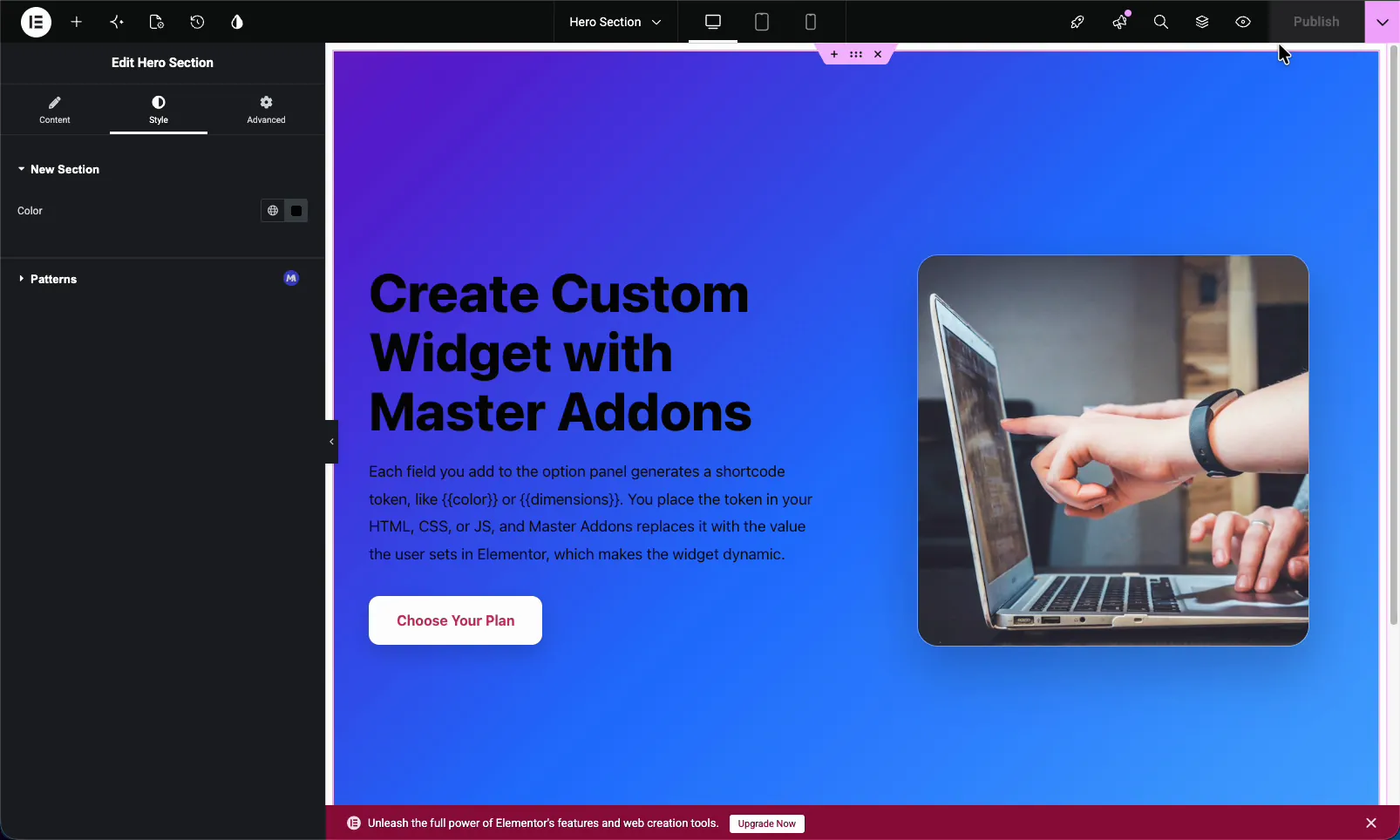
Drag your custom widget onto a page and open it in the Elementor editor. Under the tab where you placed the field, the Color control shows up as the standard swatch with the global colors button next to it. Click it, pick a color, and the widget updates on the canvas.
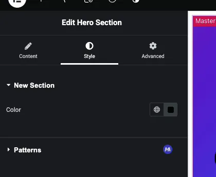
Editors can choose a one-off color or click the globe icon to pull from the site’s global colors, which keeps custom widgets on brand. If you turned on Dynamic Support, the dynamic tags icon appears here too.
Common use cases #
- Text color for headings and paragraphs.
- Background color for sections, cards, and buttons.
- Border and accent colors tied to a brand palette.
- Overlay tints using the alpha channel for transparency.
- Hover states when paired with a second Color field.
Tips for working with the Color field #
- Place it wherever fits your widget. Style is the convention, but the field works under any tab, so organize controls the way that makes sense to you.
- Turn on Alpha only when you need transparency. For solid brand colors, leaving it off keeps the picker simpler.
- Set a sensible Default Value. A good default means the widget looks right the moment it is dropped on a page.
- Lean on global colors. Encourage editors to pick from the global palette so widgets stay consistent across the site.
- Build the field before referencing its shortcode. The token exists only after the field is on the panel.
Frequently Asked Questions #
What is the Color field in the Master Addons Widget Builder?
The Color field adds Elementor’s color picker to a custom widget. You name the field, place its shortcode in your CSS, and whatever color the editor selects in Elementor is applied to your widget. It supports global colors and an optional alpha channel.
How do I use the {{color}} shortcode in my custom widget?
Add a Color field named color, then in the CSS editor use the token as a property value, like .hero-content { color: {{color}}; }. Master Addons replaces the token with the chosen color, so the widget recolors based on the editor’s pick.
Does the Color field support transparency?
Yes. Turn on the Alpha option in the field’s settings and the Elementor picker lets editors set transparency, producing rgba values. With Alpha off, the picker only allows solid colors. Use it for overlays or semi-transparent backgrounds.
Can I place the Color field outside the Style tab?
Yes. The Color field works under the Content, Style, or Advanced tab. Style is the usual choice for a styling control, but where you put it is up to how you want to organize your custom widget’s options.
Can the Color field use the site’s global colors?
Yes. Because it uses Elementor’s native picker, editors can click the global colors button and pick from the theme palette. Choosing global colors keeps custom widgets consistent with the rest of the site’s branding.
Wrapping up #
The Widget Builder Color field turns a hard-coded color into an editable picker inside your own custom widget. Name it, choose whether to allow alpha, set a default, and wire {{color}} into your CSS. After that, anyone can recolor the widget from Elementor, with global colors and transparency on tap. Have a look at the rest of the Master Addons widgets and extensions, and check the pricing page for what each plan includes.


