

The Icons field adds Elementor’s icon picker to a custom widget built with the Master Addons Widget Builder. Editors choose an icon from the Icon Library or upload their own SVG, and your template prints it. Use it for feature lists, info boxes, buttons, social links and anywhere else a small symbol helps.
Icons is a Pro field. The free plugin includes a limited Widget Builder, and the full set of fields comes with Master Addons Pro.

What the Icons field does #
- It adds an icon box to your widget’s panel in Elementor, with buttons for the Icon Library and for uploading an SVG.
- The Icon Library includes Font Awesome and the extra icon sets that come with Master Addons, such as Elementor Icons, Simple Line Icons, Linear Icons and Material Icons.
- The field stores two things:
value(the icon’s CSS class, or the SVG file for an upload) andlibrary(which set it came from). - Your template prints an
<i>tag for library icons and an<img>tag for uploaded SVGs.
If you haven’t built a widget yet, read the Widget Builder overview first.
Before you start #
- WordPress with Elementor installed and active.
- Master Addons for Elementor and Master Addons Pro, both active. The installation guide covers setup.
- A widget open in the Widget Builder. The example in this guide is a “Feature List” widget: an Icons field named
feature_iconand a Text field for the title.
How to add an Icons field #
- Go to Master Addons > Widget Builder and open your widget.
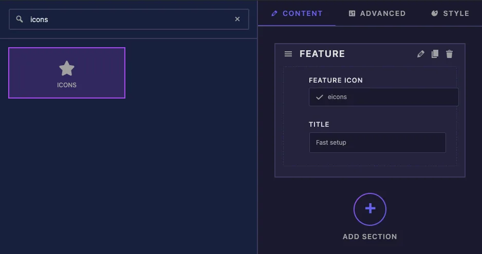
- On the Content tab, add a section, for example “Feature”.
- Type
iconsin the field search box on the left. - Drag Icons into the section. Its settings open in the left sidebar.
Icons field options explained #
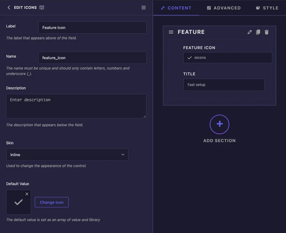
- Label is the text above the icon box in Elementor, for example “Feature Icon”.
- Name is the field’s unique ID and the start of its tokens, so
feature_icongives{{ feature_icon.value }}. Letters, numbers and underscores only. - Description appears under the control in Elementor.
- Skin offers Inline and Media. It changes how the builder’s own preview draws the field. In our tests Elementor showed the large icon box either way.
- Default Value is the icon a new copy of the widget starts with. Click Change Icon to pick one, or the small cross to clear it. With no default set, the field starts with the Elementor logo icon.
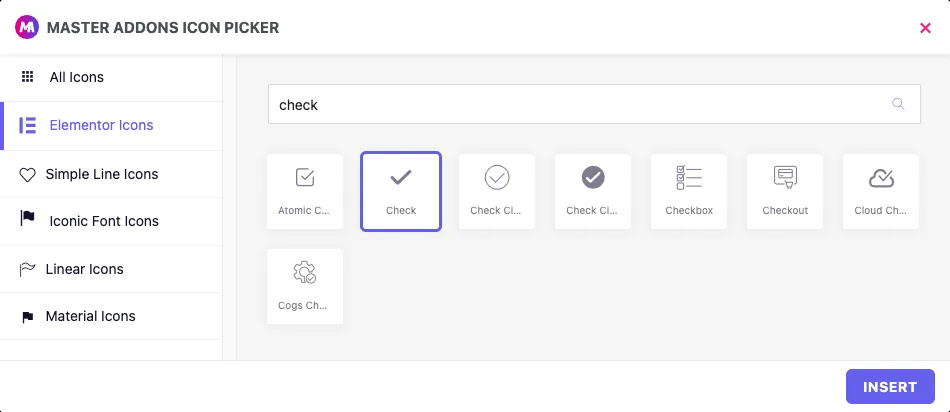
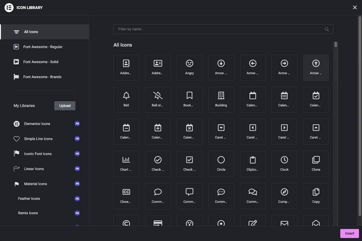
Change Icon opens the Master Addons Icon Picker. Pick a set on the left, search by name, click an icon and then Insert.
Print the icon in your template #
{{ feature_icon }} on its own prints nothing, because the field holds two values. Use its parts instead:
{{ feature_icon.value }}is the icon class for a library icon, such aseicon eicon-check. For an uploaded SVG it prints the file’s URL.{{ feature_icon.library }}is the set name, such aseicons,simple-line-iconsorsvgfor an upload.{{ feature_icon.value.url }}is the SVG’s URL when the library issvg.
Editors can pick either kind, so check the library and print the right tag. Wrap it all in a check for an empty value so nothing prints when the icon is removed:
{% if feature_icon.value %}
  <span class="feature-icon">
    {% if feature_icon.library == 'svg' %}
      <img src="{{ feature_icon.value.url }}" alt="">
    {% else %}
      <i class="{{ feature_icon.value }}" aria-hidden="true"></i>
    {% endif %}
  </span>
{% endif %}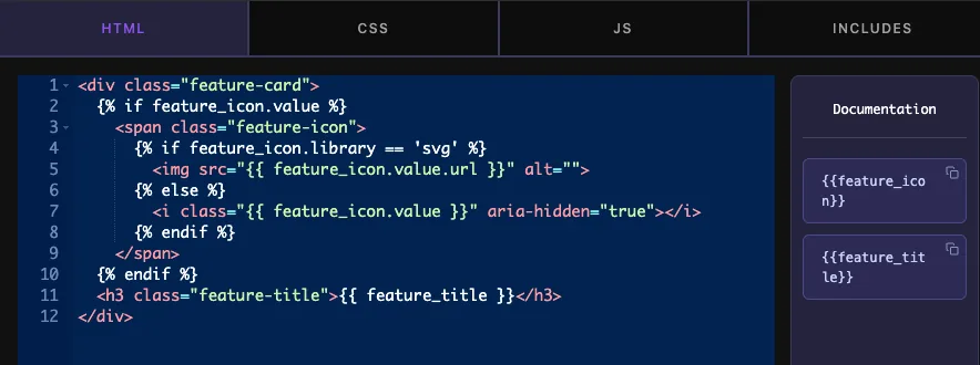
Library icons are font glyphs, so they take the color and font-size of the element around them. An uploaded SVG in an <img> tag keeps its own colors, so size it with width and height in the CSS tab.
Click Save Settings when you’re done.
Use the Icons control in Elementor #
Add the widget to a page, or reload the editor if the page was already open. The icon box shows the current icon. Hover over it to see Icon Library and Upload SVG, and a trash icon to remove the icon.
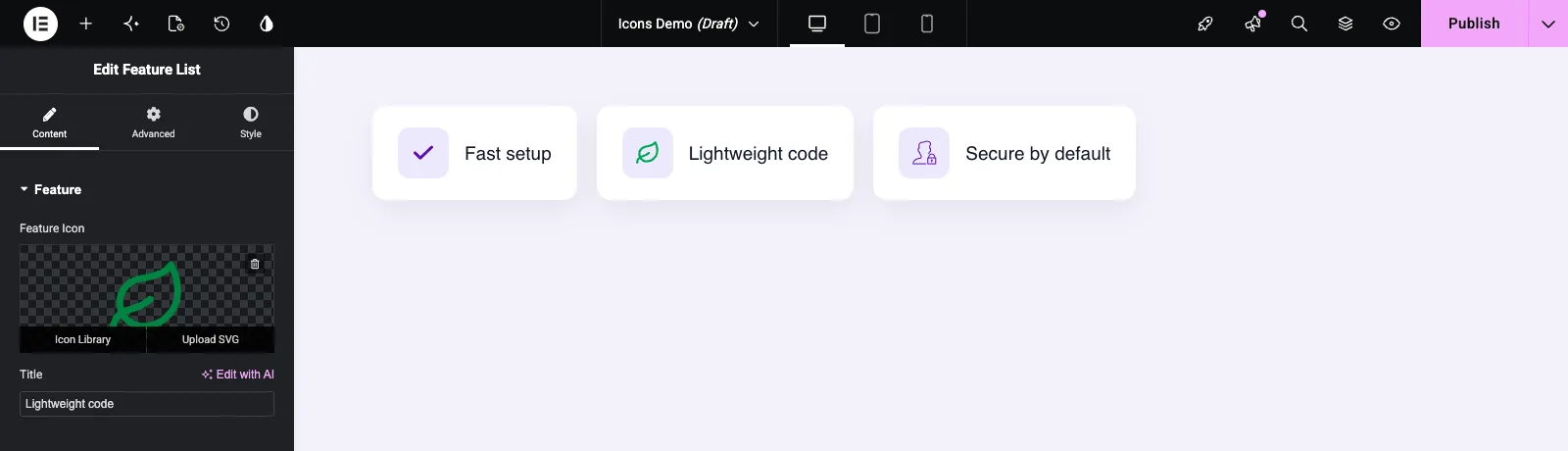
Icon Library opens Elementor’s icon window. Choose a set on the left, filter by name, click an icon and click Insert. Upload SVG opens the Media Library so you can upload or pick an SVG file. Elementor may ask you to allow SVG uploads the first time.
Font Awesome icons and Inline Font Icons #
On our test site, Elementor Icons, Simple Line Icons and uploaded SVGs all showed on the published page, but a Font Awesome icon did not. Elementor’s Inline Font Icons feature is on by default, and it stops the Font Awesome stylesheet from loading, so the <i> tag from the widget stays blank. Go to Elementor > Settings > Features, set Inline Font Icons to Inactive and save. The Font Awesome icon then appeared. If you’d rather keep that feature on, use the other icon sets or an SVG upload.
Common use cases #
- Feature lists and info boxes with an icon beside each heading.
- Buttons with a leading or trailing icon.
- Social links, contact details and list bullets.
- Brand marks, by uploading the logo as an SVG.
Tips for working with the Icons field #
- Always handle both cases in the template:
<i>for library icons and<img>for SVG uploads. - Guard with
{% if feature_icon.value %}so an empty icon doesn’t leave an empty wrapper behind. - Set a Default Value that suits the widget, so it never shows the Elementor logo by accident.
- Style the wrapper, not the icon tag, so both icon types sit in the same box.
- Check a Font Awesome pick on the live page before you rely on it (see the section above).
- For images rather than icons, use the Media field.
Frequently Asked Questions #
Is the Icons field free?
No. Icons is one of the Pro fields in the Widget Builder, so Master Addons Pro has to be active before you can add it to a widget.
Why does {{ feature_icon }} print nothing?
The field holds a value and a library, so the token on its own has nothing to print. Use {{ feature_icon.value }} for the icon class, and {{ feature_icon.value.url }} for an uploaded SVG.
Why is my Font Awesome icon blank on the page?
Elementor’s Inline Font Icons feature is probably on, which stops the Font Awesome stylesheet from loading. Set it to Inactive in Elementor, Settings, Features, or pick an icon from another set.
Can editors upload their own SVG icons?
Yes. Hover over the icon box in Elementor and click Upload SVG. Your template needs the {% if feature_icon.library == 'svg' %} branch to print it as an image.
Can I change the color of an uploaded SVG with CSS?
Not when it’s printed in an <img> tag, which keeps the file’s own colors. Library icons follow the color of the element around them.
Wrapping up #
Add the Icons field, set a default icon, and print it with a template that handles both library icons and SVG uploads. Check Font Awesome picks on the published page, and switch off Inline Font Icons if they come out blank. For other Content tab fields, see the URL and Choose fields, and check pricing for what each plan includes.


