

The Conditions option decides when a control appears in your widget’s Elementor panel. Instead of showing every field all the time, you can tie a control’s visibility to the value of another control: show the button URL only when the button toggle is on, or reveal an image field only when the layout dropdown says “With Image”.
Every field in the Master Addons Widget Builder carries this option, from a simple Text field to a full Typography group. Set it once per control and your panel stays short by default, with extra options appearing only when a choice makes them relevant. It is the same behavior you see in Elementor’s own widgets.
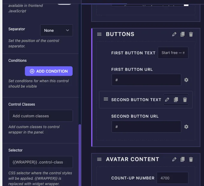
What the Conditions option does #
A condition is a small rule with three parts: which control to watch, how to compare it, and what value to compare against. When the rule passes, your control shows up in the panel. When it fails, the control stays hidden.
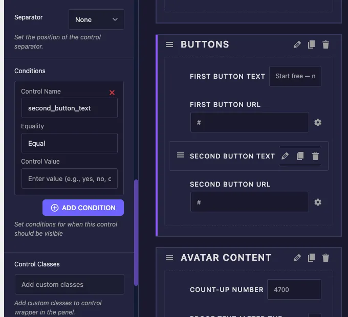
Each condition card has three settings:
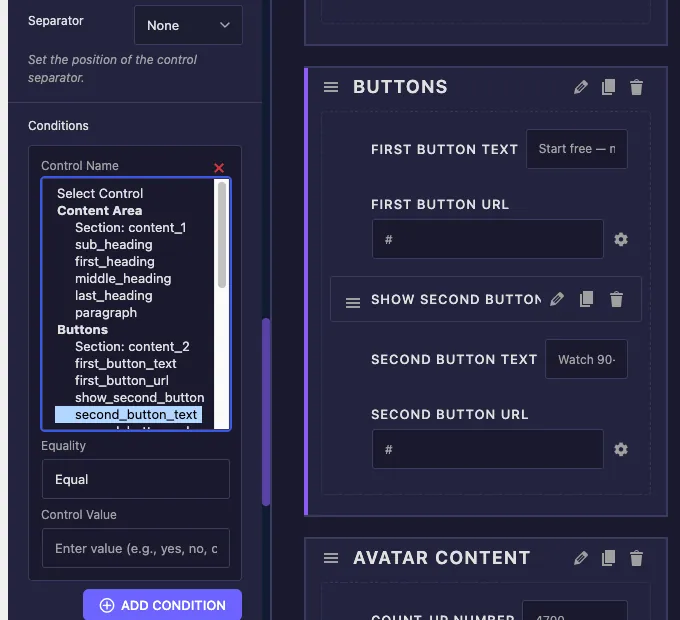
- Control Name: the field whose value you want to watch. This is a dropdown listing every control in your widget, grouped by section, so you pick the target instead of typing its name.
- Equality: how to compare. Equal shows the control when the watched field matches your value. Not Equal shows it when the field holds anything else.
- Control Value: the value to compare against, entered as plain text, for example
yes,no, or a select option value likelayout-2.
You can stack as many conditions as you need with the ADD CONDITION button. When a control has more than one condition, all of them must pass before the control appears. There is no limit on how many controls can watch the same field, so one switcher can reveal five related options at once.
Before you start #
- WordPress with Elementor installed and active.
- Master Addons Pro installed and active, since the full Widget Builder is a Pro feature. See the installation guide if you are setting up fresh.
- A custom widget open in the Widget Builder editor with at least two controls, one to watch and one to show or hide. New to the builder? Read the Widget Builder overview first.
Where to find the Conditions option #
Select any control in your widget’s option panel, in the Content, Style, or Advanced tab. The field’s settings open on the left. Scroll down past the main options like Label, Name, and Default Value, and you will find the Conditions box sitting just above Control Classes, with an ADD CONDITION button and the note “Set conditions for when this control should be visible”.
The box starts empty, which means the control is always visible. That is the default for every field.
How to add a condition #
The clearest way to see Conditions at work is the classic toggle pattern: a switcher that turns a second button on and off. Our example widget has a Buttons section with a Switcher field named show_second_button, plus second_button_text and second_button_url fields that should only appear when the switcher is on.
Step 1: Select the control you want to show or hide #
Click the second_button_text field in your widget’s option panel. Its settings open on the left. The condition always lives on the control being shown or hidden, not on the field being watched.
Step 2: Click ADD CONDITION #
Scroll to the Conditions box and click ADD CONDITION. A condition card appears with the three settings: Control Name, Equality, and Control Value. The red X in the corner removes the card if you change your mind.
Step 3: Pick the control to watch #
Open the Control Name dropdown. Every control in the widget is listed there, grouped under its section heading, so a bigger widget stays easy to navigate. Pick show_second_button. The dropdown pre-fills with the current field’s own name when the card is created, so make sure you switch it to the field you actually want to watch.
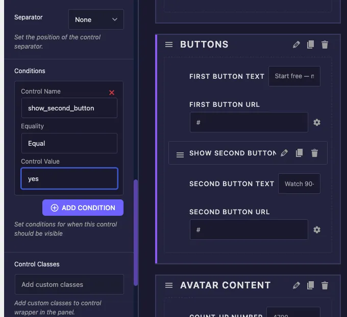
Step 4: Set the Equality and Control Value #
Leave Equality on Equal and type yes into Control Value, because a switcher stores yes when it is on and an empty value when it is off. The finished rule reads: show this control when show_second_button equals yes.
Step 5: Repeat and save #
Add the same condition to second_button_url, then click Save Settings. Both fields now follow the switcher together.
Test it in Elementor #
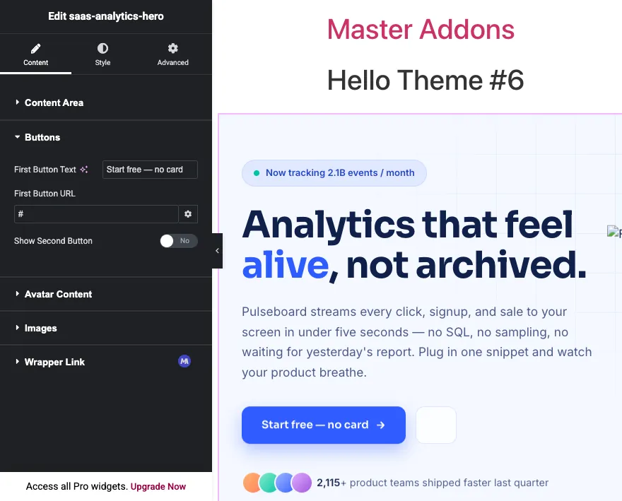
Add your widget to a page in Elementor, or reload the editor if the page was already open. With the switcher off, the Second Button Text and Second Button URL controls are nowhere in the panel. The section looks short and clean.
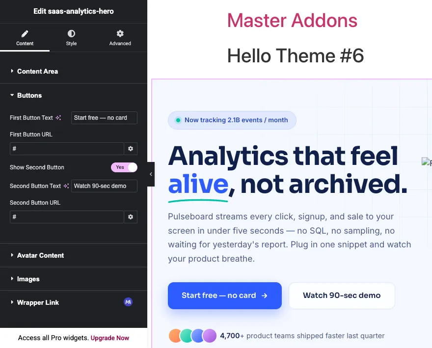
Flip the switcher on and both controls appear right below it. No page reload, no saving in between. Elementor checks conditions live as the user edits.
What value should you type in Control Value? #
The Control Value field takes the stored value of the watched control, which is not always the label you see in the panel. Nearly every “my condition doesn’t work” report comes down to this mismatch, so here is what each field type actually stores:
- Switcher: stores
yeswhen on. Use Equal +yesto show a control while the toggle is on, or Not Equal +yesto show it while the toggle is off. - Select and Select2: store the option value, not the option label. If your dropdown has an option labeled “Layout Two” with the value
layout-2, the condition must uselayout-2. - Choose: stores the key of the picked option, such as
left,center, orright. - Text and Textarea: store exactly what the user typed. Conditions on free text fields need an exact match, so they work best for checking whether a field equals a specific expected value.
- Number: stores the number itself, compared as a value, so
3matches an input of 3.
Dropdown-style controls make the most reliable condition sources because their values come from a fixed list. If you are designing a widget from scratch, drive your conditions from Switcher, Select, and Choose fields, and let text fields be the controls that get shown or hidden.
Using multiple conditions #
Click ADD CONDITION again to stack a second rule on the same control. Every condition in the list must pass at the same time for the control to show. Think of it as an AND chain: condition one AND condition two AND condition three.
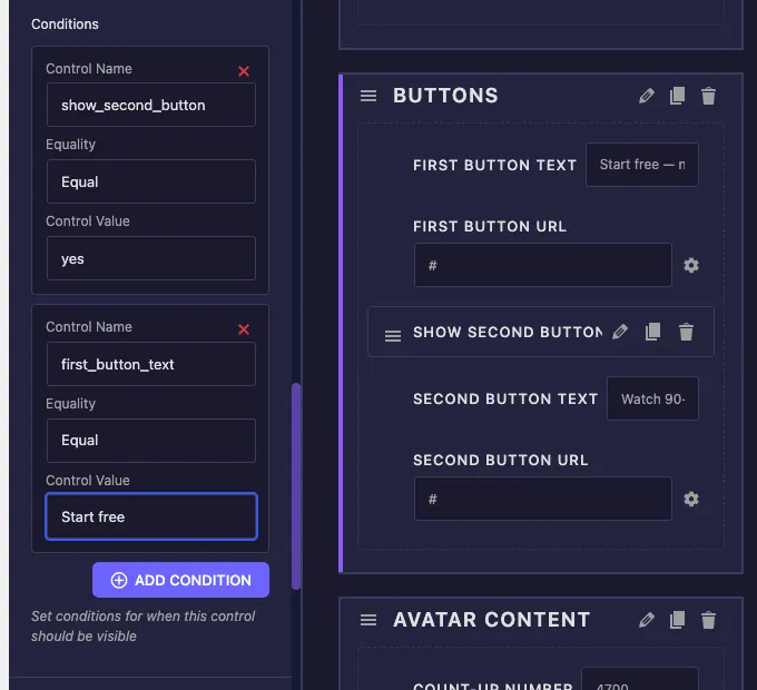
A practical example: a badge color field that should appear only when badges are enabled and the badge style is set to custom. Two cards handle it:
show_badgeEqualyesbadge_styleEqualcustom
There is no OR mode between cards. If you need “show when A or B”, flip the logic with Not Equal where possible, or restructure the source control so one dropdown value covers the case.
Conditions work across tabs #
The watched control does not have to live in the same section or even the same tab as the control you are hiding. A Style tab color field can depend on a Content tab switcher without any extra setup. The Widget Builder finds the control wherever it sits, in Content, Style, or Advanced, and wires the condition to the right place in the generated widget.
This is the pattern behind panels like the Border field, where width and color controls only appear once a border type is chosen. With Conditions, your own widgets get the same behavior: style options that only surface when the matching content feature is turned on.
Common use cases #
- Optional elements: a switcher for a second button, badge, or subtitle that reveals its text, link, and style fields only when enabled.
- Layout variants: a Select control for layout that shows an image field for image layouts and hides it for text-only ones.
- Style branching: a “Custom colors” toggle that unlocks a set of color pickers, keeping the Style tab short for everyone using defaults.
- Link behavior: URL and target options that appear only when “Make this clickable” is on.
- Tucked-away advanced settings: extra options hidden behind an “Enable advanced options” switcher so casual users never scroll past them.
Tips for working with Conditions #
- Set the source control’s Default Value deliberately. If the switcher defaults to off, every dependent control starts hidden when the widget is dropped on a page. Decide which first impression you want.
- Check the stored value, not the label. When a condition never triggers, the usual culprit is a Control Value that matches the option label instead of the option value.
- Change the source field’s Name before wiring conditions to it. Conditions reference the control by name, so renaming a field after several controls depend on it means revisiting those condition cards.
- Hidden still renders. Conditions control panel visibility. If the control’s token is printed in your HTML, the saved value still renders on the front end. Pair the condition with matching logic in your markup when the element itself should disappear.
- Group dependent fields in one section. When a switcher reveals three fields, keeping them together right below the switcher makes the cause and effect obvious to whoever edits the page.
Frequently Asked Questions #
What does the Conditions option do in the Master Addons Widget Builder?
Conditions show or hide a control in the Elementor panel based on another control’s value. Each rule names a control to watch, an Equal or Not Equal comparison, and a value to match. The control only appears when every rule on it passes.
Why is my condition not working?
Almost always the Control Value does not match the stored value. Switchers store yes when on, and Select fields store the option value rather than its label. Check the watched field’s option values in its settings and copy the exact value into the condition.
Can one control have multiple conditions?
Yes. Click ADD CONDITION as many times as you need. All conditions on a control must pass at once for it to appear, which works like an AND chain. To remove a rule, click the red X on its card.
Can a condition watch a control in a different tab?
Yes. A Style tab control can depend on a Content tab switcher, and the other way around. The Widget Builder locates the watched control across the Content, Style, and Advanced tabs automatically, so no extra configuration is needed.
Does hiding a control with a condition remove its output from the page?
No. Conditions only hide the control in the editing panel. If the field’s token is printed in your widget’s HTML, its saved value still renders. Structure your HTML so the hidden element depends on the same source field when it should vanish from the front end too.
Wrapping up #
Conditions turn a flat list of controls into a panel that reacts to its own settings. Pick the control to watch, choose Equal or Not Equal, type the value, and stack extra rules when one is not enough. Since every Widget Builder field supports the option, the same pattern covers toggled buttons, layout-dependent images, and unlockable style sections. Combine it with the Switcher and Select fields for reliable sources, browse the rest of the Master Addons widgets and extensions, and see the pricing page for what each plan includes.


