A single progress bar tells one story. A stacked set of them shows a whole skill set, a service lineup, or a project’s status without making the reader work for it. The Progress Bars widget in Master Addons for Elementor is built for that case. It groups several animated bars into one widget, so you add as many as you need and style them together or one at a time.
Think of it as the multi-bar companion to the standalone Progress Bar widget. Instead of dropping a separate widget for every metric, you manage the whole group from one panel. Each bar gets its own title, percentage, and color, while a shared Style tab controls the look of the set.
Prefer to watch first? This short tutorial walks through the widget end to end, from dragging it in to styling the bars:
What the Progress Bars widget does #
The widget renders a list of horizontal bars that animate from zero to their set value when they scroll into view. Every bar shows a title on the left, a percentage label, and a colored fill that grows to match the number you enter.
The difference from the single bar widget is structure. Here the bars live inside a repeater called Stats Bars, so you add, duplicate, reorder, and delete bars without touching the canvas. One widget, one set of style controls, and any number of bars.
Before you start #
- WordPress with Elementor installed and active.
- Master Addons for Elementor installed and active. New to the plugin? See the installation guide.
- A page open in the Elementor editor where the bars will go.
How to add the Progress Bars widget #
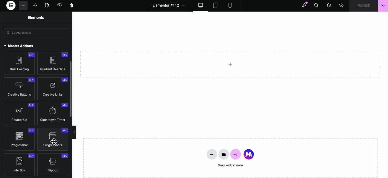
In the Elementor editor, open the Elements panel and search for Progress Bars, or scroll down to the Master Addons section. Watch the names here: there are two widgets that read almost the same. Progressbar is a single bar, and Progressbars is the group. Drag Progressbars onto your page.
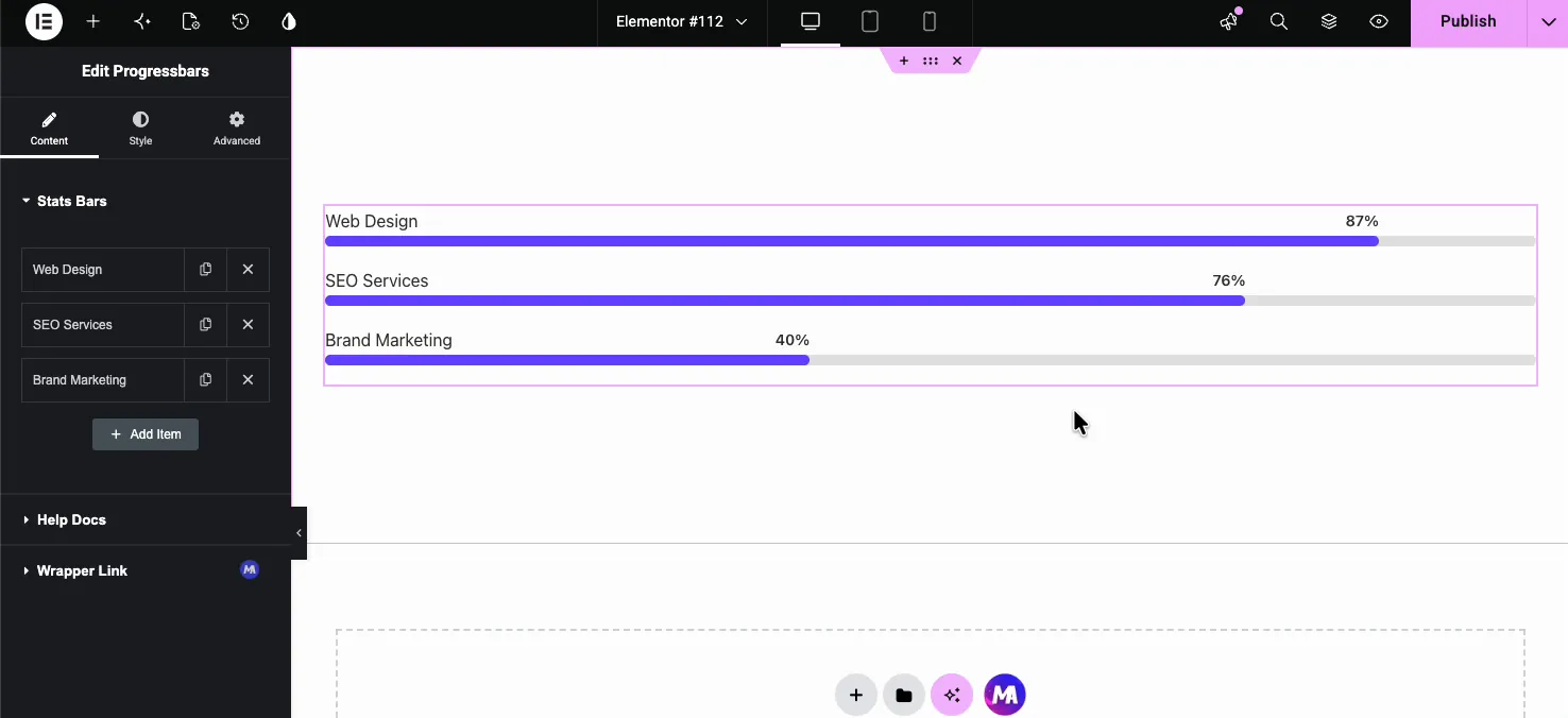
It drops in with three sample bars already filled out, so you see a working result right away and edit from there instead of starting blank.
Edit each bar in the Content tab #
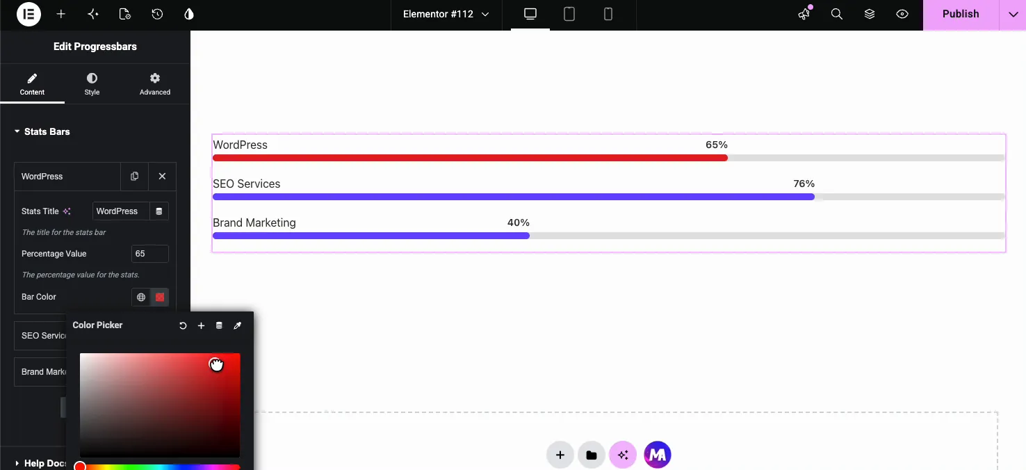
Open the Content tab and you will find the Stats Bars repeater. Each row is one bar. Click a row to expand it and you get three settings:
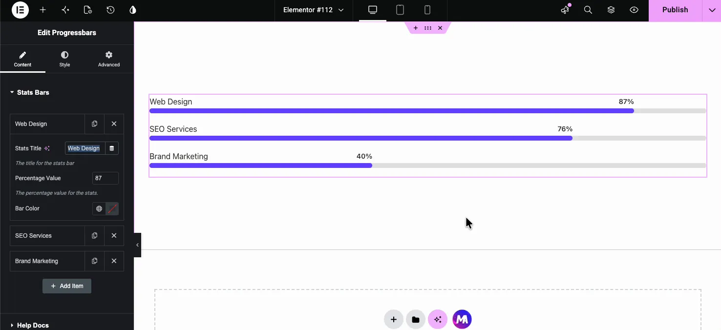
- Stats Title: the label shown above the bar, like “Web Design” or “WordPress”. This field takes Elementor dynamic tags, so you can pull the title from a post field, author meta, or another dynamic source using the tag icon.
- Percentage Value: a number from 1 to 100 that sets how far the bar fills and what the label reads. Enter
87and the bar fills to 87 percent. - Bar Color: an optional color for this one bar. Leave it empty to use the global Active Bar Color, or set it here to override the group color for a single bar.
Per-bar color is what makes the group flexible. Keep every bar on one brand color, or give each metric its own shade so they’re easy to tell apart at a glance.
Add unlimited bars #
To add another bar, click Add Item at the bottom of the repeater. A new bar appears with default values you can rename and set. There is no cap, so build out as many as the content needs. The copy icon on any row duplicates a bar with its settings intact, and the X icon removes one.
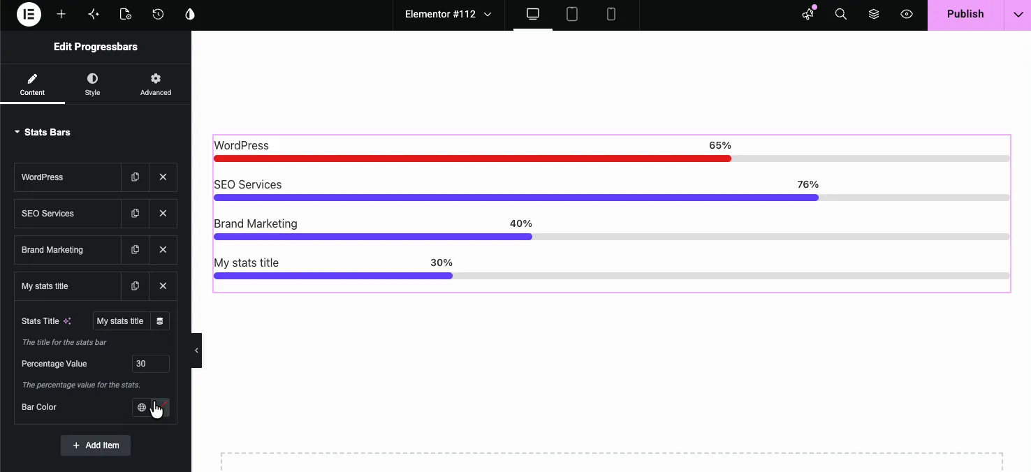
The Content tab also has a Help Docs link for quick reference and a Wrapper Link option from the free Wrapper Link extension that makes the whole widget clickable. That one comes in handy when the bars sit on a card that links somewhere.
Style every bar from the Style tab #
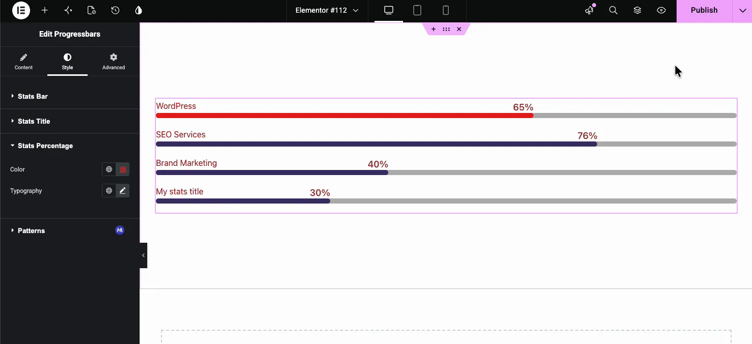
Switch to the Style tab to control how the whole group looks. These settings apply to every bar at once, which is exactly why the per-bar overrides in the Content tab are worth knowing about. The Style tab breaks into Stats Bar, Stats Title, Stats Percentage, and Patterns.
Stats Bar #
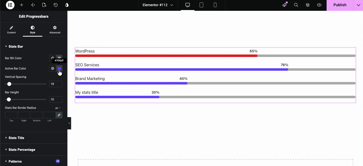
- Bar BG Color: the color of the empty track behind every fill.
- Active Bar Color: the default fill color for any bar that does not have its own Bar Color set in the Content tab.
- Vertical Spacing: the gap between stacked bars.
- Bar Height: how thick the bars are, in pixels.
- Stats Bar Border Radius: rounds the corners. Link the four values for an even radius, or set Top, Right, Bottom, and Left separately.
Stats Title #
This section styles the label above each bar.
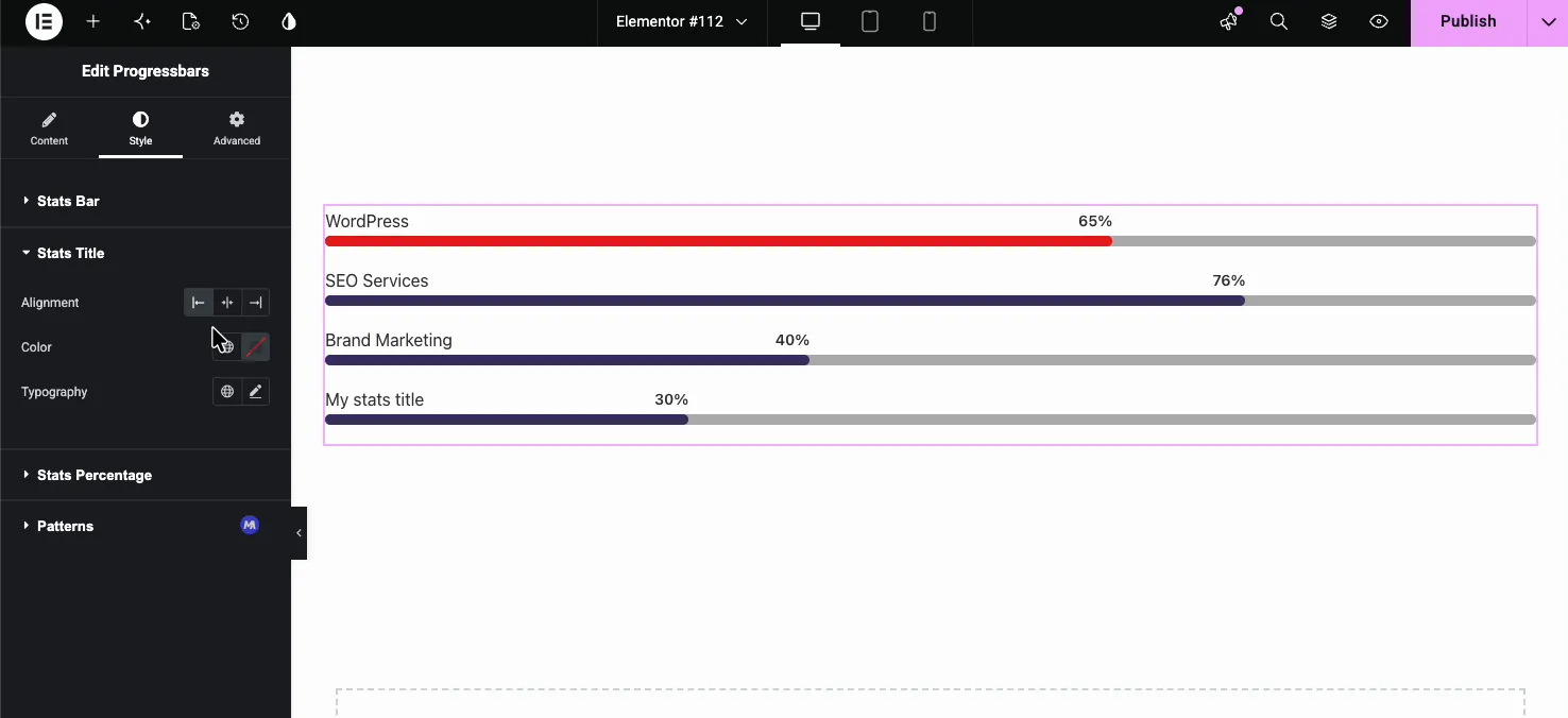
- Alignment: left, center, or right for the title text.
- Color: the title color.
- Typography: full control over font family, size, weight, transform, and the rest of Elementor’s type options.
Stats Percentage #
The percentage label gets its own Color and Typography controls, so you can make the number bold and large or keep it quiet. Below it sits the Patterns section. It comes from the free Patterns extension and adds a fixed-color background pattern behind the whole widget, not inside the bars.
The result on the page #
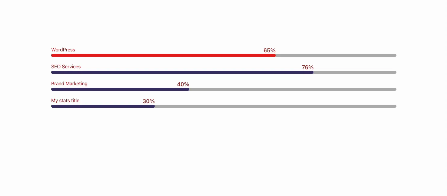
Publish or preview the page and the bars animate from zero up to their set values as the section enters the viewport. The styling carries through: custom bar colors, title color, percentage size, spacing, and height all show on the live page.
Common use cases #
- Skill bars on an about or resume page (design, development, marketing).
- Service strengths on an agency page, one bar per offering.
- Project or campaign status shown as completion percentages.
- Feature scores in a comparison block, paired with a comparison table.
- Stat highlights next to animated numbers from the Counter Up widget.
Tips for working with Progress Bars #
- Set group styling first, then override. Pick your Active Bar Color and Bar Height once, then add a per-bar color only where you want a bar to stand out.
- Keep percentages honest. The number is also the label, so a bar set to 76 reads “76%”. Match the fill to the real figure.
- Tune height and radius together. A taller bar with a matching radius reads as a rounded pill; a thin bar with a large radius can look clipped.
- Use dynamic titles in templates. When the bars sit in a post or archive template, wire the Stats Title to a dynamic tag so each entry labels itself.
- Duplicate instead of rebuilding. The copy icon clones a bar with its color and typography, which beats setting up a new item by hand.
Frequently Asked Questions #
What is the Progress Bars widget in Master Addons?
It is an Elementor widget that groups multiple animated progress bars into one element. You add bars through the Stats Bars repeater, give each a title, percentage, and optional color, and style the whole set from the Style tab. It is the multi-bar version of the single Progress Bar widget.
How is Progress Bars different from the single Progress Bar widget?
The single Progress Bar widget shows one bar per widget. The Progress Bars widget holds a repeater, so you add unlimited bars inside one widget and manage them together. Use the single one for a standalone metric and Progress Bars for a stacked set.
How many progress bars can I add?
There is no limit. Click Add Item in the Stats Bars repeater to add as many bars as you need. Each new bar starts with default values you can rename and adjust, and you can duplicate or delete bars at any time.
Can each progress bar have a different color?
Yes. Set the Active Bar Color in the Style tab as the group default, then open any bar in the Content tab and use its Bar Color field to override that one bar. Leave the field empty to keep a bar on the group color.
Do the progress bars animate?
Yes. Each bar fills from zero to its set percentage when the widget scrolls into view on the live page, at about 20 milliseconds per percentage point. There is no setting to change the speed.
Wrapping up #
The Progress Bars widget turns a stack of metrics into one tidy, animated block. Add bars in the Stats Bars repeater, set each title and percentage, color them individually or as a group, and shape the whole set from the Style tab. For a single standalone bar, reach for the Progress Bar widget instead. Browse the full Master Addons widgets and extensions to see what else you can build, and see the Progress Bars widget page for demos. The widget is free, with no Pro-only options.