

Building a data table in WordPress usually means fighting with HTML or pasting a shortcode you cannot style. The free Dynamic Table widget in Master Addons for Elementor lets you build one visually: add header columns, fill in rows, and style every part from the Elementor panel. No table markup, no plugin lock-in.
It suits anything that belongs in a grid, like employee directories, spec sheets, schedules, or price lists. You can merge cells, add icons to headers, stripe the rows, and switch on a responsive mode for phones. Below is a run through every setting, from the header cells to the styling tabs.
What the Dynamic Table widget does #
The widget builds a standard HTML table from two repeaters: one for the header row and one for the body cells. Each cell is its own item, so you control the text, alignment, and even column or row spans without writing any code.
It has three tabs: Content for the header, body, and settings, Style for colors and spacing, and Advanced for the usual Elementor options. The result is a clean, responsive table that matches your theme.
Before you start #
- WordPress with Elementor installed and active.
- Master Addons for Elementor installed and active. New to the plugin? See the installation guide.
- The data you want to show, sketched out as columns and rows.
How to add the Dynamic Table widget #
In the Elementor editor, open the Elements panel and search for Dynamic Table, or scroll to the Master Addons section. Drag it onto your page. It loads with a sample table so you edit from a working layout instead of an empty grid.
Set up the table header #
Open the Content tab. The Table Head section holds the header row. The Table Head toggle shows or hides the header, and the Table Header Cell repeater holds one item per column.
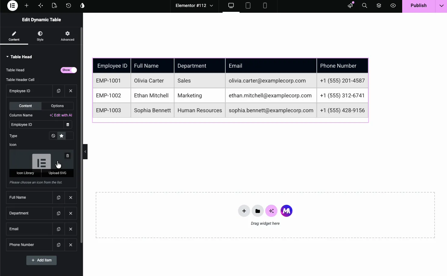
Each header cell has its own Content and Options sub-tabs. In Content you set the Column Name and can add an Icon or an Image next to it (Type: None, Icon or Image). Use Add Item to add columns, the copy icon to duplicate one, and the X to remove it.
Fill in the table body #
The Table Body section holds the cells. Each item is one cell, and a New Row? toggle marks where a new row begins, so you add cells in order and flag the start of each row.
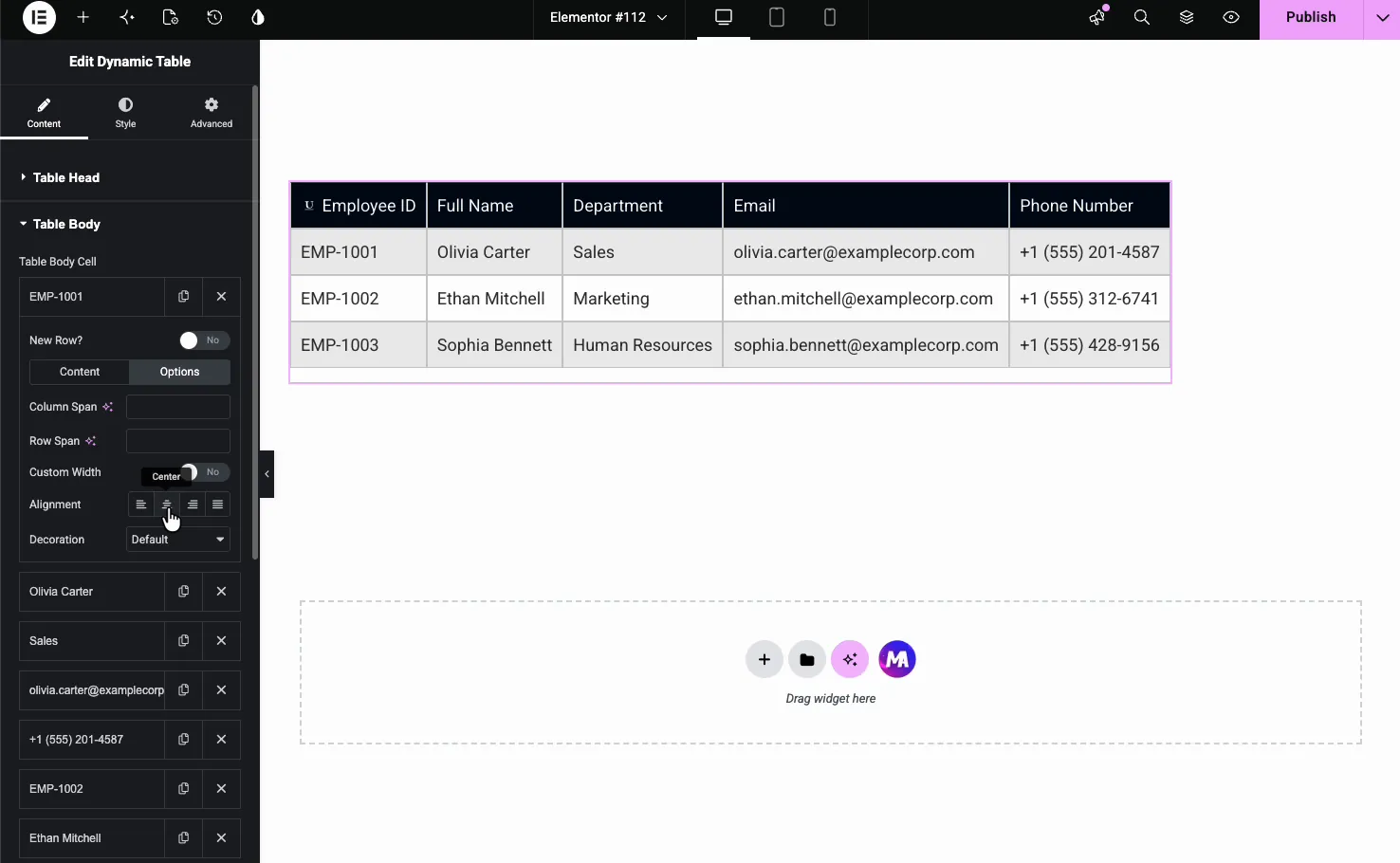
Each body cell also has Content and Options sub-tabs:
- Body Text: the cell content, which also accepts dynamic tags. Each tag fills one cell.
- Column Span and Row Span: merge a cell across columns or rows.
- Custom Width: set a fixed width for that column.
- Alignment: left, center, right, or justify within the cell.
- Decoration: underline, overline or line through for the cell text.
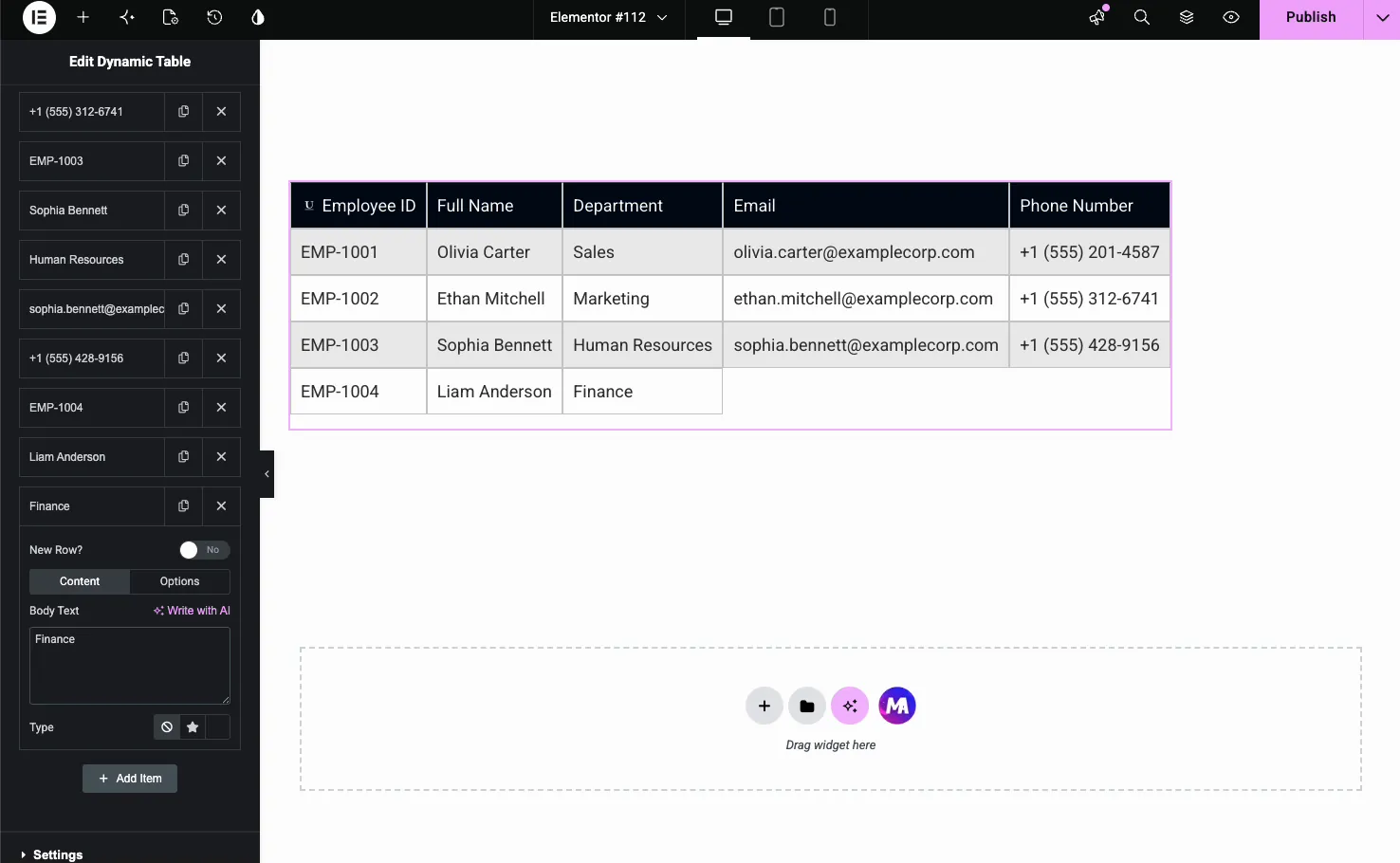
To grow the table, click Add Item, type the cell text, and turn on New Row? on the first cell of each new line. Here a fifth employee row is being added.
Make the table responsive #
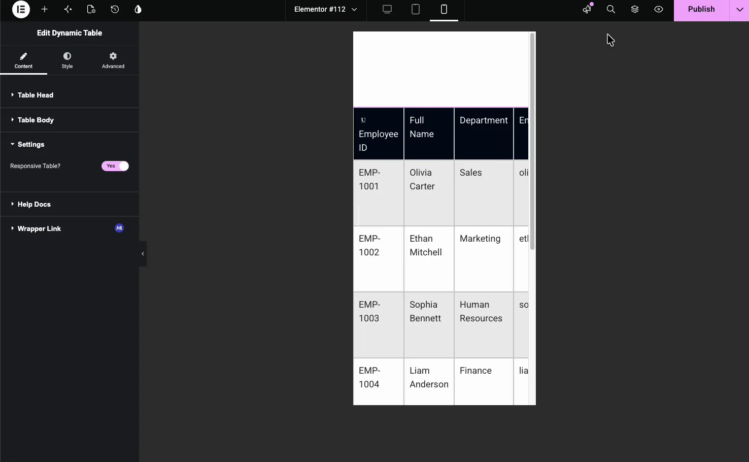
The Settings section has a Responsive Table? toggle. With it on, the table reflows on small screens instead of overflowing, so each row stacks into a readable card on devices up to 768px wide, with the column name shown as a label. This is the setting people forget, and it is why a table looks broken on mobile.
Style the table #
The Style tab is split into Global Style, Table Header Style, and Table Body, plus Patterns (a Pro option). The Global Style section sets the table-wide look.
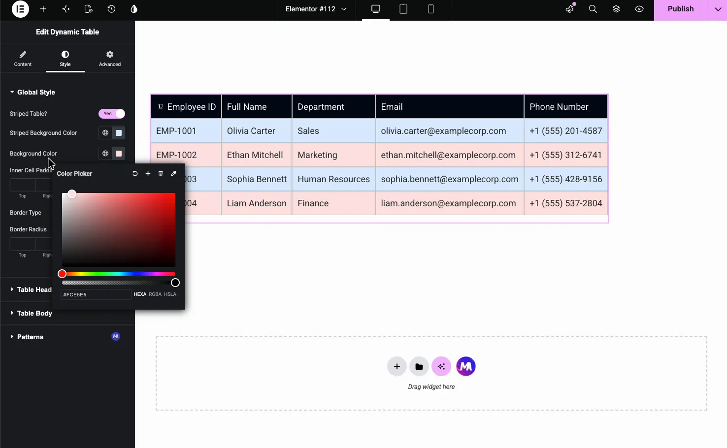
- Striped Table: turn on zebra striping and pick the striped row color.
- Background Color: the base color behind the cells.
- Inner Cell Padding: the space inside each cell.
- Border Type and Border Radius: the lines between cells and the rounded corners.
Header and body styling #
The Table Header Style section sets the header’s background, text color, typography, and padding so the top row stands apart. The Table Body section does the same for the data cells.
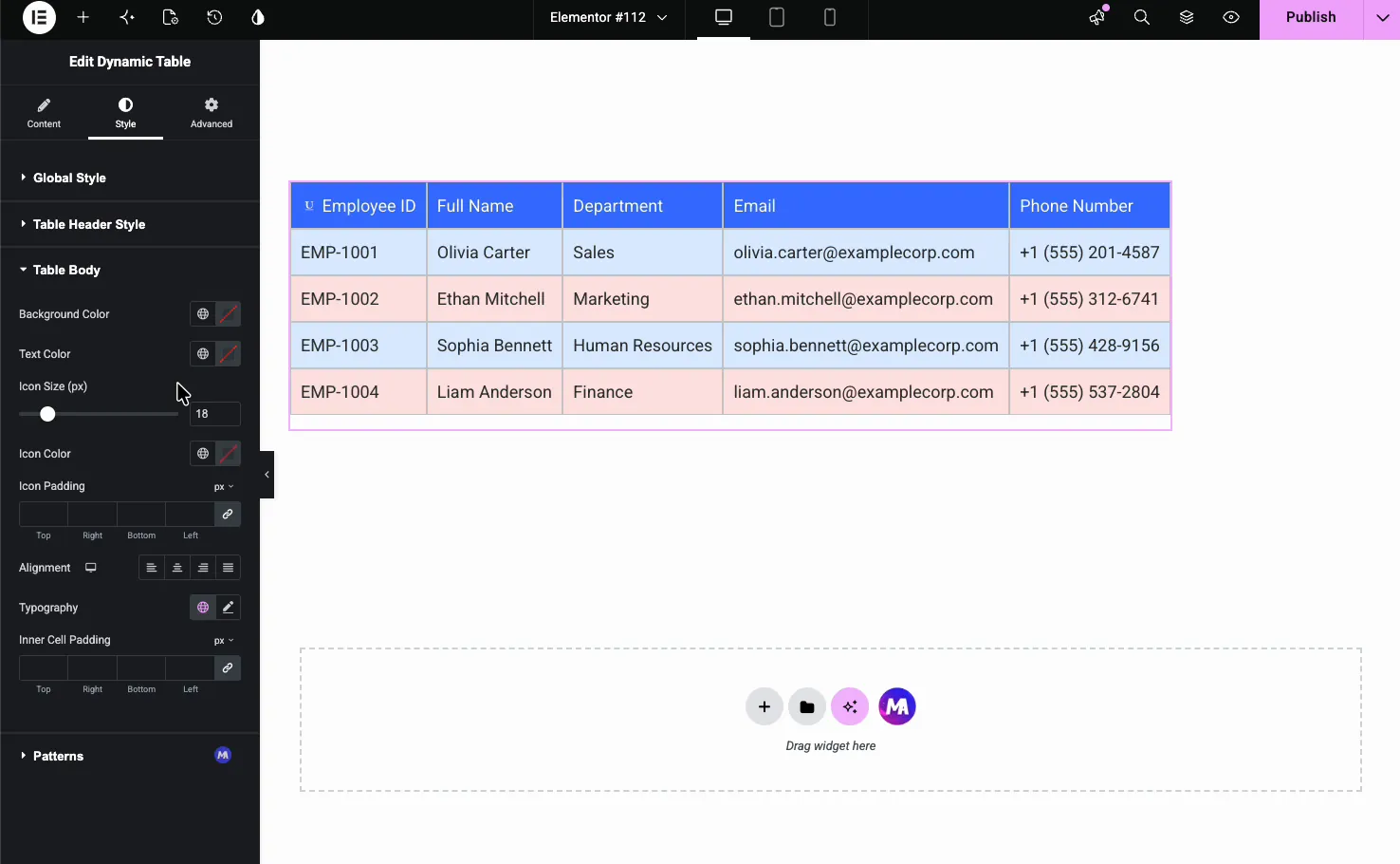
- Background Color and Text Color: the body cells’ colors.
- Icon Size, Icon Color, and Icon Padding: styling for any cell icons.
- Alignment and Typography: how the body text sits and looks.
The result on the page #
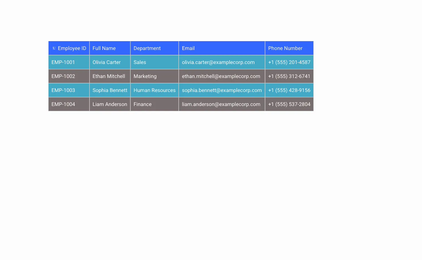
Publish or preview and the table renders with your columns, rows, and striping in place, responsive on mobile if you turned that on.
Common use cases #
- Employee or team directories with names, roles, and contact details.
- Spec sheets comparing product features and values.
- Schedules and timetables for classes, events, or office hours.
- Price lists that do not need a full pricing table.
- Data summaries pulled out of a spreadsheet into a styled grid.
Tips for working with the Dynamic Table widget #
- Plan columns first. Set every header cell before filling the body so the rows line up.
- Mark New Row on the first cell only. Flag the start of each row, not every cell, or the layout breaks.
- Turn on Responsive Table for phones. Wide tables overflow on mobile unless this is on.
- Use striping for long tables. Zebra rows make a tall data table much easier to scan.
- Keep cell text short. Long strings stretch a column, so use Custom Width to keep things even.
Frequently Asked Questions #
What is the Dynamic Table widget in Master Addons?
It is an Elementor widget that builds an HTML data table visually. You add header columns and body cells through repeaters, then style the colors, padding, borders, and striping from the panel. There is no HTML or shortcode involved, and the table can be made responsive.
Can I merge cells in the Dynamic Table?
Yes. Each body cell has Column Span and Row Span options in its Options sub-tab. Set a span to merge that cell across multiple columns or rows, which is useful for grouped headings or summary rows inside the table.
Is the Dynamic Table responsive on mobile?
Yes. The Settings section has a Responsive Table toggle. With it on, the table reflows on small screens so each row stacks into a readable block instead of overflowing the page, which keeps wide tables usable on phones.
Can I add striped rows to the table?
Yes. In the Style tab, the Global Style section has a Striped Table toggle and a Striped Background Color. Turn it on to add zebra striping, which alternates the row color and makes long tables much easier to read.
Can I add icons to the table headers?
Yes. Each header cell has a Type option with None, Icon or Image. Choose Icon to pick one from the icon library, or Image to upload a picture. The icon shows next to the column name, which helps label columns like email, phone, or location at a glance.
Can I sort, search or import a CSV into the Dynamic Table?
No. The widget has no sorting, search, pagination or CSV import. For those, use a data table plugin such as TablePress and place its shortcode on the page.
Wrapping up #
The Dynamic Table widget turns rows and columns of data into a clean, styled table without touching HTML. Set your headers, add the body cells, flag each new row, then style the colors, striping, and borders to match your page. For related data layouts, see the Comparison Table widget (Pro) and the Pricing Table widget, browse the full Master Addons widgets and extensions, and check the pricing page for what each plan includes.


