An FAQ section lives or dies by its accordion: questions stay compact, answers appear on click, and the page never feels long. The Advanced Accordion widget in Master Addons for Elementor builds that pattern with a twist most accordion widgets skip: each item can hold plain text or an entire saved Elementor template, so an answer can be a contact form, a pricing table, or even another accordion.
This guide walks through the widget on a real FAQ section, from the item list to the styled accordion on the live page.
What the Advanced Accordion widget does #
The widget renders a stack of collapsible items. Each row has a title, a content area, and a toggle icon that flips between expand and collapse states. The Accordion Type dropdown picks the behavior: Accordion keeps one item open at a time, closing the last one when a new one opens; Toggle lets visitors hold several items open at once.
Before you start #
- WordPress with Elementor installed and active.
- Master Addons for Elementor installed and active. New to the plugin? See the installation guide.
- The Advanced Accordion widget enabled in the Master Addons option panel, under Basic Widgets.
- Optional: a saved Elementor template if you want to load one inside an accordion item.
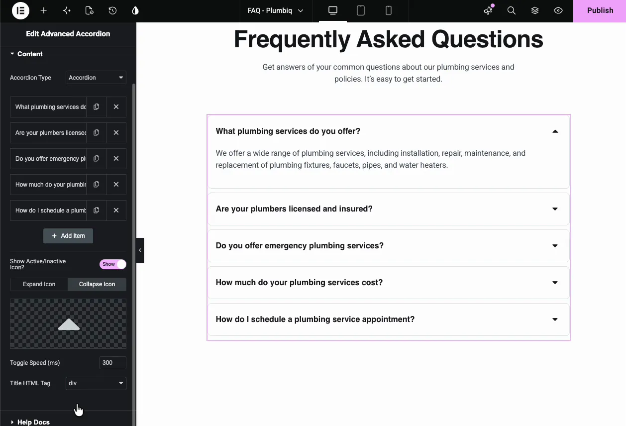
Add and manage accordion items #
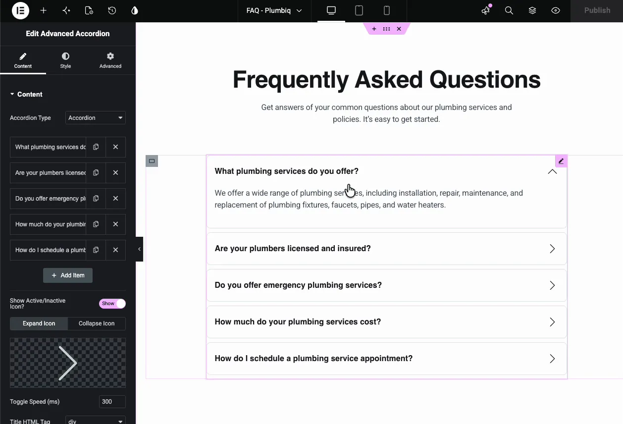
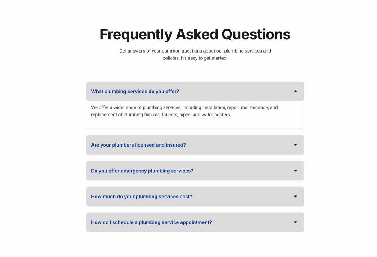
In the Content tab, the item list holds one entry per question. Click an item to expand its settings, duplicate or delete rows with the icons beside each one, and press Add Item to extend the list. The demo runs a five-question plumbing FAQ.
Below the list sit the shared controls:
- Show Active/Inactive Icon?: toggles the expand and collapse icons on the right of each title.
- Expand Icon and Collapse Icon: two tabs, one icon picker each. More on these below.
- Toggle Speed (ms): how fast items open and close, 300 milliseconds by default. That default feels snappy; past 600 the accordion starts to feel like it’s stalling.
- Title HTML Tag: the markup around each question, div by default. Pick H3 if the questions should feed the page’s heading structure.
Put text or a whole template inside an item #
Open a single item and the per-item controls appear: Active as Default starts the page with that item open, Enable Custom Icon gives it its own toggle icon, and Enable Background Color tints just that row.
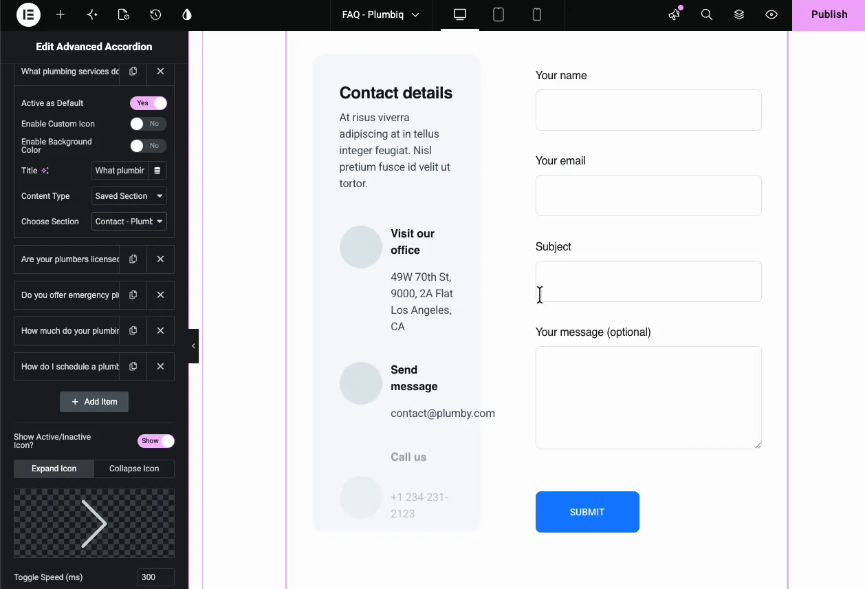
The one to remember is Content Type. Set it to text for a normal typed answer, or to Saved Section and pick any template from your Elementor library. The demo loads a contact section, complete with a working form, inside the first accordion item:
That is also how nested accordions work: save an accordion as a template, then load it inside an item of another accordion. Categories with sub-questions, course modules with lessons, that kind of structure. Two levels is the practical limit; deeper than that and visitors lose track of where they are.
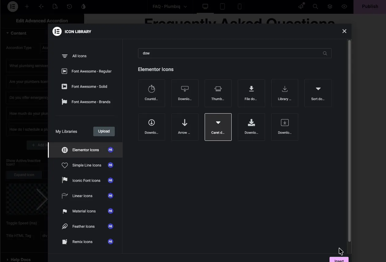
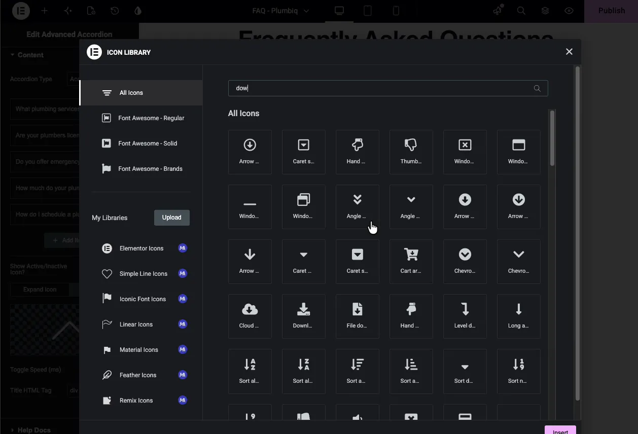
Set the expand and collapse icons #
The Expand Icon and Collapse Icon tabs each open the Elementor icon library. The expand icon shows on closed items, the collapse icon on the open one.
Matching pairs read best: caret down with caret up, plus with minus, chevron with chevron. The demo settles on carets.
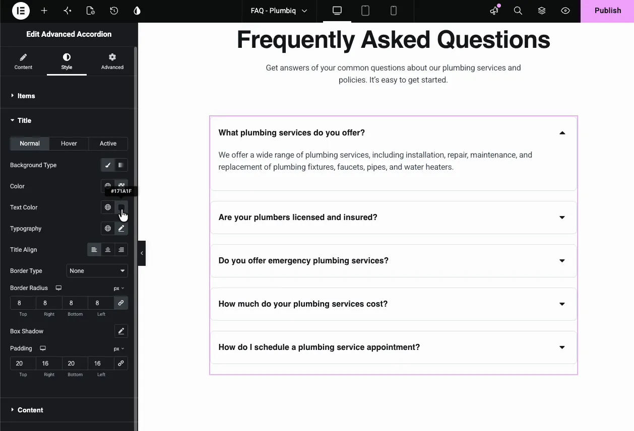
Style the titles #
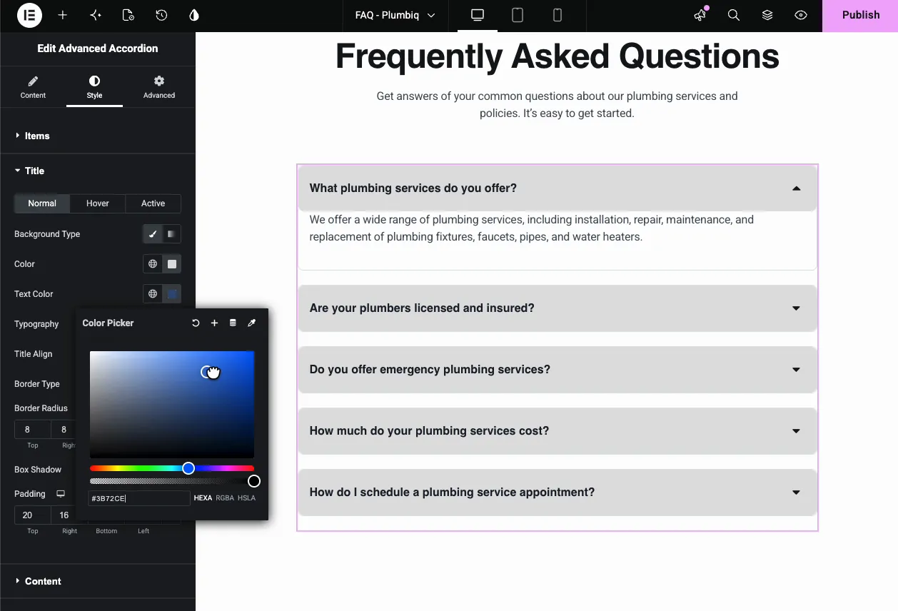
The Style tab breaks into Items, Title, Content, and Toggle Icons. The Title section carries Normal, Hover, and Active states, so the open question can look different from the rest.
- Background Type and Color: the title bar fill per state.
- Text Color and Typography: the question text.
- Title Align: left, center, or right.
- Border Type, Border Radius, Box Shadow, Padding: the demo uses an 8 pixel radius and 20 by 16 padding for soft, roomy bars.
The demo gives titles a light gray background and blue text, and the canvas updates live while the color picker is open:
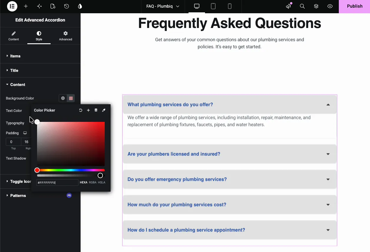
Style the content area #
The Content section styles the answer panel: Background Color, Text Color, Typography, Padding, and Text Shadow. Keep the answer background lighter than the title bars so open items read as connected but distinct.
Style the toggle icons #
The Toggle Icons section finishes the row ends.
- Icon Position: left of the title, right of it, or none.
- Icon Size, Spacing, Padding: the demo runs 18 pixel icons.
- Icon Colors: Normal, Hover, and Active states, each with background and icon color.
The result on the page #
On the live page the accordion behaves exactly as configured: one question open at a time, carets flipping as items toggle, and the styled title bars keeping the section scannable.
Common use cases #
- FAQ sections on landing pages, pricing pages, and product pages.
- Contact or quote forms inside an answer, using the Saved Section content type like the demo.
- Nested accordions for category and sub-category question sets.
- Course or documentation outlines where each module expands into its lessons.
- Job listings with the role as the title and details in the panel.
Tips for a better accordion #
- Pick Accordion type for FAQs. One open answer keeps visitors focused; Toggle suits reference content people compare side by side.
- Open the most-asked question by default. Set Active as Default on your best question so the section never starts fully closed.
- Use H3 as the Title HTML Tag on FAQ pages. Search engines read the questions as proper headings.
- Keep icon pairs consistent. A caret that flips direction communicates state instantly; mismatched icons make visitors think.
- Mind template weight in Saved Sections. A form or table inside an item is great; a full-width section with heavy images will load even while collapsed.
Video Tutorials #
If you’d rather watch the Advanced Accordion in action, this video walks through how easily anyone can build one, start to finish:
And this one shows how to add a nested accordion, loading one accordion inside another with the Saved Section content type:
Frequently Asked Questions #
What is the Advanced Accordion widget in Master Addons?
It is an Elementor widget for collapsible content sections. You add items with titles and answers, choose accordion or toggle behavior, set expand and collapse icons, and style the titles, content, and icons per state. Items can hold text or a full saved template.
What is the difference between Accordion and Toggle type?
Accordion keeps one item open at a time, closing the previous item when a new one opens. Toggle lets visitors open several items at once and close each independently. Both are set from the Accordion Type dropdown in the Content tab.
Can I put a form or template inside an accordion item?
Yes. Set the item’s Content Type to Saved Section and pick any template from your Elementor library. The demo loads a full contact section with a working form inside an accordion item, and any other saved template works the same way.
How do I create a nested accordion in Elementor?
Save an accordion as an Elementor template first. Then, in the parent accordion, set an item’s Content Type to Saved Section and choose that template. The inner accordion loads inside the outer item, giving you two levels of collapsible content.
Can one item stay open by default?
Yes. Expand the item in the Content tab and switch on Active as Default. That item starts open when the page loads, which works well for the question visitors ask most.
Wrapping up #
The Advanced Accordion widget handles the standard FAQ pattern and then goes further: per-item icons and backgrounds, three-state styling, and a Saved Section content type that puts forms, tables, or whole nested accordions inside any item. Browse the full set of Master Addons widgets and extensions to see what else ships with the plugin, and check the pricing page for Pro extras like accordion patterns.


