Designers work on top of a column grid. It is how headlines, cards, and buttons end up lining up instead of drifting a few pixels apart. Elementor does not show you one, so alignment usually happens by eye. The Grid Line extension in Master Addons Pro fixes that with a column grid overlay you can switch on right inside the editor.
You control the number of columns, the gutter, the max width, the offset, and the color of the overlay, straight from Elementor’s Page Settings. Here is how to enable it and what each option does.
What the Grid Line extension does #
Grid Line draws a set of evenly spaced vertical columns over your page inside the Elementor editor. The overlay sits on top of your design in the editor only, so visitors never see it, and you can check whether your sections and widgets actually line up on the grid a designer would use in Figma or Photoshop.
The default is a 12 column grid at 1140px max width with a 15px gutter, narrowing to 1025px and 10px on tablet and 768px and 8px on mobile. Every value is adjustable per device, and the whole overlay switches on and off with one toggle.
Before you start #
- WordPress with Elementor installed and active.
- Master Addons for Elementor installed and active. New to the plugin? Follow the installation guide first.
- A Master Addons Pro license, because Grid Line is a Pro extension.
How to enable the Grid Line extension #
Step 1: Turn it on in the Extensions tab #
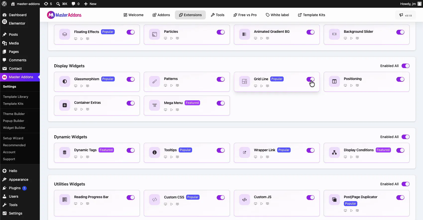
From your WordPress dashboard, go to Master Addons and open the Extensions tab. Grid Line lives in the Display Widgets group with a Popular badge, next to Glassmorphism and Patterns. Click its toggle so it turns purple.
Step 2: Save your changes #
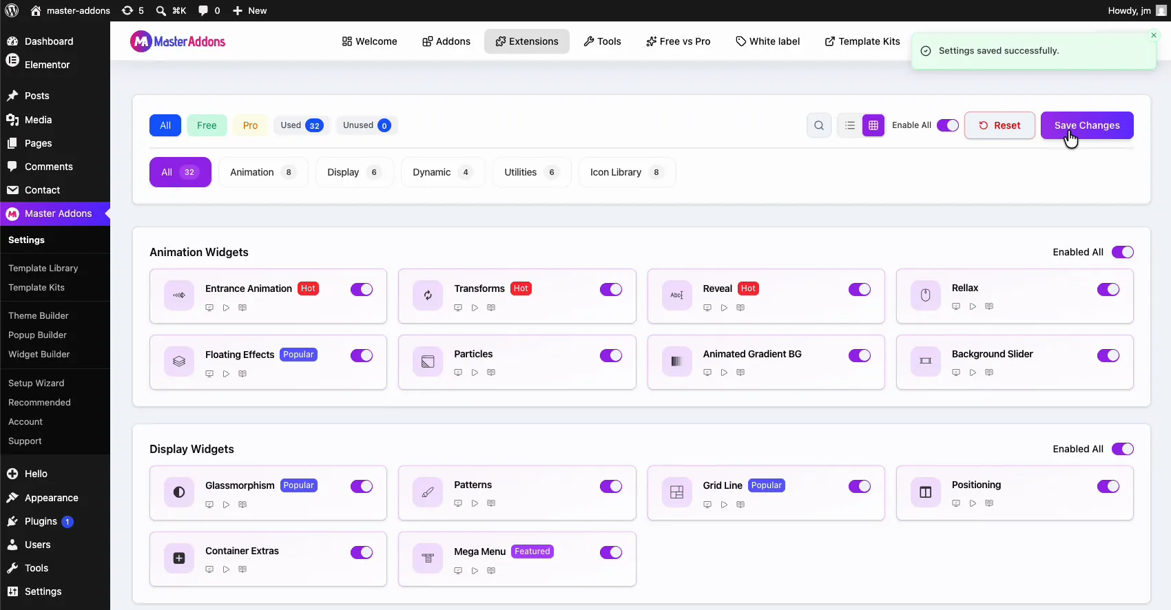
Scroll to the top and click Save Changes. A green “Settings saved successfully” notice confirms the extension is active. If the Elementor editor was open, reload it once.
How to show the grid in the Elementor editor #
Open any page with Elementor and click the Page Settings icon in the top bar. Under the Settings tab you will find a new Grid Line section marked with the purple MA badge. Flip Enable to On, and the column overlay appears across the canvas immediately.
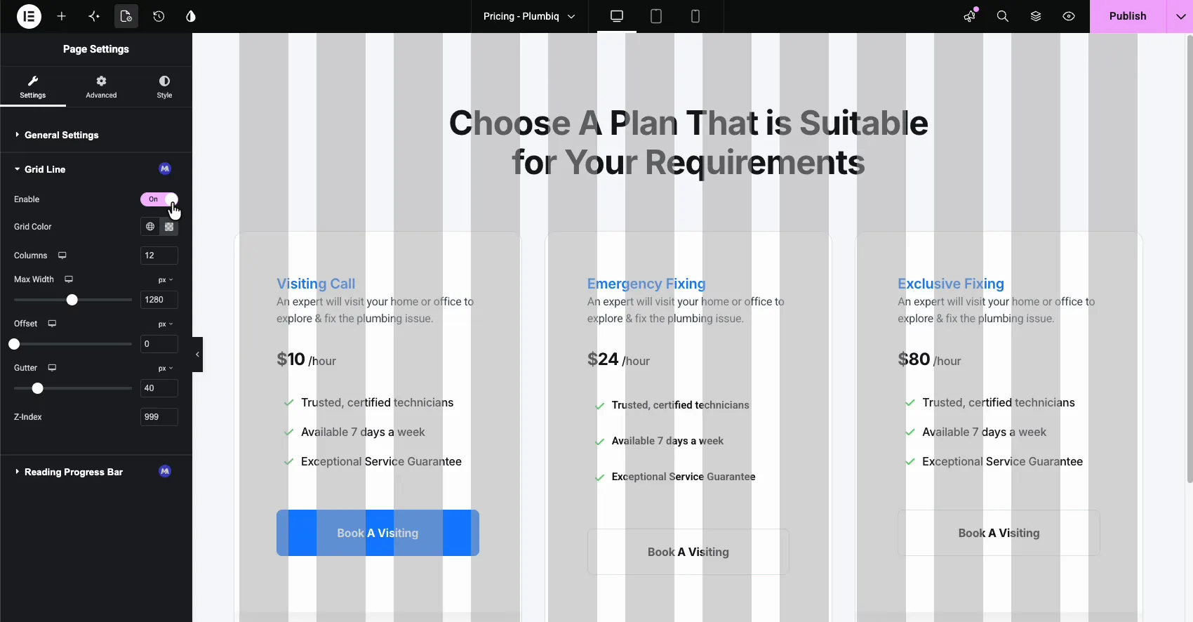
Because the setting lives in Page Settings, the grid is per page: you decide where it shows, and it does not follow you into every document.
Grid Line settings explained #
- Enable: switches the overlay on and off for this page.
- Grid Color: the color of the columns. Pick the global swatch or set a custom color with the picker. A low opacity value keeps your content readable under the overlay.
- Columns: how many columns to draw, from 1 to 12. 12 is the standard, but you can match whatever grid your design uses.
- Max Width: the total width of the grid, 1140px by default. Match it to your site’s content width so the columns line up with your actual layout.
- Offset: pushes the grid in from the edges when your layout needs it.
- Gutter: the space between columns, 15px by default.
- Z-Index: the stacking order of the overlay, 999 by default, so the grid stays visible above your content.
Columns, Max Width, Offset, and Gutter are responsive controls: click the device icon next to each one to set different values for desktop, tablet, and mobile.
Change the grid color #
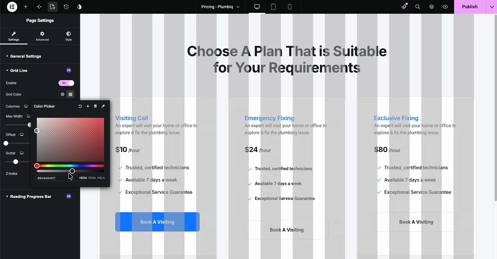
Click the custom swatch next to Grid Color to open the color picker. Any HEXA value works, and the alpha channel matters most: something like 50 percent opacity gives you visible columns without hiding the design underneath.
Tune the columns and gutter #
Drag the sliders and the overlay updates live. In the example below the gutter is up to 58px and the grid carries a custom tint, so it reads clearly against the light background while the pricing cards stay legible.
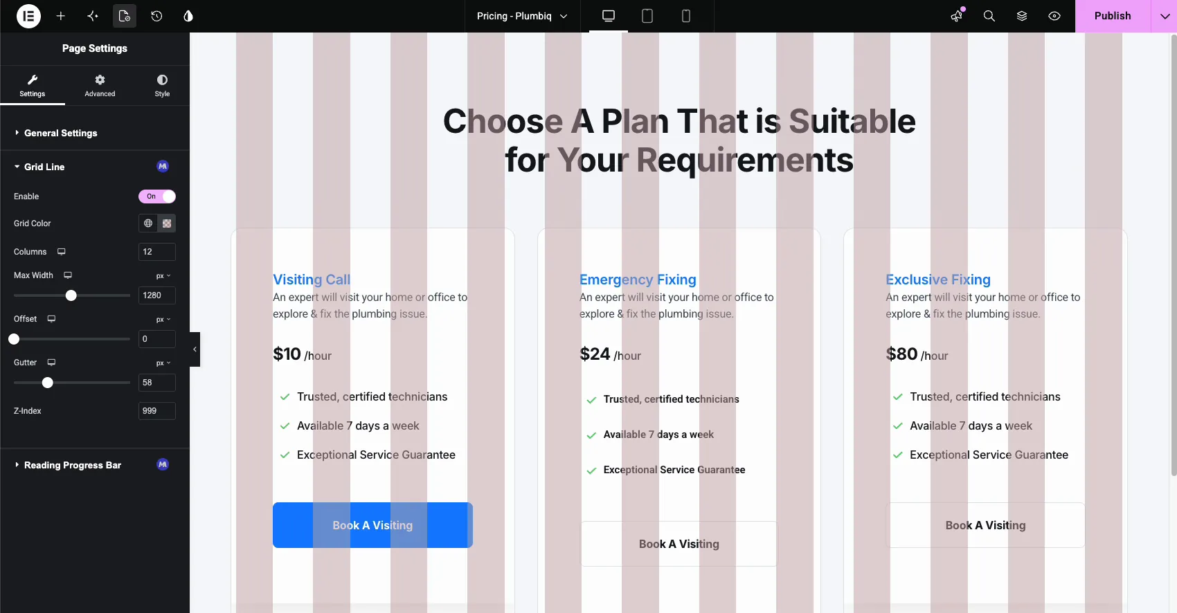
When the layout is aligned, you can flip Enable back off for a clean canvas. Leaving it on does no harm, because the grid never shows on the published page.
When Grid Line saves you time #
- Matching a design file. Rebuild a Figma or XD layout on the same 12 column grid it was designed on, instead of eyeballing distances.
- Aligning sections. Check that elements across different sections start and end on the same column.
- Consistent page series. Keep landing pages built by different team members on one shared grid.
- Polishing imported templates. Drop the overlay onto a page from a template kit and spot the elements that sit off-grid.
- Spacing decisions. Use the gutter lines as a quick ruler when setting column widths and padding.
Video Tutorial #
Prefer to watch it in motion? This video walks through enabling Grid Line and adjusting the overlay in the Elementor editor.
Frequently Asked Questions #
What is the Grid Line extension in Master Addons?
It is a Master Addons Pro extension that draws a column grid overlay in the Elementor editor. You set the number of columns, gutter, max width, offset, and color from Page Settings, then use the columns to align sections and widgets the way designers do in Figma.
Where do I find the Grid Line settings?
In the Elementor editor, open Page Settings from the top bar and stay on the Settings tab. After you enable the extension in the Master Addons dashboard, a Grid Line section with an MA badge appears there, holding the Enable toggle and all grid options.
Can I change the number of columns and the gutter?
Yes. The Columns field takes 1 to 12, with 12 as the default, and the Gutter slider controls the space between columns. Max Width and Offset shape the grid’s footprint. Each of these is responsive, so desktop, tablet, and mobile can use different values.
Does the grid overlay show on every page?
No. Grid Line is a per-page setting inside Page Settings, so you enable it only on the pages where you want the overlay. Turn the Enable toggle off when you finish aligning, and that page goes back to a clean canvas. The grid never appears on the published page either way.
Is the Grid Line extension free?
No. Grid Line is a Pro extension in Master Addons, listed in the Display Widgets group of the Extensions tab. See the pricing page for the plans.
Wrapping up #
The Grid Line extension gives Elementor the one thing every design tool already has: a real column grid to build against. Enable it once in the dashboard, flip it on from Page Settings when you need it, and tune the columns, gutter, and color to match your design system. Browse the rest of the Master Addons widgets and extensions for more tools like this, including the Which Element hover labels for the editor.