Most about pages, agency sites, and service businesses need a spot that puts a face to the people behind the work. The Team Member widget in Master Addons for Elementor builds that section without custom code. Each card holds a photo, a name, a role, a short bio, and a row of social links, and you drop in as many members as you need.
Each Team Member is its own widget. So you set up one card, style it, then duplicate it across columns to build the full grid. There is no cap on how many members you show. This guide walks through every setting, from the eleven design variations down to the Style tab.

What the Team Member widget does #
The widget renders one team member as a card: photo on top, then the name, designation, and a short description, with a row of social icons below. A Design Variations dropdown changes the whole card layout in one click, from a plain block to circular photos, gradient frames, and hover effects.
It has three tabs. Content holds the photo, text, alignment, and social links. Style controls colors, typography, spacing, borders, and shadows for each part of the card. Advanced carries the usual Elementor options like margin, padding, and responsive visibility.
Before you start #
- WordPress with Elementor installed and active.
- Master Addons for Elementor installed and active. New to the plugin? See the installation guide.
- Photos of your team members, plus their names, roles, and social profile URLs.
How to add the Team Member widget #
In the Elementor editor, open the Elements panel and search for Team Member, or scroll to the Master Addons section (the widgets carry a purple MA badge). Drag it onto your page. It loads with a placeholder card, so you edit from a working example instead of a blank one.
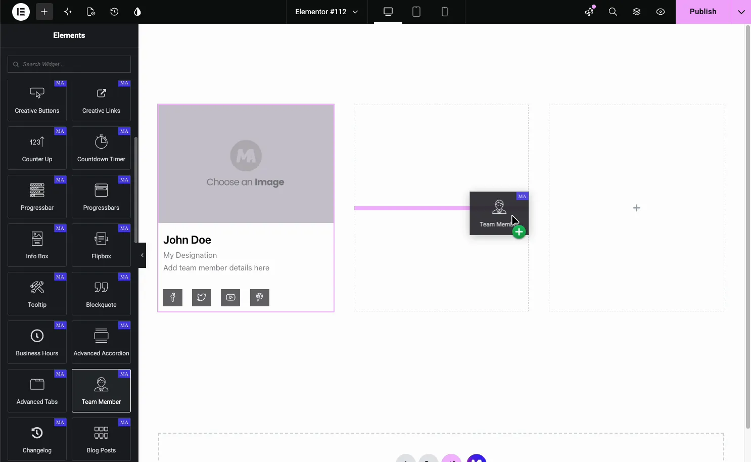
Set up the card content #
With the widget selected, open the Content tab. The Content section holds everything on the card:
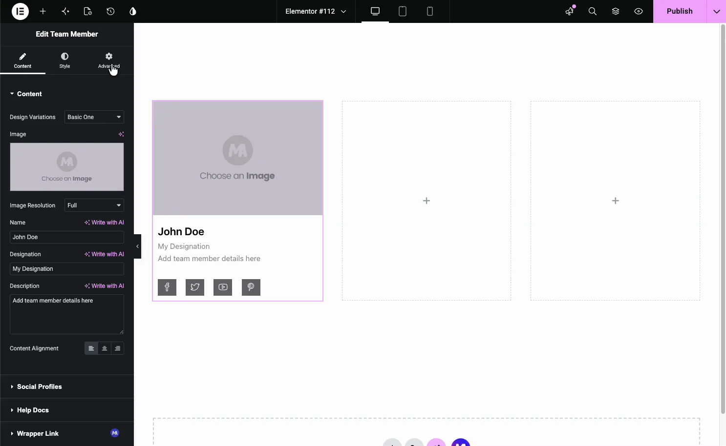
- Design Variations: the card layout preset (covered in the next section).
- Image: the member’s photo, pulled from the Media Library.
- Image Resolution: which registered image size to load, Full by default.
- Name, Designation, Description: the member’s name, role, and a short bio. Each field has a Write with AI option if you want a quick draft.
- Content Alignment: align the text left, center, or right.
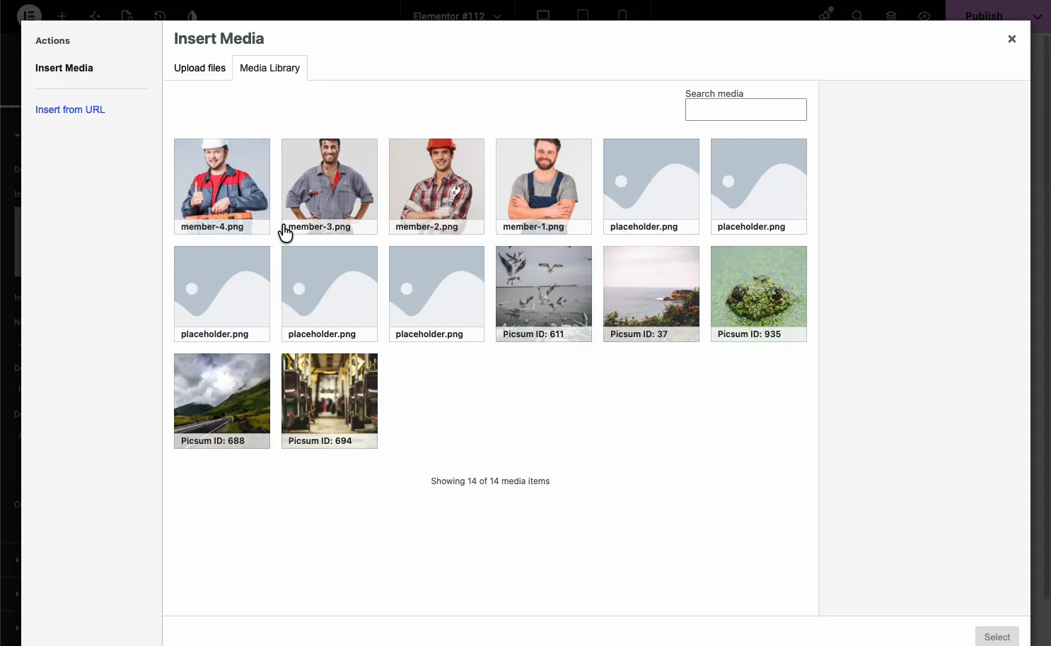
Choose the photo #
Click the image box and the WordPress Media Library opens. Pick an existing photo or upload a new one, then hit Select. One thing worth doing up front: use same-size photos. Matching dimensions keep every card even once you build the grid, and mismatched ones tend to shift the text down on a card or two.
Pick a design variation #
The Design Variations dropdown is where the Team Member widget earns its keep. One click swaps the entire card layout without touching your content. The list includes:
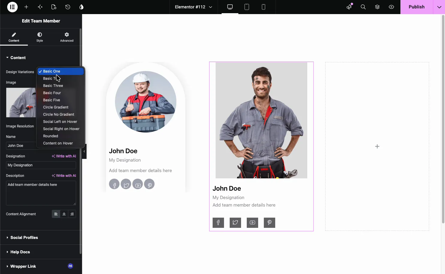
- Basic One to Basic Five: clean block layouts with the photo on top and the details below.
- Circle Gradient and Circle No Gradient: round the photo into a circle, with or without a gradient frame.
- Social Left on Hover and Social Right on Hover: hide the social icons until someone hovers the card, then slide them in.
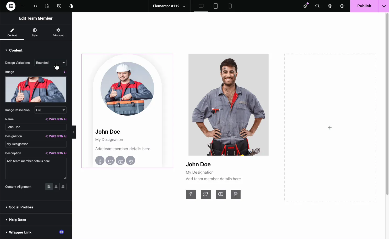
- Rounded: an arched card with a circular photo and rounded social buttons.
- Content on Hover: keep the photo clean and reveal the details on hover.
Here is the Rounded variation applied, with the arched frame, circular photo, and pill-shaped social icons:
Add social profile links #
Open the Social Profiles section and turn on Display Social Profiles?. Each link is one item in the list, so use Add Item to add a profile, pick its icon, and paste the URL. The copy icon duplicates an item and the X removes it.
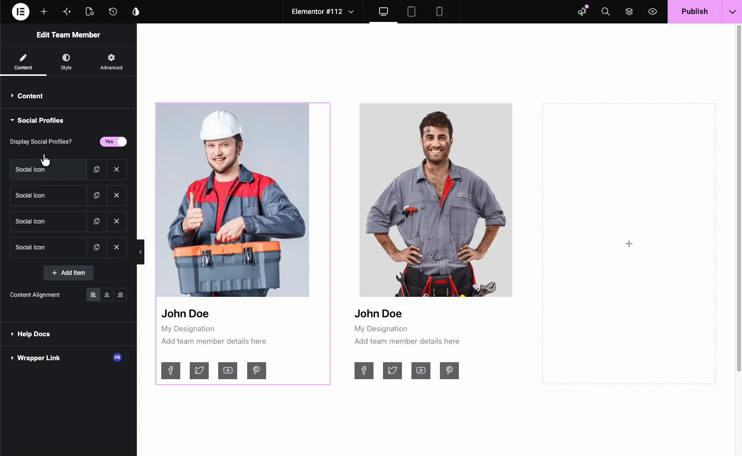
Add only the profiles a member actually uses. Empty items are skipped, so the card stays clean. The row sits at the bottom of the card by default and follows whichever design variation you picked.
Add multiple team members #
Each Team Member widget is one card, so you build a full team by duplicating it. Set up the first card the way you want, then right-click it and choose Duplicate (or press Ctrl/Cmd + D). Drop the copies into their own columns and swap in each person’s photo and details.
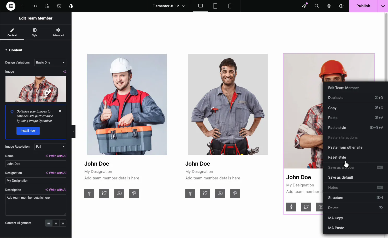
Since you are duplicating a widget, there is no limit. Add three members, a dozen, or a whole department. A three-column Elementor section gives you a clean row of cards, and you add more rows as the team grows. Every copy keeps the design variation and styling of the original, so the grid stays consistent without extra work.
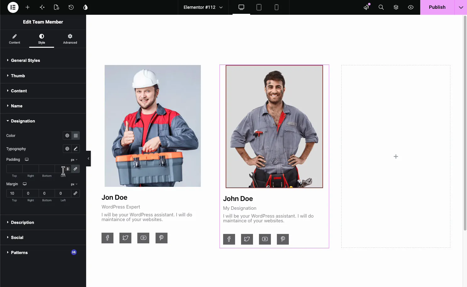
Style the card #
The Style tab breaks the card into parts you can style on their own: General Styles, Thumb, Content, Name, Designation, Description, Social, and Patterns (a Pro option).
- General Styles: the card background color, border, radius, and box shadow.
- Thumb: the photo’s size, border, and radius.
- Name, Designation, Description: color, typography, padding, and margin for each text element.
- Social: the size, color, and spacing of the social icons.
Common use cases #
- About pages introducing the whole team with photos and roles.
- Agency and studio sites showing creatives with their social links.
- Service businesses putting a face to the people doing the work.
- Speaker or instructor lineups for events, webinars, and courses.
- Leadership or founder sections highlighting the people in charge.
Tips for working with the Team Member widget #
- Style one card first, then duplicate. Copies inherit the design and styling, so you only set it up once.
- Use same-size photos. Matching dimensions keep the cards even across the row.
- Keep bios short. A line or two reads best under a photo.
- Match the variation to the page. Circle and Rounded suit friendly brands; the Basic layouts fit corporate sites.
- Fill in only the social links you use. Empty items are skipped, so the icon row stays tidy.
Frequently Asked Questions #
What is the Team Member widget in Master Addons?
It is an Elementor widget that shows a single team member as a card with a photo, name, role, short bio, and social links. It includes eleven design variations and a full Style tab, so you build and style a team section straight from the Elementor panel with no custom code.
How many team members can I add?
There is no limit. Each Team Member widget is one card, so you add more members by duplicating the widget and dropping copies into their own columns. Build a three-card row or a large multi-row grid; the layout stays consistent because copies inherit the original’s design.
What design variations does the Team Member widget include?
Eleven presets: Basic One through Basic Five, Circle Gradient, Circle No Gradient, Social Left on Hover, Social Right on Hover, Rounded, and Content on Hover. Each one changes the card layout, like circular photos or social icons that appear on hover, without changing your content.
Can I add social media links to each team member?
Yes. Turn on Display Social Profiles in the Social Profiles section, then use Add Item to add each profile with its icon and URL. Add only the links a member uses, since empty items are skipped and stay off the card.
What is the difference between the Team Member and Team Carousel widgets?
The Team Member widget shows members as a static grid of cards, one widget per person. The Team Carousel widget puts members in a sliding carousel with a repeater, arrows, and autoplay. Use Team Member for a fixed grid and Team Carousel when space is tight.
Wrapping up #
The Team Member widget turns a list of people into a polished team section: add a photo, name, role, bio, and social links, pick one of eleven design variations, then style the card and duplicate it across your columns. For a sliding version, see the Team Carousel widget, pair it with the Info Box widget for services, browse the full Master Addons widgets and extensions, and check the pricing page for what each plan includes.


