

A standard dropdown shows a thin list of links. A mega menu opens a wide panel that presents an entire section of your site at once: grouped link columns, images, icons, even a call to action. The Mega Menu extension in Master Addons for Elementor attaches one of these panels to any WordPress menu item, and you design the panel itself in the normal Elementor editor, so anything you can build on a page can live inside your navigation. For a quick overview and demos, see the free Elementor mega menu builder page.
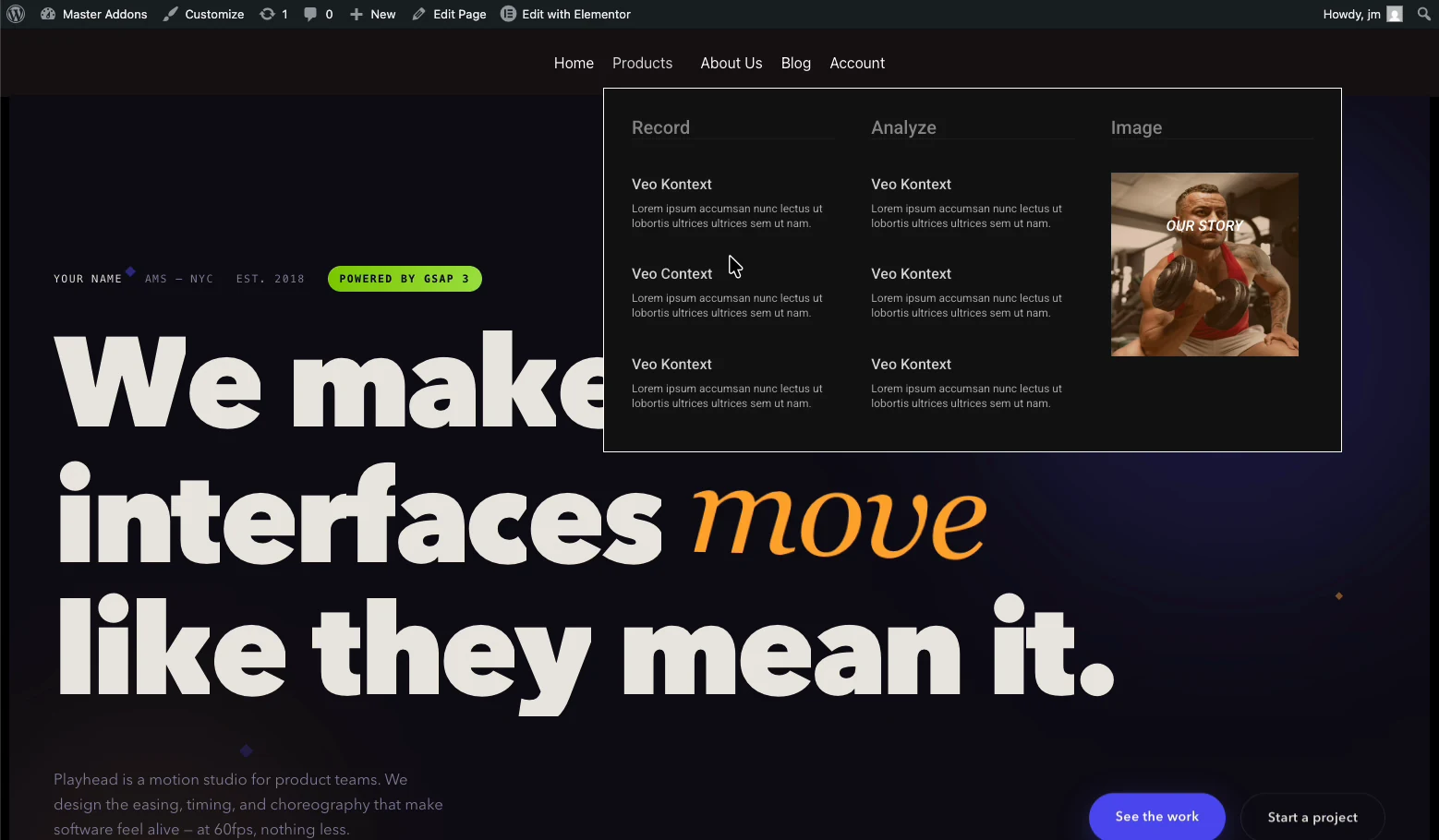
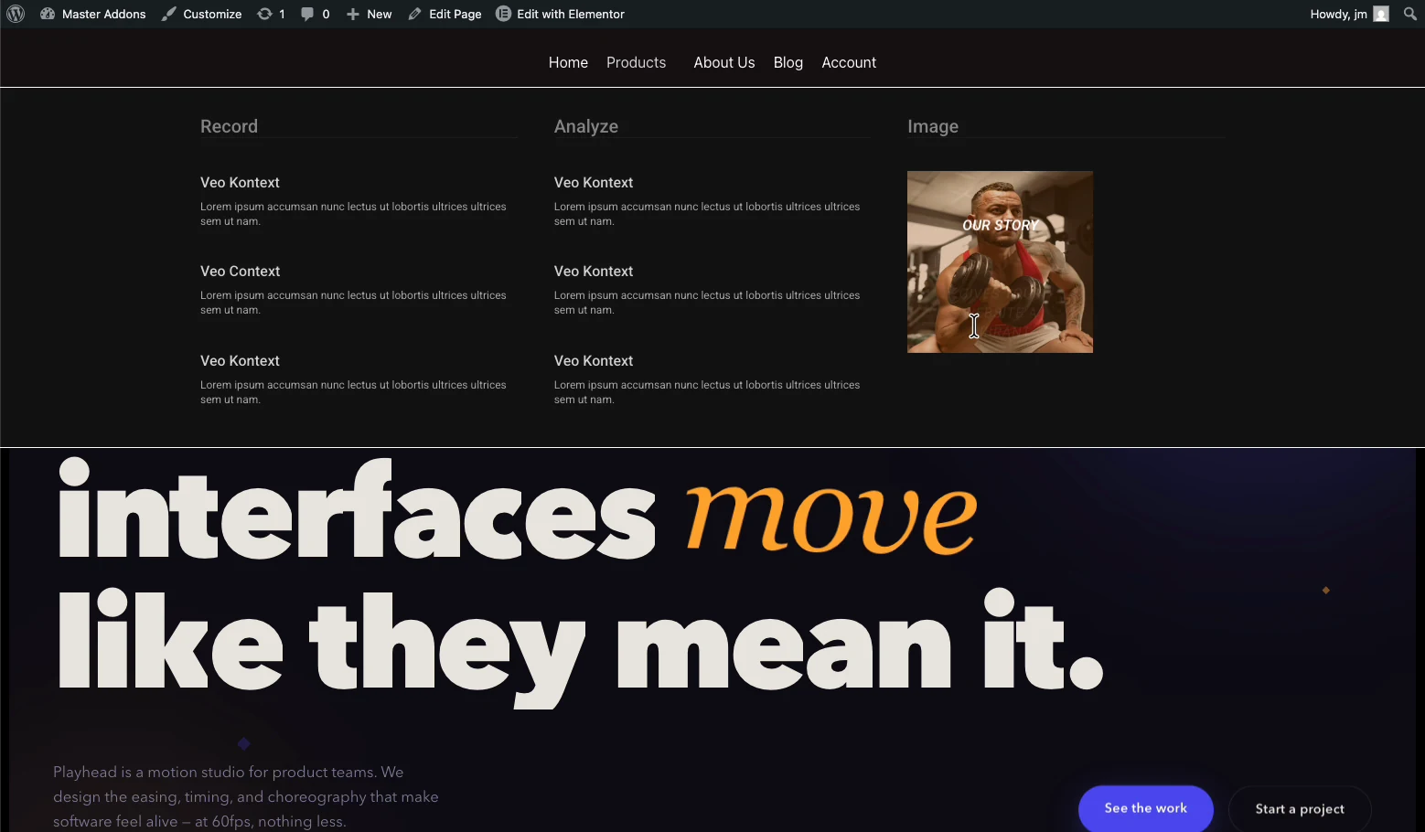
Here is the finished result from the demo: hovering Products opens a three-column panel with grouped links and a featured image.
What the Mega Menu extension does #
Once enabled, every item in your WordPress menu gets a Mega Menu configuration popup in Appearance → Menus. Turn it on for an item and that item’s dropdown becomes an Elementor template. The extension handles:
- Per-item panels: enable the mega panel only on the items that need it; the rest stay ordinary links.
- Visual panel design: the dropdown content is built with the Elementor editor, using any widgets you like.
- Mega Menu Width: Default, Full Width, or Custom Width with an exact pixel value.
- Trigger Effect: open the panel on hover or on click.
- Transition: choose how the panel animates in, Fade in the demo.
- Mobile Menu: decide what phones get, including showing the builder content inside the toggle menu.
- Badge and Icon: attach a highlight badge to the menu item label (free), or an icon with its own color (Pro).
Before you start #
- WordPress with Elementor installed and active; the free version is enough.
- Master Addons for Elementor installed and active. New to the plugin? Follow the installation guide first.
- A WordPress menu already created under Appearance → Menus, even a rough one; you can refine it later.
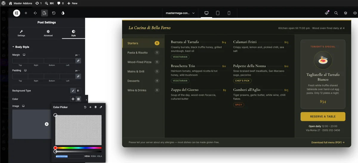
NOTE: You can control the background of your mega menu from the page style option. Make sure to put the background color, image or whatever you prefer in the page style option. By default it will be set a white background. But you can do the customization of your background from this setting. Take a look –
Step 1: Enable the Mega Menu extension #
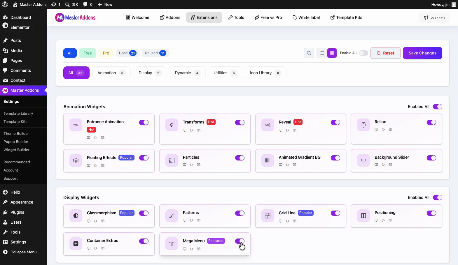
From your WordPress dashboard, go to Master Addons and open the Extensions tab. Mega Menu sits in the Display Widgets group. Click its toggle so it turns purple, then hit Save Changes and wait for the green “Settings saved successfully” notice. Master Addons ships with everything off by default so your site only loads what you actually use. If the new option doesn’t show up in the admin right away, hard-refresh the page (Cmd/Ctrl + Shift + R); caching plugins tend to hold onto the old admin menu for a minute.
Step 2: Turn on Mega Menu for your menu #
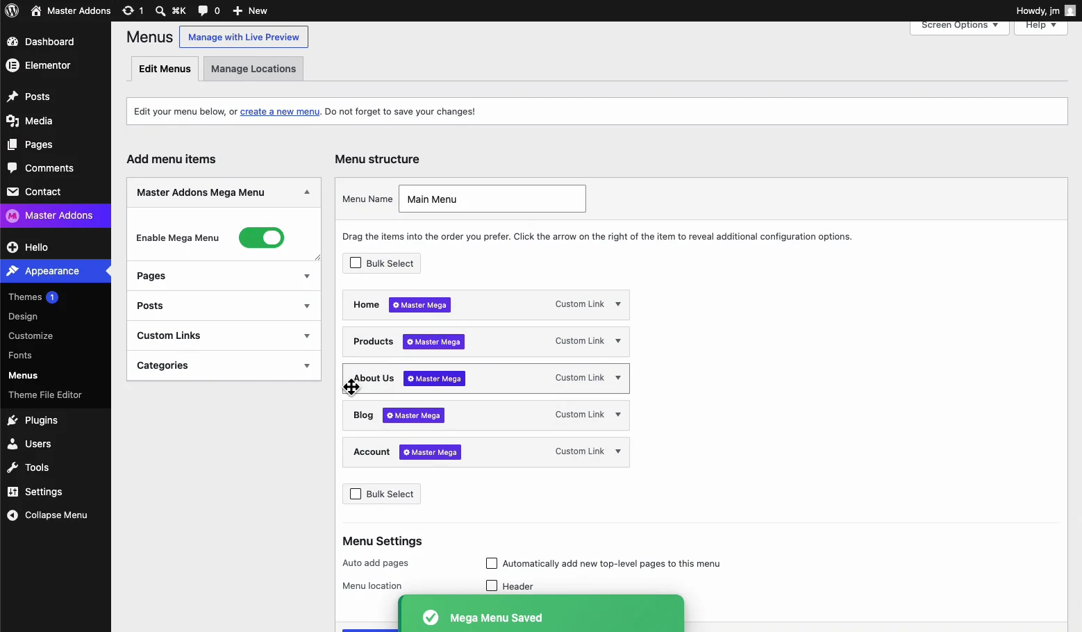
Open Appearance → Menus. A new Master Addons Mega Menu box appears above the menu item list. Switch Enable Mega Menu on and wait for the green “Mega Menu Saved” confirmation. Every item in the menu structure now carries a purple Master Mega badge, meaning it can host a panel.
Step 3: Enable the panel on a menu item #
Hover a top-level item, typically something broad like Products or Services, and open its Mega Menu settings. In the popup’s Content tab, flip Megamenu Enabled to YES. The Edit Megamenu Content button appears; it opens the Elementor editor for this item’s panel. Hit Save in the popup when you are done.
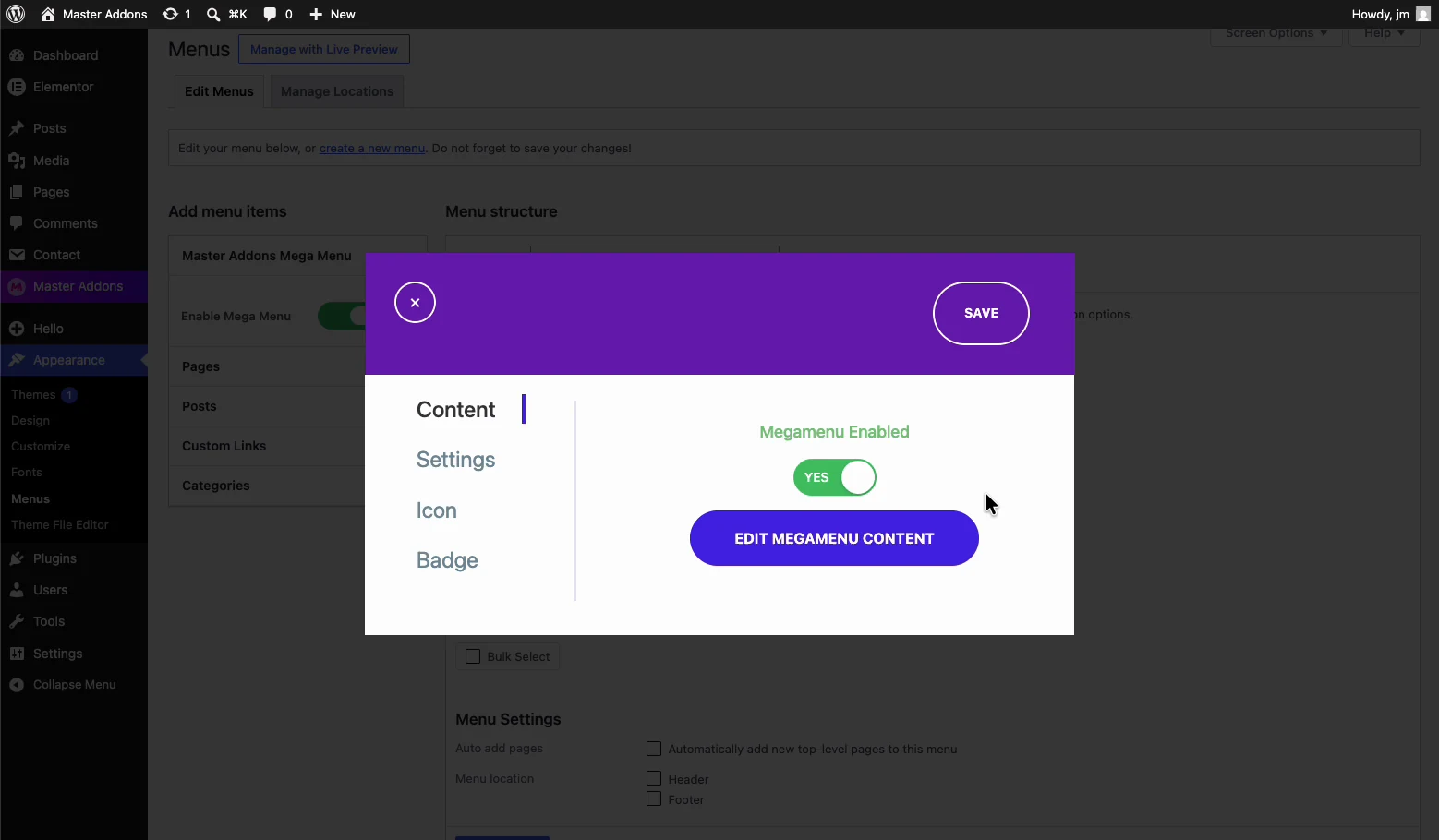
Only enable the panel on items that genuinely need the space. A mega menu on a single Contact link makes visitors work harder for one destination.
Step 4: Design the panel in Elementor #
Click Edit Megamenu Content and the familiar Elementor editor opens with the panel as the canvas. The demo builds three columns: two groups of links under Record and Analyze headings, plus an image column so the panel isn’t a wall of text. Publish the template when the layout is ready; a draft template won’t render on the live menu, which trips people up more than anything else.
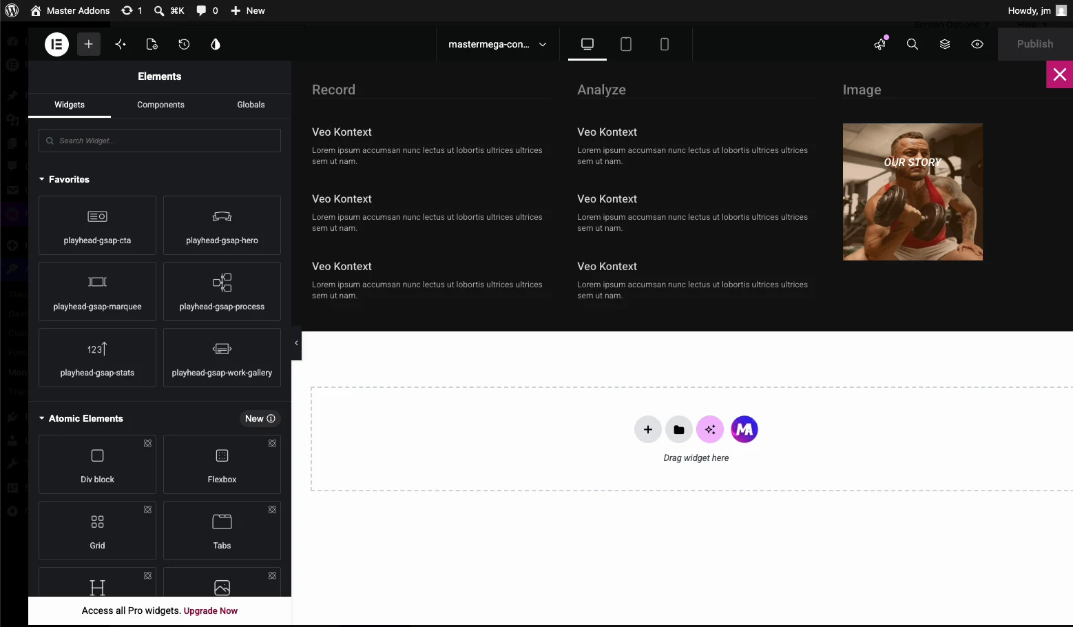
Group links by how customers think rather than your org chart, and cap each column at five to seven links; past that, scanning collapses. Give one column a job beyond links, such as a featured product or a call to action. And keep the images compressed, because the panel loads on every page of the site, not just one.
Step 5: Set width, trigger, and transition #
Back in the item popup, the Settings tab controls how the panel behaves:
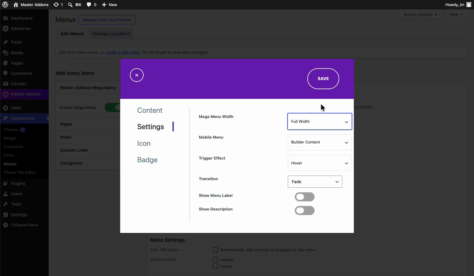
- Mega Menu Width: Default matches the menu, Full Width stretches edge to edge, Custom Width takes an exact pixel value such as 800px.
- Mobile Menu: what phones receive; Builder Content shows the same designed panel inside the mobile toggle menu.
- Trigger Effect: Hover opens the panel on mouse-over; switch to click if you prefer deliberate opens.
- Transition: the entrance animation, Fade in the demo.
- Show Menu Label / Show Description (Pro): optional label and description text on the item.
The Badge tab in the same popup attaches a highlight badge, useful for marking a New or Sale entry. The Icon tab, for an icon and icon color, needs Master Addons Pro.
Step 6: Put the menu in your header #
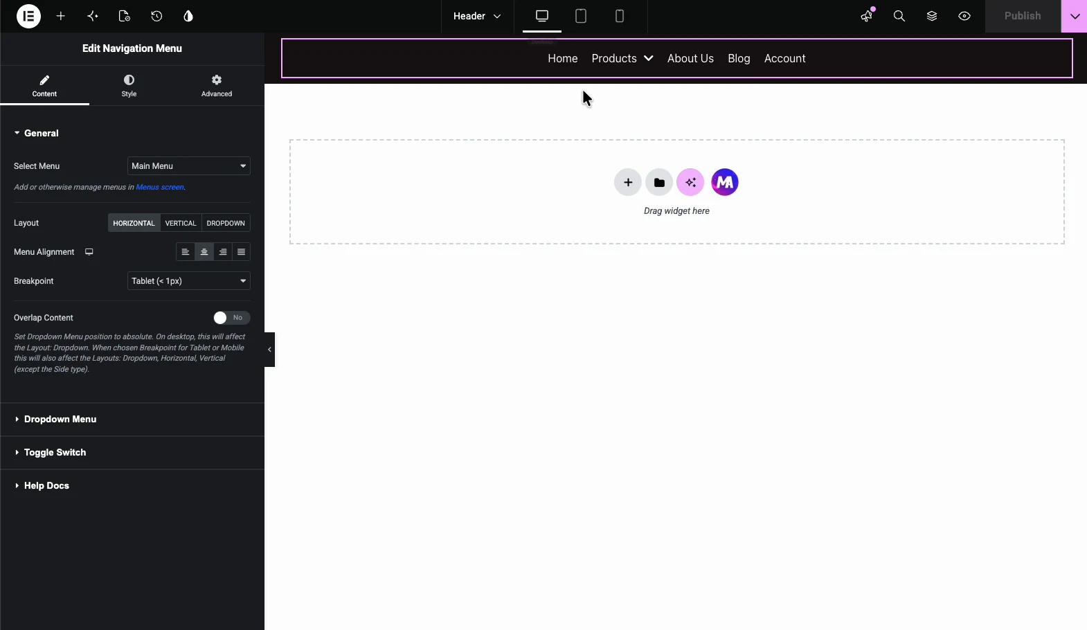
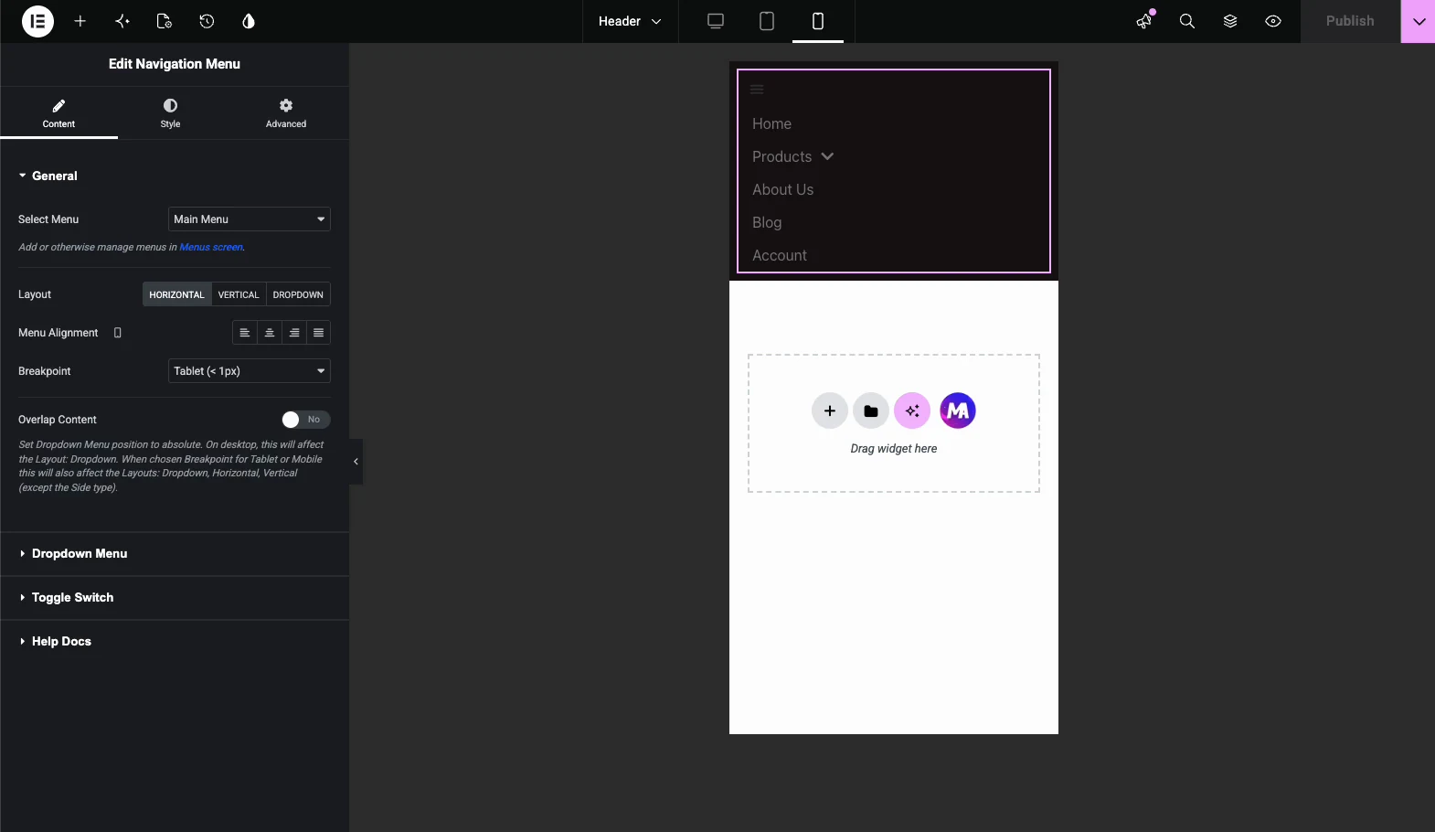
If your theme already renders the WordPress menu, the mega menu works immediately. For full header control, build one with the free Master Addons Theme Builder: create a Header template, drop in the Nav Menu widget, and select the menu that carries your mega panels. The widget’s General section covers layout, alignment, and the breakpoint where the menu collapses.
Check the mobile view #
Switch the Elementor editor to mobile preview before publishing. The menu collapses behind a hamburger toggle and the links stack vertically. Check the panel’s real height here; a four-column panel that looks sharp at 1440px can turn into an endless scroll on a phone. If it runs long, hide the decorative images with Elementor’s responsive visibility controls and keep the links. Then test on an actual phone, since the preview approximates touch behavior but doesn’t reproduce it.
The result on the page #
With Full Width selected, the published panel spans the entire viewport edge to edge; the boxed version at the top of this page shows the Default width for comparison. Either way, hovering the item opens the designed template with the transition you chose.
Where a mega menu works well #
- Stores. Product categories, bestsellers, and a promo image in one panel under Shop.
- Agencies and service businesses. Services grouped by outcome with a featured case study.
- Publishers and blogs. Topic hubs with the latest post pulled into the panel.
- SaaS sites. Features, solutions, and resources organized side by side instead of nested dropdowns.
- Universities and organizations. Departments and quick links that would otherwise bury three levels deep.
Troubleshooting #
- Mega menu does not appear. Confirm the extension toggle is on, the menu item has Megamenu Enabled set to YES, and the panel template is published rather than saved as a draft. Then clear your cache.
- Panel appears but is unstyled. Usually a cached stylesheet. Purge your page cache and any CDN, then hard-reload.
- Panel is cut off or hidden. A parent container has overflow hidden or a low z-index. Raise the header’s z-index and check the header container’s overflow setting.
- Works on desktop, broken on mobile. Almost always the toggle area. Verify the Nav Menu widget’s mobile settings and confirm nothing overlays the tap target.
Frequently Asked Questions #
How do I add a mega menu in Elementor without Pro?
Enable the Mega Menu extension in the Master Addons Extensions tab, switch Enable Mega Menu on under Appearance → Menus, set Megamenu Enabled to YES on the item you want, and design the panel with Edit Megamenu Content. Elementor Pro is not required.
Is the Mega Menu extension free?
Yes. Mega Menu ships with the free version of Master Addons for Elementor, in the Display Widgets group of the Extensions tab. The pricing page covers what the Pro plans add.
Can the panel be full width?
Yes. The Settings tab of the item popup offers Default, Full Width, and Custom Width. Custom Width takes an exact pixel value, such as 800px, when you want the panel narrower than the page.
What can I put inside the dropdown panel?
Anything Elementor can build: heading widgets, icon lists, images, buttons, forms. The panel is a regular Elementor template, so every widget available on a page is available in the menu.
How does the mega menu behave on mobile?
The menu collapses behind a hamburger toggle and the links stack vertically. The Mobile Menu setting controls whether phones get the designed builder content inside the toggle, and Elementor’s responsive controls let you hide heavy panel elements on small screens.
Wrapping up #
The Mega Menu extension turns a plain WordPress menu into designed navigation with three moves: toggle the extension on, enable the panel on an item, and build the dropdown in Elementor. Width, trigger, transition, badges, and (with Pro) icons are all set from the item popup, and pairing it with the free Theme Builder and Nav Menu widget gives you a complete custom header without Elementor Pro. The full set of Master Addons widgets and extensions is one page away.


