

Tabs are one of the easiest ways to keep a long page from feeling overwhelming. Instead of stacking everything vertically, you split content into clickable sections that visitors can explore at their own pace.
The Advanced Tabs widget in Master Addons for Elementor takes the basic elementor tabs widget and adds a lot more flexibility. You get three free preset layouts plus one Pro preset, the option to add an image or icon to each tab, and, with Master Addons Pro, the ability to load a saved Elementor section inside any tab panel. For a quick overview and demos, see the Elementor advanced tabs widget page.
Below, I’ll walk you through how to set it up from scratch using the same layout choices shown in the demo video.
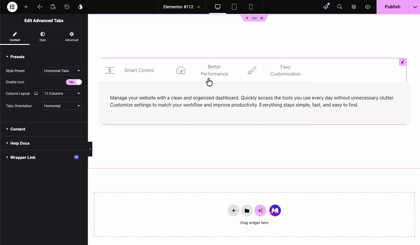
What the Elementor Advanced Tabs widget does #
At its core, this widget creates a set of tab labels plus a content area. When someone clicks a label, the matching panel appears.
Compared to the default Elementor tabs widget, the Master Addons version gives you more control. You can switch between visual presets, add images or icons to individual tabs, use plain text (free) or a saved template (Pro) as the panel content, and style normal, hover, and active states separately.
Before you start #
- WordPress with Elementor installed and active.
- Master Addons for Elementor installed and active. If you haven’t installed it yet, check the installation guide.
- The Advanced Tabs widget enabled in the Master Addons options panel.
- Optional: a saved Elementor template if you want to load one inside a tab (this needs Master Addons Pro).
Add the Advanced Tabs widget #
Open the Elementor editor and look for the Advanced Tabs widget under the Master Addons section. Drag it into your page and you’ll see the default horizontal tab bar with three sample tabs: Smart Control, Better Performance, and Easy Customization.
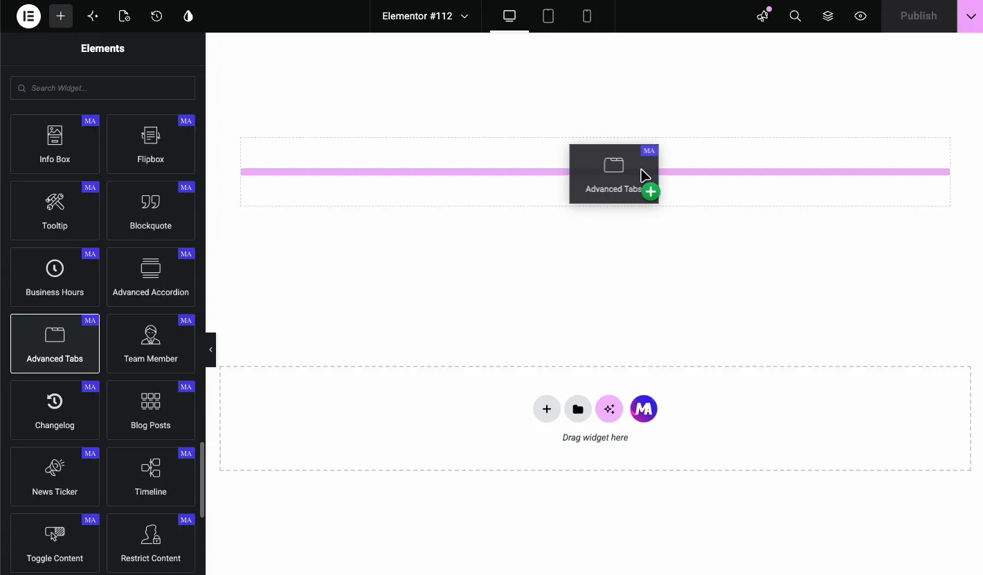
Choose a preset layout #
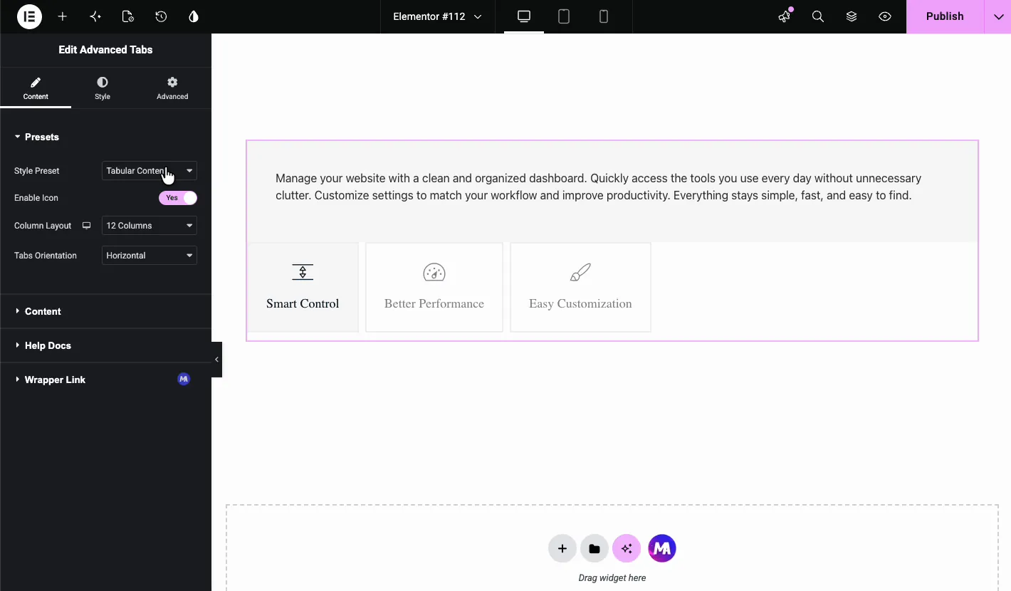
The fastest way to change the look is the Style Preset dropdown in the Content tab. You have four options, and the last one needs Pro:
- Horizontal Tabs: labels run across the top with content underneath. This is the default.
- Vertical Tabs: labels stack on the left and content appears on the right.
- Left Active Border: similar to vertical tabs, but the active tab gets a colored border on the left.
- Tabular Content (Pro): labels become larger card-style buttons above the content panel.
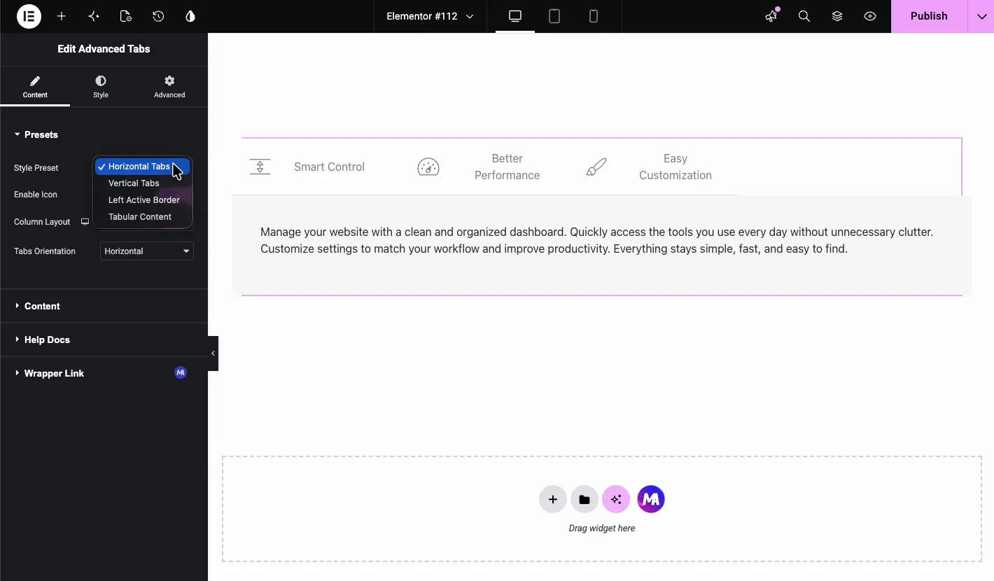
You can switch between these instantly, so try them all and see which one fits your content best. Pro also adds a Column Layout control that lets you adjust how many columns the tab labels take up, which is handy when you want narrower labels and more room for content.
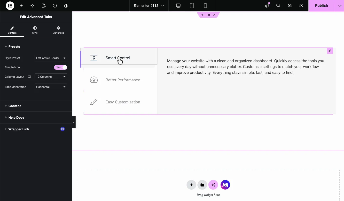
Configure the tabs and content #
Once you’ve picked a layout, expand the Content section to see the list of tabs. Each item has its own settings panel. You can duplicate, delete, or reorder tabs, and hit Add Item when you need more.
Per-tab settings #
- Set as Default: choose which tab opens first when the page loads.
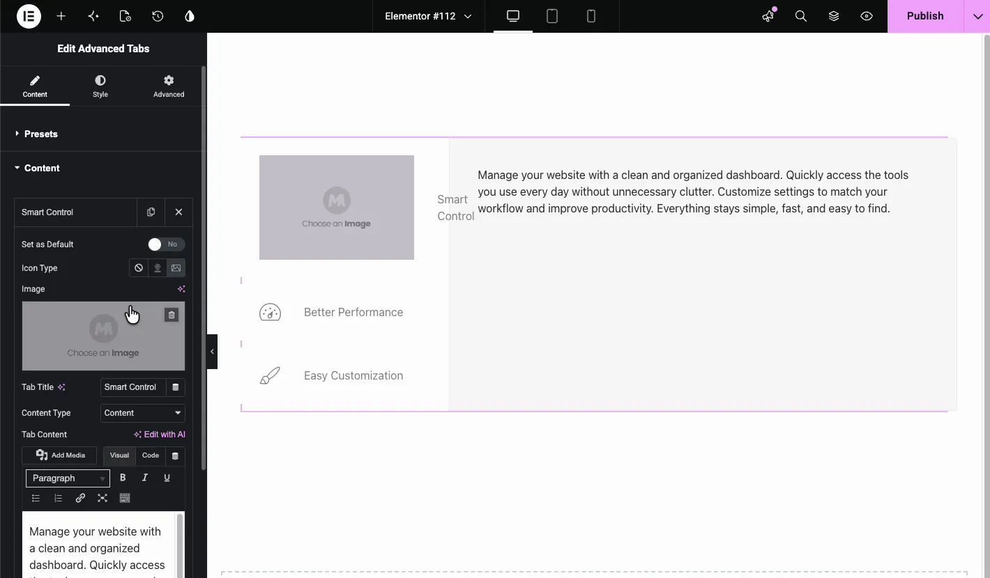
- Icon Type: pick None, Icon, or Image for the tab label.
- Image / Icon: the visual asset shown next to the tab title.
- Tab Title: the text visitors click on.
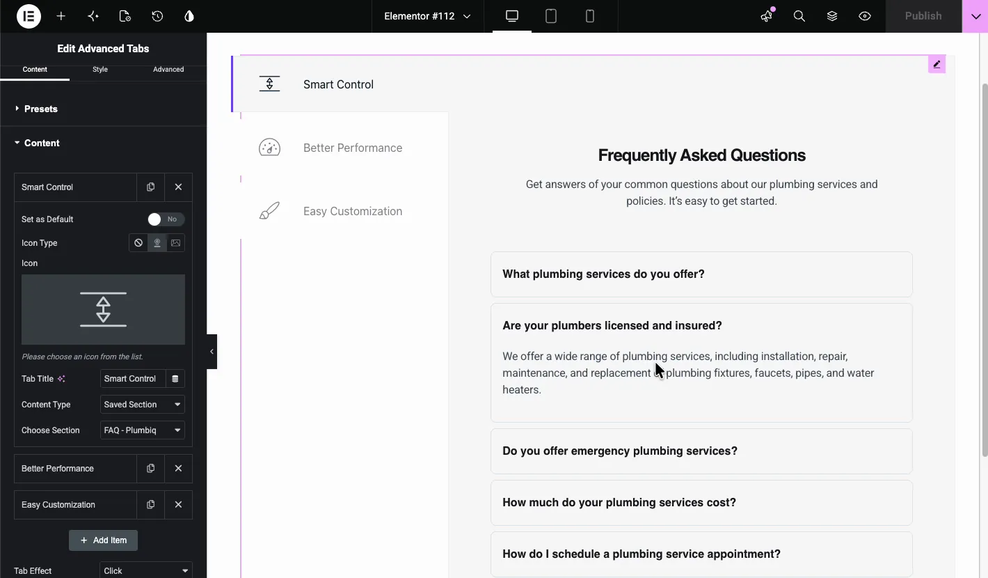
- Content Type: use Content for a regular text editor, or, with Pro, Saved Section, Saved Widget, or Saved Page Template.
- Tab Content: the actual content or template that fills the panel.
In the demo, the first tab uses an image. Just set the Icon Type to Image, open the media library, and select your file. The image shows up next to the tab title.
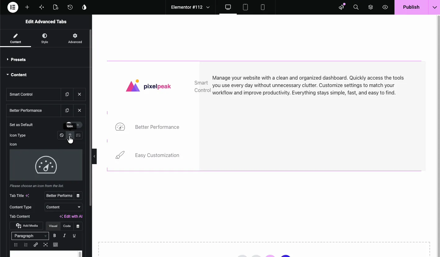
For the second tab, the demo switches to an icon. Choose the Icon type and pick something that matches the label. In this case, a speedometer-style icon works well for “Better Performance.”
Load a saved section inside a tab (Pro) #
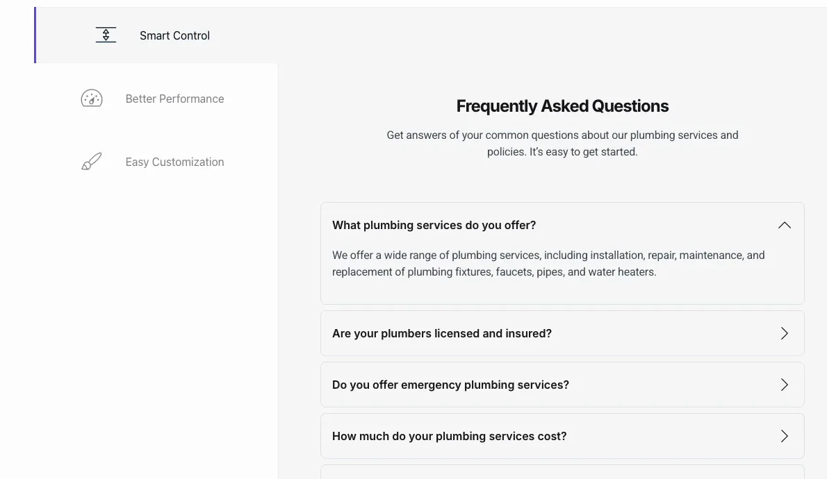
With Master Addons Pro, change the Content Type to Saved Section and pick any template from your Elementor library. The demo loads a full FAQ accordion inside one tab, which means your panel can contain headings, accordions, forms, or anything else you’ve saved as a template.
Style the tabs and content #
Head over to the Style tab to change colors, typography, spacing, and borders. The controls are grouped into two main sections:
- Tabs: covers the tab labels, including title color, title typography, background color, content color, content typography, content alignment, border radius, box shadow, padding, and margin.
- Content: styles the panel that shows when a tab is active.
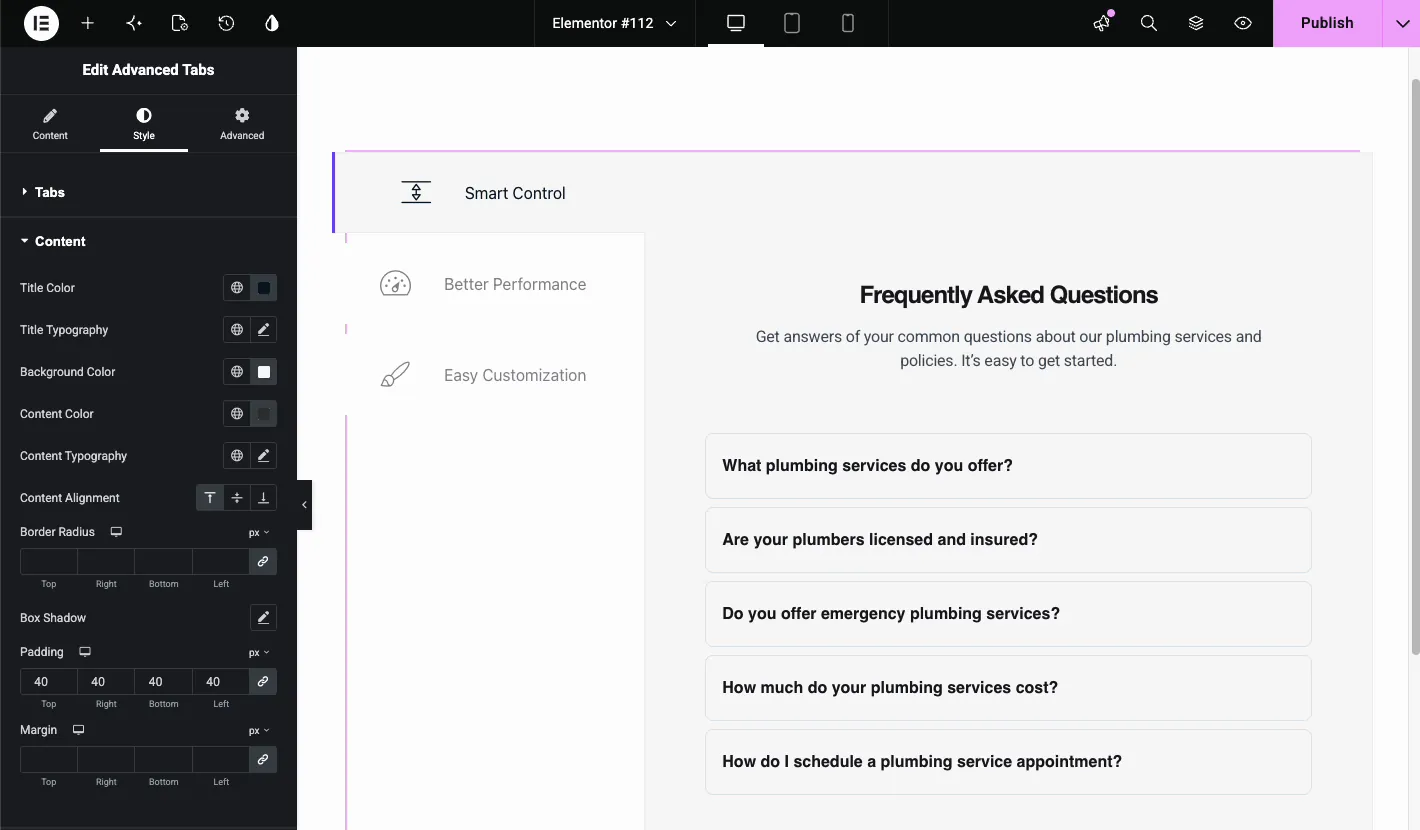
Most of these controls support normal, hover, and active states, so the tab someone is currently viewing can look different from the rest. The Content Alignment buttons also let you align the panel text to the top, center, or bottom of the content area.
Advanced settings #
The Advanced tab has the usual Elementor controls you’d expect: margin, padding, entrance animation, responsive visibility, custom CSS, and attributes. Use these to adjust positioning or hide the tabs on specific screen sizes.
The result on the page #
Once published, the tabs work exactly as you set them up. The default tab opens first, visitors click through the labels, and any saved section or media you added shows up in the matching panel.
Common use cases #
- Feature breakdowns on product pages, with one tab per feature.
- Pricing or plan comparisons using tabular content or vertical labels.
- FAQ sections inside a tab by loading a saved accordion as the panel content.
- Service descriptions where each tab covers a different service.
- Portfolio or case studies with an image or icon per tab and details in the panel.
Tips for better tabs #
- Match the preset to your content. Horizontal tabs work best with short labels, vertical tabs are great for longer lists, and the Pro Tabular Content preset makes each option stand out.
- Set your most important tab as default. Use Set as Default so visitors see your best content first.
- Keep icons and images consistent. Mixing images, icons, and plain text labels in the same tab bar tends to look messy.
- Don’t overload saved sections. A form or accordion inside a tab is perfect, but a heavy hero section can slow things down even when hidden.
- Check mobile view before publishing. Vertical tabs can get tall on small screens, so preview the responsive layout first.
Frequently Asked Questions #
What is the Advanced Tabs widget in Master Addons?
It’s an Elementor widget for building tabbed content. You can choose horizontal, vertical, left-active-border, or tabular layouts; add icons or images to each tab; fill panels with text, or with saved sections on Pro; and style the normal, hover, and active states.
Can I load an Elementor template inside a tab?
Yes, with Master Addons Pro. Set the tab’s Content Type to Saved Section and choose any template from your Elementor library. That template will render inside the panel when the tab is active.
How do I make a tab open by default?
Open the tab item in the Content tab and turn on Set as Default. Stick to one default tab so the panel always starts in a clear state.
What is the difference between Horizontal Tabs and Tabular Content?
Horizontal Tabs puts the labels in a single row above the content. Tabular Content, a Pro preset, turns the labels into larger card-style buttons, which works well when you want each tab to feel like a separate choice.
Can I use different icon types for different tabs?
Yes. Each tab has its own Icon Type control, so one tab can use an image while another uses an icon. For a cleaner look, try to keep the visual style consistent across all tabs.
Wrapping up #
The Advanced Tabs widget is a solid way to build elementor advanced tabs with multiple layouts and rich content panels. Mix and match the presets with per-tab images, icons, or saved sections until you get the design you want.
If you’d like to see what else is available, browse the full set of Master Addons widgets and extensions. And if you’re curious about Pro features, take a look at the pricing page.


