Elementor Content Toggle Widget for Switching Sections (Pro)
Toggle Content is a content switcher for Elementor, also called a content toggle. It is a Master Addons Pro widget that puts a toggle button above (or below) a block of content. Visitors click a label and the content under it changes, the way a Billed Monthly and Billed Yearly switch changes a set of pricing cards. Each option can hold text you type or a saved Elementor section, page or widget template, and you can add as many options as you like. A colored indicator slides behind the active label. The widget switches between content sets and does not expand or collapse a list, so for collapsible FAQs use Advanced Accordion.
How to Add a Content Toggle in Elementor
Toggle Content needs Elementor and an active Master Addons Pro license. If an option should show a full layout, save that layout as a template first.
- Save the sections you want to switch between (for example Monthly Pricing and Yearly Pricing) as Elementor templates.
- Edit your page with Elementor, search the widgets panel for Toggle Content and drag it into place.
- In Elements, rename Label One and Label Two, and add more items if you need them.
- For each item, set Type to Content and write the text, or set it to Template and choose the saved section, page or widget.
- In Toggle Settings, choose the Active Index, put the switch Before or After the content, and set Indicator Speed.
- Style the Toggler, Indicator and Labels, set Stack On for mobile, then preview and click each label.
Every setting is covered in the Toggle Content widget settings guide.
Toggle button or content toggle: which one do you need?
People use “toggle button” for two different things in Elementor. One is a title that opens and closes the text under it, as in an FAQ. Elementor’s own Toggle widget did that job, and Elementor now hides it in favor of Accordion. The other is a button that swaps one block of content for another, such as monthly prices for yearly ones. That second kind is a content toggle, and it is what Toggle Content does.
- To open and close answers in a list, use Accordion or Advanced Accordion.
- To switch between two or more versions of a section, use Toggle Content.
Content Toggle vs Accordion vs Tabs in Elementor
All three save space, but they solve different problems. Elementor’s old Toggle widget is a collapsible list, and Elementor now hides it from the panel in favor of Accordion. Neither Elementor nor Elementor Pro has a switch that swaps one content set for another, which is the job Toggle Content does.
| Widget | What visitors see | Best for | Where to get it |
|---|---|---|---|
| Toggle Content | A switch with labels. One content set shows at a time. | Monthly and yearly pricing, personal and business plans, two versions of a section | Master Addons Pro |
| Accordion | A stack of titles that expand and collapse | FAQs and long lists of short answers | Elementor Accordion (free) or Advanced Accordion (free) |
| Tabs | A row of tab titles over a content area | Several sections of similar weight, like Features, Specs and Reviews | Elementor Tabs (free) or Advanced Tabs (free) |
If visitors need to see several answers at once, use an accordion. If there are many sections, tabs are clearer. When the choice is between two or three versions of the same thing, a content toggle keeps the layout steady and makes the choice obvious. It also pairs well with the Pricing Table widget.
A Content Switcher for Text or Saved Templates
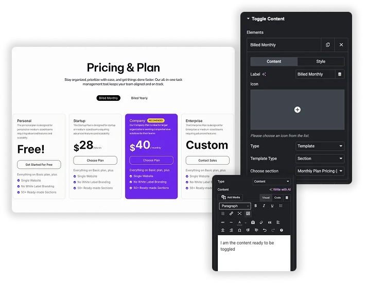
Every item in the Elements repeater is one option on the switch. Give it a Label and an optional Icon (before or after the label, with Icon Spacing). Then set Type to Content for a text editor with media and dynamic tags, or to Template and choose a saved Section, Page or Widget from your Elementor library.
- Build the monthly and yearly pricing tables as two saved sections, then point one option at each.
- A form, a gallery or any other widget can sit in an option once it is saved as a template.
- Each option has its own Label Color, Active Label Color and Indicator Color in its Style sub-tab.
Style the Toggler, Indicator and Labels
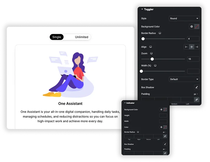
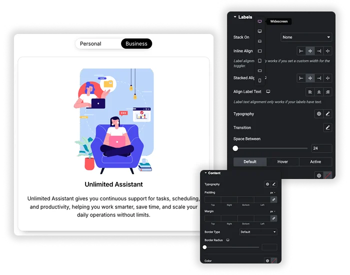
The Toggler section styles the switch track: Style (Round or Square), Background Color, Border Radius, Align, Zoom to scale it, Width (%), Border, Box Shadow, Padding and Margin. Indicator styles the sliding highlight with its own background, height, width, border radius, box shadow and padding. Labels sets typography, a transition, Space Between, and colors for the Default, Hover and Active states.
- A Content section styles the panel below with typography, padding, margin, border, color and background.
- Indicator Speed sets how long the slide takes, 0.3 seconds by default.
- The content panel itself swaps straight away. Only the indicator slides.
Default Option, Position and Mobile Layout
Active Index picks the option that shows when the page loads, 1 for the first. Position puts the switch Before or After the content. On small screens, Stack On (All, Tablet & Mobile, or Mobile) turns the row of labels into a vertical list, with separate Inline Align and Stacked Align controls.
- With two options, clicking the active label flips to the other one, so it works like an on and off switch.
- With three or more, clicking the active label moves on to the next option.
- The page does not remember the choice, so every visit starts on the Active Index option.
Build a monthly and yearly pricing toggle
A billing switch is the most common use for this widget. You build the monthly prices and the yearly prices as two separate sections, and the toggle shows one of them at a time.

- Build your monthly plans on a blank draft page. The Pricing Table widget works well here, with one widget per plan.
- Click the arrow next to Publish, choose Save as Template and name it Monthly Pricing. This creates a Page template.
- Change the prices and the billing text, then save again as Yearly Pricing.
- Add Toggle Content where the plans should appear. Rename the two items Monthly and Yearly. For each one, set Type to Template, choose Page in Template Type and pick the matching template.
- Set Active Index to the option visitors should see first, then preview the page and click both labels.
The Section list in Template Type only shows templates saved with the Section type. A container saved on its own is stored as a Container template and does not appear there, so a Page template is the safer choice.
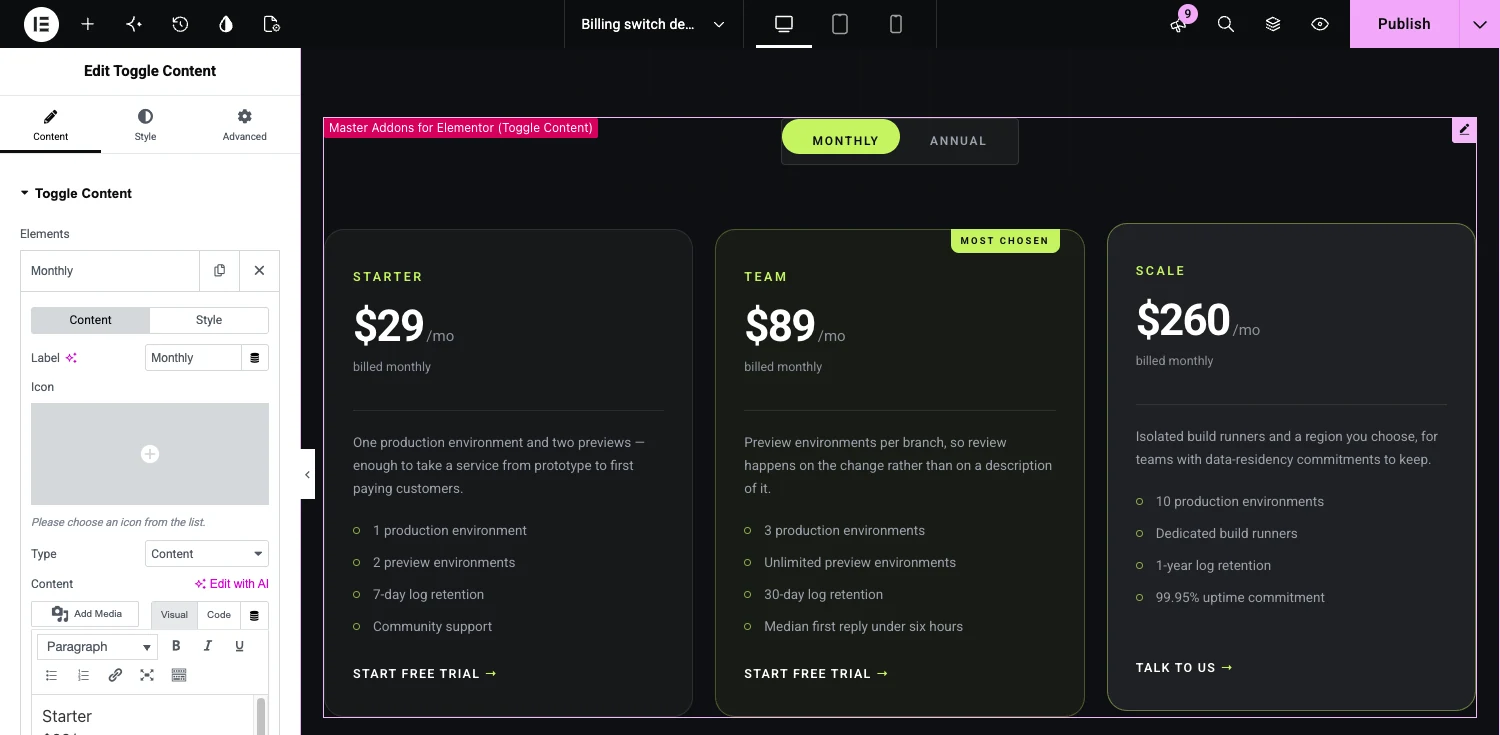
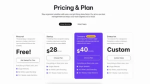
If you would rather type the plans straight into the widget, leave Type on Content and use the text editor, as in the screenshot above.
Toggle Content at a glance
The short version of what the widget does and does not do.
| Feature | Toggle Content |
|---|---|
| Options | Two or more. Add items in the Elements repeater. |
| Content in each option | Text from the editor, or a saved Section, Page or Widget template |
| Switch style | Round or Square |
| Switch position | Before or after the content |
| Default option | Set with Active Index |
| Label icons | Optional, before or after the label |
| Mobile layout | Labels can stack on mobile, on tablet and mobile, or on every screen |
| Remembers the visitor’s choice | No. Every visit starts on the default option. |
| Open an option from a link | No |
| Needs | Elementor and Master Addons Pro |
Content toggle examples
Each demo below is a working Toggle Content widget that you can open and click. Pricing is the usual job for a content switcher, and the demos show a few others.
- Billing Switch Pricing Cards: monthly and annual prices on three plan cards.
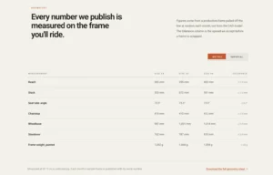
- Unit Switch Spec Table: metric and imperial measurements in one spec table.
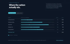
- Data Switch Benchmark Table: two data sets, own operations and supply chain, in the same table.
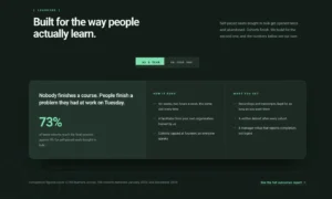
- Audience Switch Feature Panel: one message for teams and another for people learning on their own.
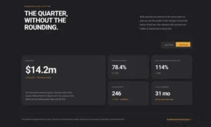
- Quarter Switch Metrics Bento: results for one quarter or the next.
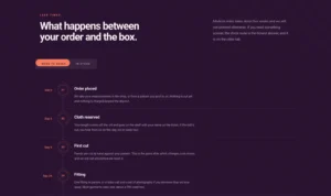
- Order Route Step Timeline: the steps for a made-to-order item or one that is in stock.
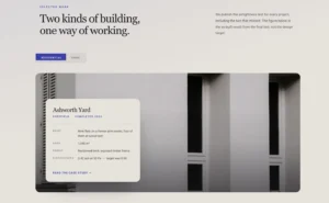
- Project Switch Overlay Card: residential and civic projects.
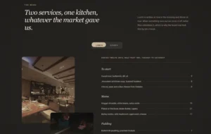
- Service Switch Menu List: a lunch menu and a dinner menu.
- Toggle Content Rounded: a rounded switch between a single plan and an unlimited plan.
- Toggle Content with Pricing: Billed Monthly and Billed Yearly plans.
Frequently Asked Questions For Toggle Content
Is Toggle Content free?
No. Toggle Content is a Pro widget and needs a Master Addons Pro license. The free plugin has Advanced Accordion and Advanced Tabs, which cover collapsible lists and tabbed sections.
Can I use my saved Elementor templates inside a toggle?
Yes. In an item, set Type to Template, choose Section, Page or Widget in Template Type, then pick the saved template. That option shows the whole template when its label is active.
Is a content switcher the same as a content toggle?
Yes. Content switcher and content toggle are two names for the same kind of widget: a switch that shows one block of content and hides the others. Some addons call theirs Content Switcher. Master Addons calls it Toggle Content.
How do I create a toggle button in Elementor?
For a button that switches content, add Toggle Content, name the items (for example Monthly and Yearly) and give each one text or a saved template. For a title that opens and closes an answer, use the Accordion widget.
Where did the Elementor Toggle widget go?
Elementor now hides its old Toggle widget from the widget panel when nested elements are active and offers Accordion for collapsible lists. The old widget was a collapsible list and never switched between content sets, which is the job Toggle Content does.
How is a content toggle different from an accordion or tabs?
An accordion expands and collapses items in a list, and tabs show a row of titles over one content area. A content toggle, also called a content switcher, swaps one whole content set for another, which suits choices like monthly or yearly pricing. Elementor’s own Toggle widget is really a collapsible list and is now hidden in favor of Accordion.
How does it behave on mobile?
The labels sit in a row by default. Set Stack On to Mobile, Tablet & Mobile, or All to stack them vertically, and use Stacked Align to line them up. Template content follows its own responsive settings.
Can I have more than two toggle options?
Yes. Click Add Item in the Elements repeater to add more. With three or more options, clicking the active label moves to the next one, and clicking any other label jumps straight to it. For many sections, tabs are usually easier to scan.
Can a toggle option be open by default?
One option always shows. Set Active Index in Toggle Settings to choose which one: 1 for the first item, 2 for the second, and so on.
Can search engines read the hidden option?
Yes. Every option is in the page HTML and only the active one is visible, so search engines can read all of them. Make the version that matters most the default option, because that is the one visitors see first.
Trending Elementor Widgets & Extensions
Build sophisticated websites in less time.
Glassmorphism
Container Extras
Patterns
![Master Addons Post/Page Duplicator extension for Elementor: MA Duplicator row link in the WordPress Pages list creating a Landing Page - [Duplicated #128] draft](https://d1asvmc6qcowgk.cloudfront.net/wp-content/uploads/2026/09/15102930/post-page-duplicator-768x403.webp)
Post/Page Duplicator