Elementor Image Hotspot Widget with Tooltips (Pro)
Image Hotspot is a Master Addons Pro widget that pins markers on top of an image. A marker can be a plain dot, a short text label, a Font Awesome icon or a small picture, and each one opens a tooltip when a visitor hovers it, or taps it once you switch on Trigger on Click. It suits shop-the-look photos, product callouts, floor plans, campus maps and labelled diagrams. If what you want is a hover hint on a button or a heading, the free Tooltip widget or the Tooltips extension (Pro) is the closer fit.

How to Add an Image Hotspot in Elementor
To add an image hotspot in Elementor, activate Master Addons Pro, edit the page with Elementor and search the widget panel for Image Hotspot. Drag it in, choose your picture under Image, then open Hotspots and click Add Item for every marker. Set each marker’s Type, Tooltip Content and Position, then publish.
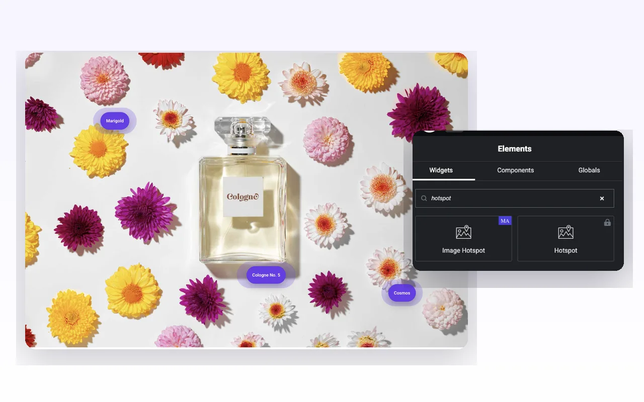
Search the panel for “hotspot” and two results come back. The one badged MA is this widget. The padlocked one beside it is Elementor’s own Hotspot, which needs an Elementor Pro licence, so it is worth checking which one you already own before you build.
Drop the widget in, pick your image and set Image Resolution to Full if the picture carries fine detail. Markers sit on the rendered image, so a downscaled source makes every pin look approximate. Open Hotspots, hit Add Item, and repeat once per marker. Each item carries its own Content, Style and Position tabs.
Two things trip people up on the first build. Markers land at the top-left corner until you touch the Position sliders, so three fresh items stack into what looks like one. And the Tooltip Content box is a full editor, which makes it tempting to paste a paragraph in. There is a reason to resist that, covered further down.
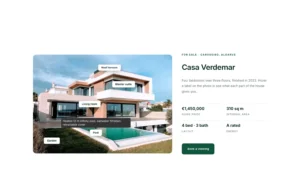
Worked examples with product photos, maps and diagrams live in how to add image hotspots in Elementor. Every control is listed in the Image Hotspot widget settings guide.
Four Marker Types on One Image
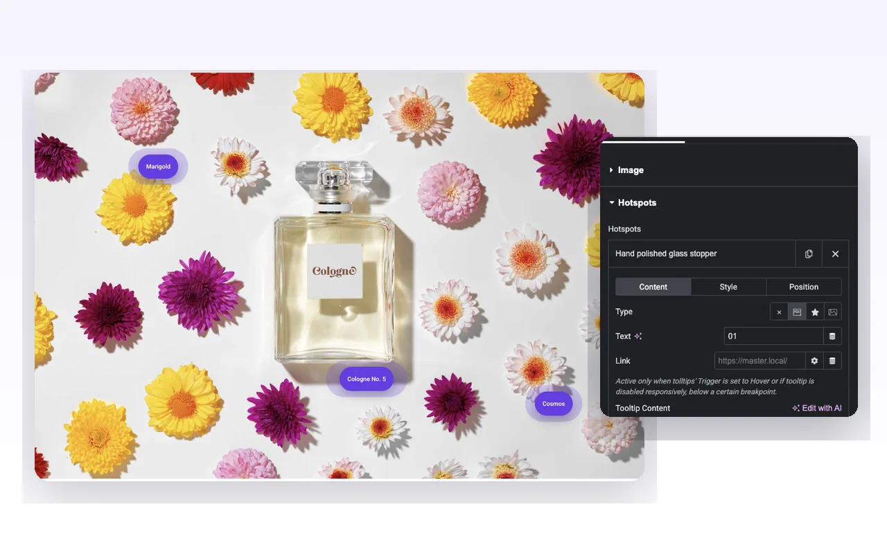
The Type control in a marker’s Content tab gives you four shapes, and you can mix all four inside a single image.
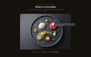
None leaves a bare coloured dot. It is the cleanest option for dense diagrams where labels would collide with each other.
Text prints a short string inside the marker. Numbers work well here, because 01, 02 and 03 across a product shot read as a guided tour with no legend to write. Longer strings turn the dot into a pill, which is the look you want for something like “Cologne No. 5”.
Icon takes any Font Awesome icon from the library, so a leaf can stand in for ingredients and a star for a rating.
Image swaps the marker for a picture from your media library. Product thumbnails and avatars read best; anything busy turns to mush at marker size.
Each marker also accepts a Link. That link fires when tooltips open on hover, or on breakpoints where you have switched tooltips off. It does not fire while Trigger on Click is on, because the tap is already taken.
Place Every Marker by Percentage
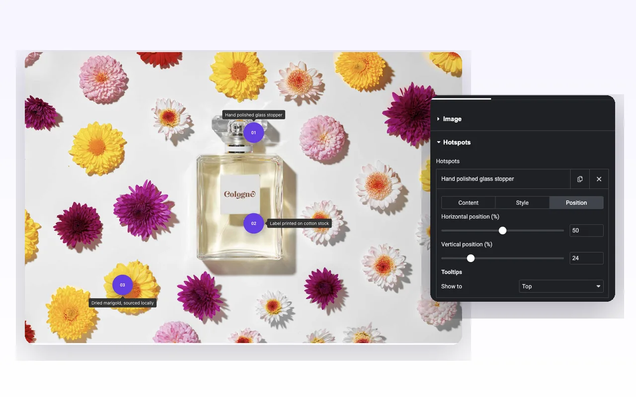
The Position tab holds two sliders, Horizontal position and Vertical position, both measured in percent of the image. Setting 50 and 24 puts a marker a quarter of the way down the middle. There is no drag-on-canvas placement, so you nudge the numbers and watch the preview.
Percent is what keeps the markers honest on a phone. The base image scales with its container and each marker keeps its relative spot, so a label pinned to a bottle cap is still on the bottle cap at 390px wide, where a pixel offset would have drifted off.
The same tab carries a per-marker Show to, which overrides the global tooltip side for that one marker. That helps when a marker sits near the right edge and its tooltip would run off the image: set that one to Left and leave the rest on Top.
Markers pulse by default. The Disable Pulse Effect switch at the bottom of the Hotspots section turns the animation off for every marker at once, which is usually what a floor plan with fifteen pins needs.
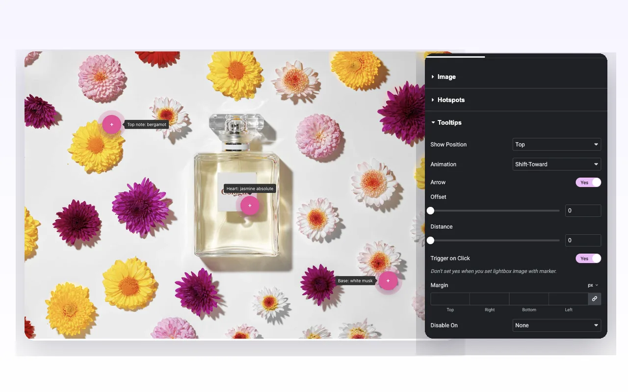
Tooltip Position, Animation and Mobile Behaviour
The Tooltips section drives every tooltip in the widget together: Show Position (top, bottom, left or right), Animation (Shift-Away, Shift-Toward, Fade, Scale or Perspective), an Arrow toggle, plus Offset and Distance for fine nudging.
Tooltips open on hover. Phones have no hover, which leaves two honest options. Switch on Trigger on Click and a tap opens the tooltip. Or set Disable On to Mobile, or Tablet & Mobile, which hides tooltips on those screens and hands the job to each marker’s Link.
One limitation to plan around. Tooltip Content is a WYSIWYG box, but the widget strips the markup before it renders, so bold, links, images and shortcodes all disappear and the tooltip shows plain text. Keep each one to a single short line. When you need formatted tooltip content, Elementor Pro’s Hotspot widget handles rich text and this widget does not.
Styling the tooltip itself is the full set: alignment, padding, radius, background, text colour, border, arrow colour, typography and box shadow. The base image gets opacity, border, radius, box shadow and CSS filters.
Style Markers for Default and Hover
Marker styling sits in two places, which is simpler than it sounds once you know the split.
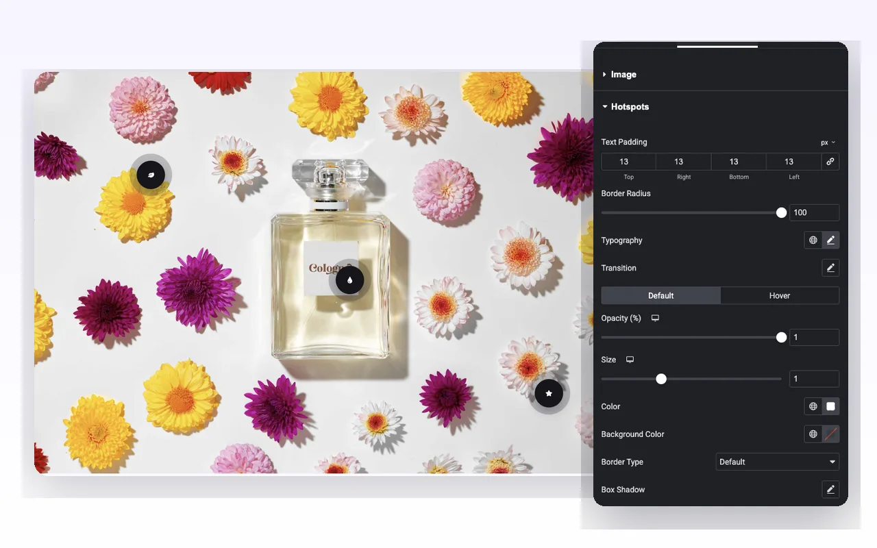
The widget’s Style tab covers every marker at once: Text Padding, Border Radius, Typography, a Transition group, and then Default and Hover tabs holding Opacity, Size, Colour, Background Colour, Border Type and Box Shadow. Size is a scale multiplier from 0.5 to 2, so setting Hover to 1.15 gives markers a light lift under the cursor without shifting anything else on the page.
The Style tab inside a single marker overrides that marker’s colour, background and opacity for default and hover. That is how you make one marker red on a wall of purple, to mark a sold-out item or flag the hotspot you want noticed first.
Border Radius at 100 gives you circles and pills. Drop it to 6 and text markers become square tags, which reads better on an architectural drawing than a row of bubbles.
Elementor Pro Hotspot vs Master Addons Image Hotspot
Elementor Pro ships its own Hotspot widget. If you already pay for Elementor Pro, check that one first, because you may not need this one at all.
| Feature | Elementor Pro Hotspot | Master Addons Image Hotspot |
|---|---|---|
| Price | Needs Elementor Pro | Needs Master Addons Pro |
| Marker types | Label text and an icon, with custom size | None, Text, Icon or Image |
| Marker animation | Soft Beat, Expand or Overlay, with sequenced animation | Pulse on or off |
| Tooltip content | Rich text with formatting | Plain text only |
| Tooltip trigger | Hover, Click or None | Hover, or Click with Trigger on Click |
| Tooltip animation | Fade and slide styles with a duration setting | Shift-Away, Shift-Toward, Fade, Scale, Perspective, plus arrow, offset and distance |
| Mobile | Per device positions | Disable tooltips on Tablet & Mobile or Mobile |
Elementor Pro wins on rich tooltip text and marker animations. Master Addons is the pick if you want image markers or already use Master Addons Pro without Elementor Pro. Related: the free Tooltip widget, the Tooltips extension (Pro), Image Comparison and Image Hover Effects.
Where an Image Hotspot Earns Its Place
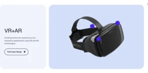
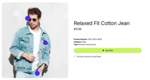
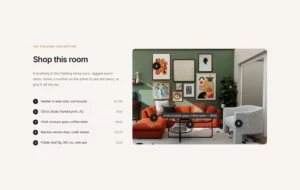
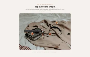
Shop-the-look photography is the obvious one. A single lifestyle shot, an image marker per product, a tooltip naming each item and a Link through to its product page. It works better than a grid of thumbnails because the visitor sees the pieces styled together before they see them priced.
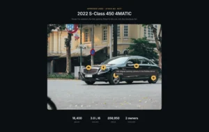
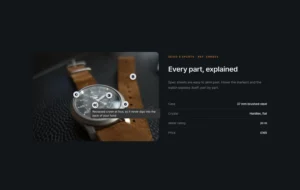
Specs without a spec table is the quieter use. On camera bodies, watches and machinery, numbered markers walk a reader around the object in the order you choose, and nobody has to map row 4 of a table back onto the photo.
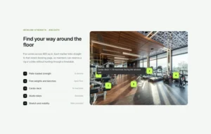
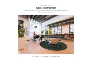
Then there are floor plans, campus maps and labelled diagrams. Dots with Disable Pulse Effect on, tooltips set to Trigger on Click, and a Link on each marker pointing at the full page. Fifteen pins stay readable that way; fifteen pulsing pills do not.


Frequently Asked Questions For Image Hotspot
What happens on mobile phones where there's no hover?
Turn on Trigger on Click in the Tooltips section so visitors tap a marker to open its tooltip. You can also set Disable On to Mobile or Tablet & Mobile, which hides tooltips on those screens and lets the marker Link take visitors to more information.
Can I use a custom image instead of an icon for the hotspot marker?
Yes. Set the hotspot Type to Image and pick a picture from the media library. A small, simple image such as a product thumbnail or avatar reads best at marker size.
Is the base image itself responsive?
Yes. The image scales with its column, and marker positions are set in percent, so each marker stays on the same part of the image across screen sizes. Tooltips may need Trigger on Click or Disable On for small screens.
Is the Image Hotspot widget free?
No. Image Hotspot is part of Master Addons Pro. The free plugin has the Tooltip widget, which adds a hover hint to a single element but does not pin markers on an image. Elementor Pro users can also use Elementor’s own Hotspot widget.
Can I turn the pulse animation off?
Yes. Disable Pulse Effect sits at the bottom of the Hotspots section and switches the pulse off for every marker in that widget. There is no per-marker pulse toggle, so use a second Image Hotspot widget if you need both looks on one page.
Why is the formatting in my tooltip disappearing?
Trending Elementor Widgets & Extensions
Build sophisticated websites in less time.
Glassmorphism
Container Extras
Patterns
![Master Addons Post/Page Duplicator extension for Elementor: MA Duplicator row link in the WordPress Pages list creating a Landing Page - [Duplicated #128] draft](https://d1asvmc6qcowgk.cloudfront.net/wp-content/uploads/2026/09/15102930/post-page-duplicator-768x403.webp)
Post/Page Duplicator