The default Elementor image widget shows a picture and links it somewhere. The Advanced Image widget in Master Addons for Elementor does more: it swaps to a second image on hover, drops a corner ribbon on top, opens in a lightbox, and adds a 3D tilt or colorized shadow, all without touching CSS.
You set the main image, an optional hover image, a ribbon, and a handful of effects from the Elementor panel. That makes it a good fit for product shots, portfolio thumbnails, or any image that needs a label or a bit of motion. This guide walks through every tab and setting.
Prefer to watch first? This short tutorial walks through the Advanced Image widget end to end:
What the Advanced Image widget does #
At its core it shows one image, but it layers extras on top. A hover image swaps in when the cursor is over it, a ribbon calls out a label like “NEW,” and the Settings tab adds a lightbox, a tilt effect, and a colorized shadow. Everything is configured from the panel, so the same image can do a lot more than a plain one.
The widget has four tabs: Content for the images and ribbon, Settings for behavior like lightbox and tilt, Style for sizing and colors, and Advanced for the usual Elementor spacing and visibility options.
Before you start #
- WordPress with Elementor installed and active.
- Master Addons for Elementor installed and active. New to the plugin? See the installation guide.
- One image to show, and a second one if you want the hover swap.
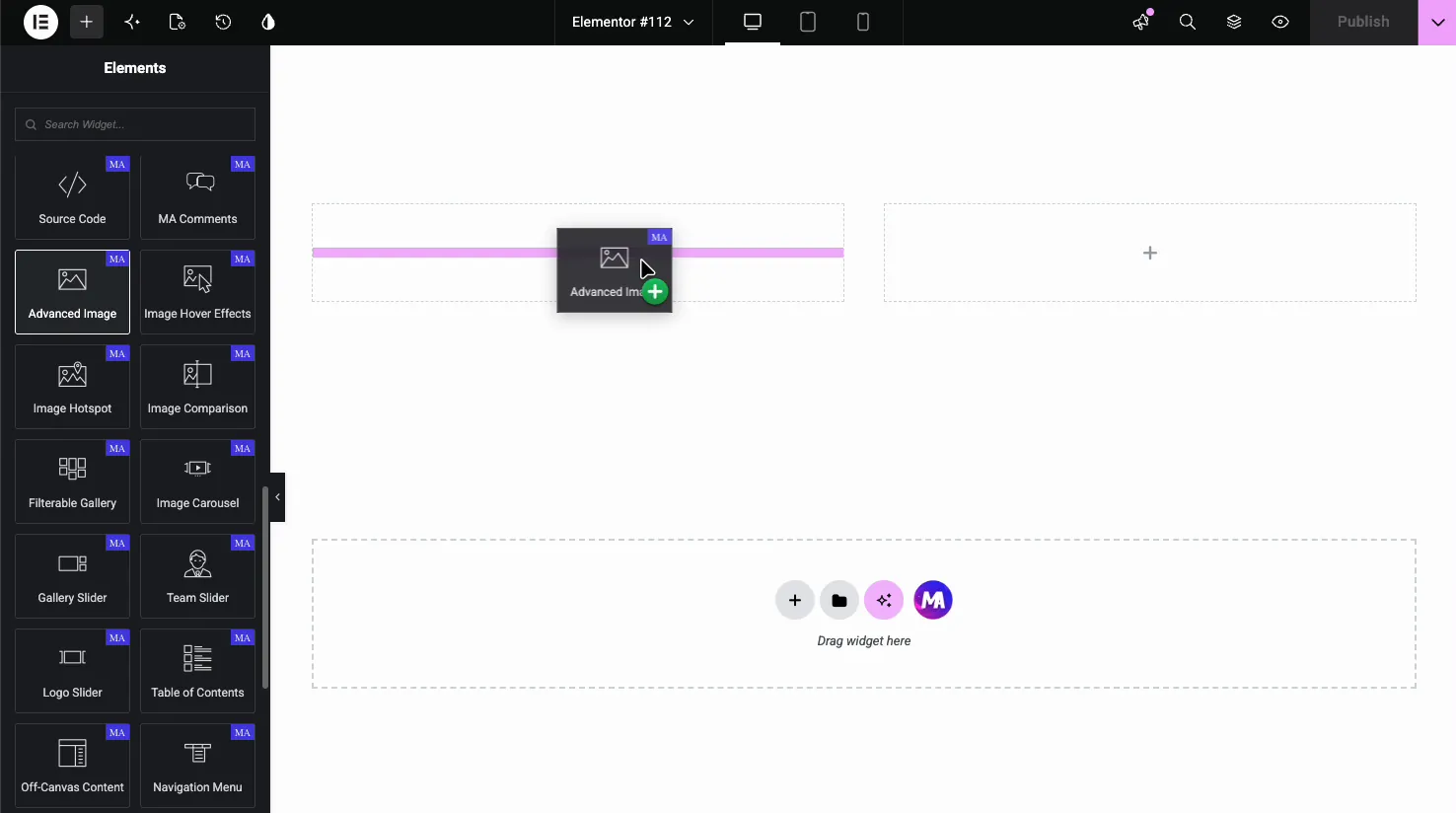
How to add the Advanced Image widget #
In the Elementor editor, open the Elements panel and search for Advanced Image, or scroll to the Master Addons section. Drag it onto your page. It starts with a placeholder, so the first step is choosing an image.
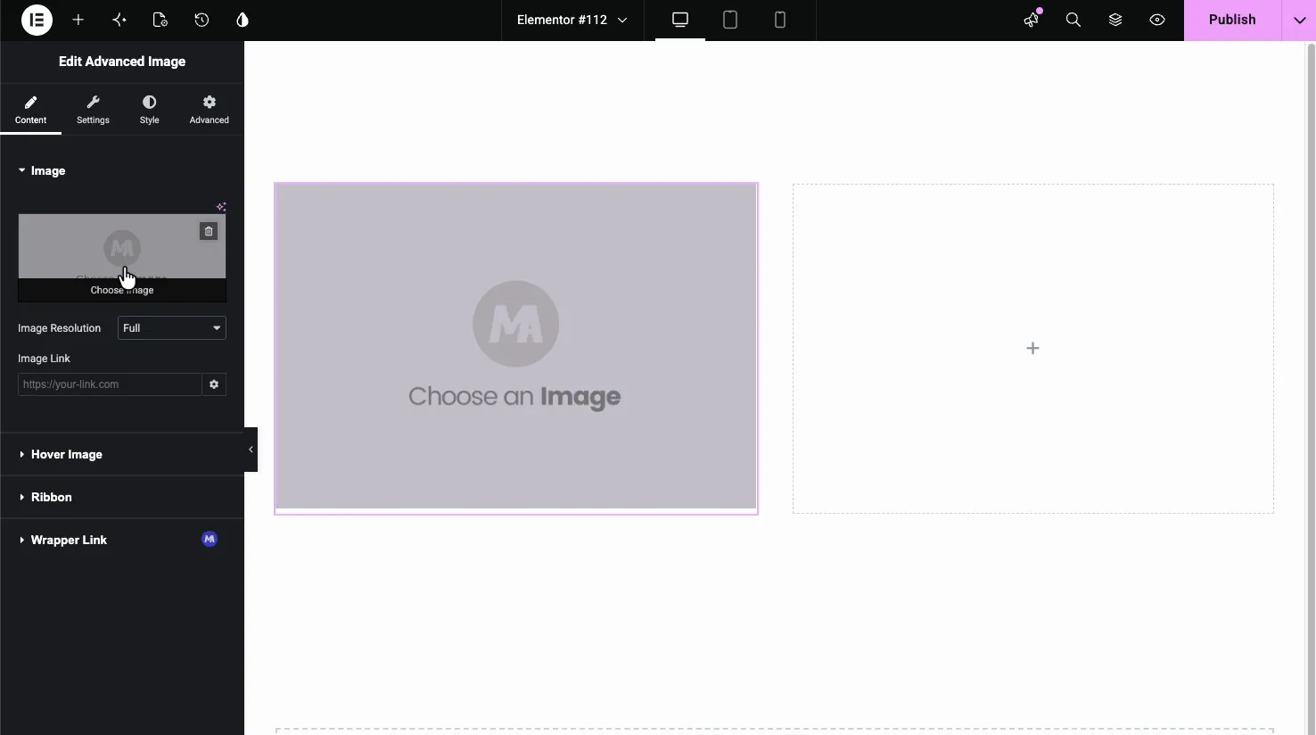
Set the image #
In the Content tab, the Image section holds the basics. Click the image box to pick one from the Media Library, set the Image Resolution WordPress should serve, and add an Image Link if the picture should link somewhere.
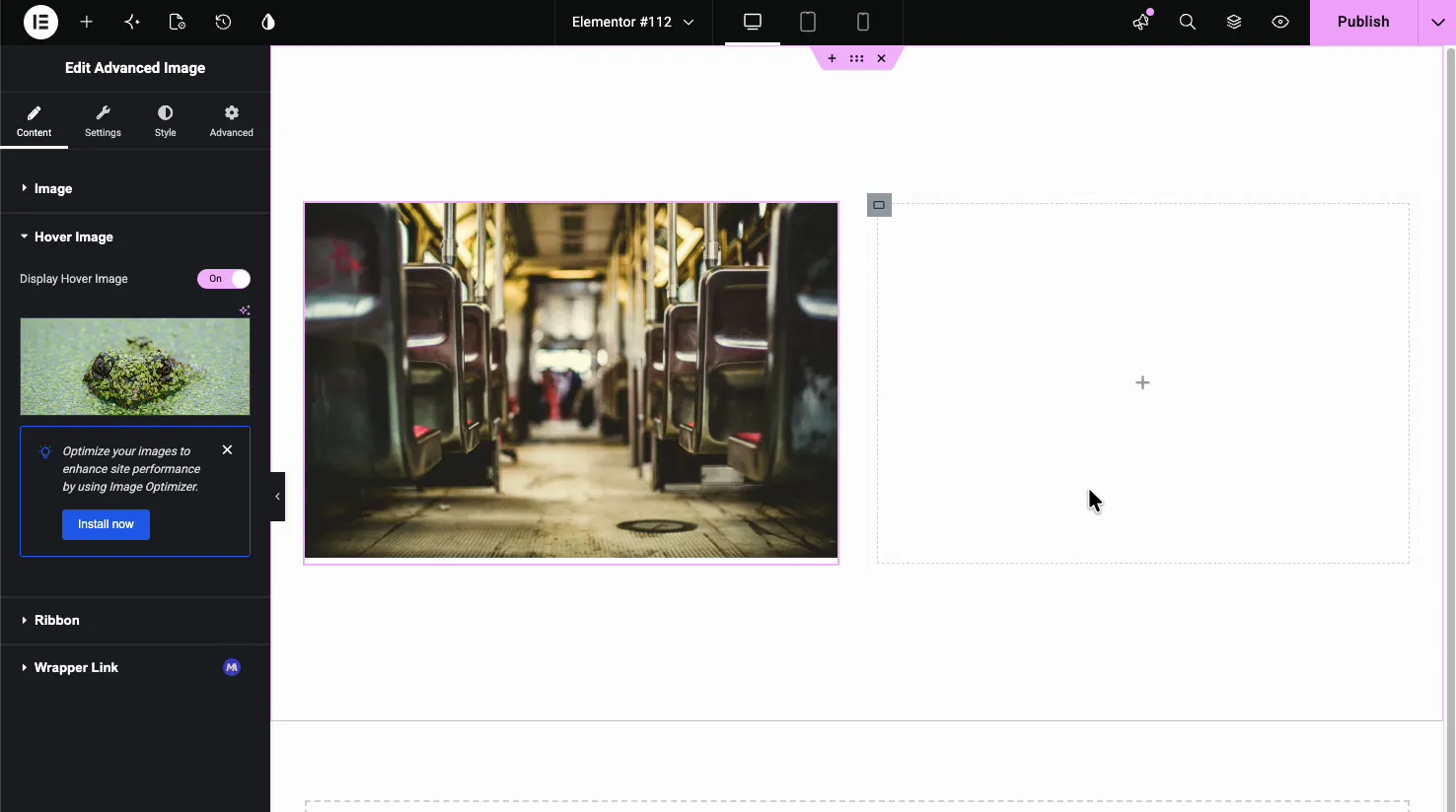
Add a hover image #
The Hover Image section is where the widget earns its name. Turn on Display Hover Image and pick a second image. On the live page, the widget shows the first image and crossfades to the second when someone hovers, which is handy for product fronts and backs or before-and-after shots.
Add a ribbon #
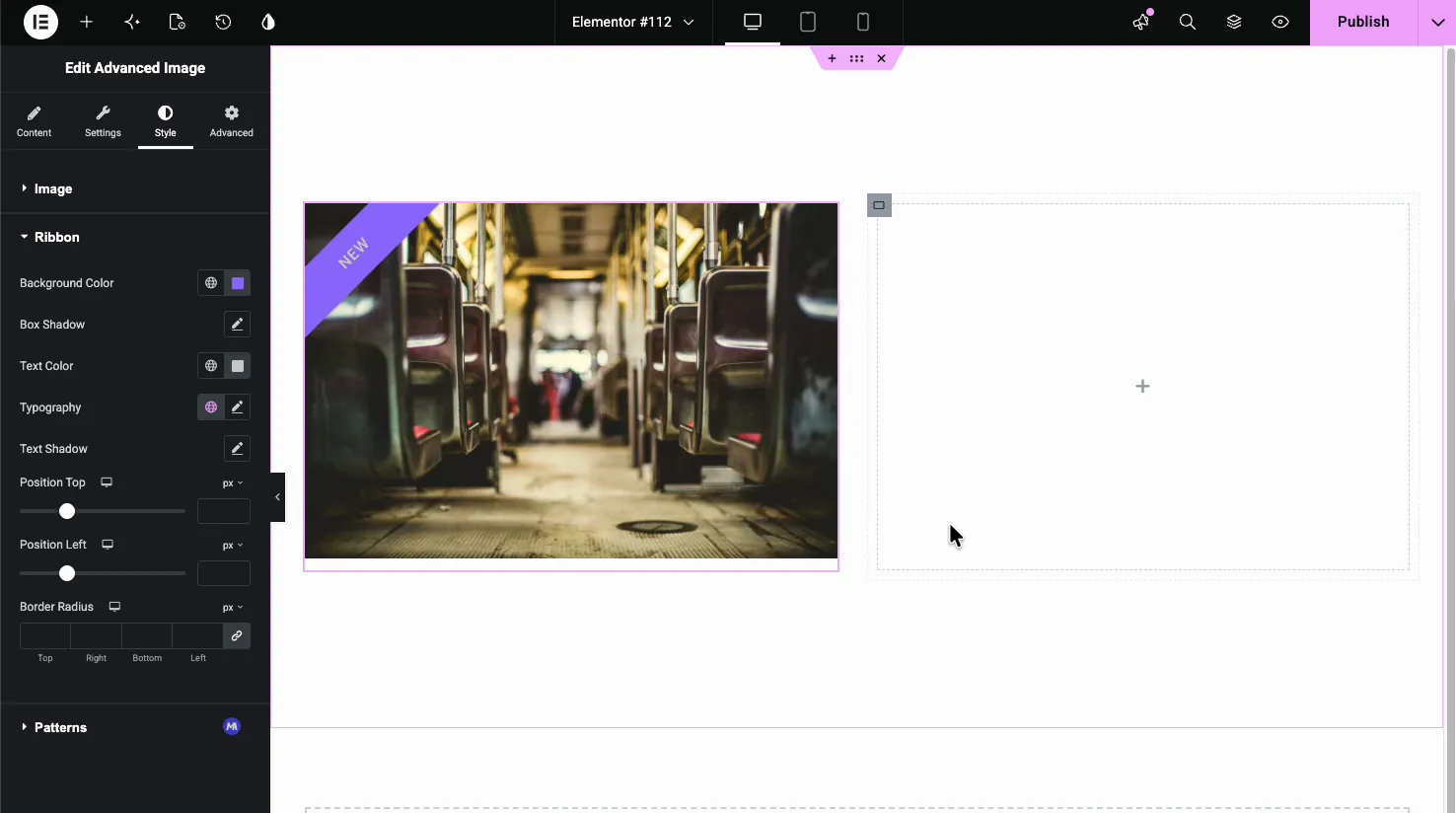
The Ribbon section adds a corner banner over the image. Turn on Display Ribbon, set the text, and choose how it looks.
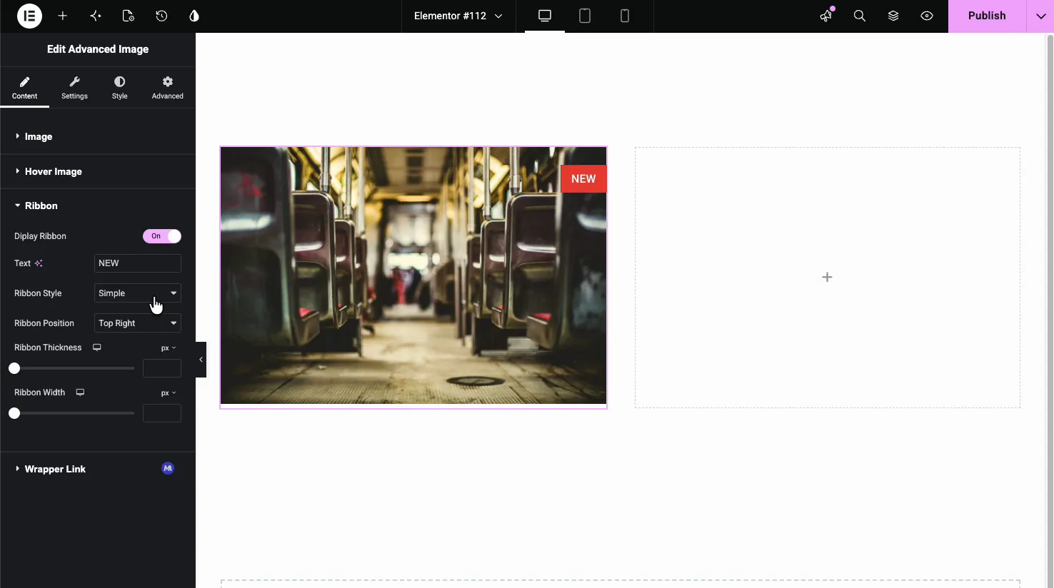
- Text: the label, like NEW or SALE.
- Ribbon Style: Simple for a diagonal corner band, or Cross for a flag-style tag.
- Ribbon Position: place it in any corner, such as Top Right or Bottom Left.
- Ribbon Thickness and Width: size the band to fit the text.
Settings: lightbox, tilt, and shadow #
The Settings tab is where the behavior lives. These are the extras that set the widget apart from a plain image.

- Open in lightbox: click the image to open it full size in a popup. Turning it on adds an iconic button option (like a plus icon) over the image.
- Alignment: left, center, or right within its block.
- Preload image: loads the image earlier for above-the-fold spots.
- Tilt Effect: adds a 3D tilt that follows the cursor for a bit of motion.
- Colorized Shadow: drops a shadow tinted from the image’s own colors. Note that it is not available while the hover image is active.
Style the image and ribbon #
The Style tab handles sizing and colors. The Image section sets the look of the picture itself.
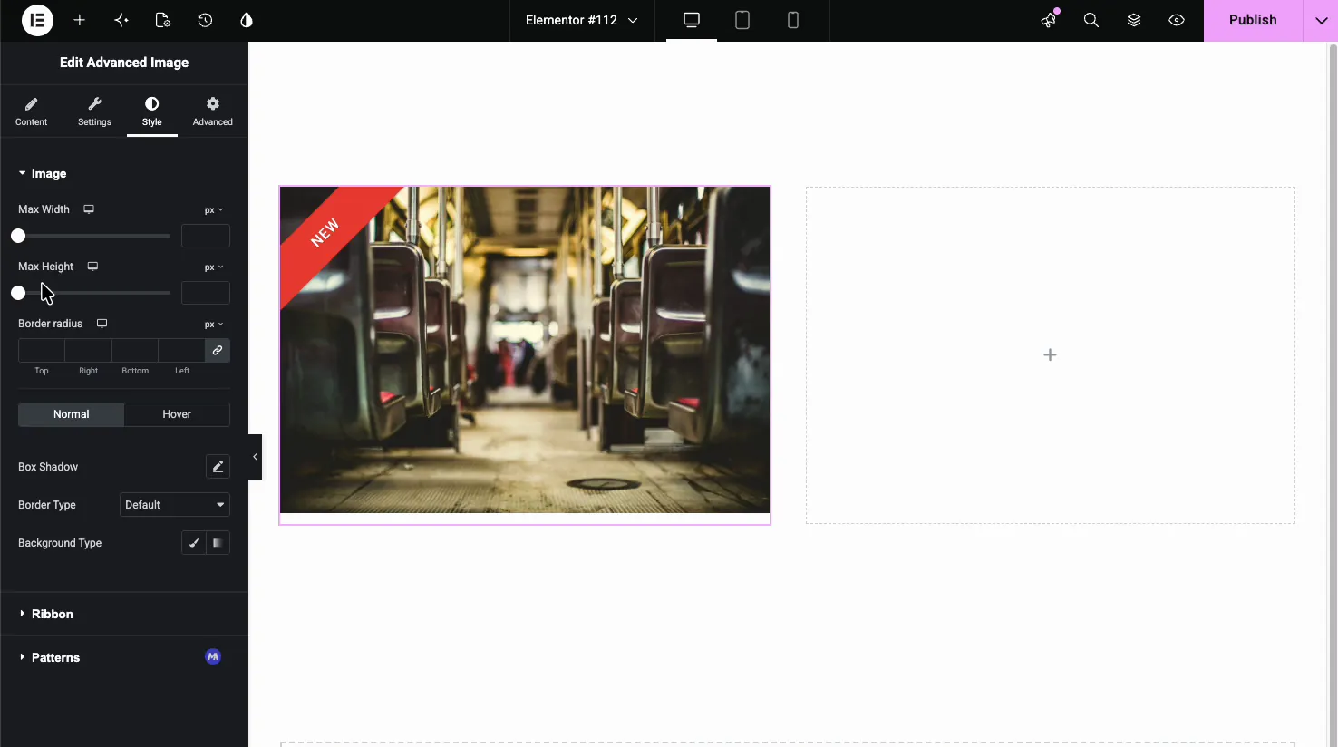
- Max Width and Max Height: cap the image size.
- Border Radius: round the corners.
- Normal and Hover states: set Box Shadow, Border, and background separately for resting and hover.
The Ribbon style section controls the banner’s look: background color, text color, typography, shadows, position offsets, and border radius.
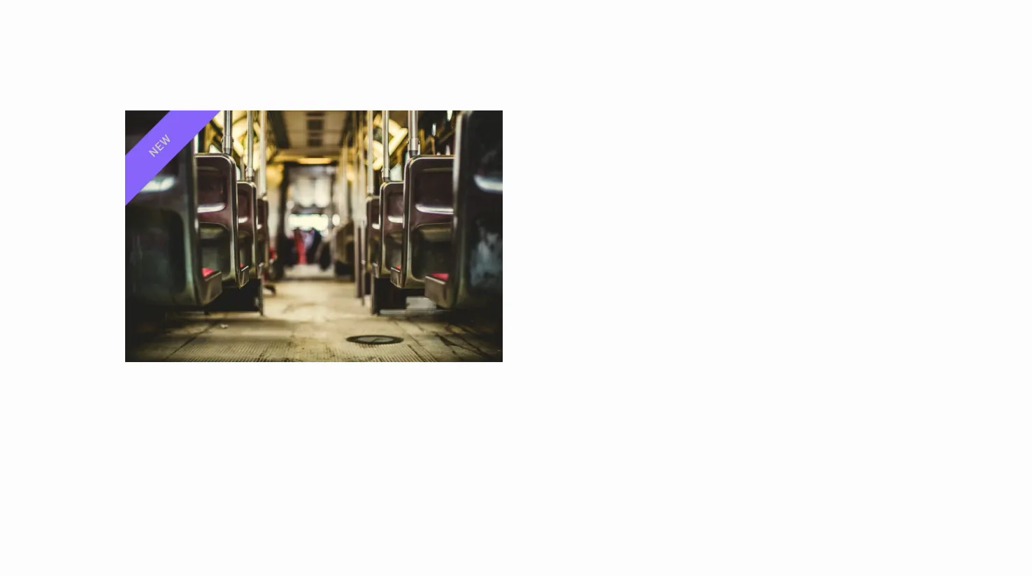
The result on the page #
Publish or preview and the image renders with your ribbon in place and the effects live: hover to swap images, hover for the tilt, or click to open the lightbox, depending on what you turned on.
Common use cases #
- Product shots with a hover swap from front to back or alternate angle.
- Portfolio thumbnails that open full size in the lightbox.
- Promo images with a NEW or SALE ribbon in the corner.
- Feature graphics with a subtle tilt for movement.
- Hero images using the colorized shadow for depth.
Tips for working with the Advanced Image widget #
- Use matching dimensions for the hover swap. Same-size images keep the crossfade from jumping.
- Pick the right Image Resolution. Serving a full-size file into a small slot slows the page; a medium or large size is usually enough.
- Keep ribbon text short. One word fits the corner band cleanly.
- Skip colorized shadow when using hover swap. The two do not run together, so choose one per image.
- Go easy on tilt. A little movement draws the eye; too much feels gimmicky.
Frequently Asked Questions #
What is the Advanced Image widget in Master Addons?
It is an Elementor image widget with extras built in: a hover image swap, a corner ribbon, a lightbox, a 3D tilt effect, and a colorized shadow. You set all of it from the Elementor panel, so a single image can do far more than the default image widget allows.
How do I make the image change on hover?
Open the Content tab, expand the Hover Image section, and turn on Display Hover Image. Then choose a second image. On the live page the widget shows the first image and crossfades to the second when a visitor hovers over it.
Can I add a ribbon or badge to the image?
Yes. In the Content tab, open the Ribbon section and turn on Display Ribbon. Set the text, pick a Simple or Cross style, and choose the corner. The Style tab then lets you set its color, typography, and position.
What is the tilt effect?
The tilt effect, found in the Settings tab, adds a 3D tilt that follows the cursor as it moves over the image. It gives a flat picture a sense of depth and motion. Use it sparingly so it stays subtle rather than distracting.
Does the Advanced Image widget support a lightbox?
Yes. Turn on Open in lightbox in the Settings tab and visitors can click the image to view it full size in a popup. You can also add an iconic button, such as a plus icon, that appears over the image to signal it is clickable.
Wrapping up #
The Advanced Image widget takes a single picture and adds the touches that usually take custom code: a hover swap, a ribbon, a lightbox, a tilt, and a colorized shadow. Set the images, switch on the effects you want, and style the result from the panel. For more image tools, see the Image Hover Effects and Image Carousel widgets, browse the full Master Addons widgets and extensions, and check the pricing page for what each plan includes.


