

The Text field is the one you reach for any time a custom widget needs a line of text someone can edit: a headline, a label, a short caption, a button word. Inside the Master Addons Widget Builder, you drop a Text field into your widget panel, give it a name, and that name becomes a shortcode you place in your HTML, CSS, or JS. Whatever the user types in Elementor prints straight into your markup.
Like every Widget Builder field, the Text field supports Conditions, so you can show or hide the control based on another field’s value. Its output also runs through the builder’s Twig-syntax template engine, which lets you wrap the token in {% if %} checks or apply filters like |upper. Both guides cover the setup and the limitations.
It does more than print a plain string, though. The Text field hooks into Elementor’s responsive controls and dynamic tags, so one field can hold a different headline on mobile than on desktop, or pull its value from a dynamic source like the post title.
What the Text field does #
A Text field renders a single-line text input in the widget’s option panel. When someone edits your custom widget in Elementor, they see that input, type a value, and your widget outputs it wherever you placed the matching shortcode.
It pairs well with the other input fields in the builder. For longer multi-line content, reach for the Text Area field. For rich formatted content, use the WYSIWYG field. The Text field is the right pick for short, plain strings. If you are new to building widgets, read the Widget Builder overview first.
Before you start #
- WordPress with Elementor installed and active.
- Master Addons for Elementor installed and active. New to the plugin? See the installation guide.
- A custom widget open in the Widget Builder editor.
How to add a Text field #
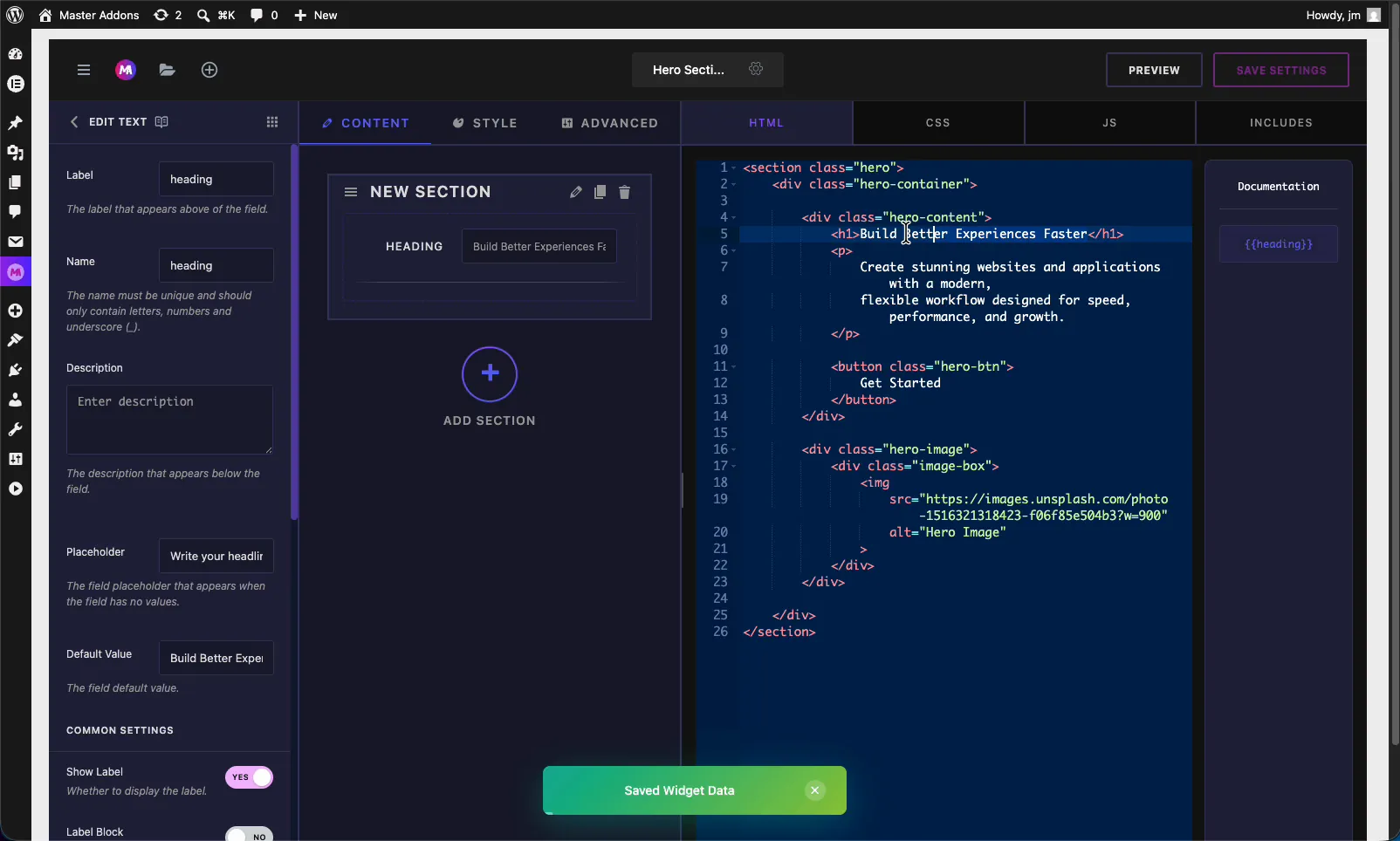
In the Widget Builder editor, find the fields panel on the left, then drag the Text field into a section under the Content, Style, or Advanced tab. Most text inputs belong under Content. Once it is in place, the field’s options open on the left and its shortcode shows up in the Documentation sidebar next to the code editor.
Text field options explained #
Select the Text field to open its settings. These options control how the input looks and behaves in the Elementor panel.
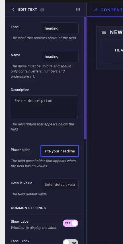
- Label: the text that appears above the field in Elementor. Keep it short and clear, like “Heading” or “Button Text”.
- Name: the unique identifier for the field. It must contain only letters, numbers, and underscores, so no spaces or dashes. This name becomes your shortcode, so a field named
headinggives you{{heading}}. - Description: optional helper text shown below the field. Use it to explain what the input controls.
- Placeholder: the greyed-out hint shown when the field is empty, for example “Write your headline”. It guides the user without setting a real value.
- Default Value: the value the field starts with. Set something like “Build Better Experiences” so the widget looks finished before anyone edits it.
Common settings: responsive, dynamic, and more #
Scroll down to Common Settings for the controls that decide how flexible the field is. This is where you turn on responsive values and dynamic tags.
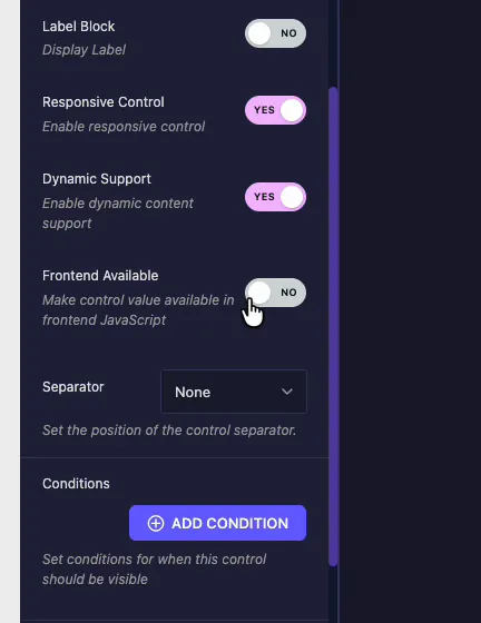
- Show Label: toggle whether the label appears above the field.
- Label Block: display the label on its own line above the input instead of beside it.
- Responsive Control: turn this on to let users set a different value for desktop, tablet, and mobile. Good for headlines that need to be shorter on small screens.
- Dynamic Support: turn this on to enable Elementor dynamic tags, so the field can pull its value from a source like the post title or author name instead of static text.
- Frontend Available: make the control’s value available to frontend JavaScript. Enable it when your widget’s JS needs to read the value.
- Separator: set where a dividing line appears around the control (None, Before, After, Default).
- Conditions: show or hide this field based on the value of another control. Click Add Condition to set the rule.
Connect the field to your code #
Every Text field generates a shortcode from its Name. Add a field named heading and the token {{heading}} shows up in the Documentation sidebar. Drop that token into your HTML wherever the text belongs.
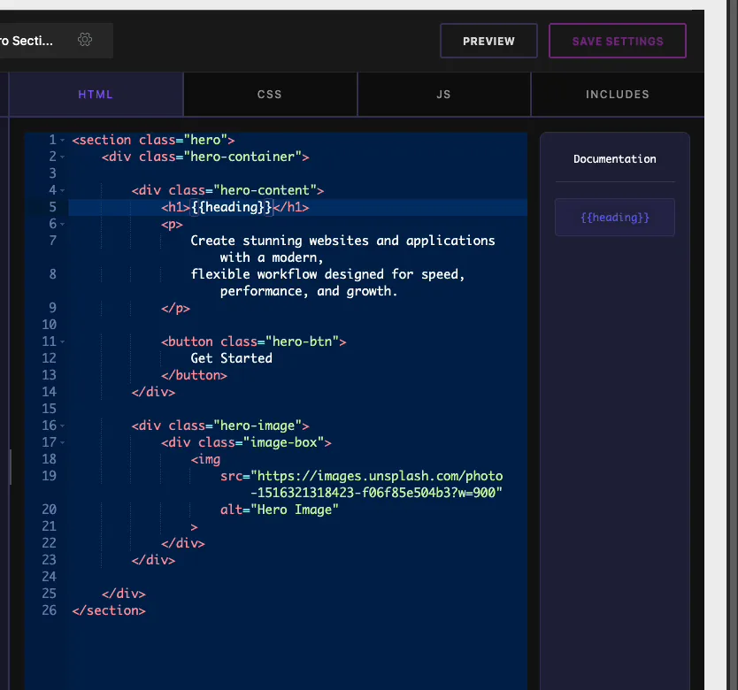
For a hero headline, the change is small:
- Replace the static text inside your
<h1>with{{heading}}. - Save the widget. Now the
<h1>prints whatever value the user sets in Elementor.
Since the shortcode is just a token, you can reuse the same field value in CSS or JS too. One field, many places.
Use the Text control in Elementor #
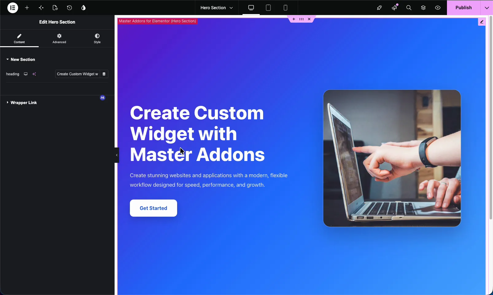
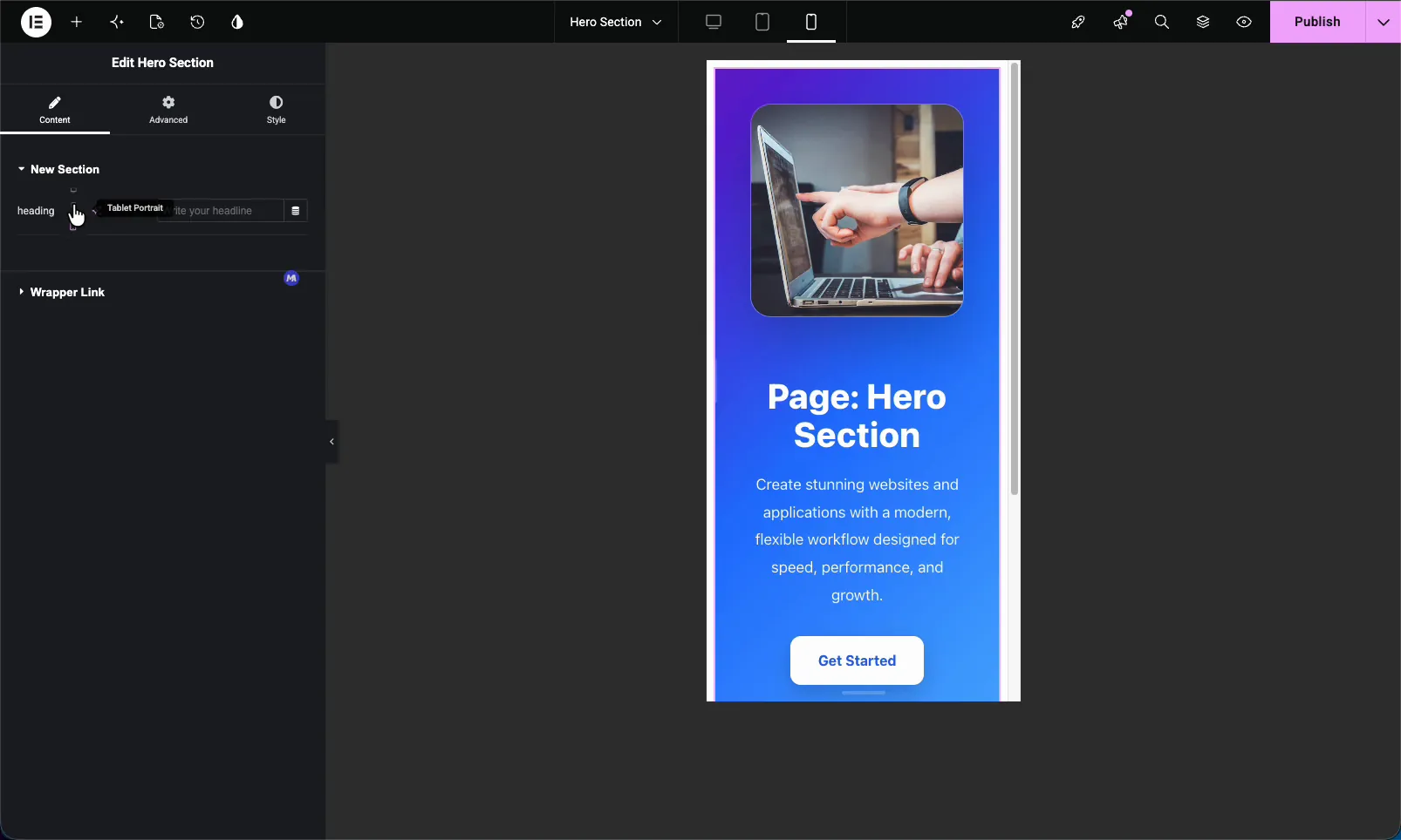
Drag your custom widget onto a page and open it in the Elementor editor. The Text field shows up as a normal control with your label, placeholder, and default value already in place. Two small icons sit next to the input: a device icon for responsive values, and a dynamic tags icon when you enabled those options.
Type a new value and the widget updates live. In the example below, changing the heading field rewrites the hero headline on the page. The same field type works just as well for a paragraph, a button label, or any other short string. That is the whole point of the Text field: anywhere a widget needs to print text, this is the control you use.
Pull text from a dynamic tag #
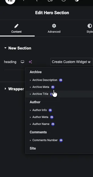
With Dynamic Support on, click the dynamic tags icon and pick a source. Master Addons and Elementor list grouped tags such as Archive Title, Author Name, Author Info, and Comments Number. Select one and the field pulls live data instead of static text, which saves you from editing the same title across dozens of posts.
Set a different value per device #
With Responsive Control on, click the device icon to switch between Desktop, Tablet, and Mobile, then enter a separate value for each. A long desktop headline can become a shorter one on phones without touching the desktop version. Worth knowing: if you leave the tablet or mobile value empty, it falls back to the desktop text, so you only override the breakpoints that actually need it.
Common use cases #
- Hero headlines that editors can change without opening the code.
- Section paragraphs and short descriptions.
- Button and CTA labels tied to the widget’s link.
- Badges, tags, and small captions where formatting is not needed.
- Dynamic titles that pull from the post or archive for reusable templates.
Tips for working with the Text field #
- Name fields meaningfully. The Name becomes your shortcode, so
headingreads better in code thanfield_1. - Always set a Default Value. It keeps the widget looking complete in the editor and on first drop.
- Only turn on Responsive and Dynamic when you need them. Extra controls clutter the panel for simple text.
- Use Placeholder as guidance, not content. It never prints to the page, so do not rely on it for real text.
- Build the field before referencing its shortcode. The token only exists once the field is on the panel.
Frequently Asked Questions #
What is the Text field in the Master Addons Widget Builder?
The Text field adds a single-line text input to a custom Elementor widget. You name the field, place its shortcode in your code, and whatever a user types in Elementor prints into your widget. It supports responsive values and dynamic tags.
How do I make custom widget text responsive in Elementor?
Open the Text field’s Common Settings and turn on Responsive Control. Back in the Elementor editor, click the device icon next to the field and set a separate value for Desktop, Tablet, and Mobile. Each device keeps its own text.
Can a Text field use Elementor dynamic tags?
Yes. Enable Dynamic Support in the field’s Common Settings. In Elementor, click the dynamic tags icon next to the control and choose a source like Archive Title or Author Name, so the field pulls live data instead of static text.
What is the difference between Label, Name, and Placeholder?
Label is the text shown above the field. Name is the unique code identifier that becomes the field’s shortcode. Placeholder is the faint hint shown when the field is empty. Only the value a user enters, or the Default Value, actually prints to the page.
Should I use the Text field or the Text Area field?
Use the Text field for short single-line strings like headlines and labels. Use the Text Area field for multi-line content, and the WYSIWYG field when you need formatting such as bold, links, and lists inside the value.
Wrapping up #
The Widget Builder Text field is the simplest way to make a custom Elementor widget editable. Name it, drop its shortcode in your code, set a default, and switch on responsive or dynamic support when a project calls for it. After that, anyone can update the text from Elementor without touching a line of code. Have a look at the rest of the Master Addons widgets and extensions, and check the pricing page for what each plan includes.


