

The Typography field gives a custom widget the exact same typography panel Elementor’s core widgets use: font family with Google Fonts, size, weight, transform, style, decoration, line height, letter spacing, and word spacing, all responsive per device. Inside the Master Addons Widget Builder, you add the field once, point it at a CSS selector, and anyone editing the widget in Elementor can restyle the text without touching code.
Like every Widget Builder control, Typography supports Conditions, so you can keep it hidden until a custom-styling toggle is on. Token output across the builder runs through the Twig-syntax template engine; both guides cover the details and limitations.
Unlike text or color fields, the Typography field does not use a shortcode in your CSS. You tell the field which selector it controls, and Elementor writes the typography styles to that selector on its own. One field, one selector, done.
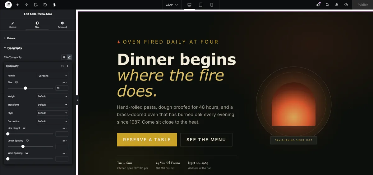
What the Typography field does #
A Typography field renders Elementor’s typography group control in your widget’s option panel. When someone selects the widget and clicks the pencil icon next to the field’s label, a popover opens with the full set of text controls:
- Font Family: a searchable dropdown with system fonts, Google Fonts, and any custom fonts registered on the site.
- Font Size: a slider and input with px, em, rem, and vw units, responsive per device.
- Font Weight: 100 through 900 plus Normal and Bold.
- Transform, Style, and Decoration: uppercase and lowercase, italic and oblique, underline and line-through.
- Line Height, Letter Spacing, and Word Spacing: each with its own responsive input.
The globe icon is there too, so the widget can follow the site’s Global Fonts presets instead of a one-off style. This follows the same pattern as the other Widget Builder fields: drop the field, name it, connect it. The one difference is how it connects, through a selector instead of a shortcode. If you are new to building widgets, start with the Widget Builder overview first.
Before you start #
- WordPress with Elementor installed and active.
- Master Addons for Elementor installed and active. New to the plugin? See the installation guide.
- A custom widget open in the Widget Builder editor. Our example is a restaurant hero widget with an
<h1 class="bfh-title">heading and a<p class="bfh-lede">intro paragraph in its HTML.
How to add a Typography field #
In the Widget Builder editor, scroll the fields panel on the left until you find the Typography field, listed with the other style group fields.
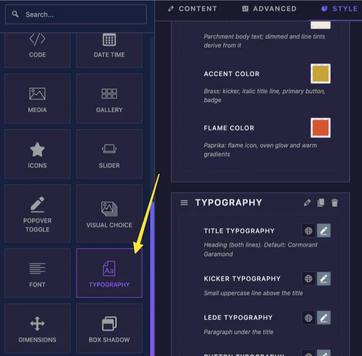
Drag the Typography field into a section under the Content, Style, or Advanced tab. Style is the natural home for it, though it works anywhere. Once it lands, the field’s options open on the left.
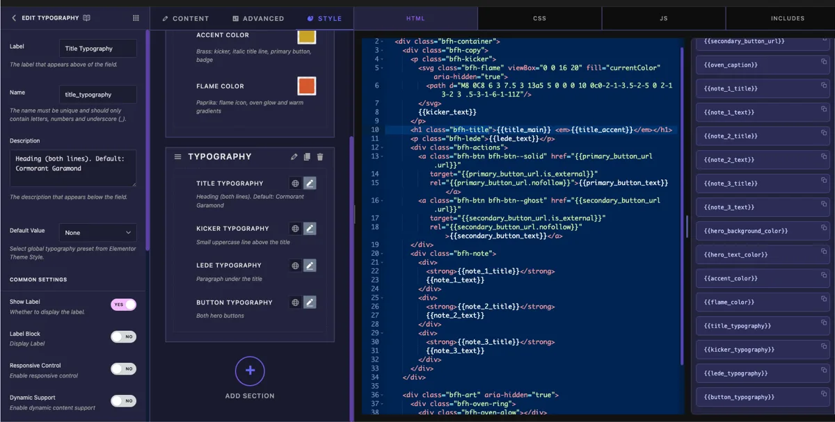
Typography field options explained #
Select the Typography field to open its settings.
- Label: the text shown next to the control in Elementor, “Typography” by default. With several typography fields in one widget, use names like “Title Typography” and “Button Typography”.
- Name: the unique identifier for the field. It must contain only letters, numbers, and underscores, for example
title_typography. - Description: optional helper text shown below the control.
- Selector: the CSS selector the typography styles apply to. This is the one setting that makes the field work, covered in the next section.
- Default Value: optionally link the field to one of Elementor’s Global Fonts presets — Primary, Secondary, Text, or Accent. The widget then starts with that preset applied, and follows it if the site’s global fonts change.
- Show Label and Separator: the standard display toggles, plus Conditions further down for showing the field only when another control has a certain value.
Point the field at your selector #
Here is the part that trips people up if they are used to the other fields: the Typography field has no {{shortcode}} for your CSS. A typography value is a whole bundle of properties, not a single value, so it cannot print into one CSS declaration. Instead, you fill in the Selector option and Elementor generates the styles for you.
For the hero’s intro paragraph, the selector is:
{{WRAPPER}} .bfh-lede
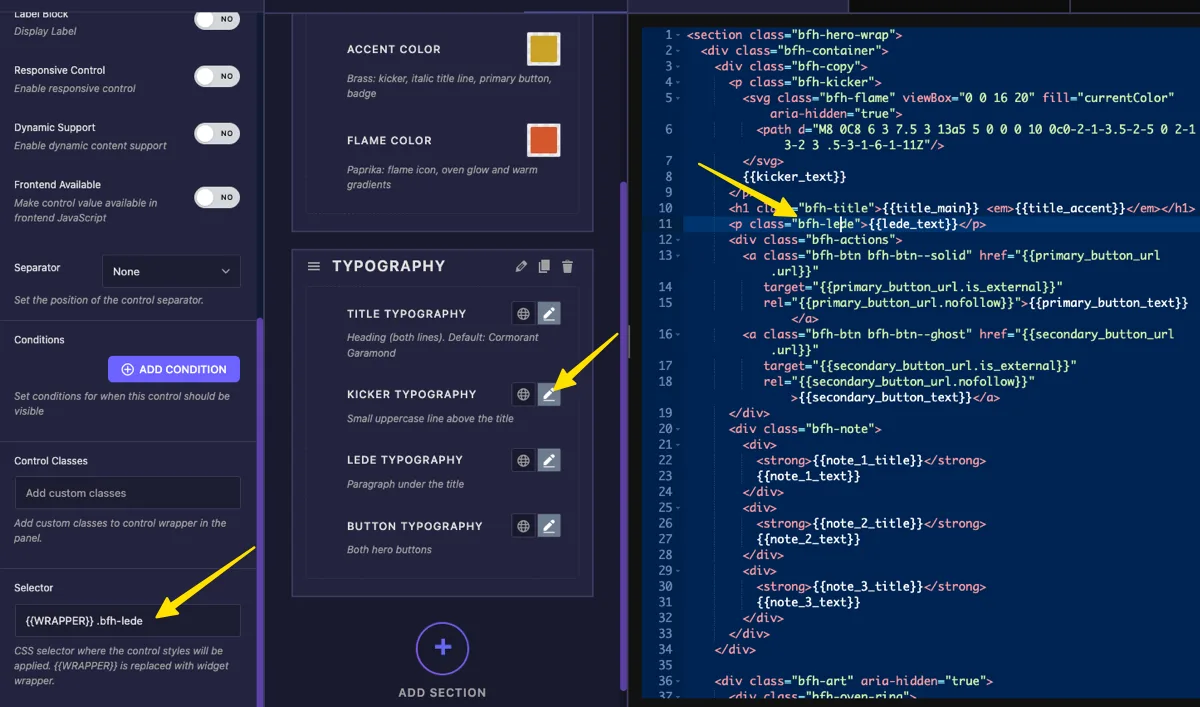
{{WRAPPER}}stands for the widget’s own container, so the styles only ever hit this widget and never leak to the rest of the page. Always start the selector with it..bfh-ledeis the element inside your widget HTML that the control should style.- To drive several elements with one control, separate selectors with commas and give each its own
{{WRAPPER}}:{{WRAPPER}} .bfh-title, {{WRAPPER}} .bfh-lede.
If you leave the Selector empty, the field falls back to the widget’s whole container, which styles every piece of text in the widget at once. That is usually more than you want. Set the selector, then click Save Settings.
Your stylesheet in the CSS tab keeps working as the widget’s starting look. Whatever font-family or font-size you wrote there stays in place until a user picks something in the panel; the control’s values then override it.
Use the Typography control in Elementor #
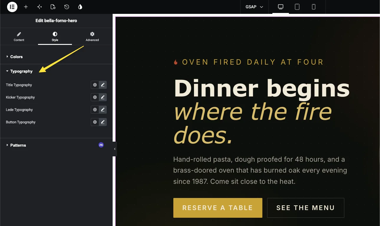
Add your custom widget to a page in Elementor, or reload the editor if the page was already open. Select the widget and the Typography control appears in its panel with the label you set, a globe icon for Global Fonts, and a pencil icon for custom values.
Pick a font family and size #
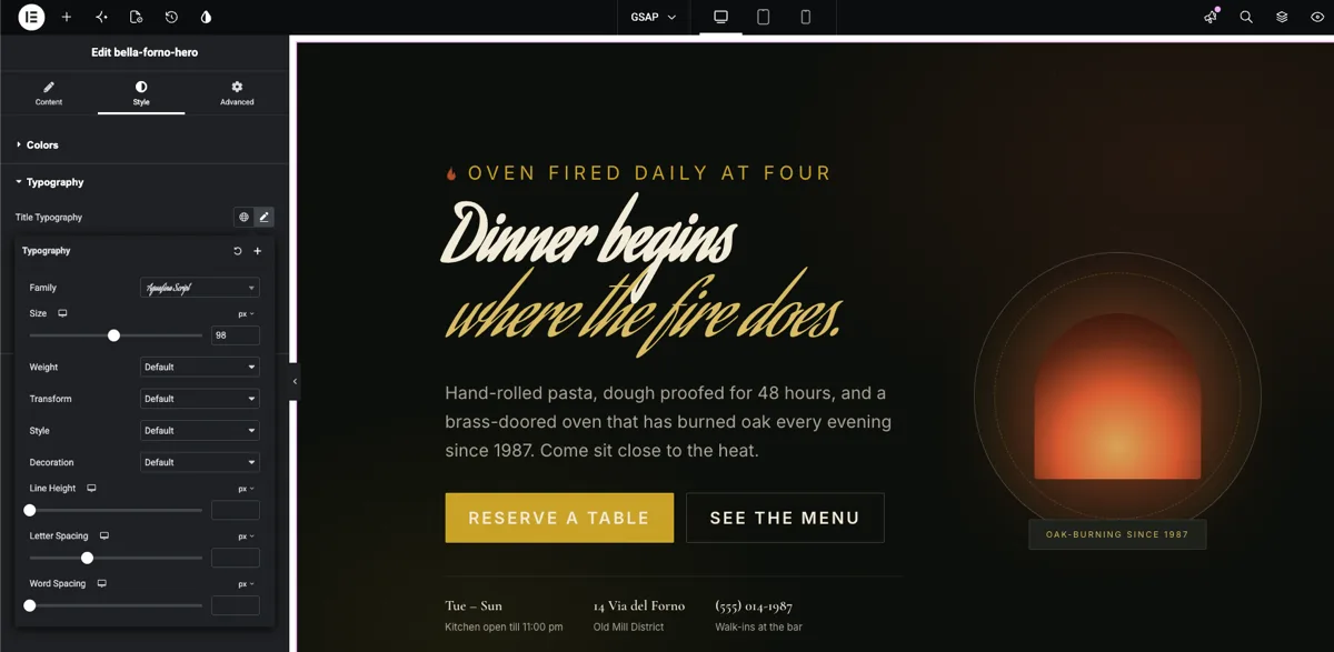
Click the pencil icon to open the typography popover. The Family dropdown searches system fonts and the full Google Fonts library as you type. Below it, Size takes a value in px, em, rem, or vw, and the device icon lets you set a different size per breakpoint — a 96px desktop headline can drop to 48px on phones from the same control.
Set weight, spacing, and the rest #
The same popover holds Weight, Transform, Style, Decoration, Line Height, Letter Spacing, and Word Spacing. Every change lands live in the preview, so you can watch the heading tighten up as you pull the letter spacing down. If nothing seems to change, check that your selector actually matches an element in the widget HTML; a typo in the class name fails silently.
Or follow the site’s Global Fonts #
Click the globe icon instead and pick Primary, Secondary, Text, or Accent. The widget’s text now follows that global preset, and when a redesign swaps the site’s fonts, this widget follows without anyone touching it. If you set a Default Value on the field, this link is already active when the widget is first dropped on a page.
In our example the heading swaps to a script face at 98px, picked straight from the Google Fonts list, and the preview redraws the moment the font loads.
Common use cases #
- Headings in hero and banner widgets where every site wants its own display font.
- Buttons that need to match the site’s existing button typography.
- Card titles and excerpts with separate fields for each, so titles and body text scale independently.
- Testimonial and quote widgets where the quote takes an italic serif and the attribution stays in the body font.
- Client-facing widgets where editors should restyle text freely without ever opening the CSS.
Tips for working with the Typography field #
- The Selector option is the whole connection. There is no typography shortcode to paste into your CSS — set the selector and let Elementor write the styles.
- Always start the selector with
{{WRAPPER}}. Without it the styles apply to every match on the page, not just your widget. In a comma-separated list, every part needs its own{{WRAPPER}}. - Keep your base styles in the CSS tab. They are what the widget looks like on a fresh drop; the control only overrides what the user actually changes.
- One field per text role. A title field, a body field, and a button field give editors clean control. One field pointed at the whole widget flattens everything to a single style.
- Use Global Fonts defaults for client sites. Linking the field to Primary or Secondary keeps custom widgets in step with the site’s design system from day one.
Frequently Asked Questions #
What is the Typography field in the Master Addons Widget Builder?
The Typography field adds Elementor’s full typography group control to a custom widget: font family with Google Fonts, responsive size, weight, transform, style, decoration, line height, letter spacing, and word spacing. You point it at a CSS selector and Elementor applies the chosen styles to that selector.
Where is the typography shortcode for the CSS tab?
There is none. Typography is a group of many CSS properties, so it cannot print through a single {{token}} the way a text or color field does. The field’s Selector option replaces the shortcode: set it to something like {{WRAPPER}} .my-title and the styles are generated for you.
What does {{WRAPPER}} mean in the selector?
It is a placeholder for the widget’s own container element. Starting the selector with {{WRAPPER}} scopes the typography to this widget only. Leave it out and the selector matches everywhere on the page, which can restyle other widgets by accident.
Can one Typography field style more than one element?
Yes. Separate the selectors with commas and begin each with {{WRAPPER}}, for example {{WRAPPER}} .card-title, {{WRAPPER}} .card-link. Both elements then follow the same control.
Why is my Typography control styling the whole widget?
The Selector option is empty, so the field fell back to the widget’s outer container. Fill in a selector that targets just the element you want, save, and reload the Elementor editor.
Do the font styles I wrote in the CSS tab still matter?
Yes. They are the widget’s default look and show until someone changes the control in Elementor. User picks from the typography panel then take priority over the stylesheet values.
Wrapping up #
The Widget Builder Typography field hands editors the panel they already know from Elementor’s own widgets, with Google Fonts, responsive sizes, and global presets, on any element of your custom widget. Name the field, set the Selector to {{WRAPPER}} plus your element’s class, and every font decision moves out of your stylesheet and into the panel. Pair it with the Border field and the Text field to build a widget panel that covers content and style in one place. Explore the rest of the Master Addons widgets and extensions, and see the pricing page for what each plan includes.


