

The Dimensions field adds Elementor’s four-box spacing control (top, right, bottom and left, with a link icon and a unit menu) to a custom widget built with the Master Addons Widget Builder. Use it whenever padding, margin, border width or corner radius should be set from the Elementor panel instead of fixed in your CSS.
Dimensions is a Pro field. The free plugin includes a limited Widget Builder, and the full set of fields comes with Master Addons Pro.
What the Dimensions field does #
- It shows four number boxes in the Elementor panel. With the link icon on, typing in one box fills all four.
- A unit menu lets editors switch between the units you allow, such as px, em and %.
- You can hide sides you don’t need. A button padding field might only show Right and Left.
- Elementor writes the CSS for you through the field’s CSS Selectors rows, including separate values per device when Responsive Control is on.
If you haven’t built a widget yet, read the Widget Builder overview first.
Before you start #
- WordPress with Elementor installed and active.
- Master Addons for Elementor and Master Addons Pro, both active. The installation guide covers setup.
- A widget open in the Widget Builder. The example in this guide is a “Pricing Card” widget with a
price-cardbox and aprice-btnbutton, and three Dimensions fields: Card Padding, Card Radius and Button Padding.
How to add a Dimensions field #
- Go to Master Addons > Widget Builder and open your widget.
- Click the Style tab and add a section, for example “Card Spacing”.
- Type
dimensionsin the field search box on the left. - Drag Dimensions into the section. Its settings open in the left sidebar.
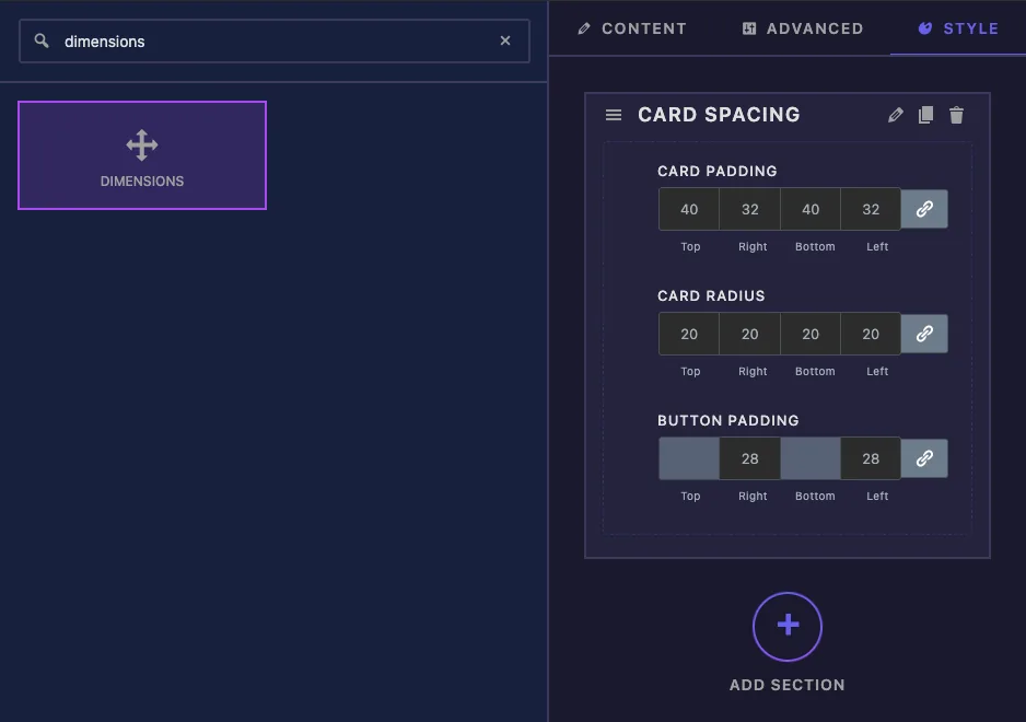
Dimensions field options explained #
Here is the Card Padding field:
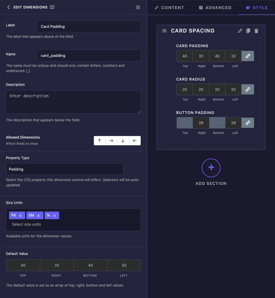
- Label is the text above the boxes in Elementor, for example “Card Padding”.
- Name is the field’s unique ID. Letters, numbers and underscores only.
- Description appears under the control in Elementor.
- Allowed Dimensions has four arrow buttons for top, right, bottom and left. Click an arrow to turn that side off. In Elementor, a side that’s off shows as a grey box that can’t be edited.
- Property Type offers Custom, Margin, Padding, Border Width and Border Radius. Pick one and the builder fills in a CSS Selectors row for that property (more on this below). Border Width also adds
border-style: solid. - Size Units lists the units editors can choose. A new field allows px, %, em, rem, vh and vw. Remove the ones that don’t make sense for your design.
- Default Value has four boxes for the starting top, right, bottom and left values.
The Button Padding field only needs left and right, so the top and bottom arrows are turned off:
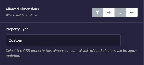
Further down, Responsive Control adds the device icon so desktop, tablet and mobile can have different values. Show Label, Separator and Conditions work as they do on other fields.
Connect the field with CSS Selectors #
Each CSS Selectors row has a CSS Selector (which element to style) and CSS Properties (the rule to write). When you pick Padding as the Property Type, the row starts out like this:
CSS Selector:   {{WRAPPER}}
CSS Properties: padding: {{TOP}}{{UNIT}} {{RIGHT}}{{UNIT}} {{BOTTOM}}{{UNIT}} {{LEFT}}{{UNIT}};
{{WRAPPER}} on its own means the whole widget. Change it to the element you want, such as .price-card. You can leave {{WRAPPER}} out, because the builder adds it in front of your selector so the rule stays inside this widget.
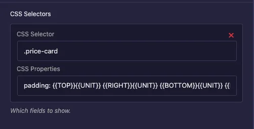
In CSS Properties, {{TOP}}, {{RIGHT}}, {{BOTTOM}} and {{LEFT}} are replaced with the numbers from the four boxes, and {{UNIT}} with the chosen unit. With the Property Type set to Custom, you write the rule yourself. The Button Padding field uses only two sides:
CSS Selector:   .price-btn
CSS Properties: padding-right: {{RIGHT}}{{UNIT}}; padding-left: {{LEFT}}{{UNIT}};
Click Add Item to apply the same value to another element with a second row.
Two things to know. The single Selector box near the bottom of the common settings does nothing for a Dimensions field, so always use the CSS Selectors rows. And picking a Property Type fills in the CSS Properties box for you, so choose it first and check the rows again if you switch it later.
Use the values in your template instead #
You can also print the values directly in the HTML or CSS tab. The field holds top, right, bottom, left and unit, so write each side followed by the unit:
.price-card {
  padding: {{ card_padding.top }}{{ card_padding.unit }} {{ card_padding.right }}{{ card_padding.unit }} {{ card_padding.bottom }}{{ card_padding.unit }} {{ card_padding.left }}{{ card_padding.unit }};
}
A bare {{ card_padding }} prints nothing. For most widgets the CSS Selectors rows are the better choice, since Elementor writes a separate rule for each device when Responsive Control is on.
Click Save Settings when you’re done.
Use the Dimensions control in Elementor #
Add the widget to a page, or reload the editor if the page was already open. Select the widget and open the Style tab. Each Dimensions field shows four boxes labelled Top, Right, Bottom and Left, the link icon, and a unit menu in the top right corner. Button Padding shows Top and Bottom greyed out.
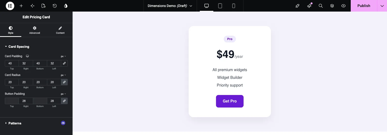
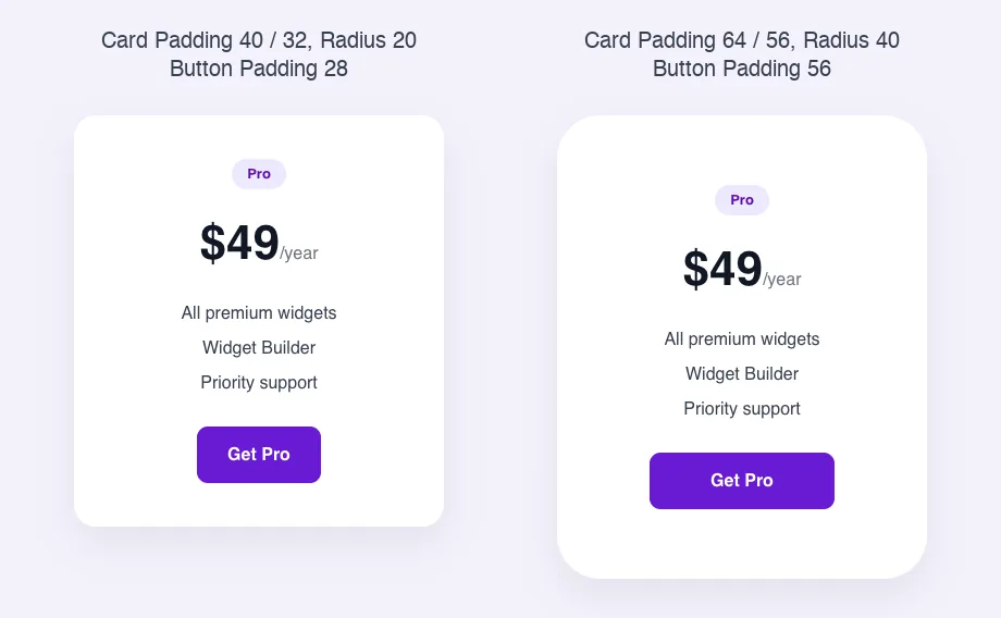
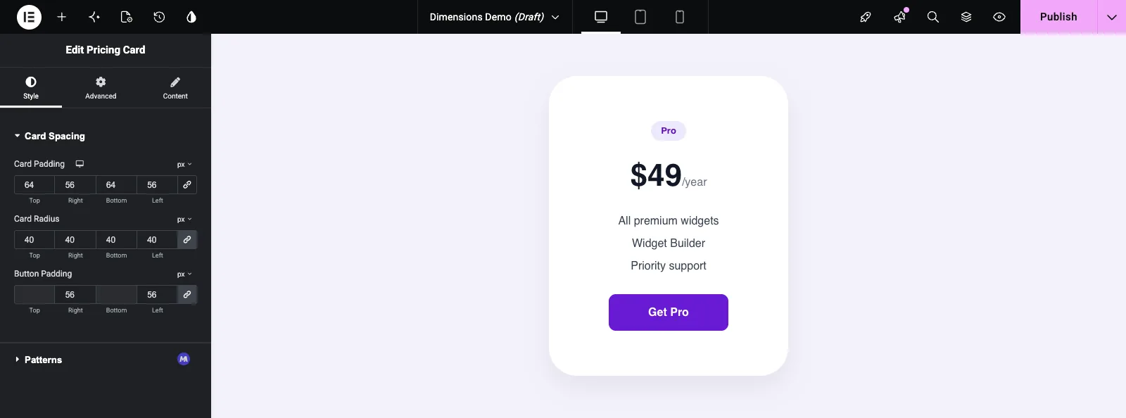
Type a number and the card updates straight away. Click the link icon to unlink the sides and give each one its own value, as Card Padding does here with 64 on top and bottom and 56 on the sides. Use the unit menu to switch between the units you allowed.
Common use cases #
- Inner padding for cards, boxes and banners.
- Margins between parts of a widget, such as the space under a heading.
- Corner radius on cards, images and buttons, using the Border Radius property type.
- Left and right button padding, with the top and bottom sides turned off.
- Border widths per side, using the Border Width property type.
Tips for working with the Dimensions field #
- Always change the CSS Selector from
{{WRAPPER}}to your element. Left as it is, the spacing applies to the whole widget wrapper. - Trim Size Units to the ones you want editors to use. px and em cover most spacing.
- Turn off sides that don’t apply. It stops editors from setting values that have no effect.
- Set a Default Value that matches your design, so the widget looks right as soon as it’s added.
- Be careful with % for padding and margin. Browsers calculate percentage padding from the element’s width, even for top and bottom.
- For a single value such as a gap or icon size, the Slider field is simpler.
Frequently Asked Questions #
Is the Dimensions field free?
No. Dimensions is one of the Pro fields in the Widget Builder, so Master Addons Pro has to be active before you can add it to a widget.
Why doesn’t my Dimensions field change anything?
Check the CSS Selectors rows. The CSS Selector must match an element in your widget’s HTML, and CSS Properties must contain the rule. The single Selector box in the common settings is not used by this field.
Do I need to add {{WRAPPER}} to the CSS Selector?
No. The builder adds {{WRAPPER}} in front of the selector for you, so .price-card is enough.
How do I show only left and right boxes?
In Allowed Dimensions, click the up and down arrows to turn off top and bottom. Elementor then shows those two boxes greyed out.
Can I print the values in my HTML or CSS?
Yes. Use {{ field_name.top }}{{ field_name.unit }} and the same pattern for right, bottom and left. {{ field_name }} on its own prints nothing.
Wrapping up #
Pick a Property Type, point the CSS Selectors row at your element, trim the units and sides, and set a sensible default. Editors then get the same spacing control they know from Elementor’s own widgets. For the rest of the box styling, see the Border and Background fields, and check pricing for what each plan includes.


