Long posts are easier to read when visitors can see the whole shape up front and jump straight to the part they want. The Table of Contents widget in Master Addons for Elementor reads the headings on your page and turns them into a linked index. No manual list to build, and none to keep in sync later.
You drop the widget in, pick which heading levels to include, and it fills itself. From there you can make it collapsible, add a scroll-to-top button, and style the whole thing. This guide covers every setting in the widget.
What the Table of Contents widget does #
The widget scans the page for headings and builds a nested list of links from them. Each item points at its heading, so a click jumps down to that section. Add a heading later and the list picks it up on its own, which is the part that saves the most time.
Two tabs run it. Content holds the title, the heading levels, the collapsible option, and the scroll behavior. Style controls the container, the title, the list items, and the index marker. The usual Elementor Advanced options sit alongside them.
Before you start #
- WordPress with Elementor installed and active.
- Master Addons for Elementor installed and active. New to the plugin? See the installation guide.
- A page or post with real headings (H2, H3, and so on) for the widget to read.
How to add the Table of Contents widget #
In the Elementor editor, open the Elements panel and search for Table of Contents, or scroll to the Master Addons section (the widgets carry a purple MA badge). Drag it to the top of your content, or into a sidebar, and it fills itself from the page’s headings right away.
Set the title and which headings to include #
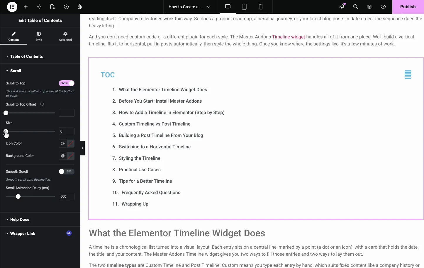
Open the Content tab and the Table of Contents section. This is where you name the box, choose the list style, and pick which heading levels show up.
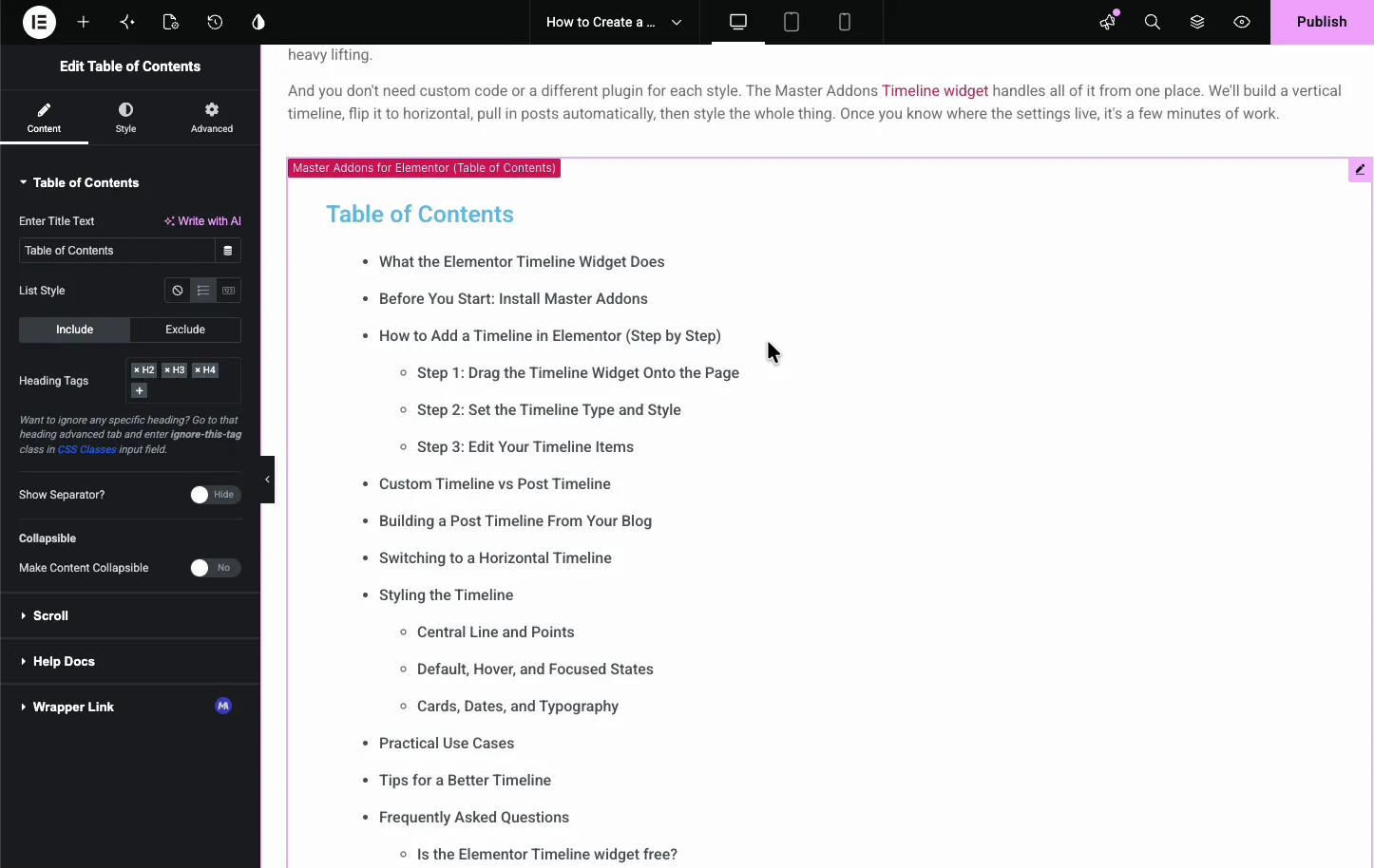
- Enter Title Text: the heading above the list, like Table of Contents or TOC.
- List Style: none, bullets, or numbers for the items.
- Include / Exclude: switch between listing heading tags to show or ones to skip.
- Heading Tags: pick the levels to pull in, such as H2 and H3. Add or remove tags to control how deep the list goes.
Want to skip a single heading? Add the ignore-this-tag class to that heading’s Advanced tab, in the CSS Classes field, and the widget leaves it out. Handy when one section heading would just clutter the list.
Make the list collapsible #
The Collapsible options let visitors fold the list down to just the title. That helps on mobile, or in a sidebar where space is tight.
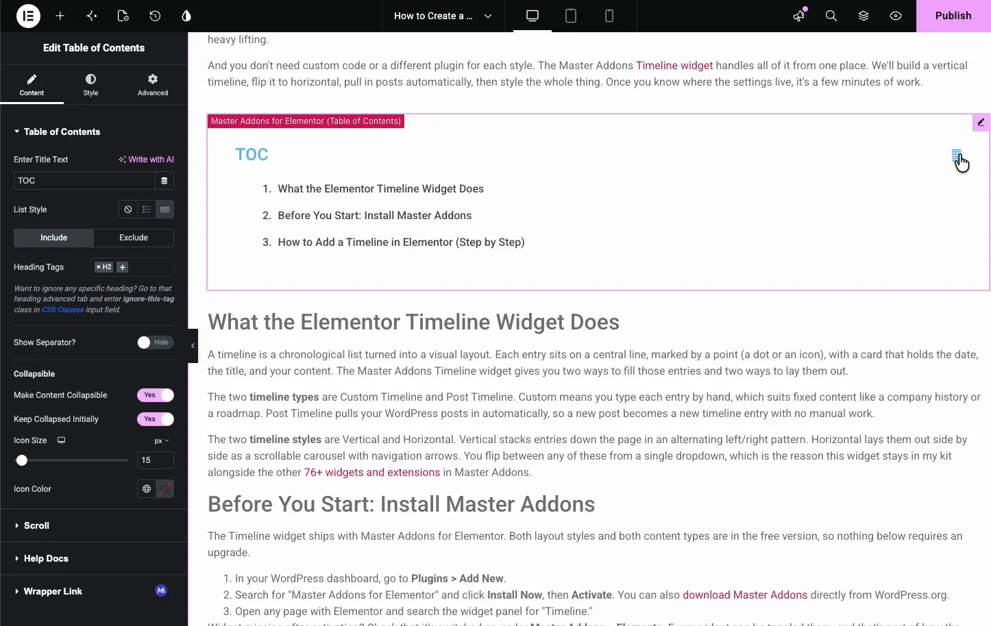
- Make Content Collapsible: add a toggle so the list opens and closes.
- Keep Collapsed Initially: load it closed so it only shows the title until clicked.
- Icon Size and Color: the look of the collapse toggle.
Set up the scroll behavior #
Open the Scroll section for how the page moves when someone uses the index. You can add a back-to-top button and turn on smooth scrolling.
- Scroll to Top: add an arrow at the bottom of the page that jumps back up.
- Scroll to Top Offset: how far down the page the arrow appears.
- Smooth Scroll and Delay: glide to the target instead of jumping, and set the speed.
Style the container and title #
Open the Style tab. The Container section sets the padding, background, and border around the whole box, and the Title section styles the heading above the list.
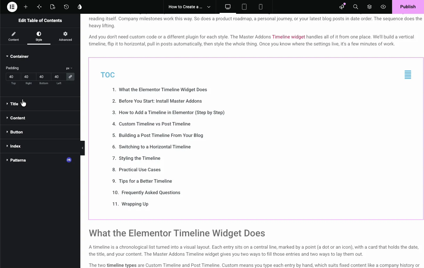
- Container: padding, background, border, and radius for the box.
- Title: color, typography, and spacing for the heading.
- Index and Button: the marker in front of each item and the scroll-to-top button.
Style the list items #
The Content section in the Style tab handles the links themselves. You get typography, spacing between items, and separate colors for the Normal, Hover, and Active states.
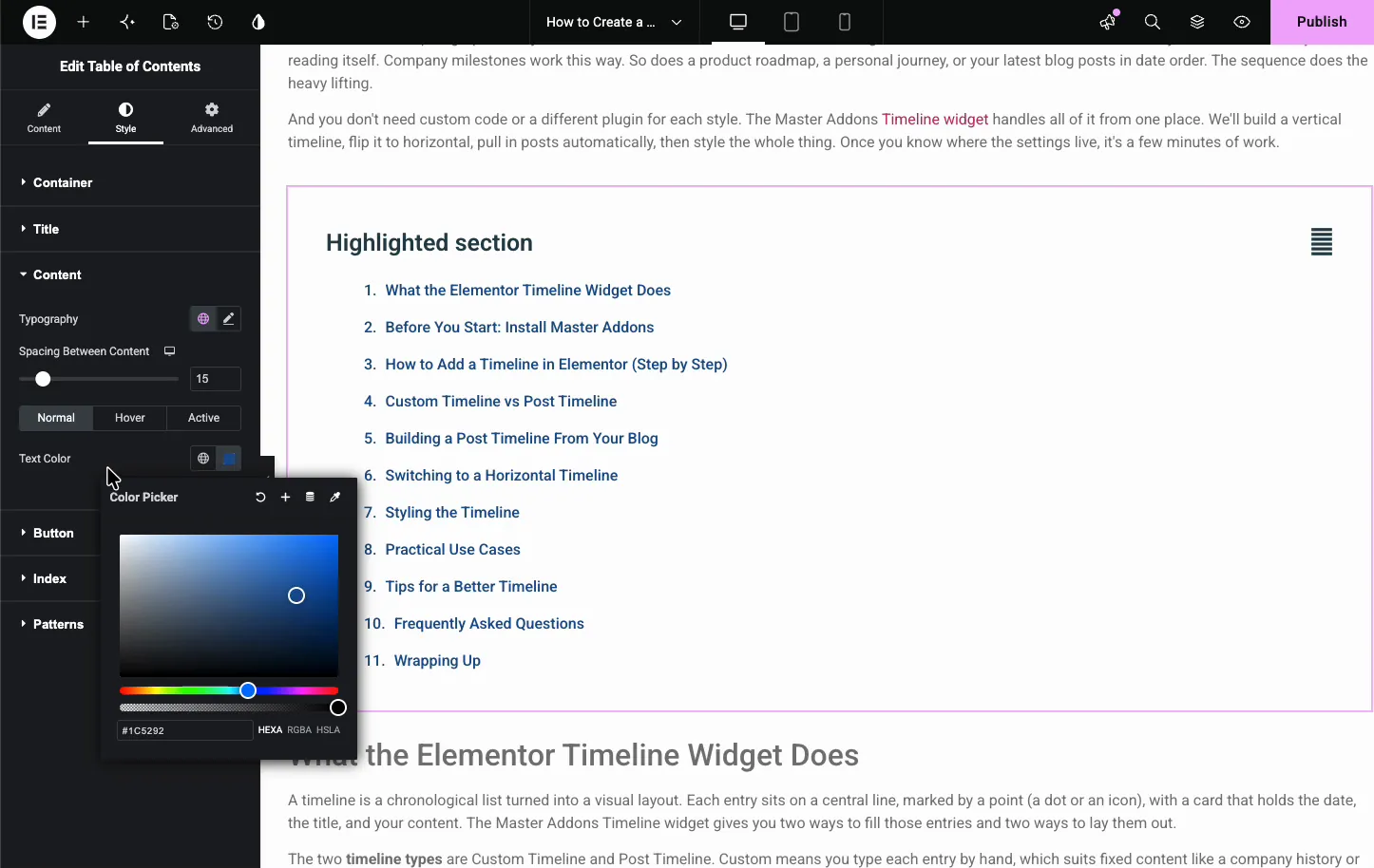
- Typography and Spacing: the font and the gap between rows.
- Normal / Hover / Active: a color for each state, so the current section can stand out.
- Text Color: the link color for the state you have selected.
Common use cases #
- Long tutorials and guides giving readers a map and quick jumps.
- Documentation pages where every heading is a section people search for.
- Sidebars with a collapsible index that follows the article.
- Roundups and listicles so visitors can skip to the entry they want.
- Legal and policy pages that need clear anchors to each clause.
Tips for working with the Table of Contents widget #
- Use a clean heading structure. The list is only as good as your H2s and H3s, so write headings that read well on their own.
- Include just two levels. H2 and H3 usually make a tidy index. Pull in H4 and beyond and it starts to get noisy.
- Collapse it on mobile. Keep Collapsed Initially saves a lot of scrolling on small screens.
- Turn on smooth scroll. A glide to the section reads better than a hard jump, and the offset keeps headings clear of a sticky header.
- Skip stray headings. Use the ignore-this-tag class on headings you do not want in the list, like a CTA or a sidebar title.
Frequently Asked Questions #
What is the Table of Contents widget in Master Addons?
It is an Elementor widget that reads the headings on your page and builds a linked index from them automatically. Each item jumps to its section on click, and you control which heading levels appear, whether the list collapses, and how it looks, all from the Elementor panel.
How does the widget know which headings to list?
You pick the heading tags in the Content tab, like H2 and H3, and the widget lists every matching heading on the page. Switch to the Exclude tab to skip levels instead. To drop one specific heading, add the ignore-this-tag class to it in the Advanced tab.
Can I make the table of contents collapsible?
Yes. The Collapsible options add a toggle so visitors can fold the list to just the title. Turn on Keep Collapsed Initially to load it closed, which works well in a sidebar or on mobile where you want to save vertical space.
Does it update when I add new headings?
Yes. The list is generated from the page’s headings, so when you add, remove, or rename a heading, the table of contents reflects the change. There is no manual list to keep in sync, which is the main reason to use the widget over a hand-built one.
Can I add a smooth scroll and a back-to-top button?
Yes. The Scroll section has a Smooth Scroll toggle that glides to the target section, with a delay you can set. It also has a Scroll to Top option that adds a back-to-top arrow at the bottom of the page, with its own offset, size, and colors.
Wrapping up #
The Table of Contents widget turns your headings into a linked index without any manual upkeep: drop it in, pick the heading levels, make it collapsible, set the scroll behavior, then style it to match. For related widgets, see the Timeline widget and the Navigation Menu widget, browse the full Master Addons widgets and extensions, and check the pricing page for what each plan includes.


