

A default button gets clicks; a button with a little motion gets more of them. The free Creative Button widget in Master Addons for Elementor ships a library of hover effect presets, from subtle background sweeps to text-swap animations, so a call to action can move without you writing a line of CSS.
You pick a preset, type the text, add an icon if you want one, and style the normal and hover states. This guide covers the whole widget, drag-in to finished button.
What the Creative Buttons widget does #
The widget renders one call-to-action button with a prebuilt hover animation. The animations come as 21 named presets, 6 free and 15 with Master Addons Pro, each with its own movement: backgrounds that slide in, borders that draw themselves, text that flips to an alternate message. Everything else works like a normal Elementor button: text, link, icon, alignment, and full color control per state.
Before you start #
- WordPress with Elementor installed and active.
- Master Addons for Elementor installed and active. New to the plugin? See the installation guide.
- The Creative Buttons widget enabled in the Master Addons option panel, under Basic Widgets.
How to add the Creative Buttons widget #
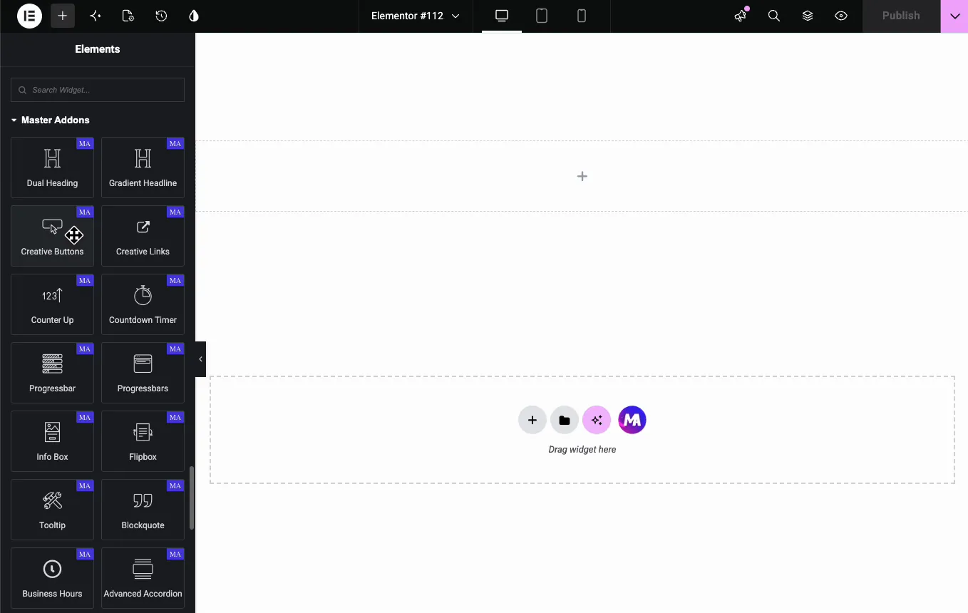
In the Elementor editor, search the Elements panel for Creative Buttons and drag the widget onto the page. A dark button reading “Add Your CTA Content” appears, already wired with the Default effect.
Pick a button effect preset #
Open Button Preset & Controls in the Content tab. The Button Effects dropdown is the heart of the widget: Default, Winona, Ujarak, Wayra, Tamaya, and Rayen are free. Pipaluk, Moema, Isi, Aylen, Saqui, Wapasha, Nina, Nanuk, Nuka, Antiman, Itzel, Naira, Quidel, Sacnite, and Shikoba need Master Addons Pro.
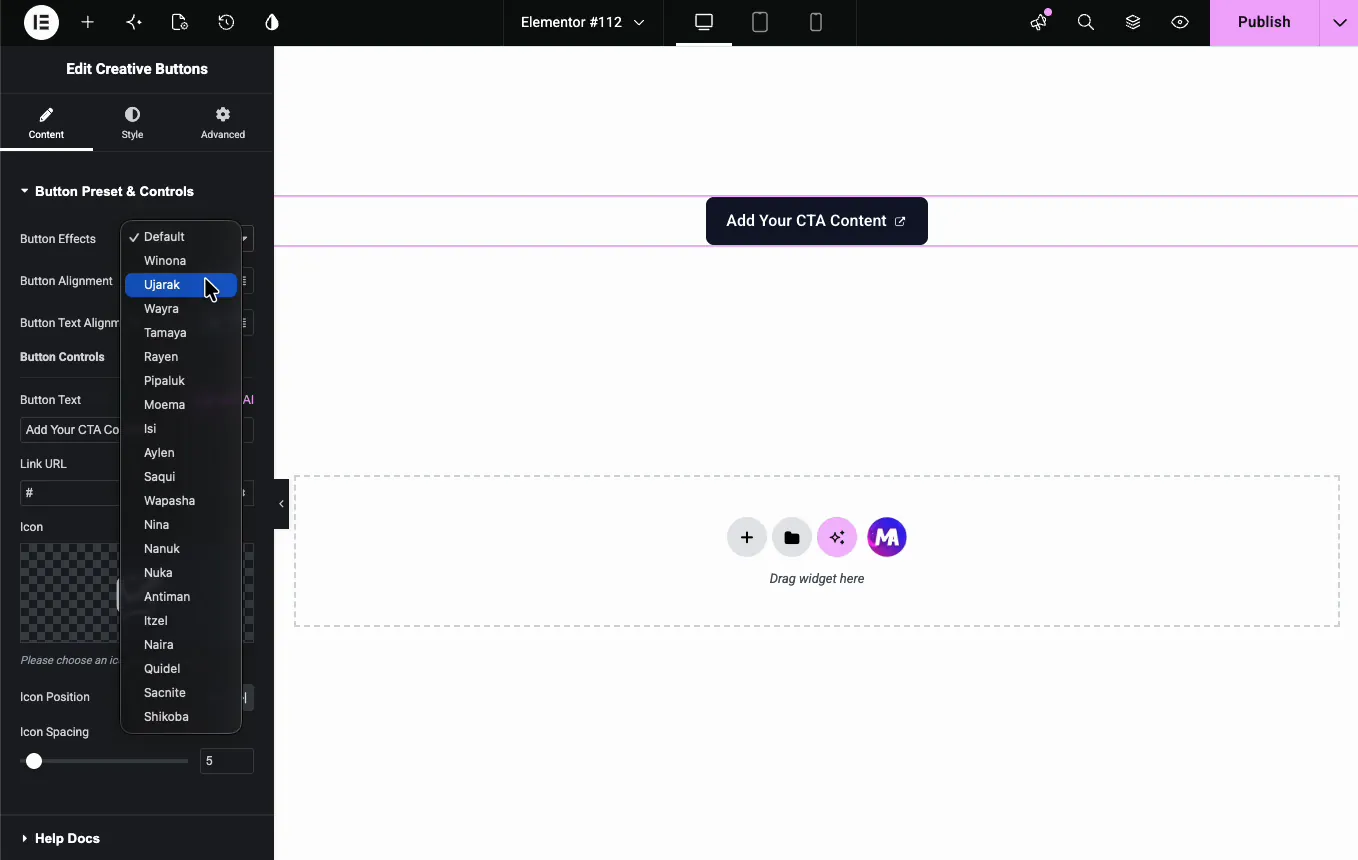
Each name is a different hover animation. Hover the button on the canvas after each pick and the editor plays the effect live, so auditioning presets takes seconds. The names don’t hint at what they do, so trying four or five is the fastest way to find the right one. Button Alignment and Button Text Alignment sit just below, each with a responsive toggle for per-device settings.
Set the text, link, and alternative text #
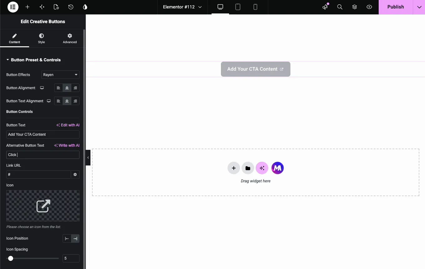
The Button Controls group covers the content. Button Text is the label, and Link URL points the button somewhere, with the gear icon for new-tab and nofollow options.
Presets can swap the label for a second message on hover. Pick any effect other than Default and an Alternative Button Text field appears; the demo sets it to “Click NOW!” so the button reads “Add Your CTA Content” at rest and flips on hover.
Add an icon #
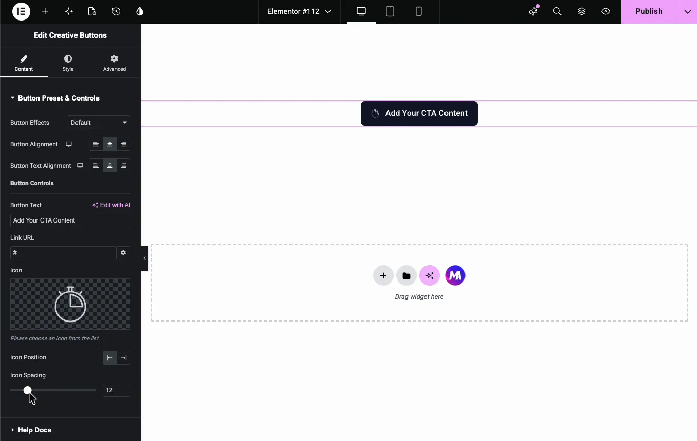
The Icon control opens the Elementor icon library, with Font Awesome and every icon set you have installed.
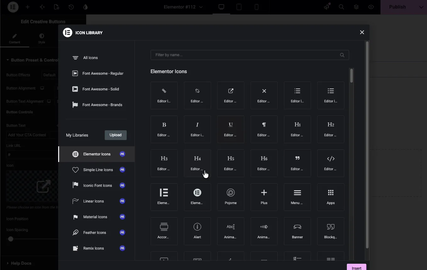
After picking one, Icon Position places it before or after the label, and Icon Spacing sets the gap; the demo bumps it to 12 pixels so the icon and text breathe.
Style the button #
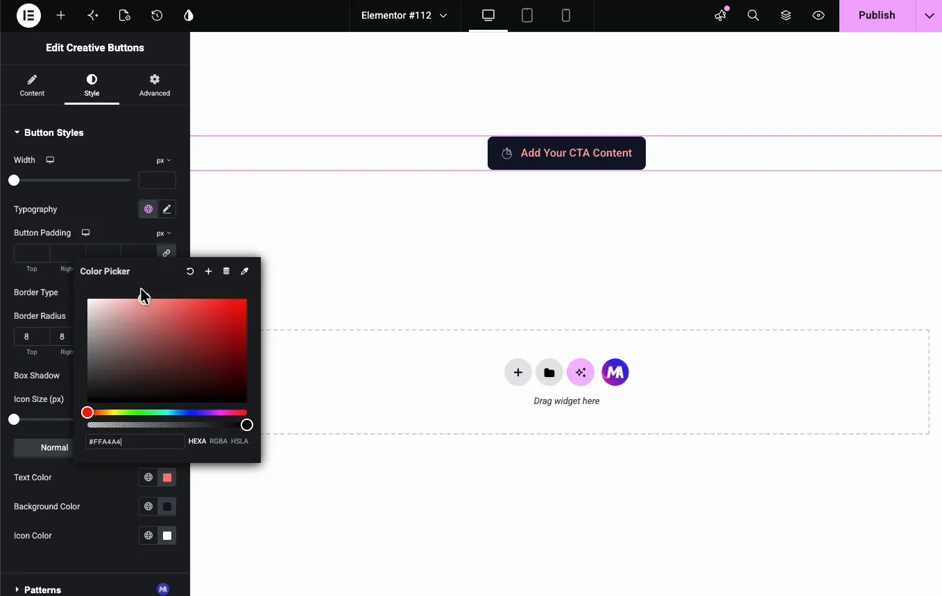
Switch to the Style tab and open Button Styles. The top group handles the shape: Width, Typography, Button Padding, Border Type, Border Radius (8 in the demo, for softly rounded corners), Box Shadow, and Icon Size.
Below that, Normal and Hover tabs each carry three colors: Text Color, Background Color, and Icon Color. The demo gives the normal state white text on blue:
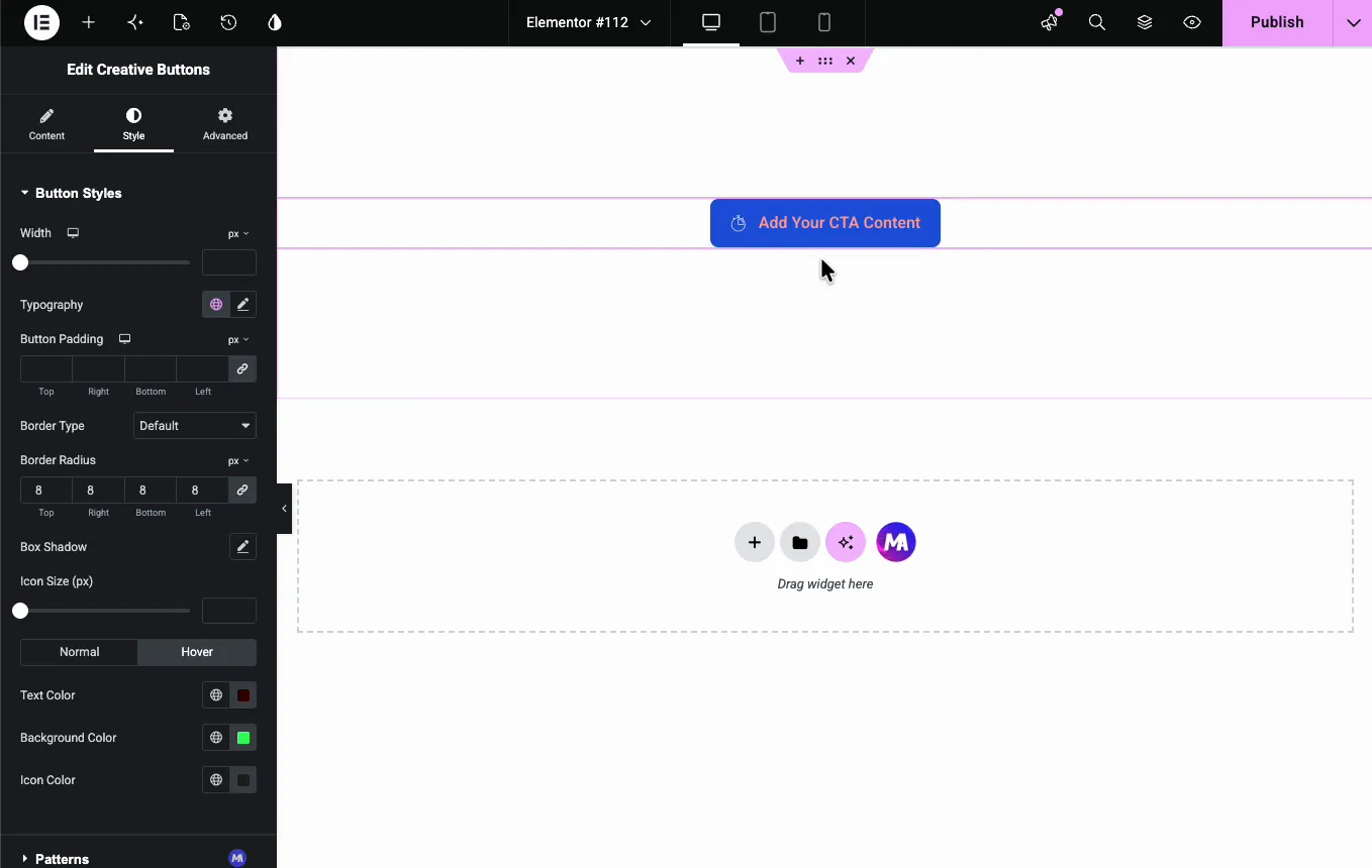
Then flips the hover state to dark text on green, so the effect animates between two clearly different looks:
A Patterns section at the bottom comes from the free Patterns extension and adds decorative background patterns.
The result on the page #
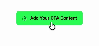
On the live page, the button sits in its normal colors until the cursor arrives. Then the preset plays: the background sweeps to the hover color, the icon and text shift, and the alternative text appears if the preset uses one.
Common use cases #
- Hero section CTAs where the animation draws the eye to the main action.
- Pricing page buttons with a text swap like “Get Started” to “It’s Free!” on hover.
- Download and signup buttons paired with an icon for instant recognition.
- Landing page sections that need one button to stand apart from the theme’s defaults.
Tips for better creative buttons #
- Audition presets on the canvas. Hover the button after each Effects pick; the animation plays in the editor, no preview needed.
- Make the hover state contrast. The animation reads best when normal and hover colors differ clearly, like the blue-to-green demo.
- Keep the alternative text short. Text-swap presets look clean when both messages are about the same length.
- One creative button per section. The motion earns attention; three moving buttons in a row compete with each other.
- Check the tap behavior on mobile. Touch screens have no hover, so make sure the normal state reads as clickable on its own.
Video Tutorial #
You can also watch the video below if you’d like to see the Creative Button in action, from picking an effect preset to the finished hover animation on the live page.
Frequently Asked Questions #
What is the Creative Buttons widget in Master Addons?
It is an Elementor widget for call-to-action buttons with prebuilt hover animations. You pick from 21 named effect presets (6 free, 15 with Pro), set the text, link, and icon, and style the normal and hover states separately from the Elementor panel.
How many button effects are included?
The Button Effects dropdown lists 21 presets. Default, Winona, Ujarak, Wayra, Tamaya and Rayen are free, and the rest need Master Addons Pro, including Winona, Ujarak, Wayra, Tamaya, Rayen, Moema, Naira, and Shikoba. Each applies a different hover animation, and the editor canvas plays the effect live when you hover the button.
What is the Alternative Button Text field?
Effects can swap the button label for a second message on hover. When you pick any effect other than Default, the Alternative Button Text field appears so you can set the hover message, like switching “Get Started” to “It’s Free!”.
Can I add an icon to the creative button?
Yes. The Icon control opens the Elementor icon library. After choosing an icon, Icon Position places it before or after the text, Icon Spacing sets the gap, and Icon Size and Icon Color live in the Style tab.
Can I style the hover state separately?
Yes. Button Styles has Normal and Hover tabs, each with its own Text Color, Background Color, and Icon Color. The preset animates between the two states, so contrasting colors make the effect more visible.
Wrapping up #
The Creative Buttons widget turns a plain CTA into an animated one without custom code: pick a preset from the Effects dropdown, set the text and icon, and give the normal and hover states colors worth animating between. It pairs well with the Creative Links widget for animated text links. Browse the full set of Master Addons widgets and extensions, and see the Creative Button widget page for demos and a comparison with the Elementor Button widget.


