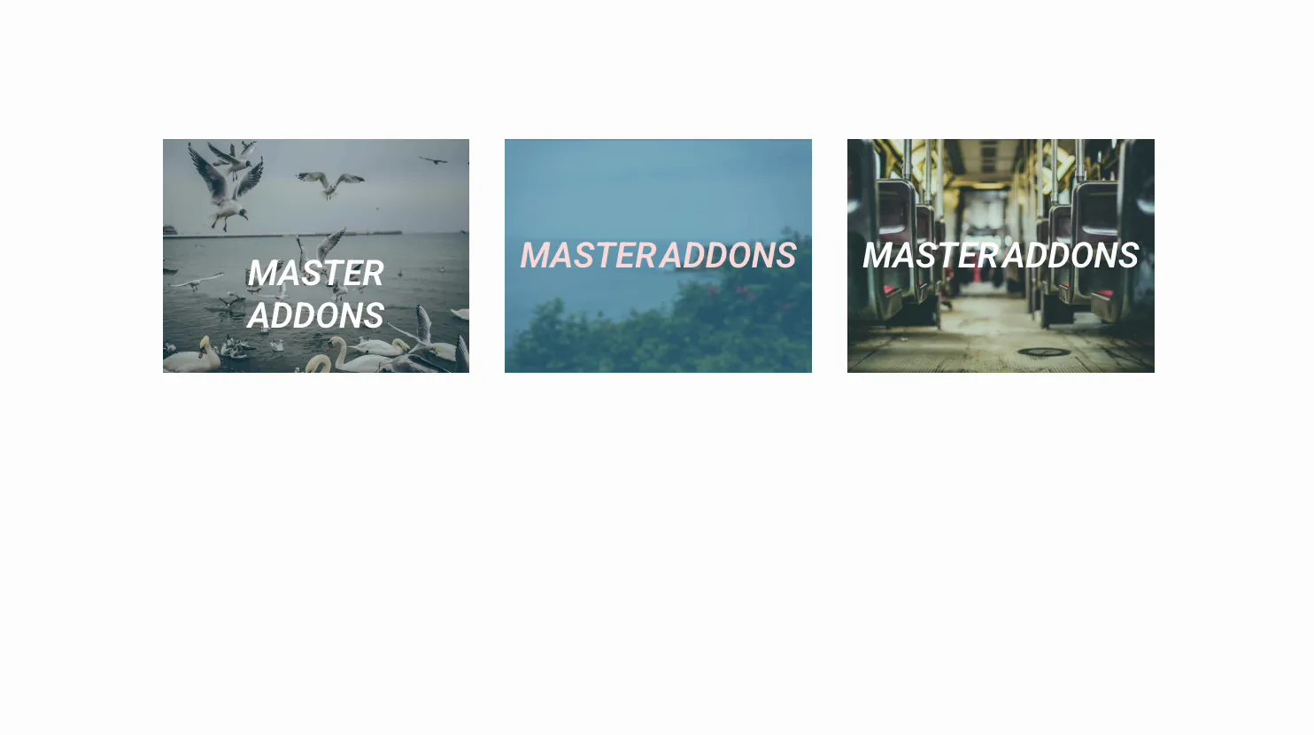
An image that reveals a title and caption on hover turns a flat gallery into something people want to touch. The Image Hover Effects widget in Master Addons for Elementor wraps any image in a CSS hover animation, so a heading, a description, and a link slide, fade, or zoom into view when the cursor lands on it.
You pick one of the named effects, drop in an image, add the overlay text, then style the colors and filters. No custom CSS needed. This guide covers every setting in the widget.
What the Image Hover Effects widget does #
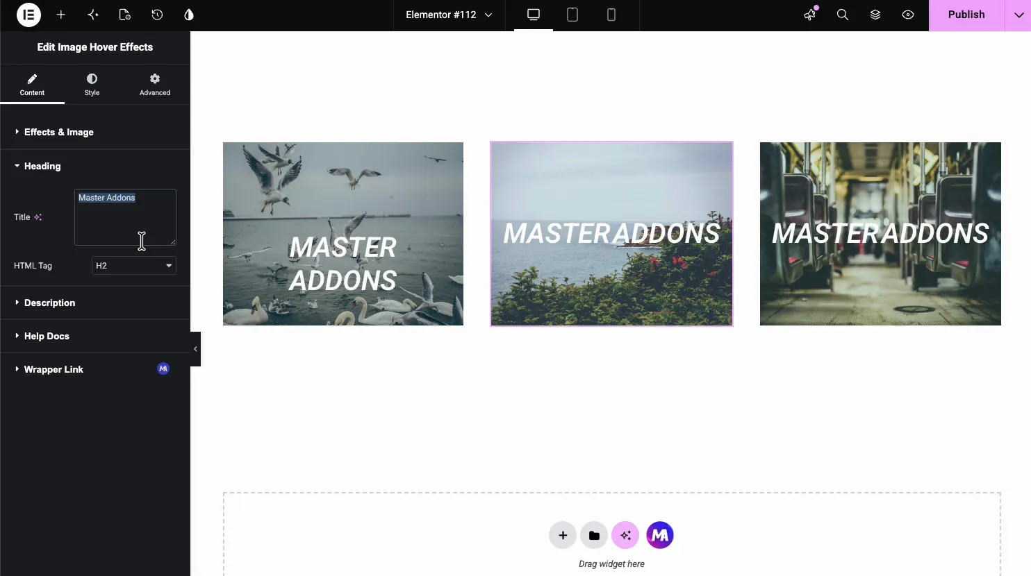
The widget takes one image and drops an animated overlay on top. Hover over it and it can reveal a title, a description, and a button or link, with the motion coming from a preset effect. The named effects (Sadie, Lily, Roxy, and plenty more) each animate the image and text in their own way.
Three tabs run it. Content holds the effect, the image, and the overlay text. Style handles image opacity, filters, borders, and the title and description colors. Advanced is the usual Elementor spacing and visibility.
Before you start #
- WordPress with Elementor installed and active.
- Master Addons for Elementor installed and active. New to the plugin? See the installation guide.
- An image, plus the title and caption text you want to show on hover.
How to add the Image Hover Effects widget #
In the Elementor editor, open the Elements panel and search for Image Hover Effects, or scroll to the Master Addons section (the widgets carry a purple MA badge). Drag it onto the page and it loads with a sample image and overlay you can edit.
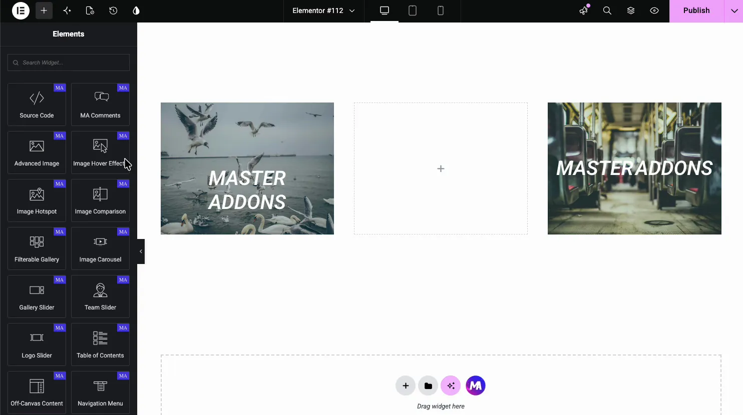
Choose the effect and image #
Open the Content tab. The Effects & Image section is where you set the hover animation and load the picture.
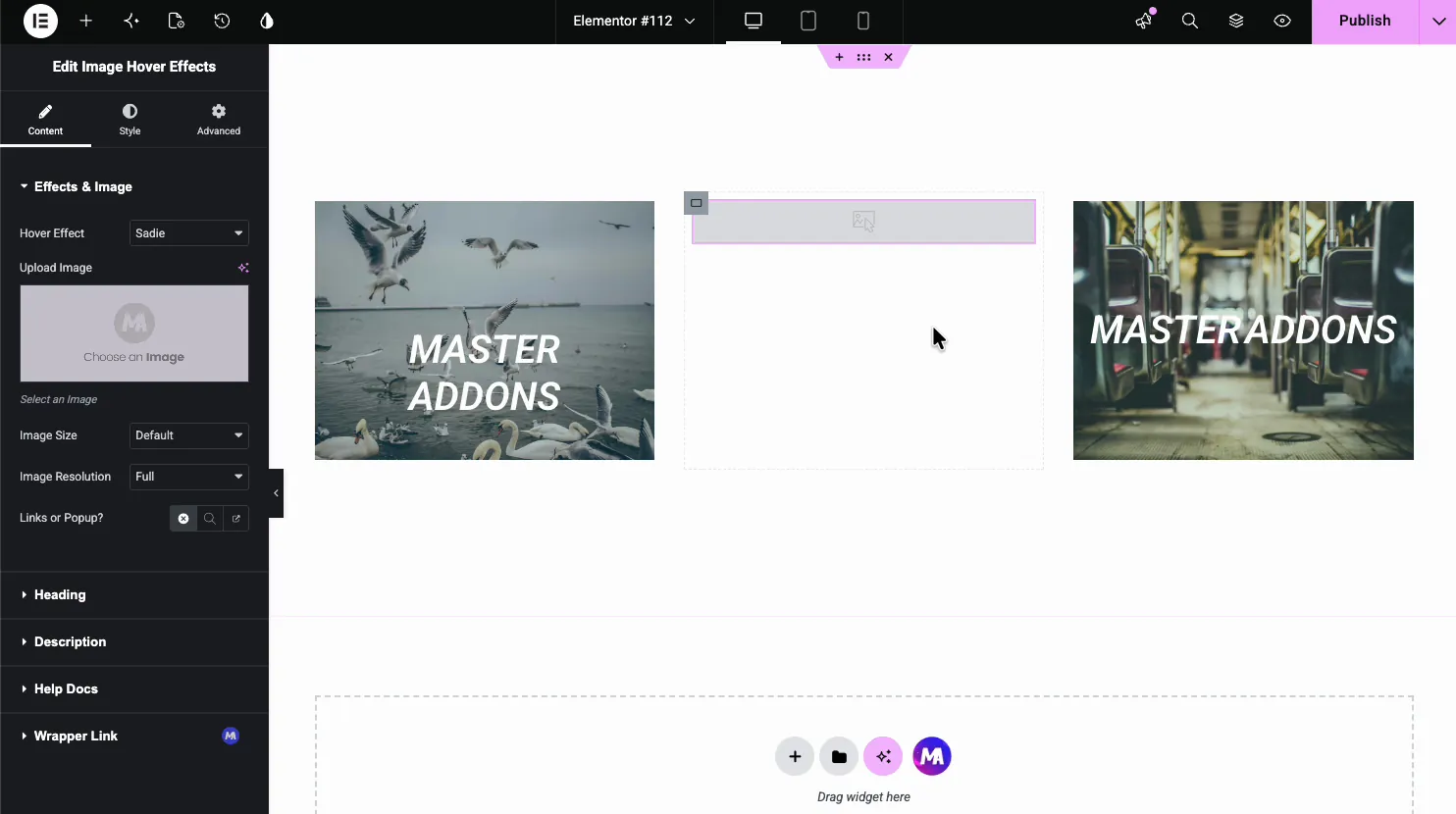
- Hover Effect: the named animation used on hover (more on this next).
- Upload Image: pick the image from the media library.
- Image Size and Image Resolution: the crop and the resolution served.
- Links or Popup?: make the whole image a link or open it in a popup.
Pick a hover effect #
The Hover Effect dropdown carries a long list of named CSS effects. Each one animates the image and the overlay text differently, from a soft fade to a caption that slides in.
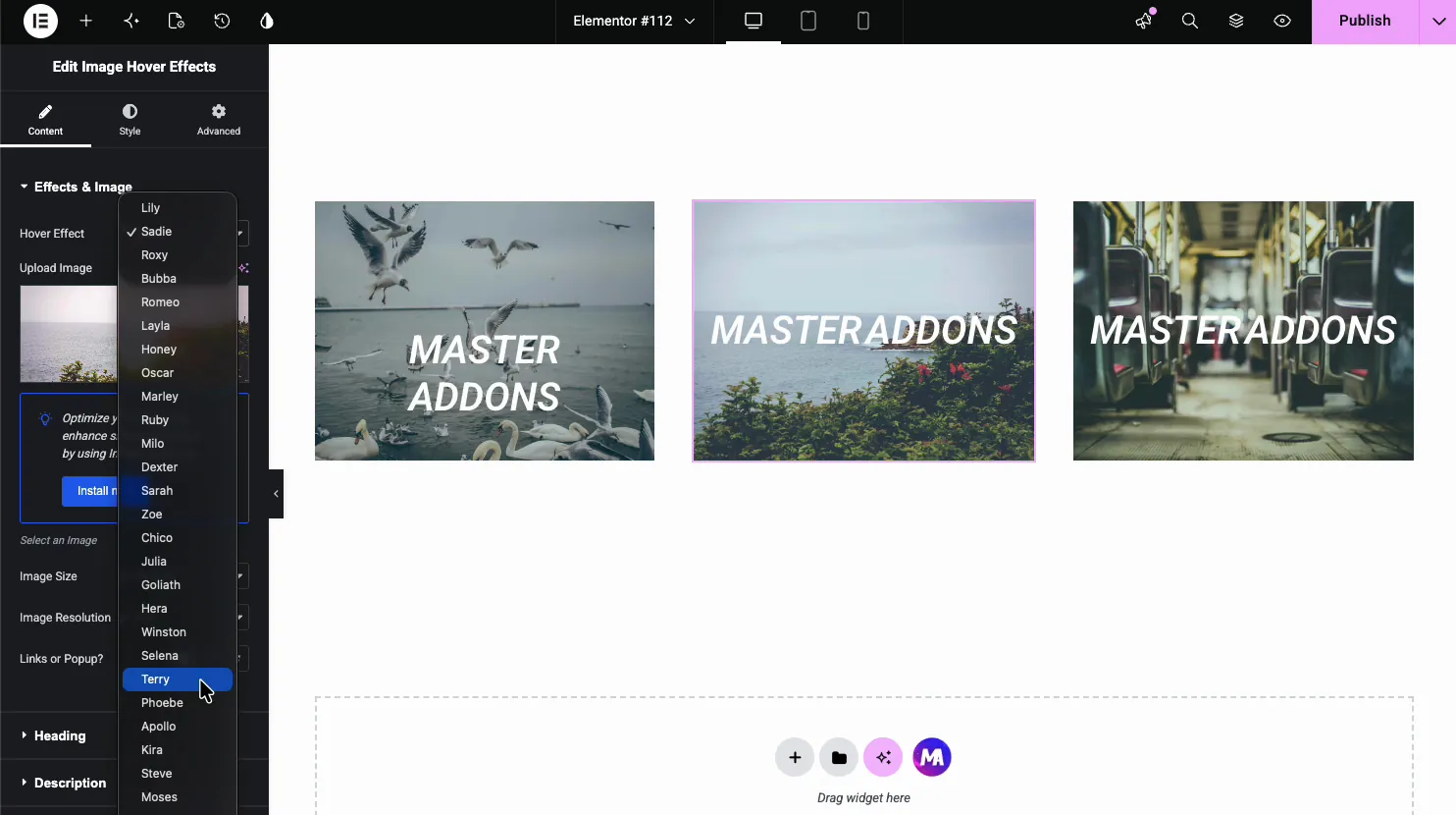
- Sadie, Lily, Layla: fade the title and caption in over a darkened image.
- Roxy, Bubba, Romeo: slide a border or panel in with the text.
- Honey, Oscar, Marley: reveal an underline or a moving caption.
- Zoom and blur variants: scale or soften the image behind the text.
Select the image #
Click Upload Image to open the media library, then pick or upload your picture. Whatever effect you chose runs on top of this image.
Add the heading #
Open the Heading section for the title that shows on hover. Type the text and set the HTML tag so it reads correctly for SEO.
- Title: the heading text, with a Write with AI option.
- HTML Tag: the heading level, H1 to H6.
Add the description and link #
Back in the Effects & Image section, the Content Type and Content fields set the caption that shows under the title. This is where the supporting line goes, and a button if you want one.
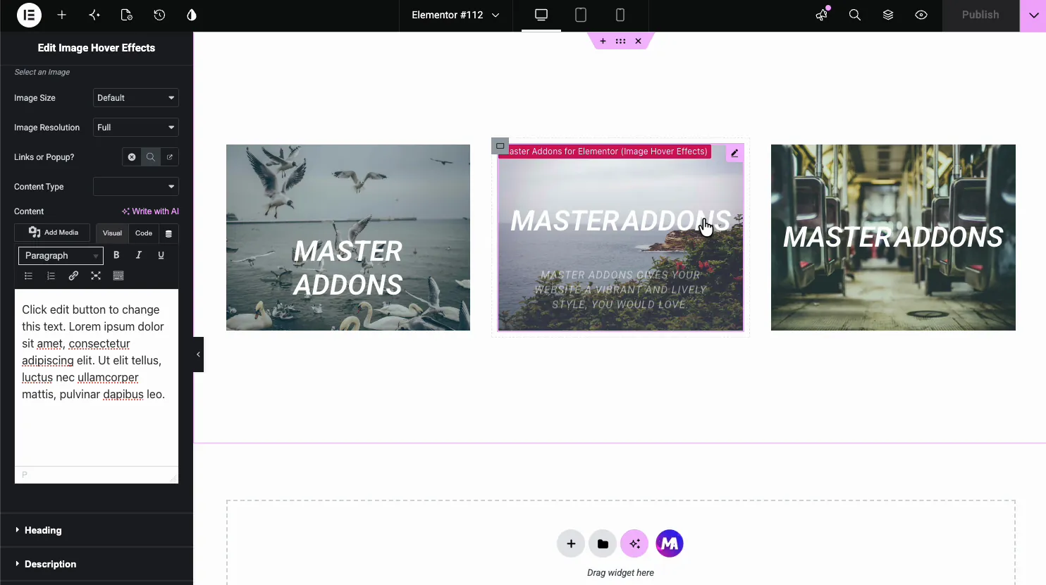
- Content Type: choose text, or a button, for the overlay content.
- Content: the caption text, edited in a full WYSIWYG box.
- Links or Popup?: point the image at a URL or open it in a popup.
Style the image and overlay #
Open the Style tab. The Image section controls how the picture looks before and during the hover, and that is where a lot of the effect actually comes from.

- Image Opacity and Hover Opacity: how visible the image is at rest and on hover.
- Image Filter and Hover Image Filter: blur, brightness, and contrast for each state.
- Border, Border Radius, Box Shadow: the frame around the image.
Under the Image section, separate Title and Description sections handle the color and typography of the overlay text.
Common use cases #
- Portfolios revealing a project name and link on hover.
- Team grids showing a name and role over each photo.
- Service tiles with a title and short caption per image.
- Blog thumbnails that surface the post title on hover.
- Product galleries pairing an image with a name and a button.
Tips for working with the Image Hover Effects widget #
- Use clear images. The overlay darkens the picture, so a busy shot can make the text hard to read. A calmer image with room in the middle works best.
- Keep the caption short. One line under the title reads better than a paragraph crammed into the overlay.
- Match the effect to the content. Subtle fades suit a portfolio; bold slides suit a promo.
- Set the right heading tag. Use H2 or H3 for gallery titles, not H1, unless it is the page’s main heading.
- Test on mobile. There is no hover on touch, so check the overlay still makes sense when someone taps instead.
Watch the video tutorial #
Prefer to follow along on screen? The video tutorial below walks through the Image Hover Effects element from start to finish, showing how the effects, overlay text, and styling work in the Elementor editor.
Frequently Asked Questions #
What is the Image Hover Effects widget in Master Addons?
It is an Elementor widget that adds a CSS hover animation to an image. On hover it reveals a title, a caption, and an optional link, with the motion coming from a named preset effect. Everything is set from the Elementor panel with no code.
How many hover effects does the widget include?
The Hover Effect dropdown holds a long list of named CSS effects, such as Sadie, Lily, Roxy, Bubba, Romeo, Layla, Honey, and Oscar. Each animates the image and overlay text a different way, so you pick the one that fits your design.
Can I add a link or button to the image?
Yes. The Links or Popup option makes the whole image a link or opens it in a popup, and the Content Type field can add a button inside the overlay. That makes each image a clickable path to a project, product, or page.
Can I show a title and caption on hover?
Yes. The Heading section sets the title and its HTML tag, and the Content field adds a description below it. Both appear as part of the hover animation, so the image stays clean until someone hovers over it.
Do the image hover effects work on mobile?
Hover is a desktop interaction, so touch devices have no true hover. Many effects still show the overlay on tap, but you should test on a phone and keep the key text visible or reachable, especially if the image is also a link.
Wrapping up #
The Image Hover Effects widget turns a static image into an interactive one: pick an effect, load the image, add a title and caption, then style the opacity, filters, and text. For related widgets, see the Info Box widget and the Flipbox widget, browse the full Master Addons widgets and extensions, and check the pricing page for what each plan includes.


