

The Date Time field adds a calendar picker to a custom widget you build with the Master Addons Widget Builder. Editors click the field in Elementor, pick a day and, if you allow it, a time. The widget gets the choice as a plain text value such as 2026-10-24 19:30, which you can print in the HTML or pass to a countdown script.
Date Time is a Pro field. The free plugin includes a limited Widget Builder, and the full set of fields comes with Master Addons Pro.
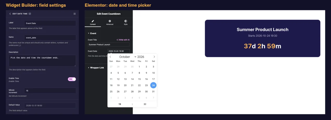
What the Date Time field does #
- Adds a date input to your widget’s panel in Elementor. Clicking it opens a calendar.
- With Enable Time on, the calendar gets an hour and minute row underneath. The clock is always 24-hour.
- Saves the picked value as text:
Y-m-d H:i(for example2026-10-24 19:30) with time, orY-m-d(2026-10-24) without it. - Prints that value wherever you place its token, like
{{ event_date }}, in the HTML, CSS or JS panel.
New to the builder? Read the Widget Builder overview first, then come back with a widget open.
Before you start #
- WordPress with Elementor installed and active.
- Master Addons for Elementor and Master Addons Pro, both active. The installation guide covers setup.
- A widget open in the Widget Builder. The example in this guide is an “Event Countdown” widget: a Text field named
event_title, a Date Time field namedevent_date, and a short script that counts down to that date.
How to add a Date Time field #
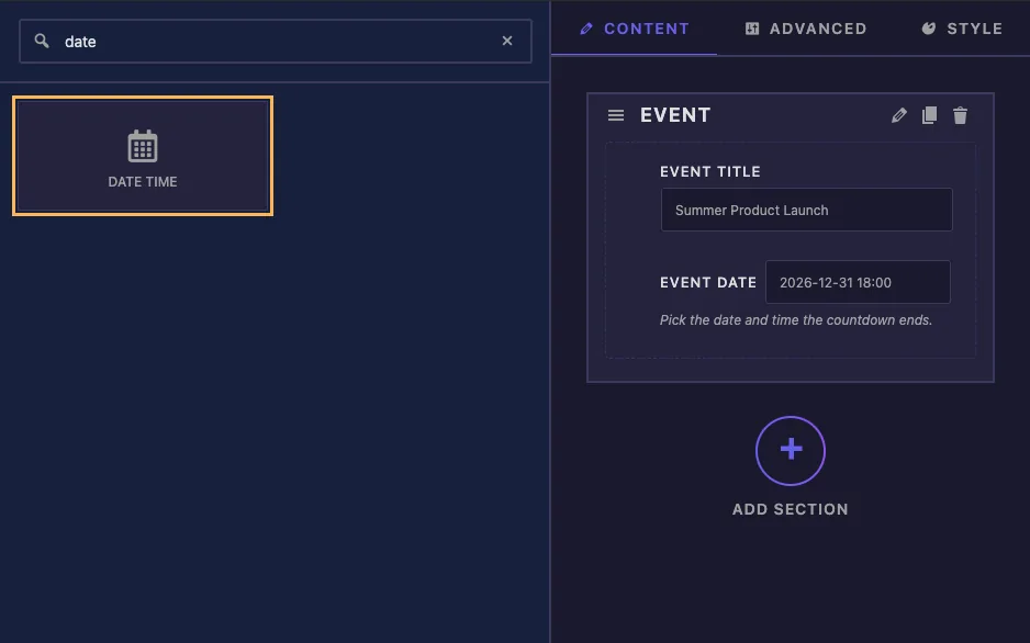
- Go to Master Addons > Widget Builder and open your widget.
- On the Content tab, add a section if there isn’t one yet, for example “Event”.
- Type
datein the field search box on the left. - Drag Date Time into the section. Click the pencil on the field to open its settings.
Date Time field options explained #
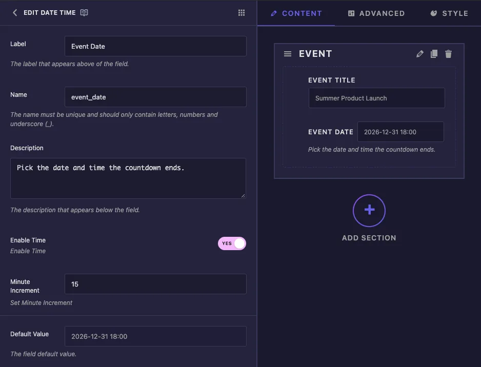
- Label: the text next to the input in Elementor, for example “Event Date”.
- Name: the field’s unique ID and the name of its token. Use letters, numbers and underscores only, for example
event_date. - Description: a hint shown under the input in Elementor, such as “Pick the date and time the countdown ends.”
- Enable Time: adds the hour and minute row to the calendar and switches the saved format from
Y-m-dtoY-m-d H:i. - Minute Increment: how far the minutes move with each click of the arrows. The default is 1. With 15, the arrows step through :00, :15, :30 and :45.
- Default Value: the date a new copy of the widget starts with.
The Default Value box opens the same calendar, so you pick the starting date instead of typing it. The time row appears here too when Enable Time is on.
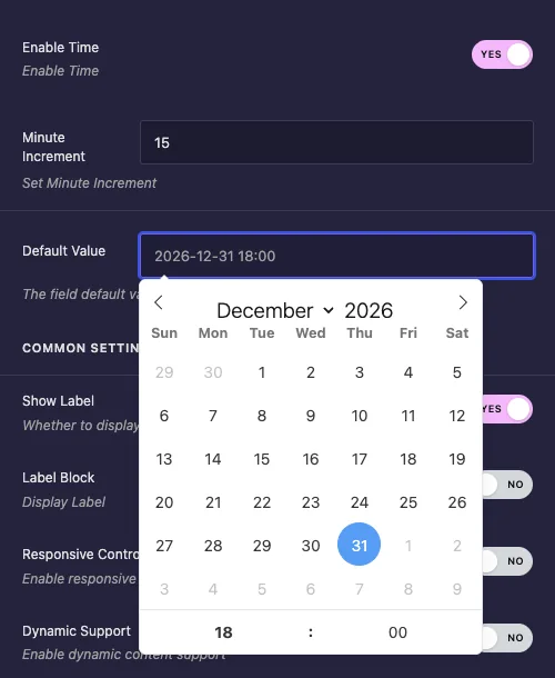
For a countdown, choose a default date in the future. A new widget then counts down right away instead of showing zeros.
Common settings #
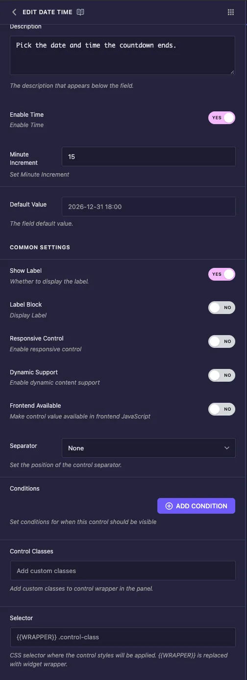
- Show Label hides or shows the label in the panel.
- Label Block puts the label on its own line above the input. Turn it on if your label is long.
- Conditions shows the field only when another control has a certain value, for example a “Show countdown” switcher. See Conditions.
- Separator draws a divider line before or after the control.
Responsive Control, Dynamic Support, Frontend Available, Control Classes and Selector appear on every field. You don’t need any of them for the setup in this guide, and the Selector can stay empty because a date picker doesn’t write CSS.
The picker has no options for a time-only clock or for blocking past dates. Editors can pick any day.
Use the date in your template #
Print the token wherever the date should appear. In the Event Countdown widget, the HTML puts the date in a line of text and in a data-deadline attribute that the script reads:
<div class="event-card">
  <p class="event-title">{{ event_title }}</p>
  {% if event_date %}
  <p class="event-when">Starts {{ event_date }}</p>
  <div class="event-countdown" data-deadline="{{ event_date }}">
    <span class="days">0</span>d <span class="hours">0</span>h <span class="mins">0</span>m
  </div>
  {% endif %}
</div>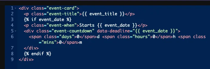
The {% if event_date %} check matters. If an editor clears the input, the token prints nothing. The Default Value is not used again, and without the check the countdown would show NaN.
Build a countdown in the JS panel #
The JS panel runs this script. It finds each countdown, turns the saved text into a date, and updates the numbers every 30 seconds:
document.querySelectorAll(".event-countdown").forEach(function (el) {
  var deadline = new Date(el.dataset.deadline.replace(" ", "T"));
  if (isNaN(deadline)) return;
  function tick() {
    var diff = Math.max(0, deadline - new Date());
    el.querySelector(".days").textContent = Math.floor(diff / 86400000);
    el.querySelector(".hours").textContent = Math.floor(diff / 3600000) % 24;
    el.querySelector(".mins").textContent = Math.floor(diff / 60000) % 60;
  }
  tick();
  setInterval(tick, 30000);
});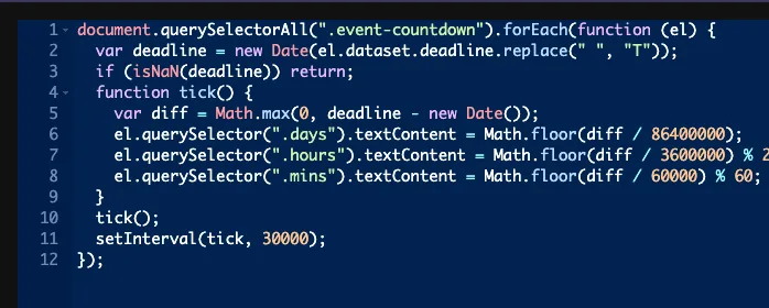
replace(" ", "T")turns2026-10-24 19:30into2026-10-24T19:30, a format every browser reads the same way.isNaN(deadline)stops the script when the date is empty or can’t be read.- Reading the value from a data attribute keeps each widget on the page counting down to its own date.
Tokens also work directly in the JS panel. In our tests, var deadline = "{{ event_date }}"; printed the saved date. Keep the quotes, because a bare date is not valid JavaScript.
The saved value has no time zone. The browser reads it as the visitor’s local time, so a countdown to 19:30 ends at 19:30 in London and again at 19:30 in New York. For one worldwide moment, add an offset to the string before parsing, for example 2026-10-24T19:30:00+00:00.
Use the Date Time control in Elementor #
Add the widget to a page, or reload the editor if the page was already open. The field sits on the Content tab under your label. Click the input to open the calendar, choose a day, then set the hour and minutes in the row below. The preview updates as soon as you pick.
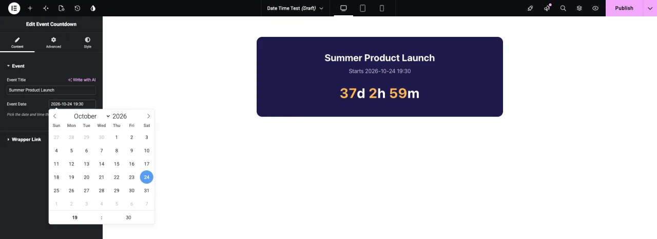
The month name has a dropdown and the year is a number box, so moving months ahead doesn’t take a lot of clicks.
Common use cases #
- Countdowns for launches, sales and webinars.
- Event cards that show the date next to the title and venue.
- Offer banners that a script hides once the deadline has passed.
- Opening or closing times printed in a schedule widget.
Tips for working with the Date Time field #
- Decide on Enable Time before editors use the widget. The format only changes for dates picked after you switch it. A value saved as
2026-10-24 19:30keeps its time even after you turn Enable Time off. - Always handle an empty value. Wrap the markup in
{% if %}and check for an invalid date in the script. - Plan for dates in the past. The example stops at zero. You could also hide the widget or show a “This event has ended” message.
- Use a Minute Increment of 5, 15 or 30 for events that start on the hour or half hour.
- Write a clear Description. Say whether the date is the start, the end or the deadline, so editors pick the right one.
Frequently Asked Questions #
Is the Date Time field free?
No. Date Time is one of the Pro fields in the Widget Builder, so Master Addons Pro has to be active before you can add it to a widget.
What format does the saved date use?
With Enable Time on, Y-m-d H:i, for example 2026-10-24 19:30. With it off, Y-m-d, for example 2026-10-24. The clock is always 24-hour.
Why does my countdown show NaN?
The date field is empty or the value can’t be read. Wrap the countdown in {% if event_date %} and skip the script when isNaN(deadline) is true.
Can I make a time-only picker or block past dates?
Not from the field settings. The Date Time field always shows a calendar, and editors can pick any day.
Can I use the token inside JavaScript?
Yes. Tokens work in the JS panel. Put the token in quotes, as in "{{ event_date }}", or read it from a data attribute in your HTML.
Wrapping up #
Add the Date Time field to a Content section, choose whether it needs a time, and print {{ event_date }} in your HTML or read it in the JS panel. Check for empty values and the widget holds up when an editor clears the date. Pair it with the Switcher field to let editors hide the countdown, and see pricing for what each plan includes.


