

An about or services page often needs to introduce the people behind the work, and a static grid runs long once you have more than a few members. The free Team Carousel widget in Master Addons for Elementor (the Team Slider) puts your team in a sliding carousel: each member gets a photo, name, role, short bio, and social links, and visitors swipe through them in a compact space.
It ships with six style presets. Team Carousel, Circle Gradient, and Content on Hover are free, while Circle Animation, Social Left on Hover, and Content Drawer need Master Addons Pro. You also get full control over the slider behavior. You add members through a repeater, drop in their details, then pick a layout and style. Below is a run through every setting.
What the Team Carousel widget does #
The widget shows your team members as cards in a carousel. Each card holds an image, a name, a designation, a short description, and a row of social profile links. Visitors move through the cards with arrows, dots, or a swipe.
It has three tabs: Content for the members, navigation, and carousel behavior, Style for the colors and spacing, and Advanced for the usual Elementor options. A Style Preset dropdown changes the whole look in one click.
Before you start #
- WordPress with Elementor installed and active.
- Master Addons for Elementor installed and active. New to the plugin? See the installation guide.
- Photos of your team members, plus their names, roles, and social links.
How to add the Team Carousel widget #
In the Elementor editor, open the Elements panel and search for Team Carousel or Team Slider, or scroll to the Master Addons section. Drag it onto your page. It loads with four placeholder members so you edit from a working slider.
Add your team members #
Open the Content tab. The Contents section holds the member list. A Style Preset dropdown sits at the top, and the Team Carousel repeater holds one item per member. Below it are Image Resolution, an Image Border toggle, and the Title HTML Tag for the names.
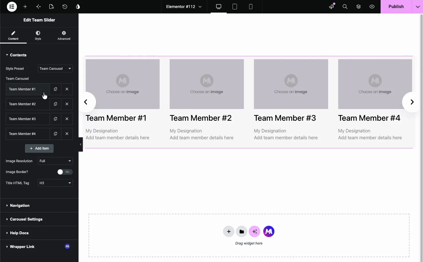
Click a member to open its settings. Each one has fields for the photo and the details:
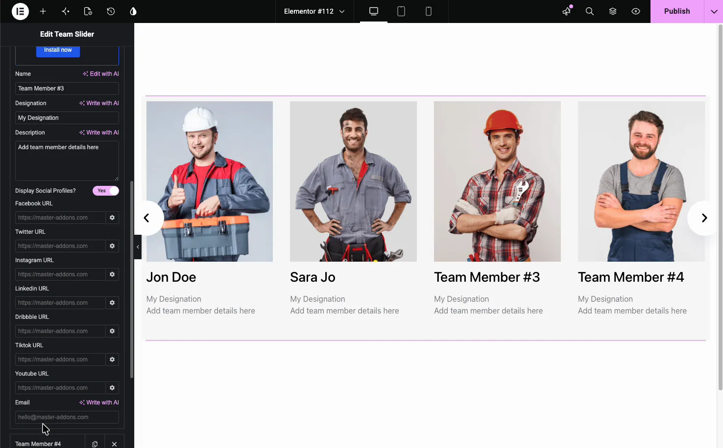
- Image: the member’s photo from the Media Library.
- Name, Designation, Description: the member’s name, role, and a short bio, each with a Write with AI option.
- Display Social Profiles: turn on a row of links, with fields for Facebook, Twitter, Instagram, LinkedIn, Dribbble, TikTok, YouTube, and Email.
Use Add Item to add members, the copy icon to duplicate one, and the X to remove it.
Choose a style preset #
The Style Preset dropdown changes how each card behaves without touching your content. The default Team Carousel shows the photo with the details below, while the other presets add interaction.
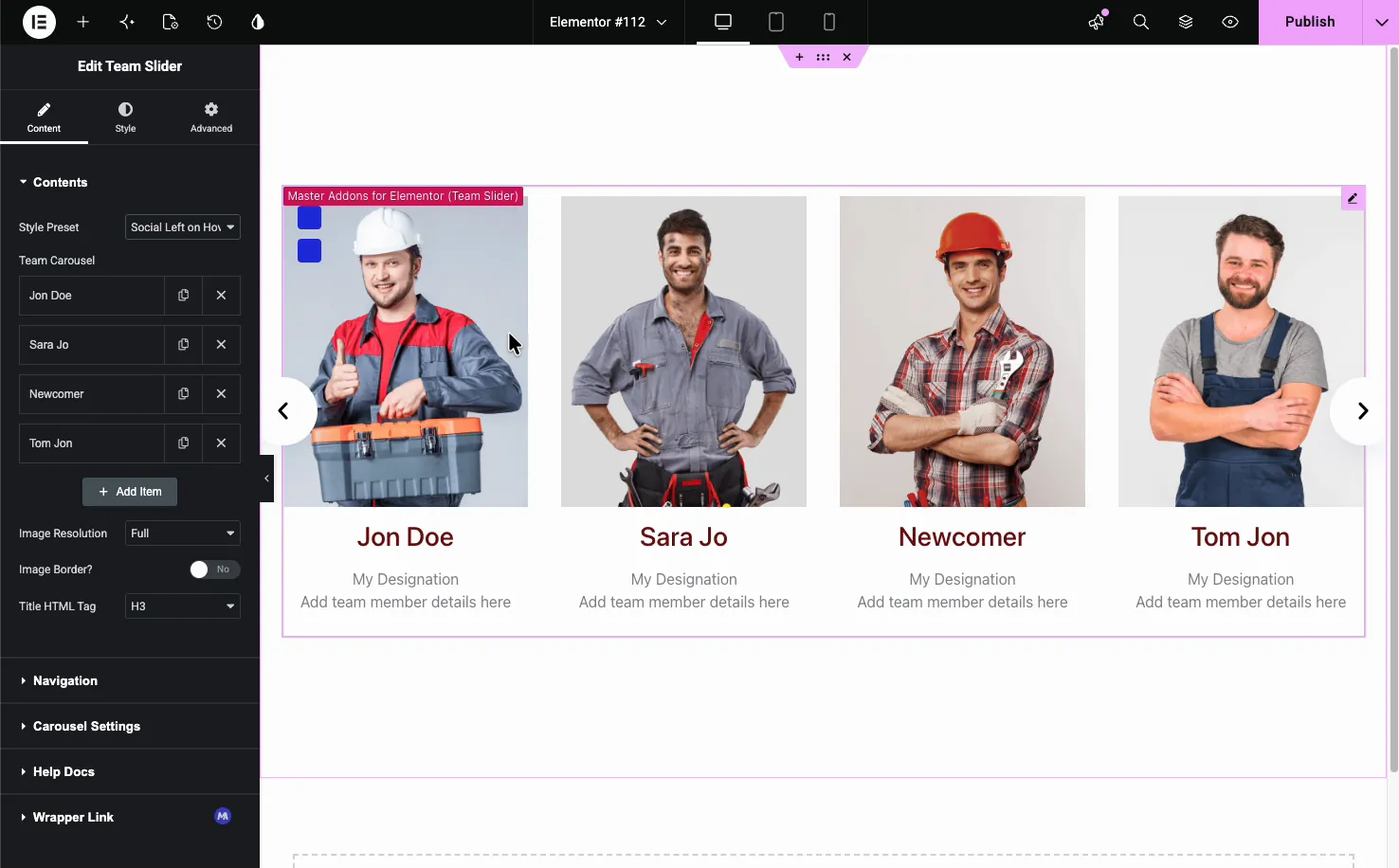
The Social Left on Hover preset (Pro) hides the social icons until someone hovers a card, then slides them in from the corner.
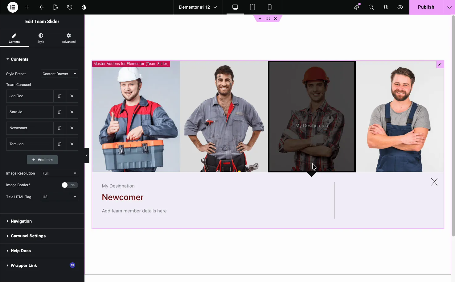
The Content Drawer preset (Pro) keeps the photos in a clean row and opens a sliding drawer with the member’s details when a card is clicked.
Navigation settings #
The Navigation section controls how visitors move through the slider.
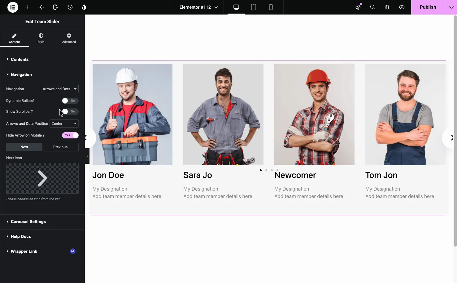
- Navigation: choose Arrows, Dots, Arrows and Dots, Arrows and Fraction, Progress, or None.
- Dynamic Bullets and Show Scrollbar: extra ways to indicate position.
- Arrows and Dots Position: place the controls where they fit.
- Next and Previous Icons: swap in your own arrow icons.
- Hide Arrow on Mobile: clean up small screens.
Carousel settings #
The Carousel Settings section sets how the slider moves and how many cards show at once.
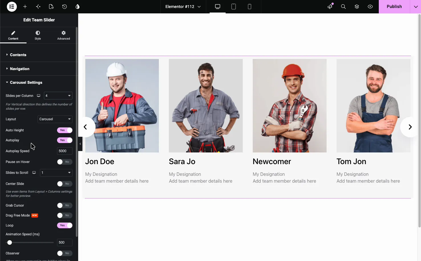
- Slides per Column: how many members show at once (4 by default).
- Layout: Carousel or Coverflow, with Rotate, Stretch, Modifier, and Depth settings for Coverflow.
- Autoplay, Autoplay Speed, and Pause on Hover: advance the slides on their own.
- Slides to Scroll, Center Slide, and Loop: control how the carousel steps and repeats.
- Animation Speed: how fast each transition runs.
Style the carousel #
The Style tab breaks the widget into parts you can style on their own: General Styles, Navigation, Name, Designation, Description, Carousel Items, and Social, plus Patterns when the free Patterns extension is switched on.
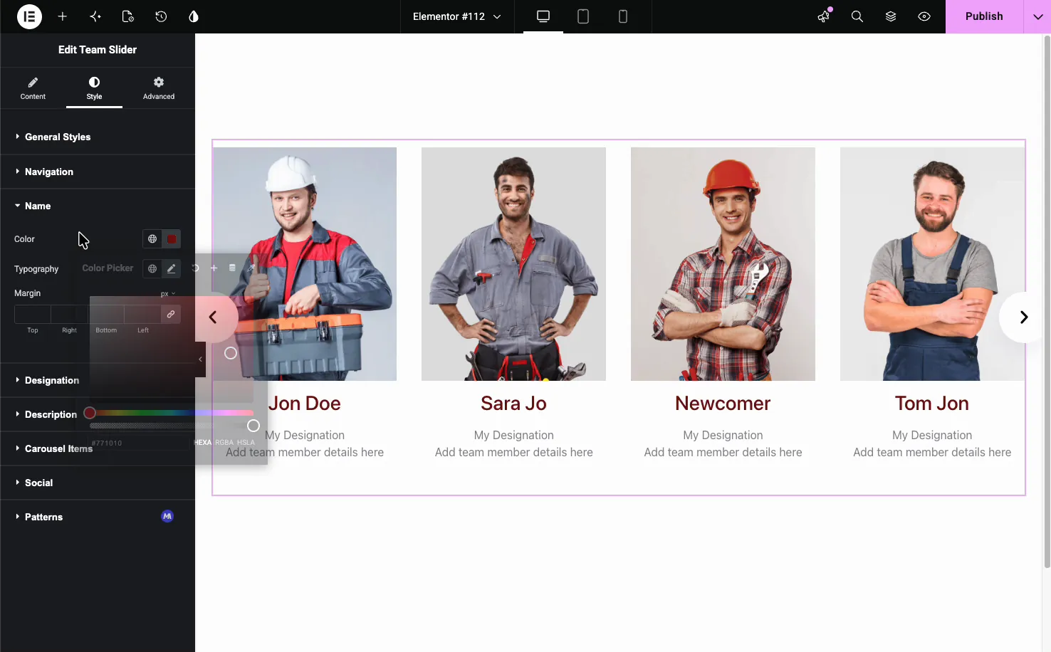
- Name, Designation, Description: color, typography, and spacing for each text element.
- Carousel Items: the card background, border, radius, box shadow, padding, gap, and opacity, with Normal, Hover, and Active tabs.
- Navigation and Social: the look of the arrows, dots, and social icons.
The result on the page #
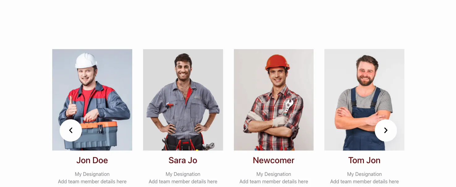
Publish or preview and the team carousel runs live: cards slide with the arrows or autoplay, and each member shows their photo, name, role, and links in the preset you picked.
Common use cases #
- About pages introducing the whole team in a compact slider.
- Agency and studio sites showing creatives with social links.
- Service businesses putting a face to the people doing the work.
- Speaker or instructor lineups for events and courses.
- Leadership sections highlighting founders and managers.
Tips for working with the Team Carousel widget #
- Use same-size photos. Matching dimensions keep the cards even as they slide. Mismatched heights are the usual reason a carousel looks jumpy.
- Keep bios short. A line or two reads best inside a carousel card.
- Pick a preset that fits the page. Content Drawer (Pro) suits detailed bios; the plain carousel works for quick intros.
- Set Slides per Column to match the width. Three or four cards fit most layouts; fewer on narrow columns.
- Add only the social links you use. Empty fields are skipped, so fill in just the active profiles.
Frequently Asked Questions #
What is the Team Carousel widget in Master Addons?
It is a free Elementor widget that shows your team members as cards in a slider. Each card holds a photo, name, role, short bio, and social links. You add members through a repeater and pick from several style presets, all from the Elementor panel.
How many style presets does the Team Carousel have?
Six. Team Carousel, Circle Gradient, and Content on Hover are free, and Circle Animation, Social Left on Hover, and Content Drawer need Master Addons Pro. Each preset changes how the card looks and behaves, like revealing social icons on hover or opening a detail drawer on click, without changing your member content.
Can I add social media links to each team member?
Yes. Each member has a Display Social Profiles toggle with fields for Facebook, Twitter, Instagram, LinkedIn, Dribbble, TikTok, YouTube, and Email. Fill in the profiles you use and the rest are skipped, so only the active links appear on the card.
Can I set how many team members show at once?
Yes. The Carousel Settings section has a Slides per Column option that sets how many cards appear at a time, four by default. Pair it with Slides to Scroll and Loop to control how the carousel steps through your members.
Does the Team Carousel autoplay?
Yes. The Carousel Settings section has Autoplay and Autoplay Speed options, so the slider advances on its own at the pace you set. Turn on Pause on Hover if you want it to stop while a visitor is reading a card.
Wrapping up #
The Team Carousel widget turns a list of people into a sliding showcase with photos, roles, bios, and social links. Add your members, choose a preset like Team Carousel or Circle Gradient (Social Left on Hover and Content Drawer need Pro), set the navigation and carousel behavior, then style the cards to match your page. For an overview and a Team Slider vs Team Member comparison, see the Elementor team member carousel page. For more sliders, see the Image Carousel widget and the Gallery Slider widget, browse the full Master Addons widgets and extensions, and check the pricing page for what each plan includes.


