

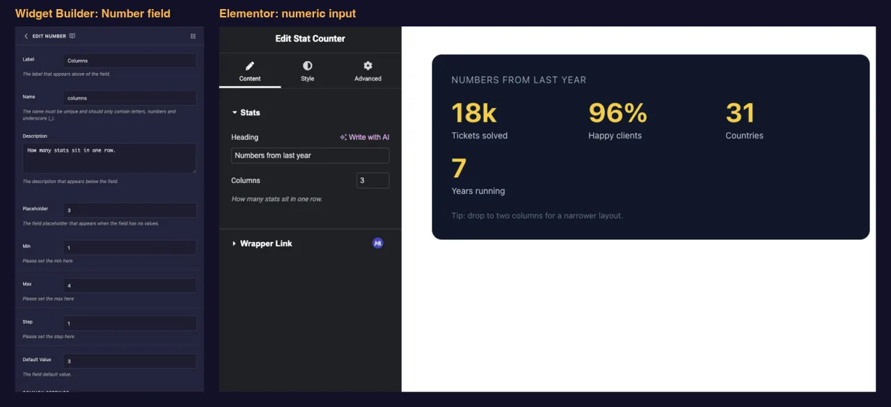
The Number field adds a numeric input to a custom widget you build with the Master Addons Widget Builder. Column counts, font sizes, items per row, star ratings: anything that only makes sense as a number belongs here. You set the allowed range in the builder, and editors get an input that keeps them inside it.
Number is one of the fields you can use in the free version’s Widget Builder. The free plugin includes a limited Widget Builder, and the full set of fields comes with Master Addons Pro.
What the Number field does #
- Adds a numeric input with spinner arrows to your widget’s panel in Elementor.
- Limits what editors can enter through Min, Max and Step.
- Prints the number wherever you place its token, in the HTML, CSS or JS panel.
- Works in comparisons, so
{% if columns > 2 %}can switch part of the markup.
New to the builder? Read the Widget Builder overview first, then come back with a widget open.
Before you start #
- WordPress with Elementor installed and active.
- Master Addons for Elementor installed and active. The installation guide covers setup.
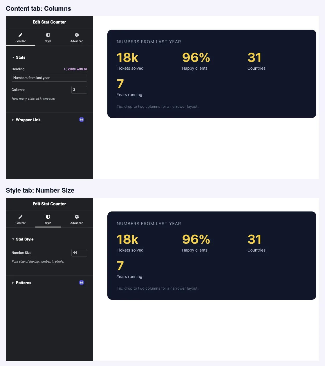
- A widget open in the Widget Builder. The example in this guide is a “Stat Counter” widget with two Number fields:
columns(1 to 4) on the Content tab andstat_size(20 to 96) on the Style tab.
How to add a Number field #
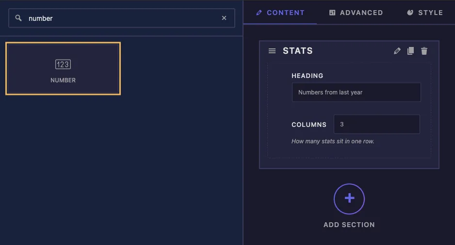
- Go to Master Addons > Widget Builder and open your widget.
- Add a section on the tab the setting belongs on. A layout count fits Content, a size fits Style.
- Type
numberin the field search box on the left. - Drag Number into the section. Click the pencil on the field to open its settings.
Number field options explained #
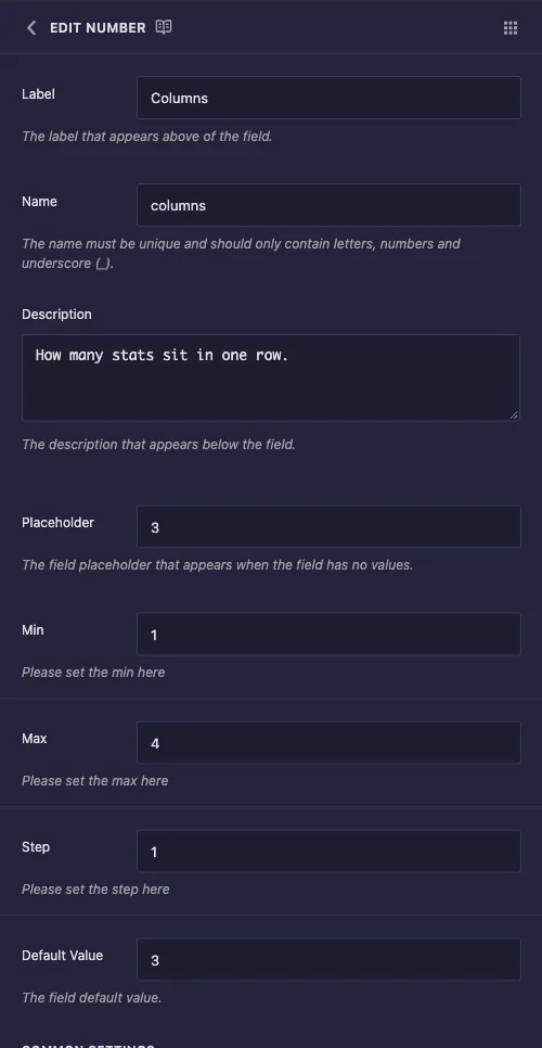
- Label: the text next to the input in Elementor, for example “Columns”.
- Name: the field’s unique ID and the name of its token. Use letters, numbers and underscores only, for example
columns. - Description: a hint shown under the input in Elementor. Say what the number controls and, if it matters, the unit.
- Placeholder: grey text shown while the input is empty.
- Min and Max: the lowest and highest values the input accepts.
- Step: how far the spinner arrows move each click. Use 1 for whole numbers, 2 for even numbers, 0.5 for half steps.
- Default Value: the number a new copy of the widget starts with.
Min, Max and Step reach the input itself. In our tests the Columns field arrived in Elementor as a number input with min 1, max 4 and step 1, so the arrows stop at the ends of the range.
Common Settings works as on other fields, including Conditions if the number should only appear when another field is set.
Print the number in your template #
The token works in all three panels. In the Stat Counter widget, the HTML puts the value in a data attribute and uses it in a comparison:
<div class="stats-grid" data-columns="{{ columns }}">
  ...
</div>
{% if columns > 2 %}
<p class="stats-note">Tip: drop to two columns for a narrower layout.</p>
{% endif %}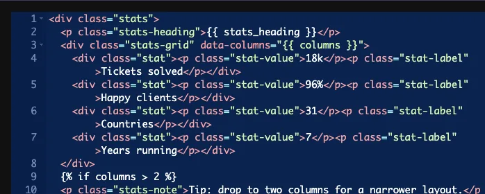
The CSS panel is where a number field usually earns its keep. Put the unit outside the braces, because the field stores a bare number:
.stats-grid { grid-template-columns: repeat({{ columns }}, 1fr); }
.stat-value { font-size: {{ stat_size }}px; }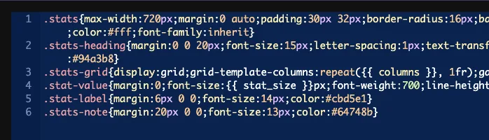
The same token works in the JS panel, for example var perRow = {{ columns }};.
Give every Number field a Default Value #
An empty field prints nothing, and that silently breaks the rule around it. With the Columns field cleared, our CSS became repeat(, 1fr), which browsers drop, and the grid fell back to a single column. The {% if columns > 2 %} check stopped matching at the same time. Nothing in the panel warns you.
So set a Default Value on any Number field that feeds CSS or JavaScript, and treat an empty value as possible in your template if editors can clear it.
Leave Selector empty on a Number field #
The Selector box behaves oddly for this field, and in our tests it caused two problems at once:
- It wrote the bare number into the rule with no property name, so no usable CSS came out of it.
- While a Selector was filled in, the field’s Default Value stopped reaching the token. A widget nobody had touched rendered
font-size:pxon the front end. Clearing the Selector fixed it, and the same untouched widget renderedfont-size:44px.
Print the token in the CSS panel instead, as shown above. That keeps the default working and lets you write the property and unit yourself.
Use the Number control in Elementor #
Add the widget to a page, or reload the editor if the page was already open. Each Number field shows as a small input under its label, on the tab where you placed it. Type a value or use the arrows, and the preview updates.
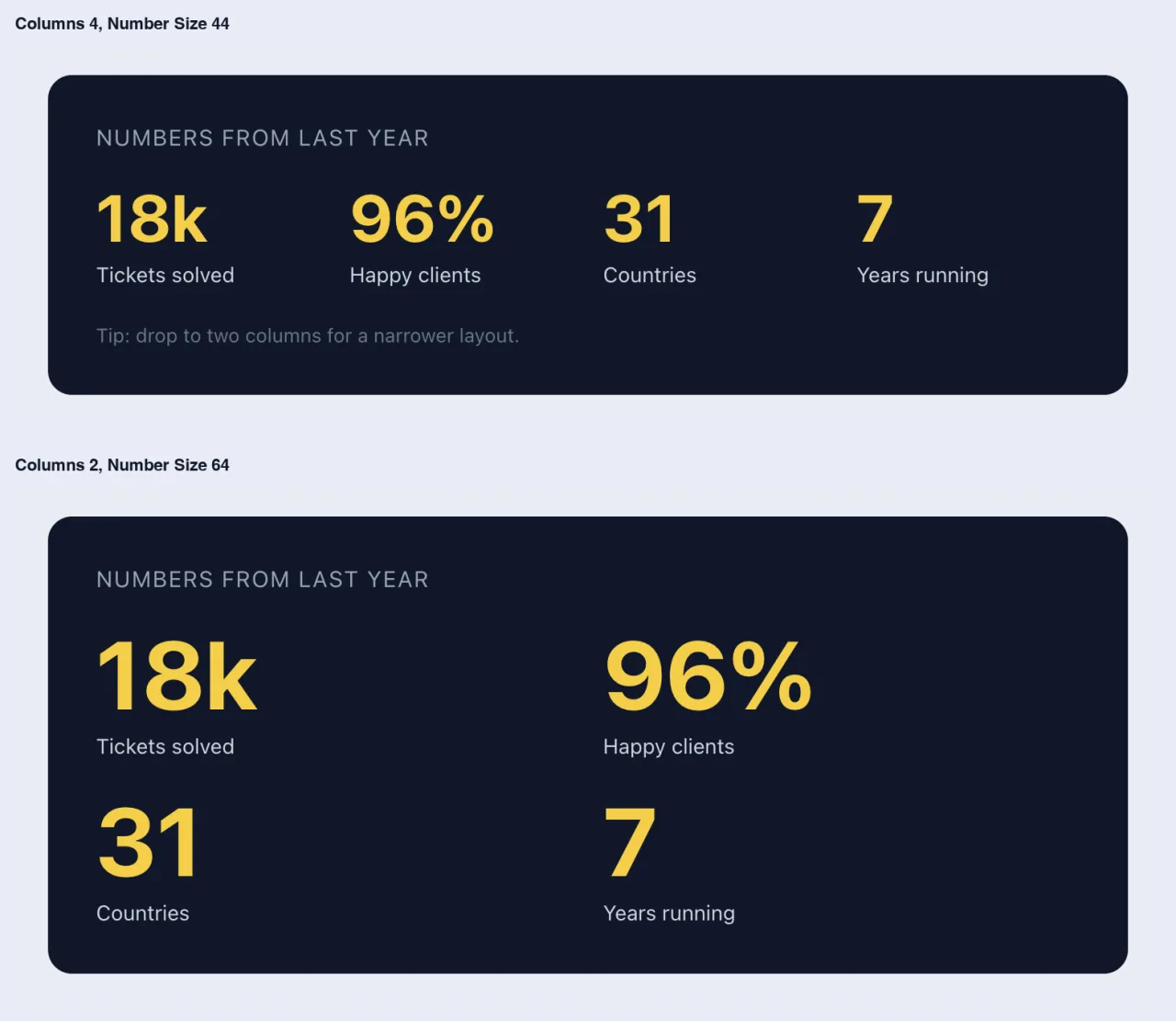
Here is the same widget at four columns and at two columns with a larger number size:
Common use cases #
- Column or item counts in grids and carousels.
- Font sizes, spacing values and widths in pixels.
- Star ratings, review scores and percentages.
- Counts and speeds a script reads, such as items per slide or an autoplay delay.
Tips for working with the Number field #
- Always set a Default Value. It’s the difference between a working widget and a silently broken rule.
- Set Min and Max to what the design can take. A grid built for four columns shouldn’t accept 12.
- Put the unit in the Label or Description, such as “Number Size” with “in pixels”, since the field stores a plain number.
- Keep the unit outside the token in CSS:
{{ stat_size }}px, not inside the braces. - Want a slider with units instead? The Slider field is a Pro field that gives editors a drag handle.
Frequently Asked Questions #
Is the Number field available in the free version?
Yes. Number is one of the fields you can use in the free version’s Widget Builder. The full set of Widget Builder fields comes with Master Addons Pro.
Do Min, Max and Step actually limit what editors type?
They reach the input in Elementor, so the arrows stop at the range you set. Set a Default Value as well, so the field is never empty.
Why did my CSS rule stop working?
The field is probably empty. An empty Number field prints nothing, so a rule like repeat(, 1fr) becomes invalid and the browser drops it. Set a Default Value.
Can I use the Selector option to style with a Number field?
Not usefully. In our tests it wrote the bare number with no property, and while it was filled in the field’s default stopped reaching the template. Print the token in the CSS panel instead.
How do I add a unit like px or %?
Write it outside the braces, for example font-size: {{ stat_size }}px;. The field stores only the number.
Wrapping up #
Add a Number field, set Min, Max, Step and a Default Value, then print the token where you need it and add the unit yourself. Leave Selector empty so the default keeps working. For a drag handle with unit options, see the Slider field, and check pricing for what each plan includes.


