

The Select field adds a dropdown to a custom widget you build with the Master Addons Widget Builder. You set a fixed list of choices, the editor picks one in Elementor, and your template changes to match: a different layout class, an extra badge, a different block of markup. It’s the field to use for named variants like card styles, badge types or sort orders.
Select is one of the fields you can use in the free version’s Widget Builder. The free plugin includes a limited Widget Builder, and the full set of fields comes with Master Addons Pro.
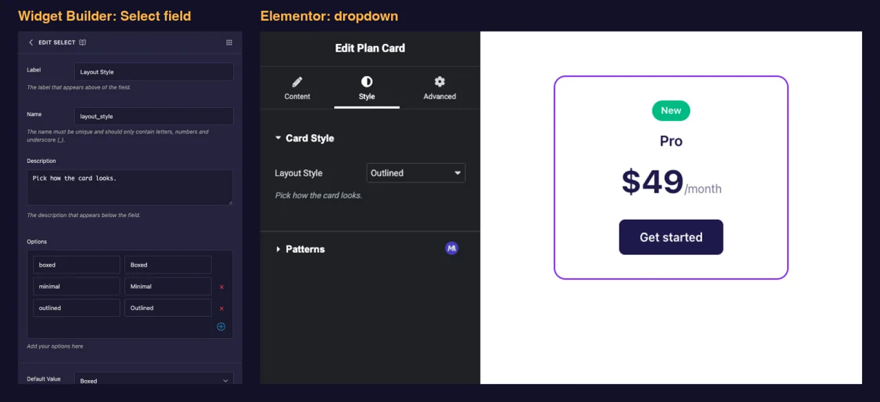
What the Select field does #
- Adds a standard dropdown to your widget’s panel in Elementor.
- Lets the editor pick one option from the list you define.
- Saves the option’s key (for example
outlined), not the label the editor sees. - Prints that key wherever you place its token, like
{{ layout_style }}, so you can use it as a class or check it with{% if %}.
New to the builder? Read the Widget Builder overview first, then come back with a widget open.
Before you start #
- WordPress with Elementor installed and active.
- Master Addons for Elementor installed and active. The installation guide covers setup.
- A widget open in the Widget Builder. The example in this guide is a “Plan Card” widget with two Select fields:
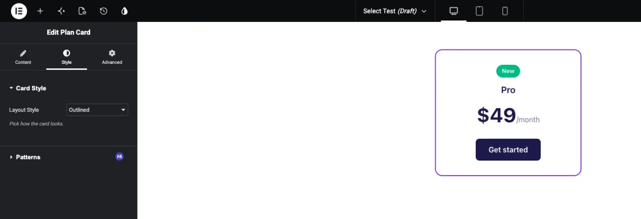
layout_style(Boxed, Minimal, Outlined) on the Style tab andbadge(No badge, Most Popular, New) on the Content tab.
How to add a Select field #
- Go to Master Addons > Widget Builder and open your widget.
- Pick the tab the setting belongs on and add a section. A look-and-feel choice like Layout Style fits the Style tab, for example in a “Card Style” section.
- Type
selectin the field search box on the left. Two fields come up: Select and Select2. - Drag Select into the section. Click the pencil on the field to open its settings.
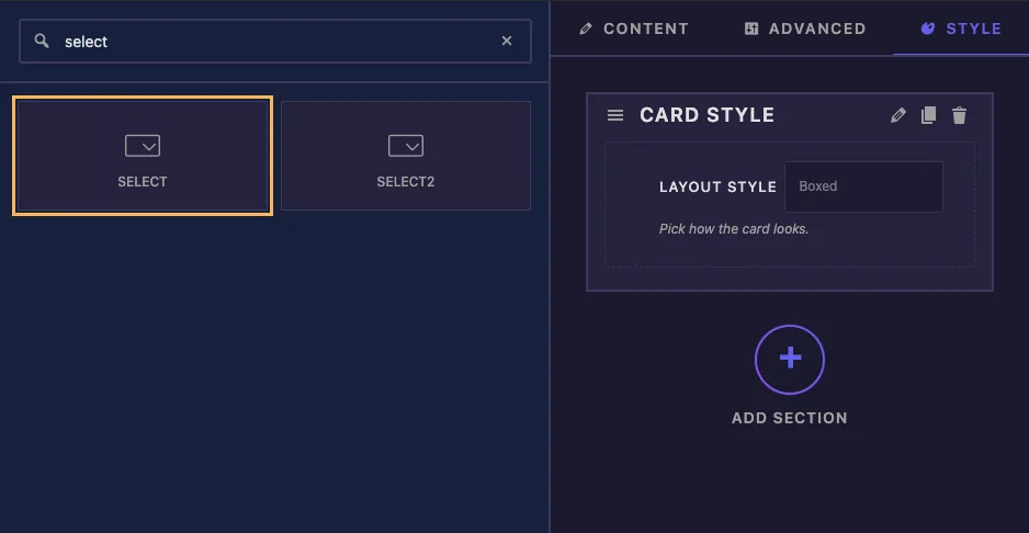
Select holds one choice from a short list. If editors need to search a long list or pick more than one option, use Select2 instead, which is a Pro field.
Select field options explained #
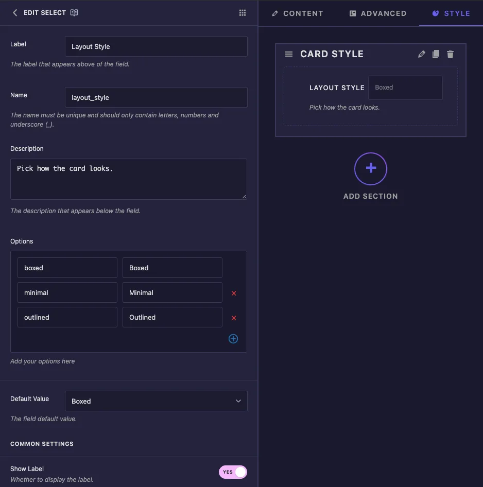
- Label: the text next to the dropdown in Elementor, for example “Layout Style”.
- Name: the field’s unique ID and the name of its token. Use letters, numbers and underscores only, for example
layout_style. - Description: a hint shown under the dropdown in Elementor.
- Options: one row per choice. The left box is the key your template receives, and the right box is the label editors see. Use the red cross to remove a row and the plus button to add one.
- Default Value: the option a new copy of the widget starts with. The dropdown shows labels, but the field saves the key.
A new Select field comes with three sample rows, value-1 to value-3 with the labels Option 1 to Option 3. Replace them with your own keys and labels before you use the widget.
Keep keys short, lowercase and without spaces, such as boxed or most_popular. They end up in class names and comparisons. If you leave Default Value empty, the widget starts on the first option in the list.
Under Common Settings you’ll find Show Label, Label Block, Separator and Conditions, which work the same as on other fields.
Use the choice in your template #
The Plan Card HTML uses both Select fields in the two most common ways:
<div class="plan plan--{{ layout_style }}">
  {% if badge == 'popular' %}
  <span class="plan-badge">Most Popular</span>
  {% elseif badge == 'new' %}
  <span class="plan-badge plan-badge--new">New</span>
  {% endif %}
  <p class="plan-name">{{ plan_name }}</p>
  <p class="plan-price">{{ plan_price }}<span>/month</span></p>
  <a class="plan-button" href="#">Get started</a>
</div>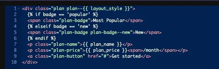
Modifier classes #
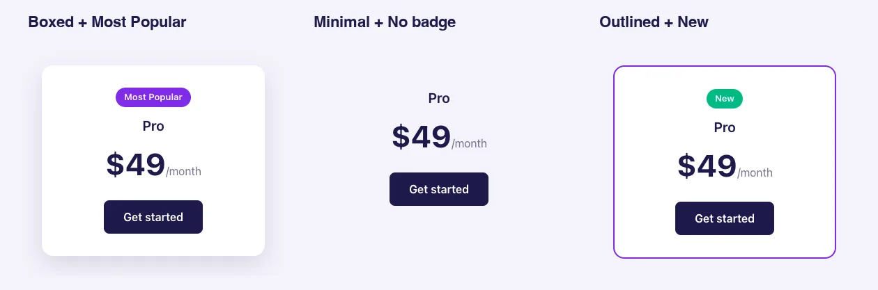
plan--{{ layout_style }} becomes plan--boxed, plan--minimal or plan--outlined. Each variant is then a short rule in the CSS panel, and the HTML stays the same:
.plan--boxed { background: #fff; box-shadow: 0 12px 32px rgba(29, 27, 76, .14); }
.plan--minimal { background: transparent; }
.plan--outlined { background: #fff; border: 2px solid #7c3aed; }
Different markup per option #
When an option needs different HTML, compare the key with {% if %}. {% elseif %} and {% else %} work too. In the example, none matches neither check, so no badge is printed.
Always compare against the key. {% if badge == 'popular' %} matches, while {% if badge == 'Most Popular' %} never does and gives no error. If a check never fires, look at the key’s spelling first.
Selector and Responsive Control #
- Selector always writes
color: {{VALUE}};for this field, and there’s no box to change the property. With keys likeboxedthe rule does nothing. It only helps when your keys are colors: in our tests, keys such as#7c3aedand#0ea5e9with a Selector of.plan-pricedid color the price. For anything else, leave Selector empty and use classes. - Responsive Control lets editors pick a different option per device. Those per-device picks only reach the page through the Selector rule above. The token prints the desktop choice, so leave Responsive Control off when you use the value in your template.
Use the Select control in Elementor #
Add the widget to a page, or reload the editor if the page was already open. Select the widget and open the tab where you placed the field. The dropdown shows your labels, with the default option already selected. Pick another option and the preview updates.
Here is the same Plan Card with three combinations of Layout Style and Badge:
Common use cases #
- Card, button or section style variants.
- Badges or ribbons such as Sale, New or Most Popular.
- Heading tag, image ratio or column count choices.
- Sort order or data source for a list widget.
Tips for working with the Select field #
- Decide on keys before editors use the widget. You can rename labels later, but changing a key breaks pages that already saved the old one.
- Add a “none” option when the element is optional, like the badge in the example.
- Set a Default Value that looks good on its own, so a newly added widget is ready to use.
- Only two or three options with clear icons? The Choose field shows them as buttons instead of a dropdown.
- Just on or off? Use the Switcher field.
Frequently Asked Questions #
Is the Select field available in the free version?
Yes. Select is one of the fields you can use in the free version’s Widget Builder. The full set of Widget Builder fields comes with Master Addons Pro.
Does the token print the key or the label?
The key. If the option is outlined with the label Outlined, {{ layout_style }} prints outlined.
Why does my {% if %} check never match?
It’s probably comparing against the label or a misspelled key. Use the exact key from the left box of the option row, for example {% if badge == 'popular' %}.
What happens if I leave Default Value empty?
The widget starts on the first option in the list.
What’s the difference between Select and Select2?
Select is a plain dropdown with one choice. Select2 is a Pro field with a searchable list that can also allow several choices.
Wrapping up #
Add a Select field, replace the sample rows with short keys and clear labels, and set a default. Then print the key as a class for style variants, or check it with {% if %} when the markup changes. For searchable or multiple choices, see Select2, and check pricing for what each plan includes.


