Elementor Team Member Widget
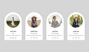
The Master Addons Team Member widget builds one profile card with a photo, name, designation, short bio and social icons. It is free, with 6 design variations in the free plugin (Basic One to Five and Rounded) and 5 more in Master Addons Pro. Elementor has no team member widget of its own, so this saves you stacking an image, headings and an icon list by hand. For a sliding row of people, use the Team Slider widget.
How to Add a Team Member Section in Elementor
You need Elementor and the free Master Addons plugin. The full walkthrough with a grid and a carousel is in How to Create a Team Members Section in Elementor.
- Check that Team Member is switched on under Master Addons, Widgets.
- Add a container and set its layout to Grid with 3 or 4 columns.
- Search for Team Member in the Elementor panel and drag it into the grid.
- Choose a Design Variation, then add the photo, name, designation and bio.
- Add social icons under Social Profiles.
- Style the first card, then duplicate it for each person and swap the content.
11 Design Variations (6 Free, 5 Pro)
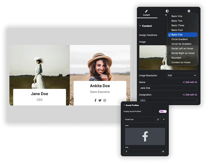
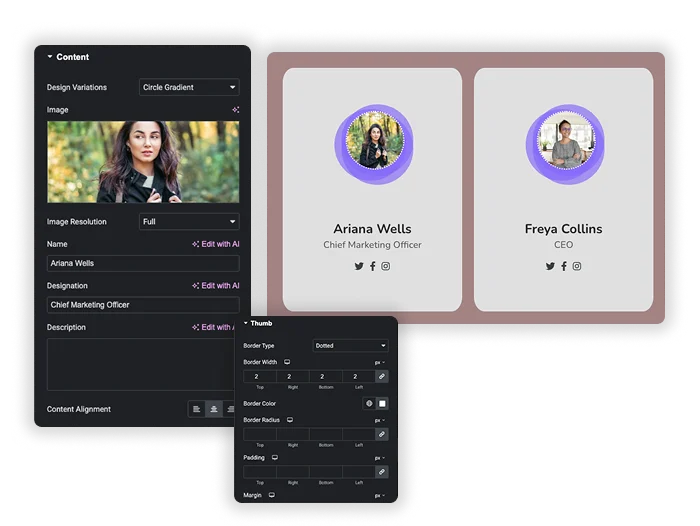
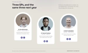
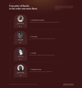
Pick a layout in Design Variations at the top of the Content tab. Basic One to Five and Rounded are free. Circle Gradient, Circle No Gradient, Social Left on Hover, Social Right on Hover and Content on Hover need Pro. Your name, photo, bio and icons stay in place when you switch.
- Free: Basic One, Basic Two, Basic Three, Basic Four, Basic Five, Rounded.
- Pro: Circle Gradient, Circle No Gradient, Social Left on Hover, Social Right on Hover, Content on Hover.
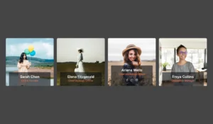
- The hover variations show the social icons or bio when a visitor points at the card.
Profile Content and Social Icons
In the Content tab, upload the Image and choose its image size. Fill in Name, Designation and Description, then set Content Alignment. Under Social Profiles, turn on Display Social Profiles and click Add Item for each network. Each item has an icon from the Elementor icon library and a link. Social icons have their own alignment setting.
- Name, designation and description are plain text fields.
- Add as many social icons as you need, each with its own link.
- Tick “Open in new window” on a link if you want it to open in a new tab.
Card, Photo and Text Styles
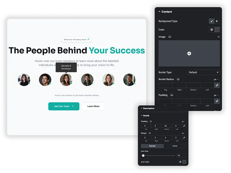
General Styles sets the card background color, Item Border Radius and box shadow. Thumb styles the photo with border, border radius, padding and margin. Content adds a background (color or gradient), border, radius, padding and margin to the text area. Name, Designation and Description each have color, typography, padding and margin. Social sets icon size, icon color and background for normal and hover states.
- Set the Thumb border radius to 50% for a round photo.
- Padding and margin are responsive, so you can tighten the card on mobile.
- The Rounded variation adds a second background color for its social icons.
Core Elementor Widgets vs the Team Member Widget
Elementor Free and Pro have no team member widget. You can build a card from an Image, a Heading, a Text Editor and a Social Icons widget. Here is how that compares.
| Task | Core Elementor widgets | Master Addons Team Member |
|---|---|---|
| Widgets per card | 4 or more inside a container | 1 |
| Ready layouts | None, you design each card | 6 free, 11 with Pro |
| Hover reveal of icons or bio | Needs custom CSS | Pro hover variations |
| Social icon brand colors | Yes, in the Social Icons widget | One color set for all icons |
| Layout freedom | Full, any widget order | Fixed order within the chosen variation |
Related widgets: Team Slider for a carousel of people, Infobox for icon and text cards, and Flipbox for cards with a back side.











Frequently Asked Questions For Team Member
How do I create a full team grid or list with this element?
Each widget is one person. Add a container, set its layout to Grid with the number of columns you want, and place one Team Member widget in each cell. Style the first card and duplicate it so every card matches.
What’s the difference between “Circle Gradient” and “Circle No Gradient”?
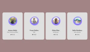
Both are Pro variations with a round photo. Circle Gradient draws a colored shape behind the photo. Circle No Gradient has a transparent background with no shape.
Can I link the team member’s name or image to a dedicated bio page?
The widget has no link field for the name or photo. Only the social icons take links. To make the whole card clickable, use the free Wrapper Link extension on the widget.
Is the profile responsive on mobile?
Yes. The card scales with its column, and padding and margin settings are responsive. Set the grid to one column on mobile in the container settings so cards stack.
Is the Team Member widget free?
Yes. It is part of the free Master Addons plugin with 6 design variations and all content and style controls. Master Addons Pro adds 5 more variations: Circle Gradient, Circle No Gradient, Social Left on Hover, Social Right on Hover and Content on Hover.
How many social icons can I add?
There is no fixed limit. Social Profiles is a repeater, so click Add Item for each network. Most cards look best with three to five icons.
Trending Elementor Widgets & Extensions
Build sophisticated websites in less time.
Glassmorphism
Container Extras
Patterns
![Master Addons Post/Page Duplicator extension for Elementor: MA Duplicator row link in the WordPress Pages list creating a Landing Page - [Duplicated #128] draft](https://d1asvmc6qcowgk.cloudfront.net/wp-content/uploads/2026/09/15102930/post-page-duplicator-768x403.webp)
Post/Page Duplicator