The Master Addons Widget Builder turns your own HTML, CSS, and JavaScript into a real Elementor widget, with editable controls in the Elementor panel. You design the option panel, connect it to your code with shortcodes, and the widget behaves like any native Elementor element. No PHP, no plugin boilerplate, no separate code editor to juggle.
This guide walks through the Widget Builder option panel exactly as it appears on screen: adding a new widget, dragging fields into the Content, Style, and Advanced tabs, writing code, using the dynamic shortcodes, loading CDN libraries, and finally exporting or importing a widget as a JSON file. You can find the feature on the Widget Builder page and inside the full widgets and extensions list.
What the Widget Builder does #
Most addons give you a fixed set of widgets. This one gives you the tools to make your own. You assemble an option panel from ready-made field types (heading, text, color, number, dimensions, switcher, and more), drop in your code, and bind the fields to that code with simple shortcode tokens. Save the widget and Master Addons registers both a shortcode and an Elementor widget you can drag onto any page.
Think of it as the bridge between a CodePen-style snippet and a fully editable Elementor widget. Once it is built, anyone on your team can tweak the colors, spacing, and text from the Elementor editor without ever opening the source.
Before you start #
- WordPress with the Elementor page builder installed and active.
- Master Addons for Elementor installed and active. New to the plugin? Follow the installation guide first.
- Basic HTML and CSS. JavaScript is optional and only needed for interactive widgets.
Open the Widget Builder and add a new widget #
From the WordPress dashboard, go to Master Addons → Widget Builder. This opens the Master Addons Widgets screen, which lists every custom widget you have built along with its category, author, and generated shortcode. At the top you will see three buttons: Add New Widget, Import Widget, and Video Tutorial.
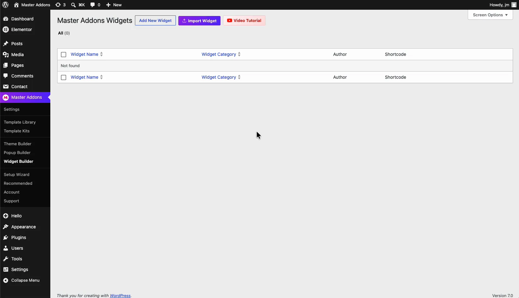
Click Add New Widget. A Create New Widget dialog appears with two fields:
- Widget Title (required): a descriptive name for your widget, for example “Hero Section”. This is what you will search for in the Elementor panel later, so make it something you will recognize.
- Widget Category: the Elementor category the widget is grouped under (Favorites by default). Categories keep your custom widgets organized in the editor.
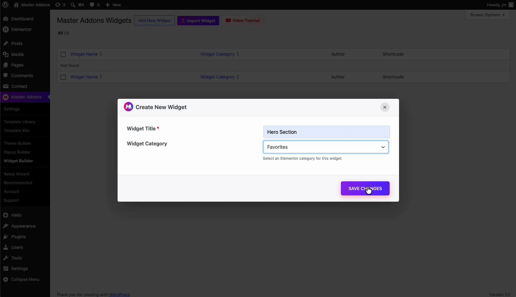
Enter a title, pick a category, and click Save Changes. Master Addons opens the Widget Builder editor for your new widget.
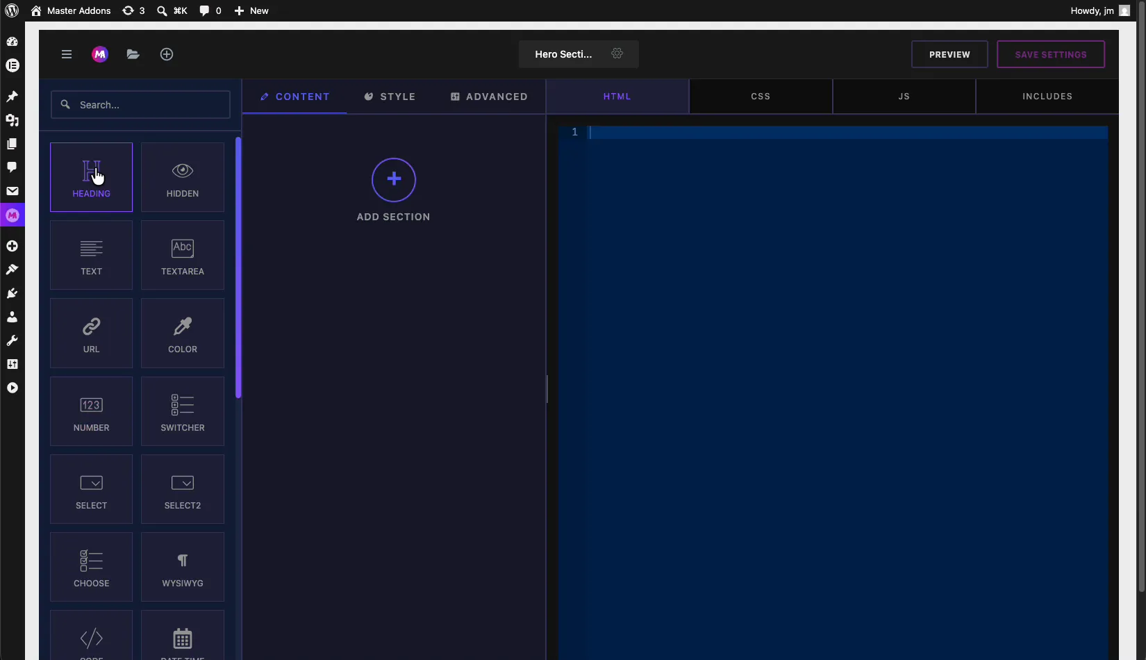
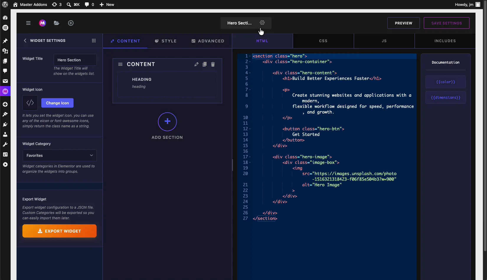
Inside the Widget Builder interface #
The builder is split into three working areas, left to right:
- Fields panel (left): a searchable library of control types you drag into your widget, such as Heading, Text, Textarea, URL, Color, Number, Switcher, Select, Choose, WYSIWYG, Code, and Date Time.
- Settings panel (center): the Content, Style, and Advanced tabs where you arrange those fields into sections. This is the actual option panel your users will see in Elementor.
- Code panel (right): the HTML, CSS, JS, and INCLUDES tabs where you write the markup, styles, scripts, and library references.
The top bar holds the widget name with a settings gear icon next to it, plus Preview and Save Settings buttons.
Build the option panel: Content, Style, and Advanced tabs #
This is where you design the controls. Pick a field from the left panel and drag it into a section under the Content, Style, or Advanced tab. Follow the same logic Elementor uses: text and links under Content, colors and typography under Style, spacing and layout under Advanced.
Each section has a Section Title (the label shown in the section header) and a Section Name, a unique identifier you will reference in your code. Add as many sections and fields as the widget needs.
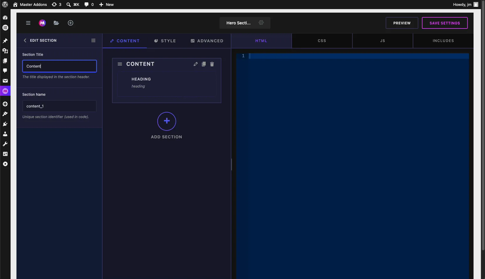
For example, drop a Color field into the Style tab to let users recolor the widget, and a Dimensions field into the Advanced tab to control padding on all four sides. Every field type has its own documentation if you want the full list of options.
Dynamic shortcodes: connect fields to your code #
This is the part that ties everything together. Every field you add generates a shortcode token, and those tokens show up in the Documentation sidebar beside the code editor. Add a Color field and you get {{color}}. Add a Dimensions field and you get {{dimensions}}.
Drop these tokens into your HTML, CSS, or JS wherever you want the field’s value to land. When a user changes that control in Elementor, Master Addons swaps the token for the live value, so your code stays dynamic. One thing to remember: the token only exists once the matching field is on the panel, so build the field first, then reference its shortcode.
Add your HTML, CSS, and JS #
With the panel and shortcodes ready, switch to the code tabs on the right and paste your markup, styles, and scripts.
HTML tab: write the widget structure and place shortcode tokens where dynamic values belong.
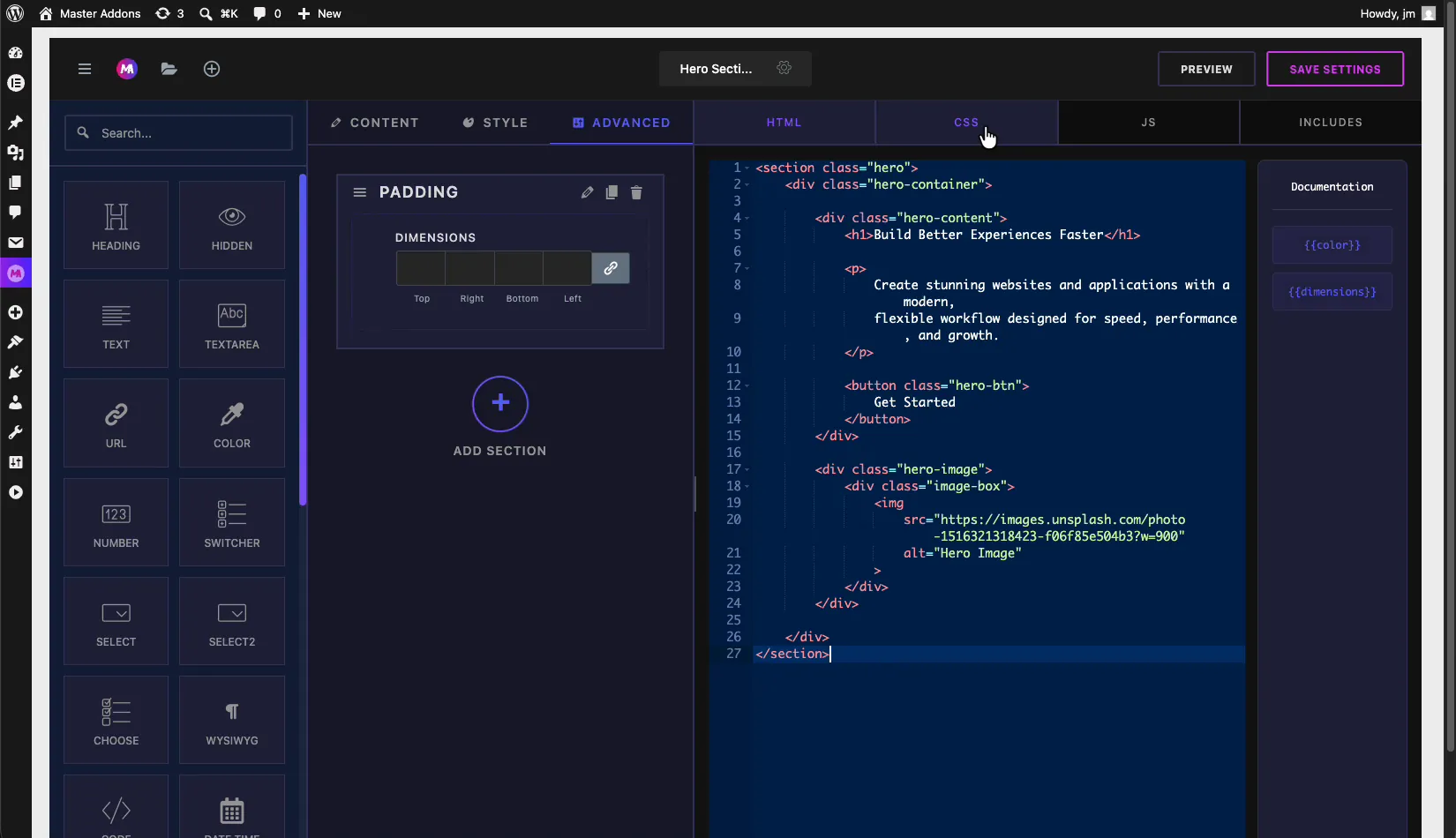
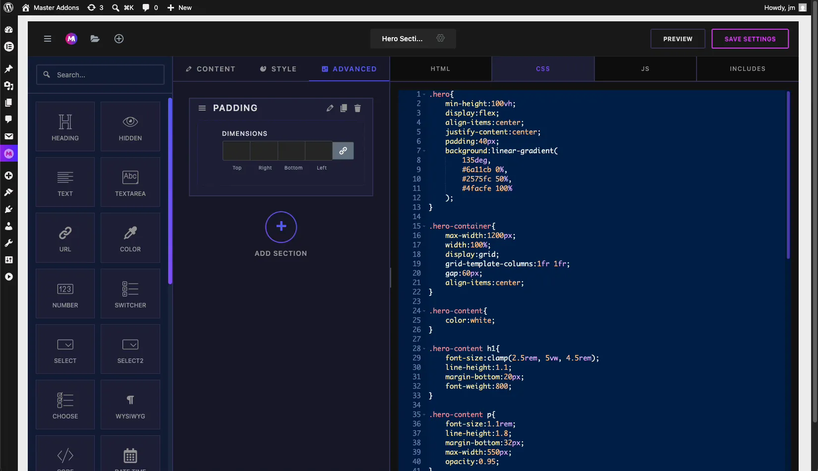
CSS tab: style the markup. Reference the same shortcode tokens to pull in colors and dimensions chosen in the panel.
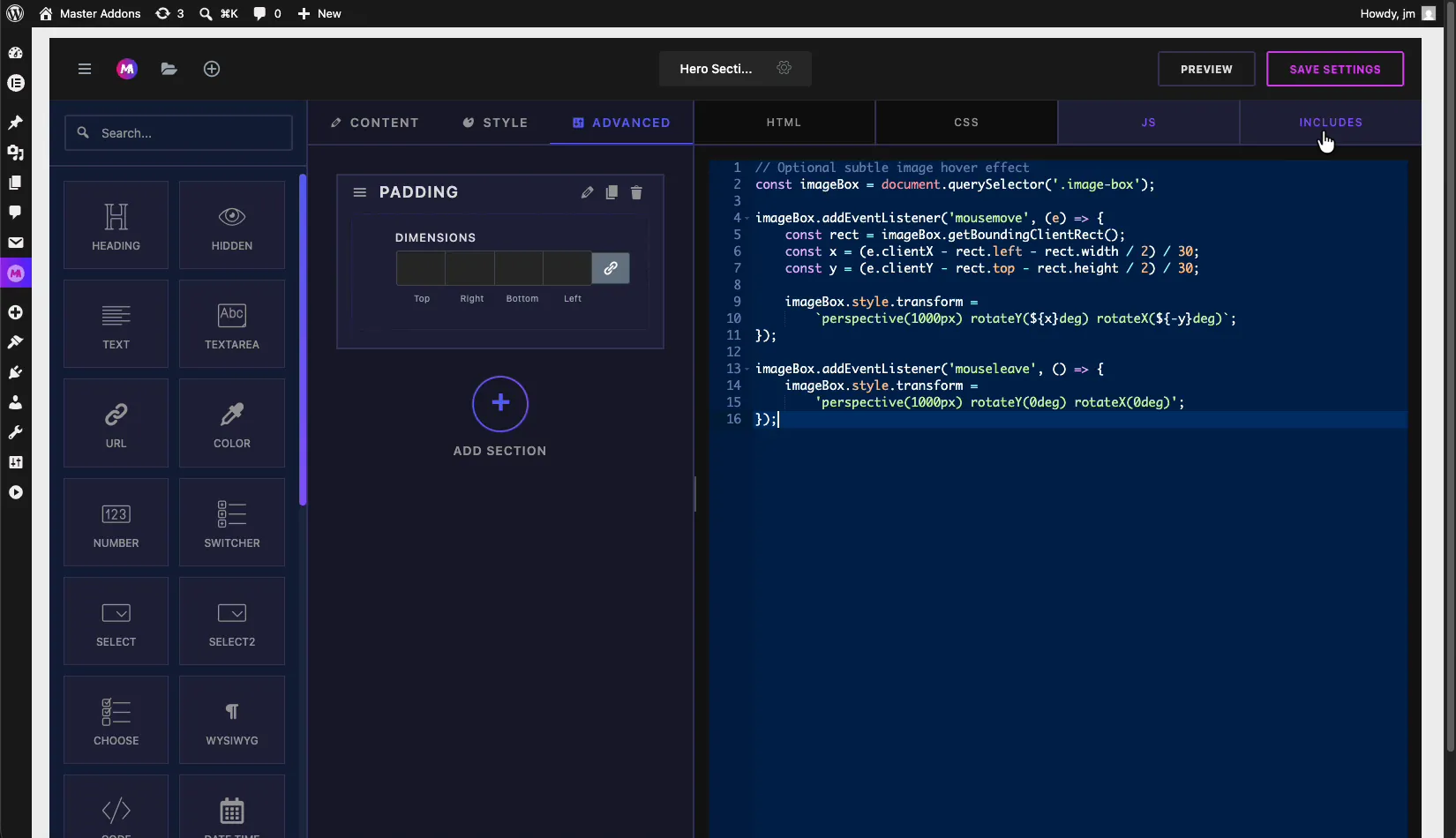
JS tab: add JavaScript for any interactive behavior, like hover effects or a slider. Plain vanilla JS works, and so does jQuery once you load it under Includes.
If you only need a code field inside the panel rather than the main editor, the Code field drops a syntax-highlighted input into your controls.
Includes: load CDN CSS and JS libraries #
Open the INCLUDES tab to attach external libraries your widget depends on. There are two lists: CSS Libraries and JS Libraries. For each one you add a Handle (a unique name) and a Source URL or Registered Handle, then click Add CSS or Add JS.
This is how you pull in something like Font Awesome from a CDN, or jQuery, without editing your theme. Master Addons only enqueues the library when the widget is actually on the page, so your other pages stay clean.
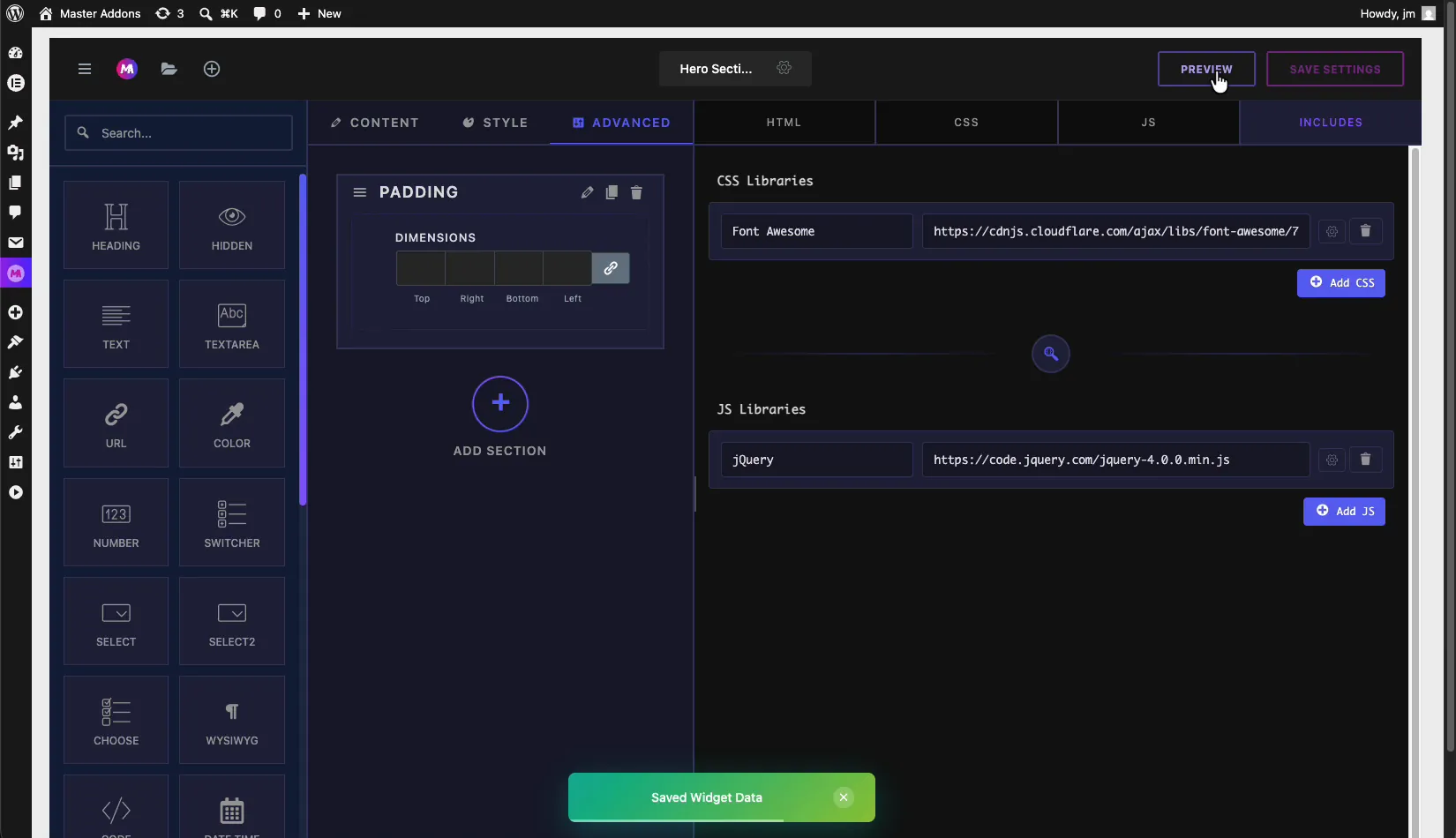
Need icons inside the widget? Master Addons also ships eight bundled icon libraries you can use without an external CDN call.
Widget settings: title, icon, category, and export #
Click the gear icon next to the widget name in the top bar to open Widget Settings in the left panel. From here you control how the widget presents itself inside Elementor:
- Widget Title: rename the widget. This title shows in the Elementor widget list.
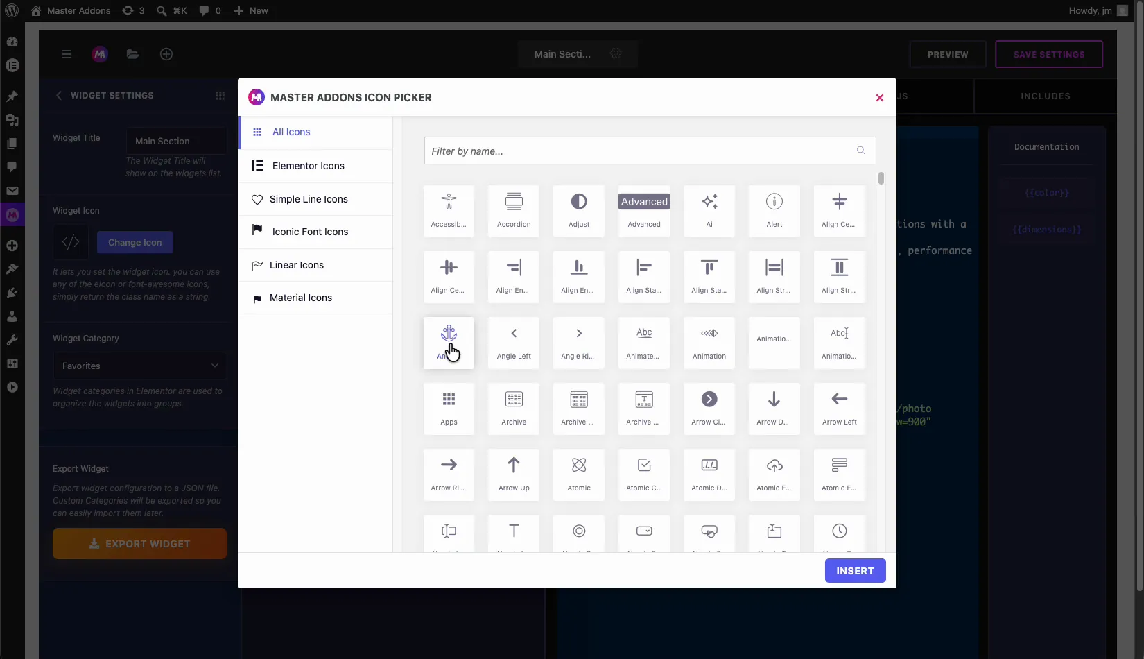
- Widget Icon: click Change Icon to pick an icon from the Master Addons icon picker. You can use any included icon or a Font Awesome class.
- Widget Category: choose the Elementor category the widget appears under, so it groups with related widgets.
- Export Widget: export the whole widget configuration as a JSON file you can save, back up, or share with anyone.
The icon picker groups thousands of icons into categories such as All Icons, Elementor Icons, Simple Line Icons, Iconic Font Icons, Linear Icons, and Material Icons. Filter by name, select one, and click Insert.
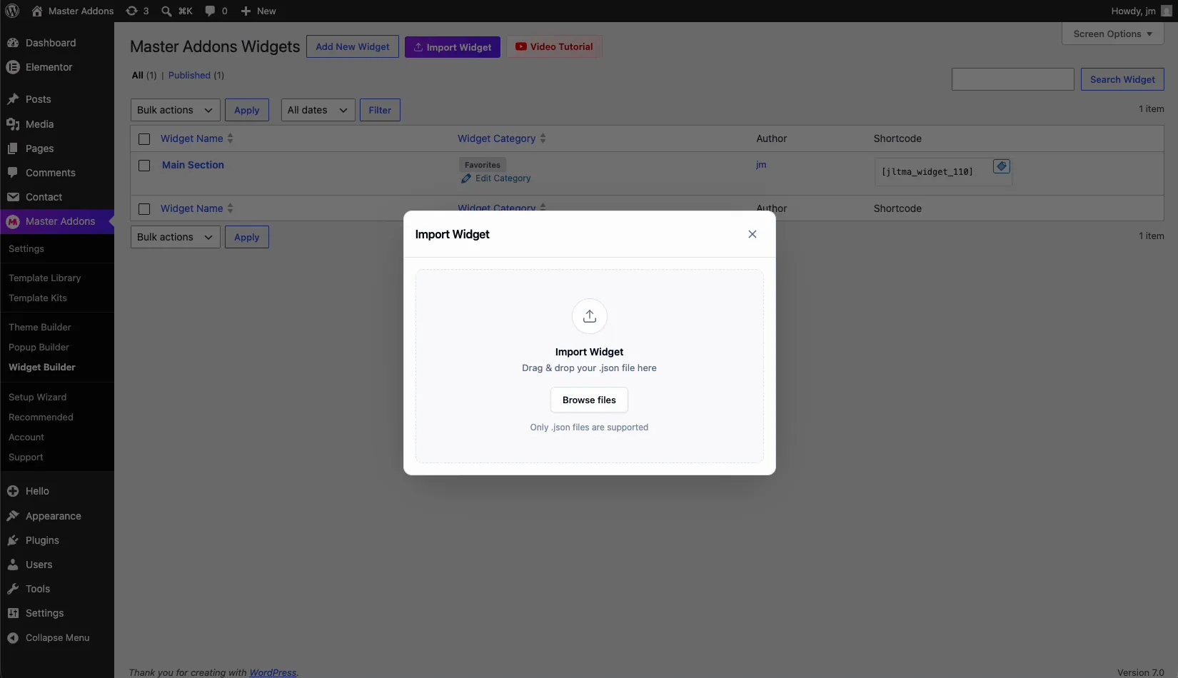
Import a widget from a JSON file #
Sharing works both ways. Back on the Master Addons Widgets screen, click the Import Widget button. The dialog lets you drag and drop a .json file, or browse for it. Only .json files exported from the Widget Builder are supported.
Anyone with the JSON file of a widget can import it, panel, code, includes, and all, then use it on their own site in seconds. That makes the Widget Builder a tidy way to reuse widgets across projects or hand them off to a client.
Tips for building reliable custom widgets #
- Name sections clearly. The Section Name ends up in your code, so keep it short and meaningful.
- Add a field before you reference its shortcode. Tokens only exist after the matching field is on the panel.
- Use Preview often. Check the live preview before saving so you catch a missing token early instead of on the live page.
- Load libraries through Includes, not inline. It keeps your code clean and loads scripts only where they are needed.
- Export as you go. A JSON export doubles as your backup and your share file.
- Not seeing your widget in Elementor? Check the troubleshooting guide for visibility fixes.
Frequently Asked Questions #
What is the Master Addons Widget Builder?
The Widget Builder is a tool in Master Addons for Elementor that turns your own HTML, CSS, and JavaScript into an editable Elementor widget. You design an option panel from drag-and-drop fields and connect it to your code with shortcode tokens, no PHP required.
How do the {{color}} and {{dimensions}} shortcodes work?
Each field you add to the option panel generates a shortcode token, like {{color}} or {{dimensions}}. You place the token in your HTML, CSS, or JS, and Master Addons replaces it with the value the user sets in Elementor, which makes the widget dynamic.
Can I add external CSS and JS libraries to a custom widget?
Yes. Open the Includes tab, add a handle and a CDN source URL under CSS Libraries or JS Libraries, then click Add. Master Addons loads the library only on pages that use the widget, so it does not slow down the rest of your site.
How do I share a custom Elementor widget?
Open Widget Settings from the gear icon and click Export Widget to download a JSON file. Anyone can then use the Import Widget button on the Widget Builder screen to drag in that JSON file and use the widget on their own site.
Is the Widget Builder included for free?
The Widget Builder is part of Master Addons for Elementor. See the pricing page for the current plan breakdown and which features are included at each tier.
Wrapping up #
The Master Addons Widget Builder closes the gap between a code snippet and a production Elementor widget. Build the panel, write your HTML, CSS, and JS, wire it up with shortcode tokens, load any libraries you need, then export or import the result as JSON. Have a look at the rest of the Master Addons widget library to see what else you can build.


