

Some images need a little explaining, like a product shot, a floor plan, or a map. The Image Hotspot widget in Master Addons for Elementor is a Pro widget that pins clickable markers anywhere on an image. Each one shows a short text tooltip, and can link to another page, when a visitor hovers or taps it.
You load an image, drop hotspots where you want them, add the tooltip text, then style the markers and set how the tooltips behave. This guide covers every setting in the widget.
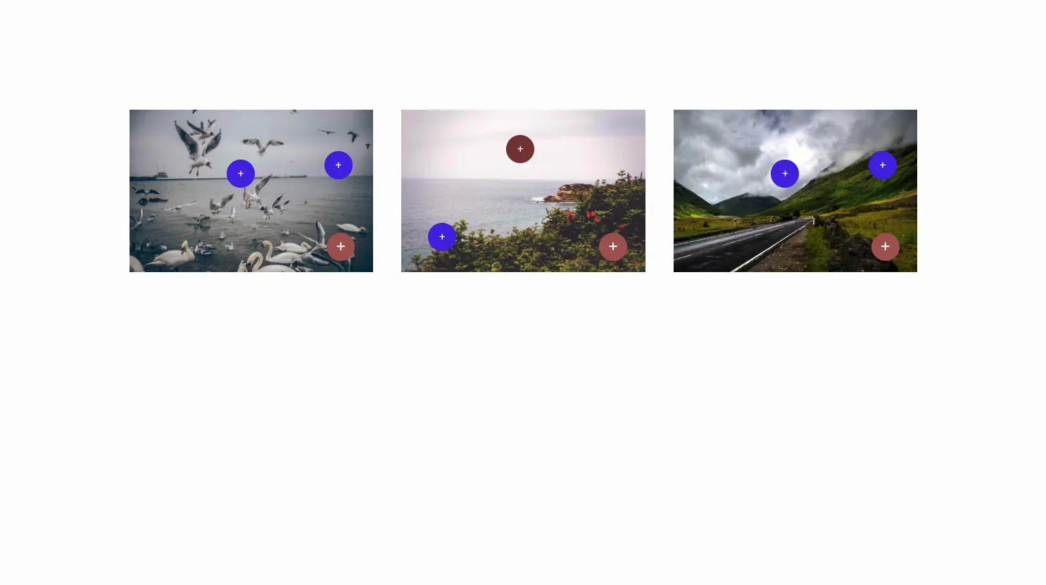
What the Image Hotspot widget does #
The widget puts markers on top of a single image. Each hotspot has its own position, icon, and tooltip, so you can label parts of a photo or link them to other pages. Hover or click a marker and its tooltip pops up next to it.
Three tabs run it. Content holds the image, the hotspots, and the tooltip behavior. Style handles the image, the marker colors, and the tooltip look. Advanced is the usual Elementor spacing and visibility.
Before you start #
- WordPress with Elementor installed and active.
- Master Addons Pro installed with an active license, since Image Hotspot is a Pro widget. New to the plugin? See the installation guide.
- An image, and the labels or links you want each hotspot to show.
How to add the Image Hotspot widget #
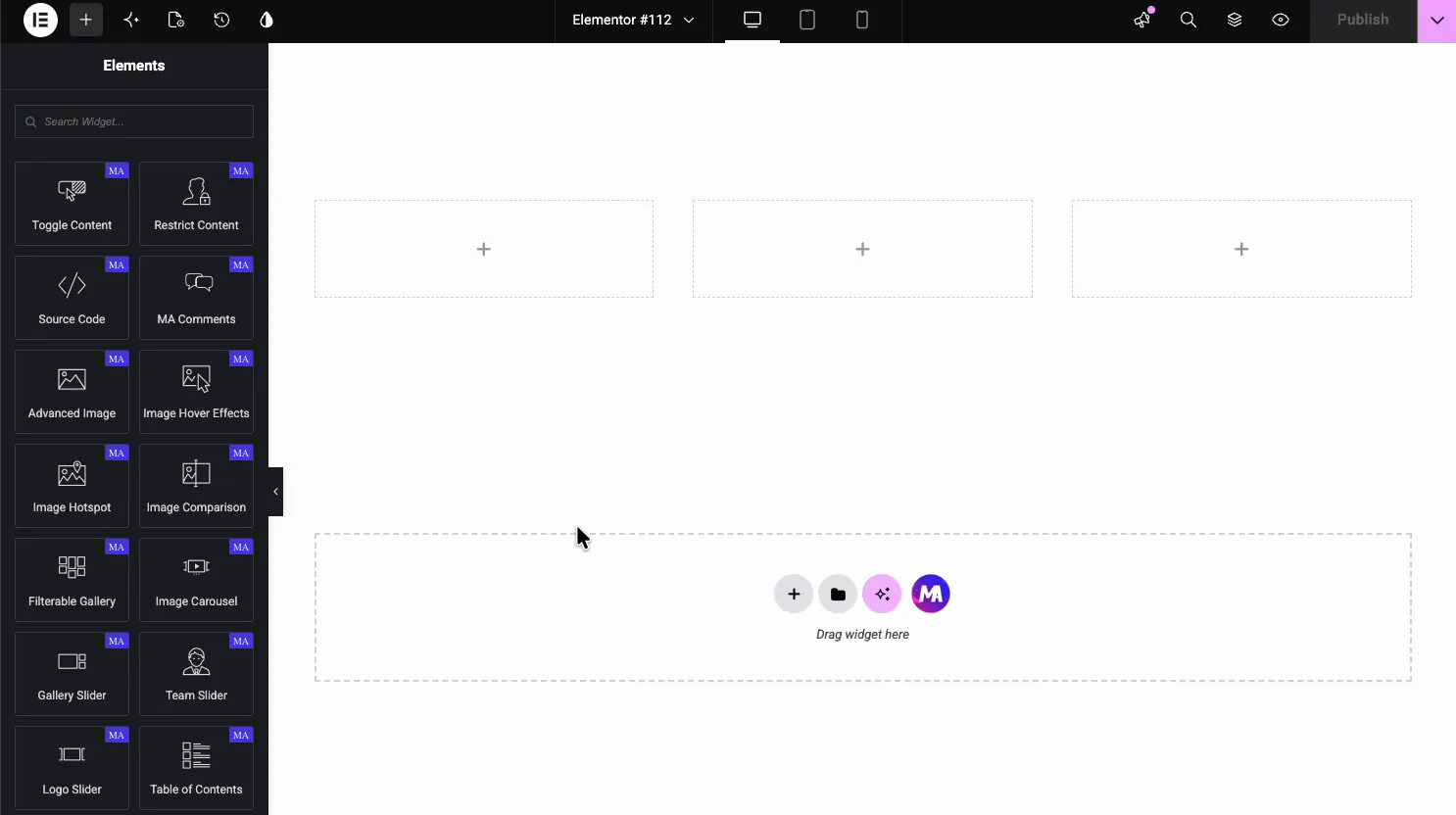
In the Elementor editor, open the Elements panel and search for Image Hotspot, or scroll to the Master Addons section (the widgets carry a purple MA badge). Drag it onto the page and it loads with a sample image and markers you can edit.
Choose the image #
Open the Content tab. The Image section is where you load the base picture that the hotspots sit on.
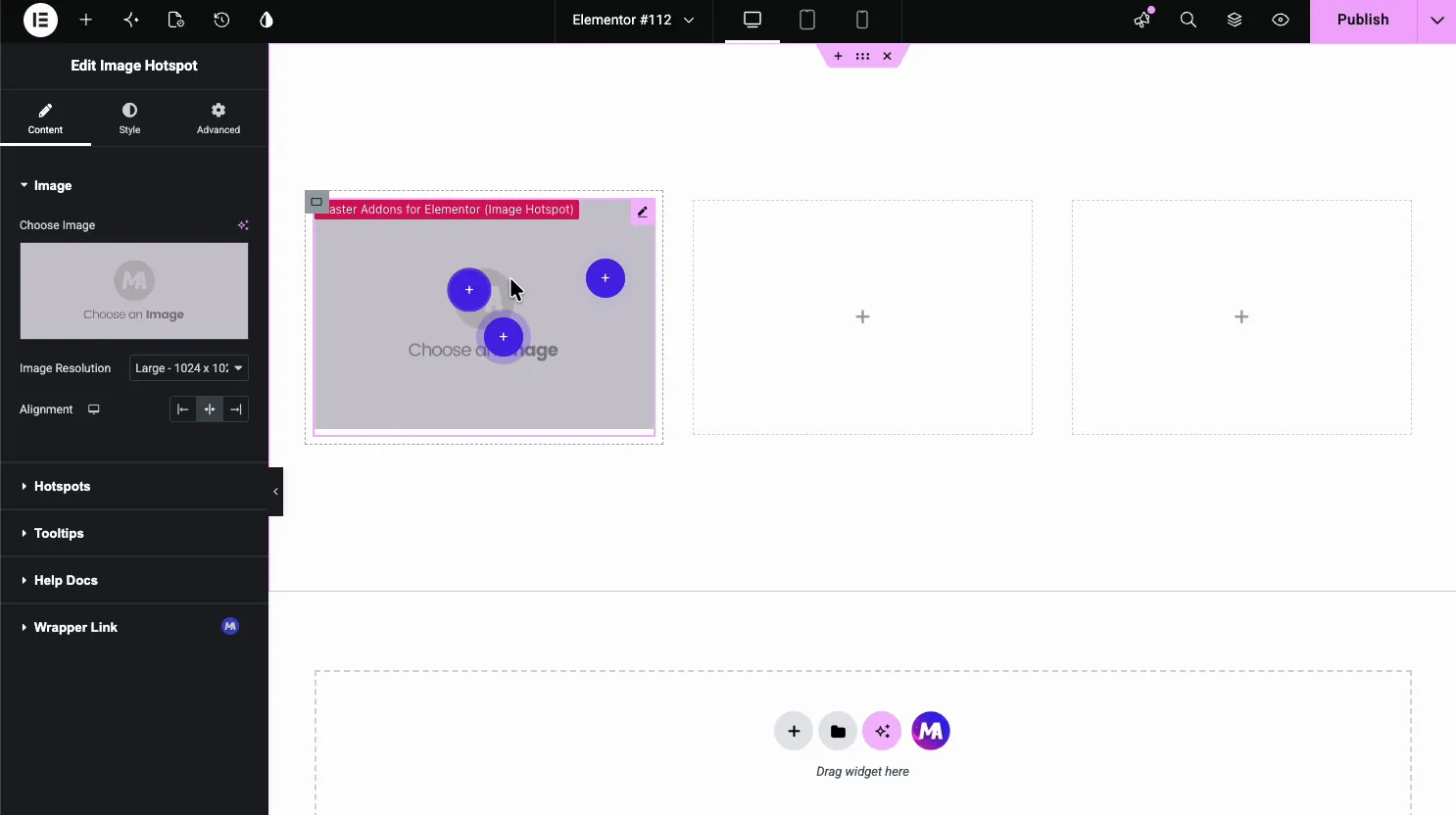
- Choose Image: pick the picture from the media library.
- Image Resolution: the size served, like Large or Full.
- Alignment: left, center, or right within its column.
Add hotspots #
Open the Hotspots section. It is a repeater, so each marker is its own item. Use Add Item to add markers, then place each one with the sliders in its Position tab.
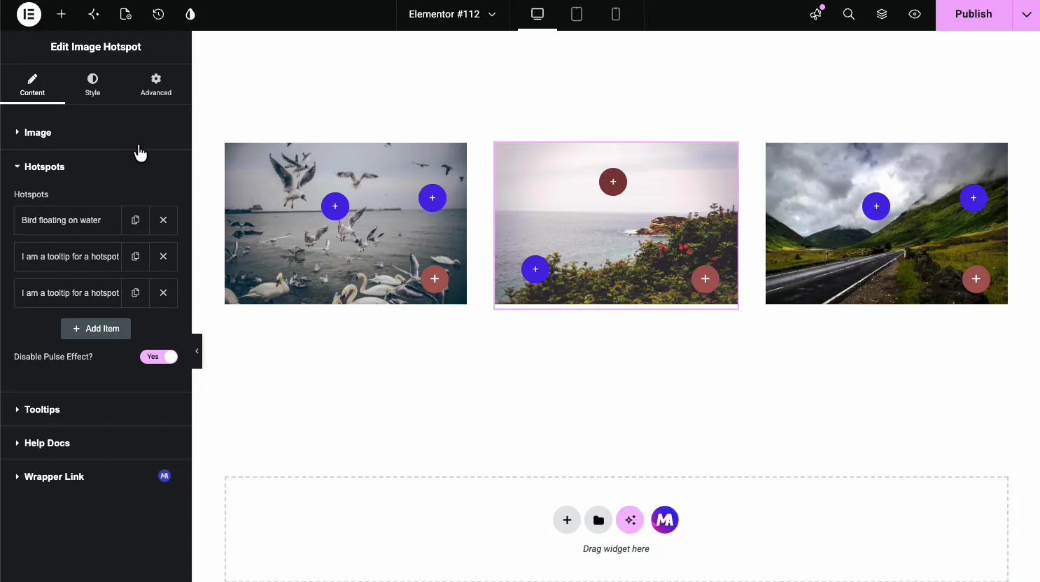
- Add Item: add as many hotspots as the image needs.
- Disable Pulse Effect: turn off the pulsing animation on the markers.
- Position tab: Horizontal and Vertical position in percent for each marker.
Set up each hotspot #
Click a hotspot to open its settings. The Content tab sets the marker type, its tooltip text, and an optional link.
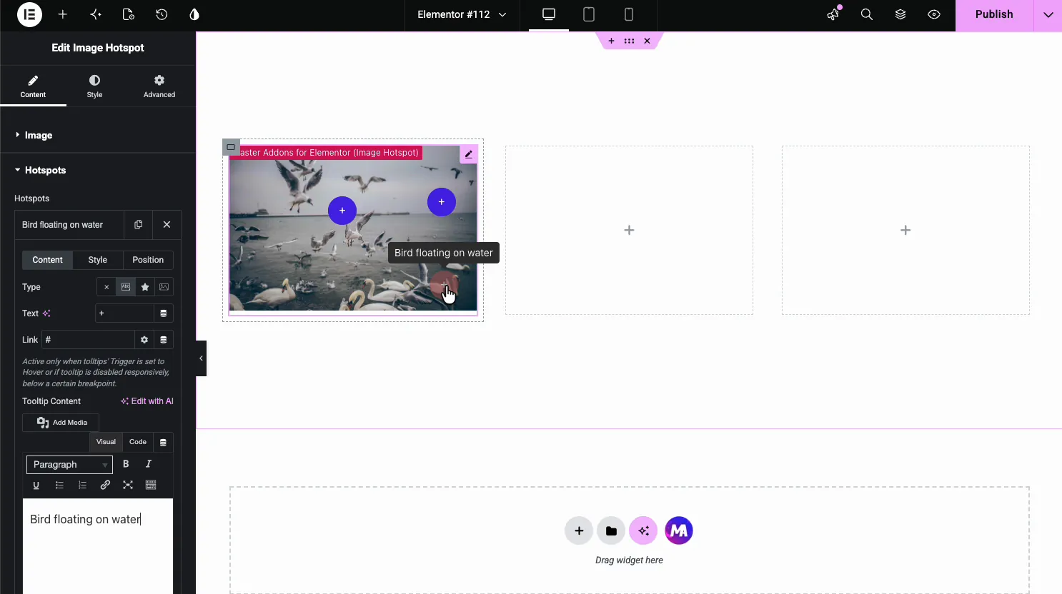
- Type: show nothing, short text, an icon, or an image inside the marker.
- Text and Link: the text inside the marker and a URL, which works when tooltips open on hover or are disabled on that screen.
- Tooltip Content: the tooltip text. It is edited in a WYSIWYG box, but the tooltip shows plain text only.
Style each hotspot #
The Style tab on a hotspot sets its colors. You get a color and background for the normal state and a separate set for hover, plus an opacity slider.
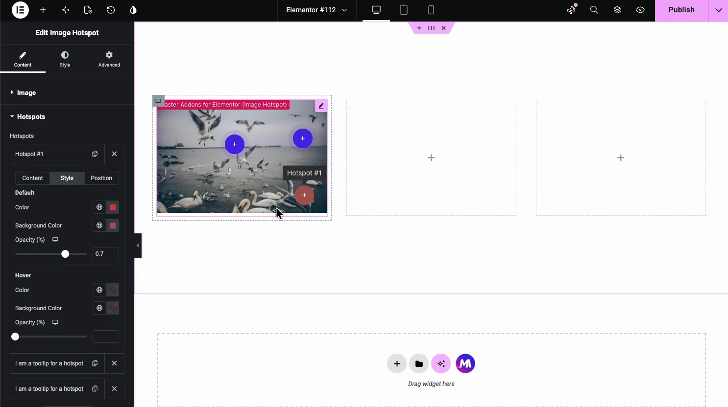
- Default Color and Background: the marker at rest.
- Hover Color and Background: how it changes on hover.
- Opacity: how solid the marker looks.
Control the tooltips #
Back in the main Content tab, the Tooltips section controls how every tooltip behaves: where it sits, how it animates, and whether it opens on hover or click.
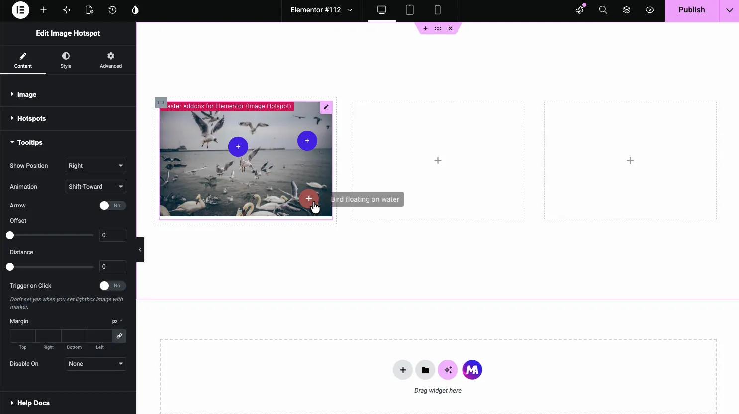
- Show Position and Arrow: which side the tooltip opens on and whether it has a pointer.
- Animation: the reveal effect, like Shift-Toward.
- Trigger on Click: open tooltips on click instead of hover, better for touch. Disable On hides tooltips on Tablet & Mobile or Mobile.
Style the image and tooltips #
Open the Style tab on the widget. The Image section sets the picture’s opacity, border, and filters, and separate Hotspots and Tooltips sections style the markers and the tooltip boxes.
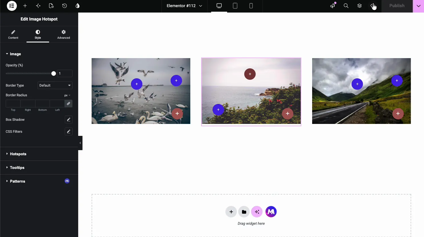
- Image: opacity, border radius, box shadow, and CSS filters.
- Hotspots: global size and color for the markers.
- Tooltips: the tooltip background, text color, and typography.
Common use cases #
- Product images pinning features or specs to parts of the photo.
- Maps and floor plans marking rooms, booths, or locations.
- Infographics adding detail without cluttering the image.
- Team or office photos labeling people or areas.
- Tutorials pointing out steps or parts on a screenshot.
Tips for working with the Image Hotspot widget #
- Keep hotspots readable. Space them out so the markers and tooltips do not overlap on smaller screens.
- Use click on mobile. Turn on Trigger on Click so touch users can open tooltips, since there is no hover on a phone.
- Contrast the markers. Pick a marker color that stands out from the image behind it, or a busy photo will swallow it.
- Keep tooltip text short. A line or two reads better than a paragraph stuffed into a floating box.
- Set exact positions. Use the Position tab sliders, then preview on a phone to check each marker.
Watch the video tutorial #
Prefer to follow along on screen? The video tutorial below walks through the Image Hotspot element from start to finish, showing how the image, hotspots, tooltips, and styling work in the Elementor editor.
Frequently Asked Questions #
What is the Image Hotspot widget in Master Addons?
It is a Master Addons Pro widget for Elementor that pins interactive markers on an image. Each hotspot has its own position, marker type, plain text tooltip, and optional link, shown on hover or click. Everything is set from the Elementor panel with no code.
How do I add more hotspots to an image?
Open the Hotspots section in the Content tab and use Add Item to create another marker. Each new hotspot gets its own content, style, and position, and you place it with the sliders in its Position tab.
Can I add a link to a hotspot?
Yes. Each hotspot has a Link field in its Content tab, so a marker can point to any URL. The link works when tooltips open on hover or are disabled on that screen. That lets an image act as a clickable map, sending visitors to a product page, a section, or an external site from a pin on the photo.
Do image hotspots work on mobile?
Yes, but hover does not exist on touch. Turn on Trigger on Click in the Tooltips section so mobile users can tap a marker to open its tooltip. You can also hide tooltips below a breakpoint and use the marker link instead.
Can I use a custom icon or image as the marker?
Yes. Each hotspot has a Type option in its Content tab where you can show an icon or an image inside the marker instead of the default. That way the markers can match your brand or the subject of the image.
Wrapping up #
The Image Hotspot widget turns a flat image into an interactive one: load the picture, pin the markers, add tooltips, then style the markers and set the tooltip behavior. For examples and a comparison with Elementor Pro’s Hotspot, see the Elementor image hotspot widget page. For related widgets, see the Image Comparison widget and the Image Hover Effects widget, browse the full Master Addons widgets and extensions, and check the pricing page for what each plan includes.


