A timeline turns a list of dates into something people actually read: company history, a product roadmap, a project schedule, a step-by-step process. The Timeline widget in Master Addons for Elementor builds all of those. You can pull entries straight from your blog posts or type your own custom items, then show them as a vertical line, a horizontal strip, or a sliding carousel.
It is one of the more flexible widgets in the set, since the same content can switch between layouts with one dropdown. Below is a walk through both timeline types, all three layouts, and the styling controls for the cards, dates, line, and points.
What the Timeline widget does #
The widget arranges dated entries along a connecting line. Each entry is a card with a date, a title, some text, and an optional image, and the line runs between the cards with a point marking each one.
There are two ways to fill it. Post Timeline pulls your WordPress posts in date order, so the timeline updates itself as you publish. Custom Timeline lets you add items by hand for anything that is not a blog post, like founding dates or release notes. The widget has three tabs: Content for the data and layout, Style for the look, and Advanced for the usual Elementor options.
Before you start #
- WordPress with Elementor installed and active.
- Master Addons for Elementor installed and active. New to the plugin? See the installation guide.
- The dates and entries you want to show, or published posts if you are using the Post Timeline.
How to add the Timeline widget #
In the Elementor editor, open the Elements panel and search for Timeline, or scroll to the Master Addons section. Drag it onto your page. It loads with sample entries so you start from a working layout instead of a blank one.
Post Timeline: pull entries from your posts #
Set Timeline Type to Post Timeline and the widget builds itself from your blog posts. Reach for this when you want a timeline of news, releases, or articles that keeps itself current.
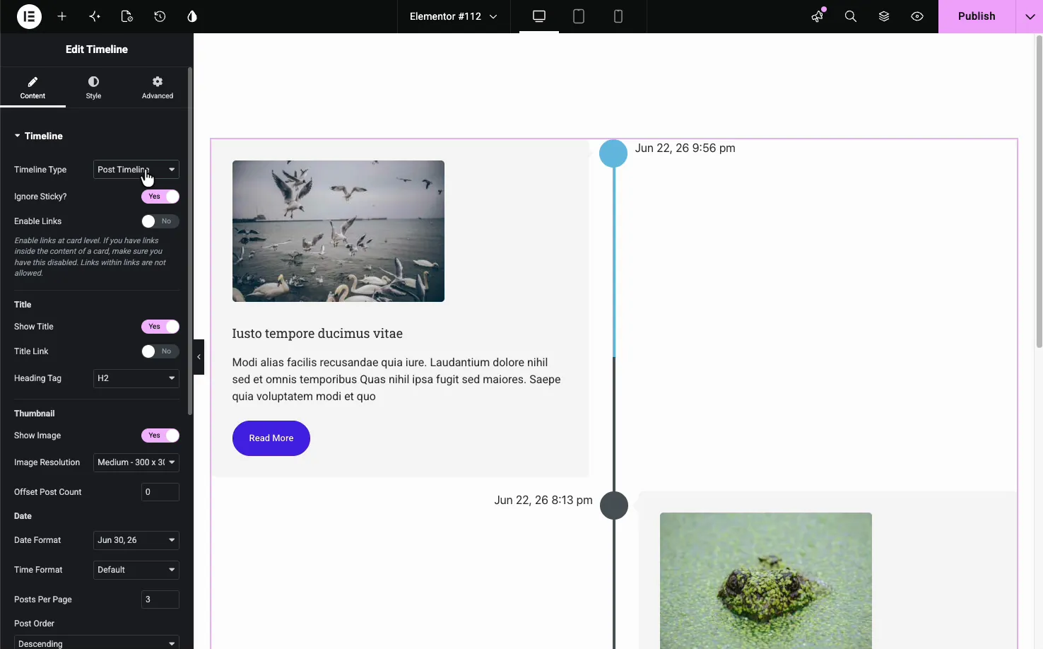
- Ignore Sticky: skip sticky posts so they do not jump to the top.
- Enable Links: make each card link to its post. Turn it off if you have links inside the card content, since a link inside a linked card will not work.
- Title: show or hide the post title, give it a link, and set the heading tag (H2 by default).
- Thumbnail: show the featured image and choose its resolution.
- Date: set the date and time format shown on each card.
- Query: Posts Per Page, Post Order, and Offset Post Count control how many posts appear and in what order.
Custom Timeline: add your own items #
Set Timeline Type to Custom Timeline and an Items repeater appears. Each item is one entry on the timeline, with its own date, title, content, and image. Use Add Item to add entries, the copy icon to duplicate one, and the X to remove it.
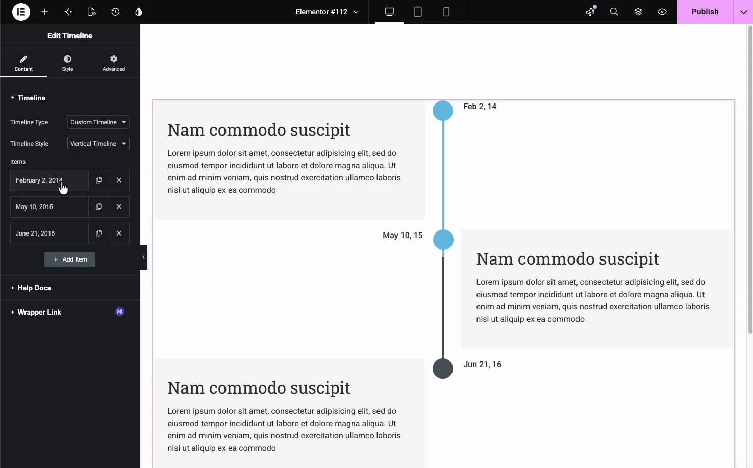
This is the type for history pages, roadmaps, or any sequence that is not driven by blog posts. Open an item to set its date, heading, description text, and an optional image for the card.
Pick a timeline style #
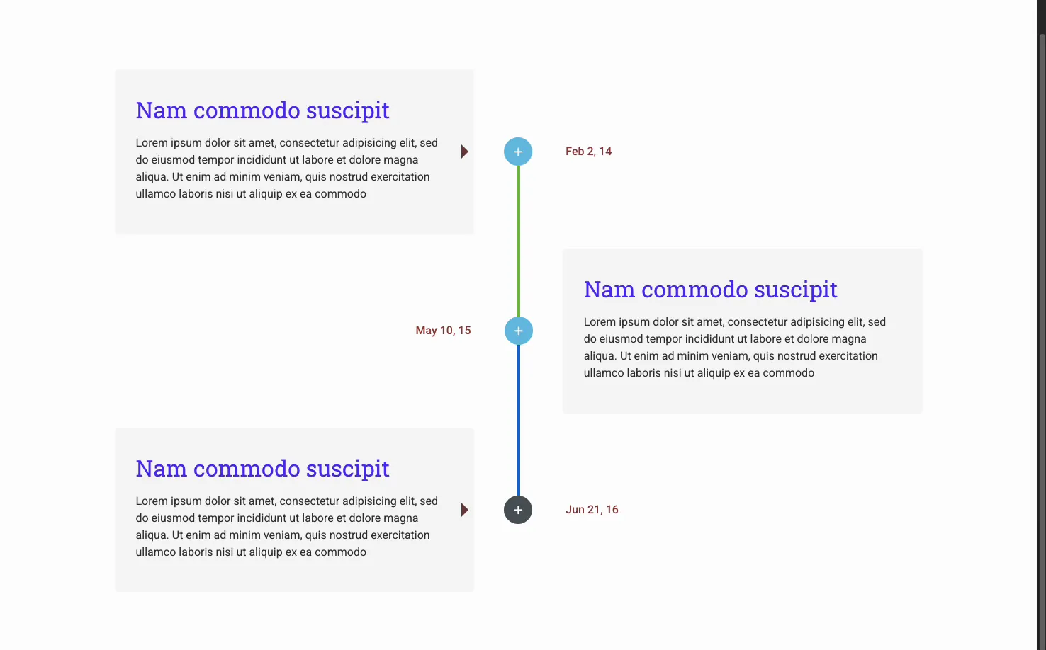
With Custom Timeline selected, the Timeline Style dropdown switches between Vertical Timeline and Horizontal Timeline. Vertical stacks the cards down a center line with the dates alternating left and right. Horizontal lays the entries across the page as a row you scroll through.
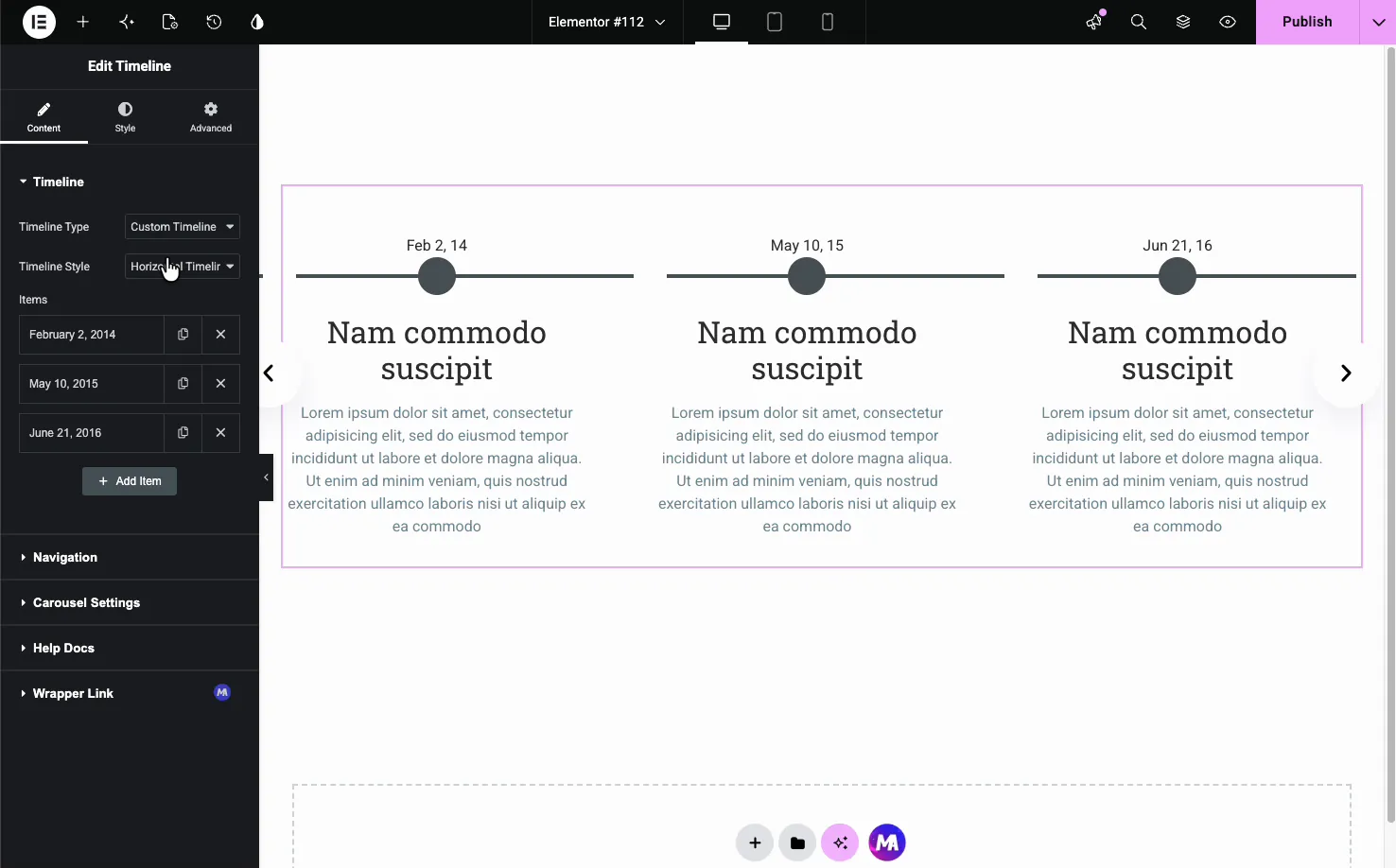
Navigation for horizontal timelines #
The horizontal style turns on a Navigation section that controls how visitors move through the entries.
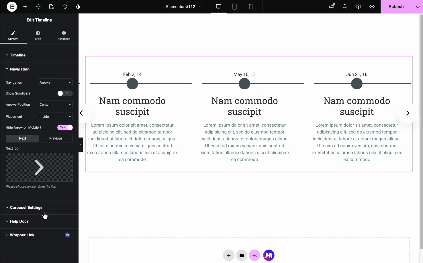
- Navigation: choose Arrows, a scrollbar, or none.
- Arrows Position and Placement: set where the arrows sit and whether they are inside or outside the timeline.
- Next and Previous Icons: swap in your own icons for the arrows.
- Hide Arrow on Mobile: clean up small screens by hiding the arrows there.
Carousel settings #
The horizontal timeline can run as a slider. The Carousel Settings section sets how it moves, including a coverflow layout that angles the side cards.
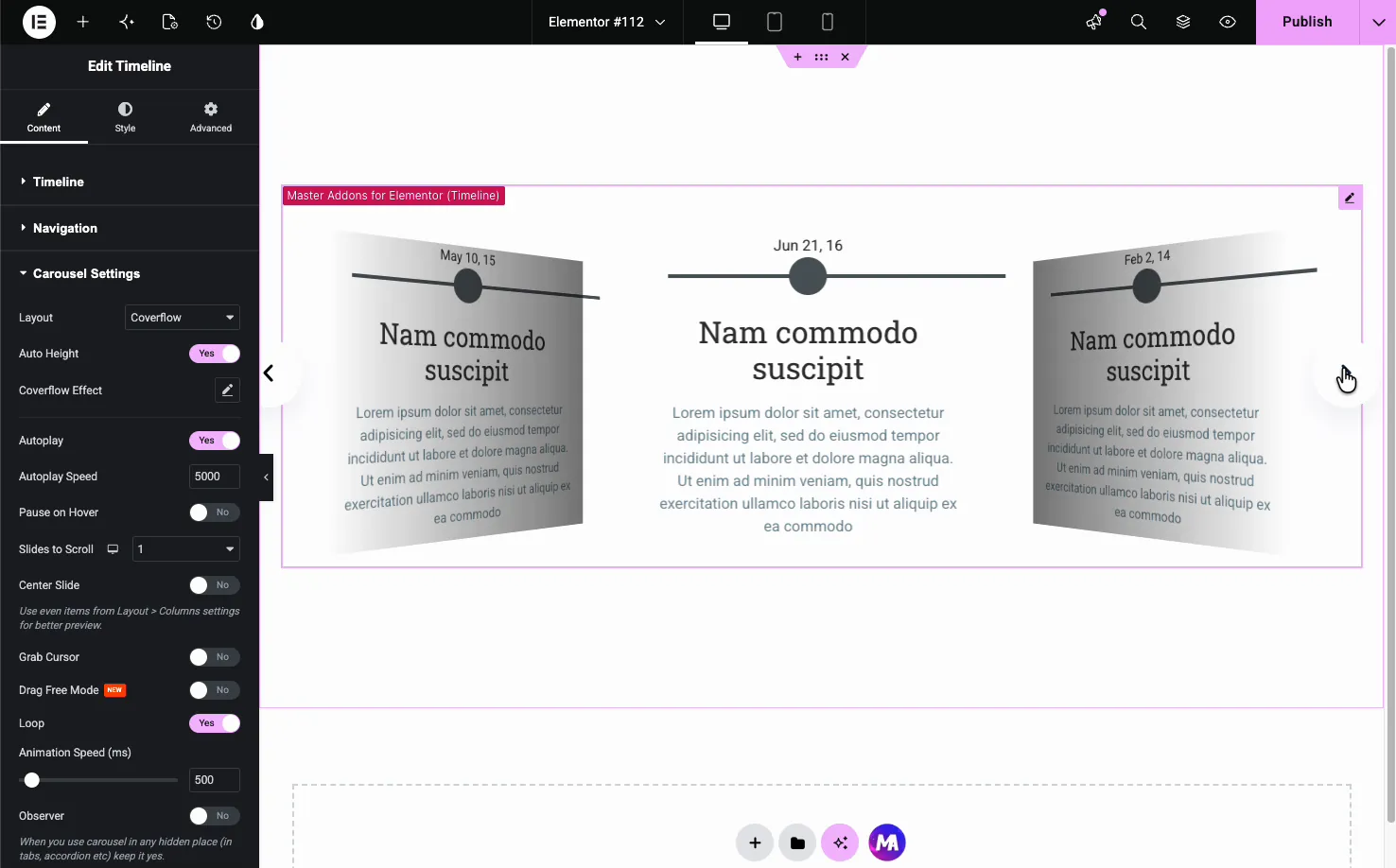
- Layout: a standard slide or the Coverflow effect.
- Autoplay and Autoplay Speed: advance the slides on their own at a set pace.
- Pause on Hover, Loop, and Slides to Scroll: fine-tune how the carousel behaves.
- Animation Speed: how fast each transition runs.
Style the timeline #
The Style tab breaks the timeline into parts you can style on their own: Layout, Images, Cards, Arrow, Dates, Line, Points, and Navigation, plus Patterns (a Pro option).
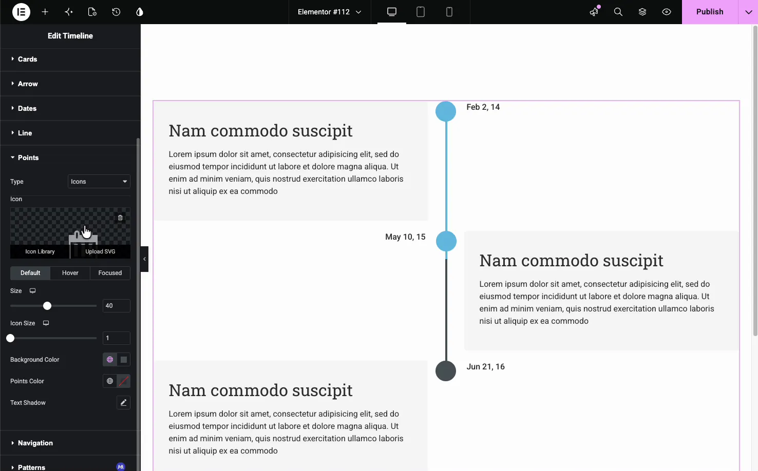
The Points section is a good example. You can set each point as an icon, choose its size, and give it Default, Hover, and Focused colors, so the marker on the active card stands out.
- Layout: horizontal and vertical alignment, card spacing, and a Reverse Cards Positions toggle.
- Cards: background, border, radius, box shadow, padding, and item gap.
- Dates and Line: typography and color for the dates, plus the line’s background, progress color, and thickness.
- Points: point type, size, and colors for each state.
The result on the page #
Publish or preview and the timeline renders with your cards, dates, line, and points in place. Here is a vertical timeline with alternating cards and a colored connecting line, the layout that suits a history or roadmap section.
Common use cases #
- Company history with a founding date and milestones down a vertical line.
- Product roadmaps showing past releases and what is coming next.
- Project schedules laid out as a horizontal strip of phases.
- A blog or news feed built automatically with the Post Timeline.
- Step-by-step processes where each step has a date or stage.
Tips for working with the Timeline widget #
- Use Post Timeline for anything that updates. News and release logs stay current without you touching the widget again.
- Keep card text short. A title and two or three lines read best, especially in the horizontal layout.
- Match the layout to the content. Long histories suit vertical; a handful of phases work well horizontal.
- Set the line progress color. A different progress color shows how far down the timeline a visitor has scrolled.
- Turn off Enable Links if cards contain links. A link inside a linked card does not work, so pick one or the other. This one trips people up often.
Frequently Asked Questions #
What is the Timeline widget in Master Addons?
It is an Elementor widget that arranges dated entries along a connecting line. Each entry is a card with a date, title, text, and optional image. You can build it from your blog posts or custom items, and show it as a vertical, horizontal, or carousel layout.
Can the timeline pull entries from my blog posts?
Yes. Set Timeline Type to Post Timeline and the widget builds itself from your WordPress posts in date order. You control the post count, order, offset, title, thumbnail, and date format, and the timeline updates itself as you publish new posts.
Does the Timeline widget support horizontal layouts?
Yes. With a Custom Timeline, the Timeline Style dropdown switches between Vertical and Horizontal. The horizontal layout lays entries across the page and adds Navigation and Carousel Settings, including arrows, a scrollbar, autoplay, and a coverflow slider effect.
Can I add my own dates and content instead of posts?
Yes. Choose Custom Timeline and use the Items repeater to add entries by hand. Each item has its own date, title, content, and image, which is ideal for company history, roadmaps, or any sequence that is not driven by blog posts.
Can I style the timeline points and line?
Yes. The Style tab has separate sections for the Line and Points. You can set the line’s background color, progress color, and thickness, and make each point an icon with its own size and Default, Hover, and Focused colors.
Wrapping up #
The Timeline widget turns a set of dates into a clear visual sequence, whether the entries come from your posts or your own custom items. Pick a type, choose vertical, horizontal, or carousel, then style the cards, line, and points to match your page. For related layout tools, see the Changelog widget and the Blog Posts widget, browse the full Master Addons widgets and extensions, and check the pricing page for what each plan includes.


