Elementor Advanced Tabs Widget: Free Horizontal, Vertical and Image Tabs
The Advanced Tabs widget in Master Addons splits long content into clean, clickable tabs, and it is free. Pick a horizontal, vertical or left active border preset, add an icon or image to each tab title, and choose whether tabs switch on click or on hover. Fill each tab with text from the editor, or, with Master Addons Pro, load a saved section, widget or page template. It works well for product features, FAQs, plans and step-by-step guides.
See the tabs widget in action
The block below is the widget, not a screenshot. Four tabs, icons on the titles, and the first one set to open by default. Click a title to switch panel.
- Overview
- Specification
- Delivery
- Warranty
One block, four panels
Tabs keep a long page short. Everything below sits in the same block, and only the panel you pick is on screen, so a specification, a delivery note and a warranty page stop competing for the same scroll.
This is the widget itself. Click a title above to switch panel.
Specification
Each panel takes ordinary editor content: headings, paragraphs, lists and images. Nothing here is a screenshot.
- Tab titles with an icon, an image or text alone
- Horizontal, vertical or left active border presets
- Switch on click or on hover
Delivery
A delivery or shipping panel is the classic second tab on a product page, because people look for it and nobody wants it in the main description.
Set which tab opens first with Set as Default on the item.
Warranty
The last panel is a good home for terms, returns and anything else that matters to a buyer but does not belong in the pitch.
How to add tabs in Elementor
Five steps from an empty page to a working tab block.
- Search for Tabs in the Elementor widget panel and drag the widget onto the page.
- Open the Tabs repeater and add one item per panel. Each item has a Tab Title and a content editor.
- Set Icon Type on each item to None, Icon or Image, then pick the icon or upload the image.
- Choose a Style Preset: Horizontal Tabs, Vertical Tabs or Left Active Border.
- Set Tab Effect to Click or Hover, and switch Set as Default on the tab that should open first.
Horizontal and vertical tabs with style presets
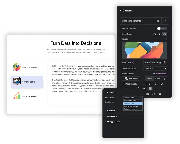
Start from a built-in preset. Horizontal Tabs puts the titles in a row on top, Vertical Tabs lines them up on the side, and Left Active Border marks the open tab with a colored border. Master Addons Pro adds a Tabular Content preset for a boxed look. Each preset is only a starting point, so you can restyle it to match your brand.
- Horizontal and vertical layouts: choose the tab direction that fits your content.
- Visual presets: start from a designed layout instead of a blank widget.
- Easy switching: change from horizontal to vertical tabs without rebuilding the content.
Vertical tabs, live
The same widget with Style Preset set to Vertical Tabs. Titles run down the left, the panel sits beside them, and on a narrow screen the strip stacks above the content.
- Survey
- Design
- Build
- Handover
Survey
Vertical tabs put the titles in a column on the left and the panel beside them. They suit a process, where the order matters and each step has a paragraph or two.
Design
With four or five steps a vertical strip reads better than a horizontal row, because long titles have room and the eye follows them down the page.
Build
Switch between the two with the Style Preset control. Horizontal Tabs, Vertical Tabs and Left Active Border are the three presets in the list.
Handover
On a narrow screen the vertical strip stacks above the panel, so the content stays readable without a second layout.
Saved templates inside tabs (Pro)
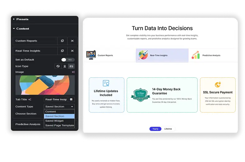
The free version fills each tab from the text editor. With Master Addons Pro, each tab can use a different Content Type: simple Text Editor, a Saved Section, a Saved Widget, or even an entire Saved Page Template. This means you can place a complex pricing table, a contact form, an image gallery, or any other pre-designed content block into a tab. It’s like having multiple pages in one, without the clutter.
- Template Integration: Insert any saved Elementor template into a tab for unlimited design possibilities.
- Consistent Design: Reuse your existing sections and widgets to maintain a cohesive look.
- Perfect for Comparisons: Use tabs to switch between different product specs, pricing plans, or feature lists.
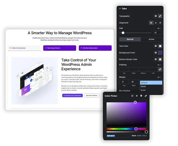
Tab styling: colours, borders and typography
Achieve a perfect, polished look by styling every part of the tabs. Design the Tabs container and the Content area separately. For the tabs, control the Normal and Active states with different colors, backgrounds, borders, and typography. Adjust the padding, margin and Icon Size. For the content area, style the background, padding, margins, and typography. This level of control ensures your tabs look integrated and professional.
- State-Based Styling: Set unique colors, backgrounds, and borders for active and inactive tabs.
- Icon Support: Add icons to your tabs and control their size and position.
- Content Area Design: Style the content container to match your site’s aesthetic.
Switch tabs on click or hover
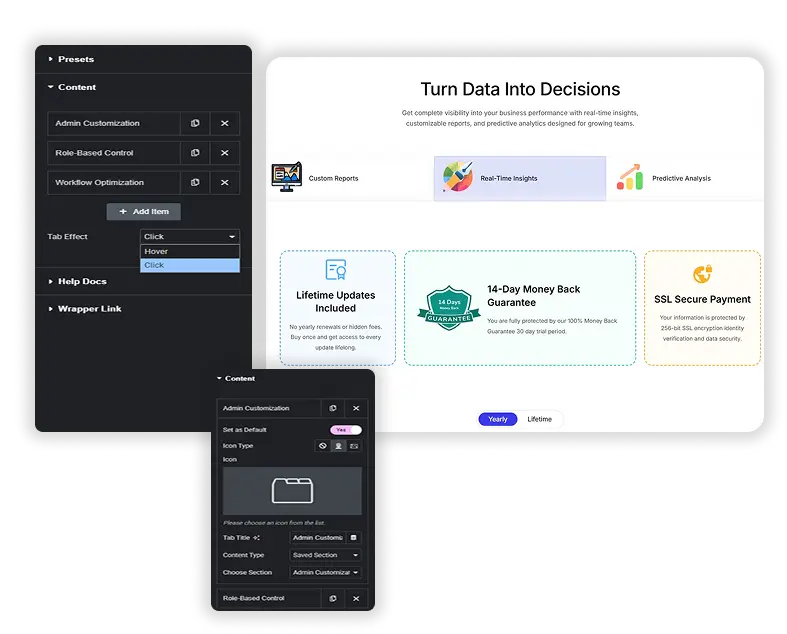
Decide how users interact with your tabs. Set the Tab Effect to Click (traditional) or Hover (for faster navigation). You can also set which tab is open by default. This flexibility allows you to create the exact user experience you want, whether it’s for a fast-paced product showcase or a careful, step-by-step guide.
- Click or Hover: choose the trigger that suits your content. Hover is the default.
- Default Active Tab: set which tab is open when the page loads.
Elementor Tabs vs Master Addons Advanced Tabs
Elementor’s own Tabs widget is in the free plugin, and it is good at one thing this one cannot do: it holds other widgets inside each panel, because each tab is a container. The trade is what the tab titles can carry and how much of the styling is exposed.
| Feature | Elementor Tabs (free core) | Master Addons Tabs |
|---|---|---|
| Drop other widgets inside a tab | Yes, each panel is a container | No, the panel takes editor content |
| Titles on the side (vertical) | Yes | Yes, the Vertical Tabs preset |
| Turns into an accordion on mobile | Yes | No |
| Image as the tab title | No | Yes, Icon Type set to Image |
| Icon on the tab title | Yes | Yes |
| Style presets | No | Three, plus Tabular Content with Pro |
| Switch on hover | No | Yes, Tab Effect set to Hover |
| Saved template inside a tab | Not needed, use widgets | Pro |
So the short version: if a panel needs a form, a gallery or a pricing table inside it, use the core widget. If the tab strip itself is the design problem, with image titles, presets or hover switching, this one has the controls.
What the Tabs widget does and does not do
Checked in the widget panel. The “no” rows are as useful as the rest, because two of them are the questions people ask most.
| Setting | Supported |
|---|---|
| Horizontal tabs | Yes, the default preset |
| Vertical tabs | Yes |
| Left Active Border preset | Yes |
| Icon on a tab title | Yes, from the Elementor icon library |
| Image as a tab title | Yes, Icon Type set to Image |
| Text only titles | Yes, Icon Type set to None |
| Switch on click or hover | Yes, Tab Effect |
| Choose which tab opens first | Yes, Set as Default on the item |
| Tab and content alignment | Yes |
| Active and inactive colours | Yes |
| Saved section, widget or page template in a tab | Pro |
| Tabular Content preset | Pro |
| Column layout for the tab strip | Pro |
| Open a tab from a URL or a link | No |
| Accordion on mobile | No |
Related widgets for the same job: Advanced Accordion for FAQ lists, Toggle Content for swapping one block of content, Dynamic Table for specifications, Pricing Table for plans, and Table of Contents for long pages.
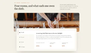
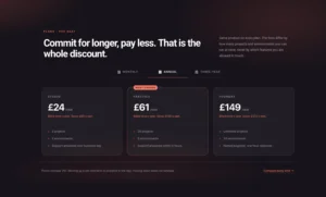
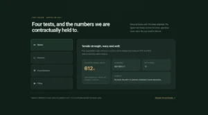
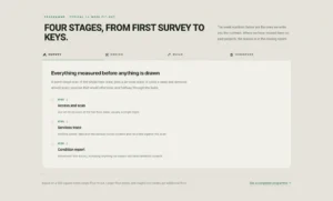
Image and icon tabs in Elementor
Each tab title can carry an icon from the Elementor library or an image of your own. Set Icon Type to Image, choose a picture from the media library, and the title becomes an image tab. This is a free option and works with every free preset.
- Icon Type per tab: None, Icon or Image.
- Use images for product or category tabs, and icons for feature lists.
- Keep one style across a tab bar, since mixing images and icons looks busy.
For content that opens in place instead of switching panels, try the Advanced Accordion or Toggle Content (Pro).
Frequently Asked Questions For Tabs
Can I use both icons and text in the tab titles?
Yes. For each tab, set Icon Type to Icon or Image, then pick an icon from the library or an image from your media library. The Icon Size control in the Style tab sets how big the icon appears.
How do I make the tabs look good on mobile?
Use Elementor’s responsive mode to adjust typography, padding and margins for tablet and phone. Preview vertical tabs on a small screen before publishing, since the column of titles takes up width.
What’s the difference between the "Tabular Content" preset and the others?
Tabular Content is a Pro preset. It gives the tab content area a distinct background, border, and padding, making it look like a box that’s connected to the tabs. It’s a more structured, contained look compared to the classic underline or border-left styles.
Can I put a saved template inside a tab?
Yes, with Master Addons Pro. Set Content Type on the item to Saved Section, Saved Widget or Saved Page Template and pick the template. On the free plugin each panel takes editor content instead.
Can I set which tab opens first?
Yes. Switch Set as Default on the item you want open when the page loads. If none is set, the first tab opens.
Can I link a tab to an external URL or another section on the page?
The Advanced Tabs element is designed for toggling content within the widget. For linking to external URLs or page sections, you might need a different solution, such as a navigation menu or anchor links. However, you can place a button with a link inside the tab content.
How is this different from Elementor's own Tabs widget?
Elementor’s free Tabs widget lets you place any widgets inside each tab and put the titles above, below or beside the content. Master Addons Advanced Tabs gives you a hover trigger, icon or image labels, and ready-made presets such as Left Active Border, and you can add as many Advanced Tabs widgets to a page as you need. Pro adds the Tabular Content preset and saved sections, widgets or page templates as tab content.
How does the "Left Active Border" preset work?
The Left Active Border preset typically highlights the active tab with a colored border or background on the left side. It’s a modern, clean look that works well for vertical tabs or even horizontal ones if you want a distinctive indicator.
Do the tabs turn into an accordion on mobile?
No. The tab strip stays a tab strip and wraps on narrow screens. Elementor’s own Tabs widget does switch to an accordion, so that one is the better pick if a mobile accordion is the requirement.
Should I use tabs or an accordion?
Tabs when the panels are alternatives a visitor picks between, such as specification, delivery and warranty. An accordion when the items are a list people read through, such as an FAQ, since several can be open at once and it stacks naturally on a phone.
Trending Elementor Widgets & Extensions
Build sophisticated websites in less time.
Glassmorphism
Container Extras
Patterns
![Master Addons Post/Page Duplicator extension for Elementor: MA Duplicator row link in the WordPress Pages list creating a Landing Page - [Duplicated #128] draft](https://d1asvmc6qcowgk.cloudfront.net/wp-content/uploads/2026/09/15102930/post-page-duplicator-768x403.webp)
Post/Page Duplicator