Free Elementor Nav Menu Widget: No Elementor Pro Needed
Nav Menu is a free Master Addons widget that places any WordPress menu in an Elementor header, footer or page and lets you style it from the panel. Choose a horizontal or vertical layout for each device, style the main items, dropdowns and submenus in their normal, hover and active states, and pair it with the free Mega Menu extension for multi-column panels. On phones it collapses into a hamburger toggle by default. Master Addons Pro adds the Hamburger layout for any width, with Popup and Offcanvas menus.

Horizontal, vertical and hamburger layouts
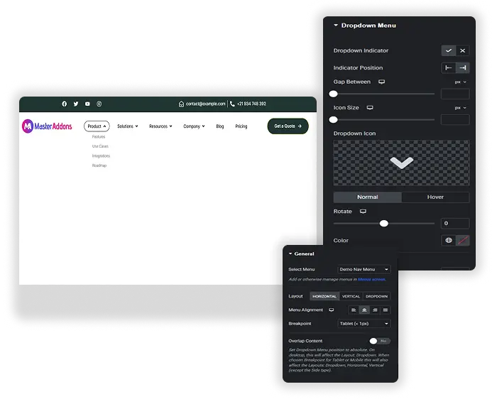
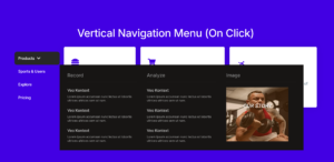
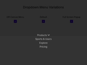
Set the layout separately for desktop, tablet and phone. Horizontal suits a top bar. Vertical comes in four types: Normal with side dropdowns, Toggle, Accordion, and Side, which pins the menu to the edge of the page. Phones use the hamburger toggle by default. With Pro you can pick the hamburger for any width and open the menu as a Default dropdown, a Popup or an Offcanvas panel.
- Layouts set per device, including Elementor’s extra breakpoints.
- Vertical menus as Normal, Toggle, Accordion or Side.
- Popup and Offcanvas hamburger menus with Master Addons Pro.
- Works with the free Mega Menu extension for multi-column panels.
Style every menu level and state
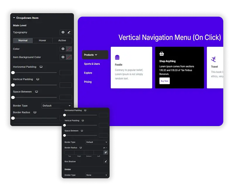
The Style tab has separate sections for the Main Menu Item, Dropdown Menu, Dropdown Menu Item, Dropdown Submenu and Dropdown Submenu Item. Each gets colors and backgrounds for the Normal, Hover and Active states, plus padding, borders and dividers, so the link to the current page can look different from the rest.
- Normal, Hover and Active states for main items and dropdown items.
- Separate styling for the dropdown panel, its items and deeper submenus.
- Dividers between items, with type, size and color.
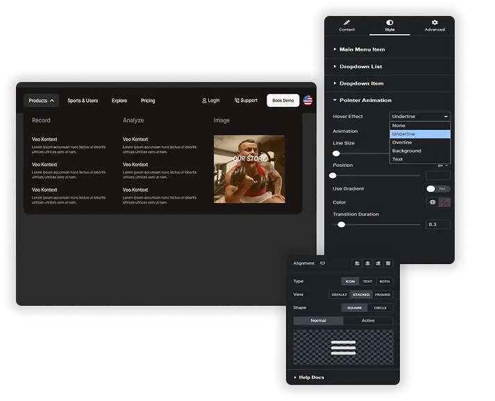
Hamburger toggle and indicator icons
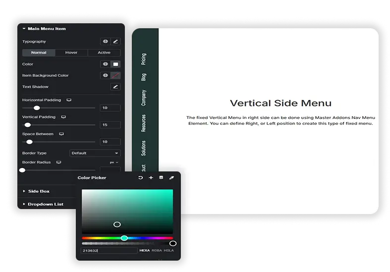
Style the hamburger toggle as an icon, text or both, with a Default, Stacked or Framed view and a square or circle shape. It can show one icon while the menu is closed and another while it is open. Indicator icons mark the items that have dropdowns and submenus: pick your own icons, show or hide them, and set their size, color, position and rotation.
- Hamburger toggle as an icon, text or both.
- Different icons for the closed and open menu.
- Custom dropdown and submenu indicator icons with rotation.
Dropdown spacing and per-device layouts
Set the dropdown width and its gap from the top of the menu, the gaps between items and the padding inside each link. Transition duration controls how fast hover colors and dropdowns change. Because the layout is set per device, you decide where the menu switches from a horizontal bar to a vertical list, or to the hamburger with Pro.
- Dropdown width and gap from the top.
- Gaps between items and link padding for easy tapping.
- Transition duration for hover and dropdown changes.
Elementor Pro menu widgets vs Master Addons Nav Menu
Elementor’s free plugin has no widget for placing and styling a WordPress menu. Its Menu and WordPress Menu widgets come with Elementor Pro. Here is how they compare.
| Elementor Pro | Master Addons Nav Menu | |
|---|---|---|
| Price | Elementor Pro license | Free, with Pro hamburger types |
| Layouts | Horizontal, vertical, dropdown | Horizontal, vertical (4 types), hamburger |
| Mobile menu | Toggle below a breakpoint you choose | Hamburger on phones by default; Popup and Offcanvas with Pro |
| Layout per device | One breakpoint setting | Set for every device |
| Hover pointer animations | Yes | No |
| Mega menu | Menu widget with dropdown content | Free Mega Menu extension |
If you already pay for Elementor Pro, its menu widgets do the job. Without it, Nav Menu and the Mega Menu extension give you a styled header menu for free.
How to add a nav menu in Elementor
The widget uses menus you build in WordPress, so start there.
- Create your menu under Appearance > Menus.
- In Elementor, drag the Master Addons Nav Menu widget into your header, footer or page.
- Pick the menu in Select Menu and choose a layout for desktop.
- Switch to tablet and phone view to check the layout on each device. Phones get the hamburger toggle by default.
- Style the menu items, dropdowns and toggle in the Style tab, then publish.
For a full header walkthrough, read how to build a nav menu in Elementor without Pro. For a site-wide header, use the free Theme Builder.
Frequently Asked Questions For Nav Menu
How is this different from other Nav Menu widgets?
Elementor’s own menu widgets need Elementor Pro. Master Addons Nav Menu is free and adds per-device layouts, four vertical menu types, separate styling for every menu level and state, custom indicator icons and a styleable hamburger toggle. It also works with the free Mega Menu extension.
Can I use this menu with the Mega Menu extension?
Yes. Turn on the Mega Menu extension, build the panel content for a menu item from the WordPress Menus screen, then select that menu in the Nav Menu widget. The widget shows the mega menu panels on the front end.
Is it difficult to set up the different styles for normal, hover, and active?
No. Open the Style tab, pick a part of the menu such as Main Menu Item, and switch between the Normal, Hover and Active tabs to set the colors for each state.
What's the best use case for the "Offcanvas" or "Popup" menu type?
Both are Pro hamburger types. Offcanvas slides the menu in from the left or right, which suits phones and minimal designs. Popup opens the menu over the page, which works well for full-site navigation on portfolio or agency sites. On the free version, the hamburger opens the menu in place under the toggle.
Will this menu work with my existing WordPress theme's header?
Yes, you can place the widget anywhere Elementor runs. To replace your theme’s header completely, build a header template with the free Master Addons Theme Builder and add the Nav Menu widget to it.
Can I have a different menu style on mobile vs. desktop?
Yes. Layout, alignment and many style settings can be set per device. For example, keep a horizontal bar on desktop, use a vertical accordion on tablets and the hamburger toggle on phones.
Trending Elementor Widgets & Extensions
Build sophisticated websites in less time.
Glassmorphism
Container Extras
Patterns
![Master Addons Post/Page Duplicator extension for Elementor: MA Duplicator row link in the WordPress Pages list creating a Landing Page - [Duplicated #128] draft](https://d1asvmc6qcowgk.cloudfront.net/wp-content/uploads/2026/09/15102930/post-page-duplicator-768x403.webp)
Post/Page Duplicator