Free Elementor Logo Carousel Widget for Client and Partner Logos
Logo Slider is a free Master Addons widget that shows client, partner or sponsor logos in a carousel. Add each logo in Logo Items, give it an optional link, and choose what happens on hover: a brand name and description, a second logo image, or nothing. Each logo can also have its own tooltip. The carousel runs on Swiper with autoplay, loop, a Coverflow layout option and six navigation styles, and every part from the logo boxes to the arrows can be styled.

How to Add a Logo Carousel in Elementor
You need Elementor and the free Master Addons plugin from WordPress.org.
- Check that Logo Slider is switched on under Master Addons, Widgets.
- In the Elementor editor, search for Logo Slider and drag it into your section.
- In Logo Items, open each item, upload the Client Logo and add a Link if needed.
- Choose the Hover option and turn on a Tooltip for any logo that needs one.
- In Carousel Settings, set Slides per Column for desktop, tablet and mobile and adjust Autoplay.
- Pick a Navigation type, then style the logo boxes and arrows in the Style tab.
For a full walkthrough with design tips, read How to Create a Logo Carousel in Elementor. Every setting is listed in the Logo Slider widget settings.

Logo Hover Content and Tooltips
Each logo has a Hover? setting. Text shows a Brand Name and Description over the logo, Image swaps in a Hover Logo Image, and None keeps the logo as it is. With Select Event set to Icon Click, the hover content opens from a small icon that you can place in any corner. Turn on Tooltip for a logo to add short text with its own placement, animation, trigger, offset and styling.
- Show a colored version of a logo on hover with Hover Logo Image.
- Add a one-line description of each partner without cluttering the strip.
- Style the hover box background, border, name and text in Carousel Items Hover.
Carousel Settings
Slides per Column sets how many logos are visible, from 1 to 6 and per device, and Slides to Scroll sets how many move at once. The Layout is Carousel or Coverflow. Autoplay is on by default at 5000 ms, with Pause on Hover, Loop, Center Slide, Grab Cursor, Drag Free Mode and Animation Speed. Turn on Observer when the slider sits inside tabs, accordions or popups so it resizes when they open.
- Normal, Hover and Active states for the logo boxes, each with background, border color, shadow and opacity.
- Item Gap and padding for spacing between logos.
- Autoplay steps slide by slide. Set Autoplay Speed to 0 to remove the pause for a marquee-style strip.

Navigation and Arrow Styling
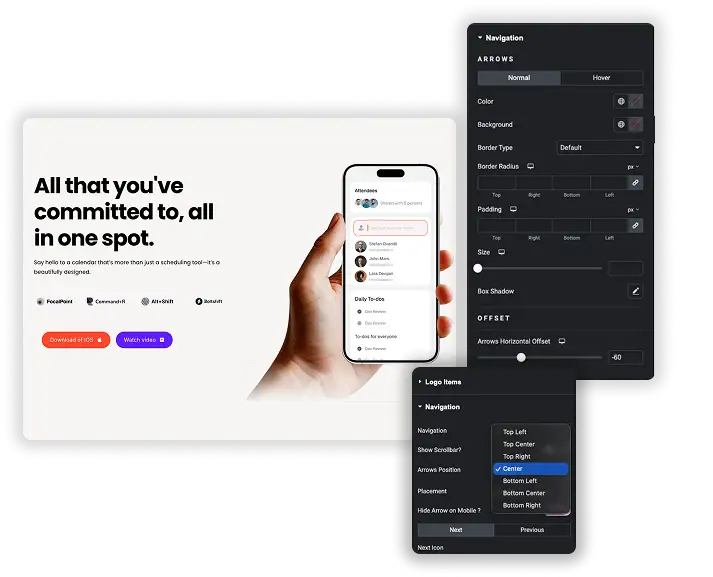
Navigation offers Arrows and Dots, Arrows and Fraction, Arrows, Dots, Progress or None, plus an optional scrollbar and Dynamic Bullets. Place arrows inside or outside the slider and choose their position. Pick your own Next and Previous icons, and turn on Hide Arrow on Mobile for a cleaner phone layout.
- Arrow color, background, border, radius, padding, size and shadow for Normal and Hover.
- Dot size, spacing and active color, with an Advanced Size option for pill-shaped dots.
- Offset sliders to move arrows, dots, fraction or progress bar exactly where you want them.
Elementor Image Carousel vs Master Addons Logo Slider
Elementor’s free Image Carousel can also show a row of logos. It is lighter to set up, so here is when each one makes sense.
| Feature | Elementor Image Carousel | Master Addons Logo Slider |
|---|---|---|
| Price | Free in Elementor | Free |
| Adding logos | Pick all images at once from the gallery | One repeater item per logo |
| Links | One Link setting for the whole carousel | A separate Link for each logo |
| Hover content | Caption under the image | Brand name and description, or a second logo image |
| Tooltips | No | Per logo, with placement, trigger and styling |
| Layout | Slide or Fade effect | Carousel or Coverflow |
| Navigation | Arrows, dots or both | Arrows, dots, fraction, progress bar or scrollbar |
| Lightbox | Yes | No |
Use Image Carousel for a quick strip of logos with one shared link or none. Use Logo Slider when each logo needs its own link, hover content or tooltip. Neither widget has a grayscale setting, so add a CSS filter with custom CSS if you want gray logos that turn to color. For a continuously scrolling strip, see the Elementor marquee guide, and for photo sliders use the Image Carousel widget.







Frequently Asked Questions For Logo Slider
Is the Logo Slider widget free?
Yes. Logo Slider is in the free Master Addons plugin with all its hover, tooltip, carousel and navigation settings.
Can each logo link to the brand's website?
Yes. Every logo item has its own Link field. Use the link options to open it in a new tab or add nofollow.
Is the logo carousel responsive?
Yes. Slides per Column and Slides to Scroll can be set separately for desktop, tablet and mobile, and you can hide the arrows on mobile.
How do I stop the autoplay?
In Carousel Settings, turn Autoplay off. If you keep it on, set Autoplay Speed in milliseconds and turn on Pause on Hover.
Can I hide the navigation arrows on mobile?
Yes. In the Navigation section, turn on Hide Arrow on Mobile.
Can logos turn from grayscale to color on hover?
There is no grayscale switch. You can upload a gray Client Logo and a colored Hover Logo Image with the Image hover option, or add a CSS grayscale filter with custom CSS.
Trending Elementor Widgets & Extensions
Build sophisticated websites in less time.
Glassmorphism
Container Extras

Patterns
![Master Addons Post/Page Duplicator extension for Elementor: MA Duplicator row link in the WordPress Pages list creating a Landing Page - [Duplicated #128] draft](https://d1asvmc6qcowgk.cloudfront.net/wp-content/uploads/2026/09/15102930/post-page-duplicator-768x403.webp)
Post/Page Duplicator