

A changelog page tells users a product is alive: what got added, what got fixed, and when. The free Changelog widget in Master Addons for Elementor builds those release note blocks with a version heading, a subtitle, and rows of colored badges, ADDED, FIXED, UPDATED, so each entry reads at a glance.
This guide covers the widget end to end: one version block, the badge rows inside it, styling, and stacking blocks into a full version history.
What the Changelog widget does #
One widget renders one release entry: a heading for the version and date, a main title beneath it, and a list of change rows. Each row carries a colored badge naming the change type and a line of text describing it. Stack several widgets down the page and you have a complete changelog, newest release on top.
Before you start #
- WordPress with Elementor installed and active.
- Master Addons for Elementor installed and active. New to the plugin? See the installation guide.
- The Changelog widget enabled in the Master Addons option panel, under Basic Widgets.
How to add the Changelog widget #
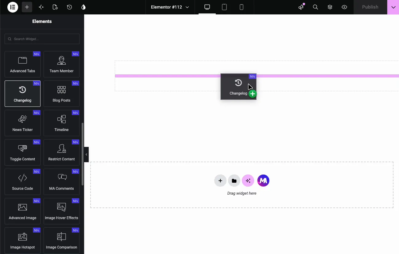
In the Elementor editor, search the Elements panel for Changelog and drag it onto the page. It loads with a sample version heading and two badge rows, so the shape of the block is visible immediately.
Set the version heading and main title #
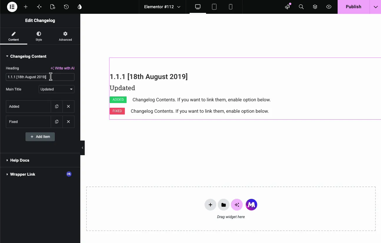
The Changelog Content section holds everything. Heading is the version line; the demo replaces the placeholder with “V 1.0.5”, and a date works well there too, like “1.1.1 [18th August 2019]”. Main Title is a dropdown that sets the subtitle under the heading, matching the change types: Updated, Fixed, and the rest.
Add the change rows #
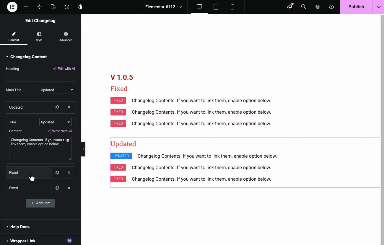
Each entry in the item list is one row in the block. Click an item to expand it: Title picks the badge type, and Content holds the change description. The badge color follows the type, green for ADDED, red for FIXED, blue for UPDATED, so a scan down the page shows the character of each release before anyone reads a word.
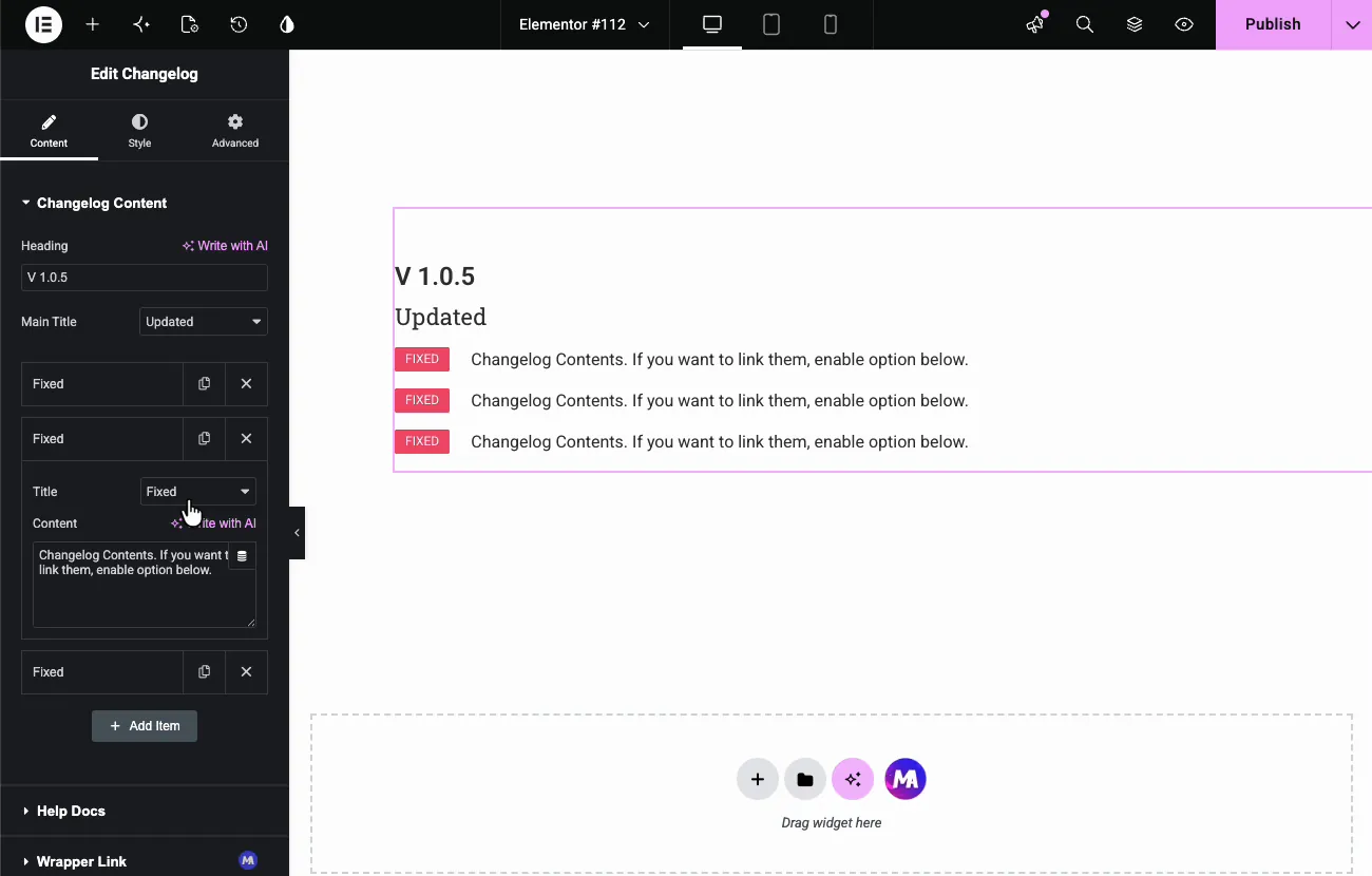
Use the copy icon to duplicate a row, the X to remove one, and Add Item to extend the list. A release with six fixes takes a minute of duplicating and editing. Duplicating an existing row is faster than Add Item since the badge type carries over.
Style the block #
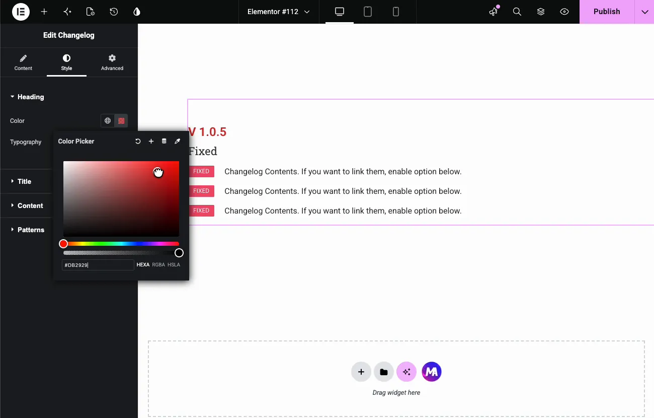
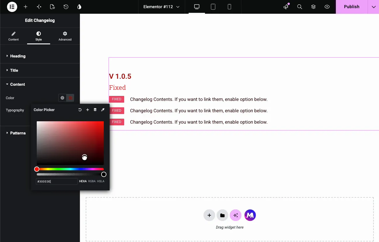
The Style tab has four sections: Heading, Title, Content, and Patterns (from the free Patterns extension). Heading and Content each carry a Color and Typography control.
The demo colors the version heading red:
And darkens the row text to match:
Stack releases into a full changelog #
One widget is one release. For the next version, right-click the widget, duplicate it below the first, and edit the heading, main title, and rows. The demo adds a second block with UPDATED badges under the V 1.0.5 block, then pads the container so the history sits comfortably on the page.
The result on the page #
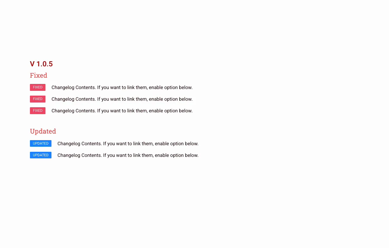
The published page reads like a proper release history: version heading, subtitle, and badge rows per release, newest on top.
Common use cases #
- Plugin and theme changelog pages, the classic use, one block per version.
- SaaS release notes with UPDATED and ADDED rows for each sprint.
- App version histories on product landing pages.
- Service updates, like an agency listing what changed in a client’s monthly maintenance.
- Documentation “what’s new” sections at the top of a knowledge base.
Tips for a better changelog #
- Newest release first. Visitors come to see what just changed; make them scroll for history, not for news.
- Put the date in the heading. “V 1.0.5 [4th July 2026]” answers the two questions every changelog reader has in one line.
- Match badge type to the change honestly. Marking everything ADDED looks like growth but hides fixes users are waiting for.
- Keep each row to one change. Three fixes in one row defeats the badge system; duplicate the row instead.
- Anchor-link versions. Give each widget a CSS ID like v105 in the Advanced tab so support can link users straight to a release.
Video Tutorial #
If you’d like to see the Changelog widget in action, this short video walks through the whole setup, from the version heading to the finished release notes on the page:
Frequently Asked Questions #
What is the Changelog widget in Master Addons?
It is an Elementor widget for release note blocks. Each block has a version heading, a subtitle, and rows of colored badges, ADDED, FIXED, UPDATED, with a text description per row. Stack blocks to build a full version history page.
How do I change the badge type on a row?
Expand the item in the Changelog Content list and pick the type from its Title dropdown. The badge text and color follow the choice, green for ADDED, red for FIXED, blue for UPDATED.
Can I show more than one version on a page?
Yes. Each widget holds one release, so duplicate the widget for every version and edit its heading and rows. Stacking them in one container, newest first, produces a complete changelog page.
Can I style the changelog colors and fonts?
Yes. The Style tab has Heading, Title, and Content sections, each with color and typography controls, so the version heading, subtitle, and row text can match your brand. A Patterns section from the free Patterns extension adds decorative backgrounds.
Can each row link somewhere?
There is no separate link field. The Content box accepts basic HTML, so you can type a link tag inside the text to point a change at a blog post or documentation page.
Wrapping up #
The Changelog widget turns release notes into a scannable page element: version heading, subtitle, badge rows, and colors that tell the story before the text does. One widget per release, stacked newest first, and the changelog page maintains itself as the product grows. Browse the full set of Master Addons widgets and extensions, and see the Changelog widget page for a live example.


