Free Elementor Info Box Widget with Icon and Image Styles
Info Box is a free Master Addons widget that builds a card from an icon or image, a title and a short description. Pick a Style Preset, fill in the text and style the box, icon, title and description from the Elementor panel. The free plugin includes Variation One to Five, and Master Addons Pro adds Variation Six to Ten, a gradient icon background and a Read More button on Variation Six. Use it for feature rows, service lists, contact details and how-it-works steps.

How to Add an Info Box in Elementor
You need Elementor and the free Master Addons plugin from WordPress.org.
- Check that Infobox is switched on under Master Addons, Widgets.
- In the Elementor editor, search for Info Box and drag it into a column.
- Pick a Style Preset. Variation One to Five are free.
- Set Image or Icon, then choose the icon or upload the image.
- Type the Title and Description and add a Title URL if the card should link somewhere.
- Open the Style tab to set the border, background, hover animation, icon and text styles. Duplicate the widget to build a row.
Every setting is covered in the Info Box widget settings guide.
Style Presets: 5 Free, 10 with Pro
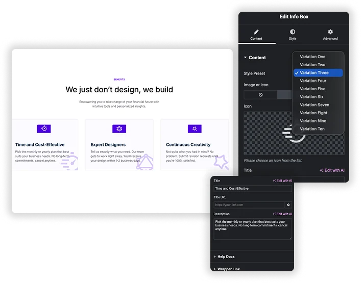
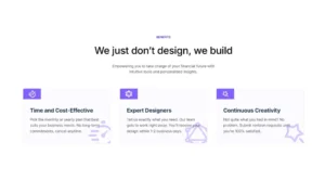
The Style Preset dropdown changes the layout and decoration of the card without touching your content. Variation One to Five work in the free plugin. Variation Two and Three add a large faded copy of the icon behind the card, and Variation Five puts the icon in a hexagon shape. Pro unlocks Variation Six to Ten.
- Image or Icon: choose None, Icon or Image. Images use the Image Resolution setting.
- Title URL: links the title. To make the whole card clickable, use the free Wrapper Link extension.
- Read More Text and Link: shown only on Variation Six (Pro).
Title and Description Styling
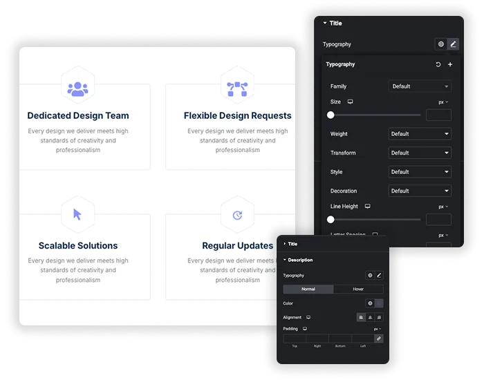
The Title and Description sections each have Typography, Color, Alignment and Padding. Both have Normal and Hover tabs, and the hover color changes when a visitor points anywhere on the card, not only on the text. The title always renders as an H3, so plan your heading order around that.
- Typography: family, size, weight, transform, style, decoration, line height, letter and word spacing.
- Separate hover colors for the title and description.
- Alignment and padding can differ per device.
Box, Icon and Hover Styling
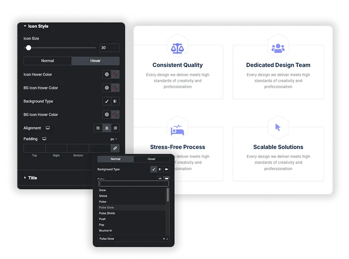
General Styles covers the card: Border Type, Border Width, Border Color, Border Radius, Padding and Margin. The Background has Normal and Hover tabs, each with a classic or gradient background. Hover Animation uses the Elementor effects such as Grow, Pulse, Push and Bob. Icon Style sets Icon Size, Icon Color, the icon background and alignment, again with Normal and Hover states.
- Different backgrounds for the normal and hovered card.
- Icon and faded background icon colors for both states.
- A gradient icon background on Variation Six is Pro.
Elementor Icon Box vs Master Addons Info Box
Elementor already ships free Icon Box and Image Box widgets. They are enough for many sites, so here is where each one fits.
| Feature | Elementor Icon Box | Master Addons Info Box |
|---|---|---|
| Price | Free in Elementor | Free with 5 presets, Pro adds 5 more |
| Icon or image | Two widgets: Icon Box and Image Box | One widget with None, Icon or Image |
| Layout | Icon Position Start, End, Top or Bottom; Default, Stacked or Framed icon | Ready-made Style Presets |
| Title HTML tag | H1 to H6, div, span or p | Always H3 |
| Link | One Link for the icon and title | Title URL; whole card with Wrapper Link |
| Card background | From the Advanced tab | Normal and Hover backgrounds, classic or gradient |
| Hover effects | Icon and title hover colors, icon hover animation | Card hover animation plus hover colors for icon, title and description |
| Read More button | No | Variation Six only (Pro) |
Choose Elementor Icon Box when you need a specific heading tag or a side icon layout. Choose Info Box when you want a styled card with hover backgrounds in one step. For a card with a back face, see Flipbox, and for a card with a button, see Call to Action.


Frequently Asked Questions For Infobox
Is the Info Box widget free?
Yes. Info Box is in the free Master Addons plugin with Variation One to Five. Master Addons Pro adds Variation Six to Ten, a gradient icon background and the Read More button on Variation Six.
Can I link the entire box, not just the title?
The widget itself only links the title through Title URL. To make the whole card clickable, turn on the free Wrapper Link extension and add the link in the widget’s Wrapper Link section.
How is Info Box different from the Elementor Icon Box?
Elementor Icon Box is free and lets you pick the title tag and put the icon on the side. Info Box gives you ready-made presets, image or icon in one widget, and separate normal and hover backgrounds for the card. The Info Box title is always an H3.
Can I use an image instead of an icon?
Yes. Set Image or Icon to Image, pick a file from the Media Library and choose an Image Resolution. Choose None for a text-only card.
Trending Elementor Widgets & Extensions
Build sophisticated websites in less time.
Glassmorphism
Container Extras
Patterns
![Master Addons Post/Page Duplicator extension for Elementor: MA Duplicator row link in the WordPress Pages list creating a Landing Page - [Duplicated #128] draft](https://d1asvmc6qcowgk.cloudfront.net/wp-content/uploads/2026/09/15102930/post-page-duplicator-768x403.webp)
Post/Page Duplicator