Elementor Image Hover Effects: 30 Hover Animations for Images
A static image just sits there. Add image hover effects and the same picture starts doing some work: a title slides in, a description fades up, and a click sends people to a link or opens a full popup. The Image Hover Effects widget for Elementor ships with 30 hover animations (8 in the free plugin and 22 more with Pro) and you set them up without writing a line of CSS. It fits the places where one image has to carry a title, a caption, and an action: portfolios, team grids, service cards, product showcases.
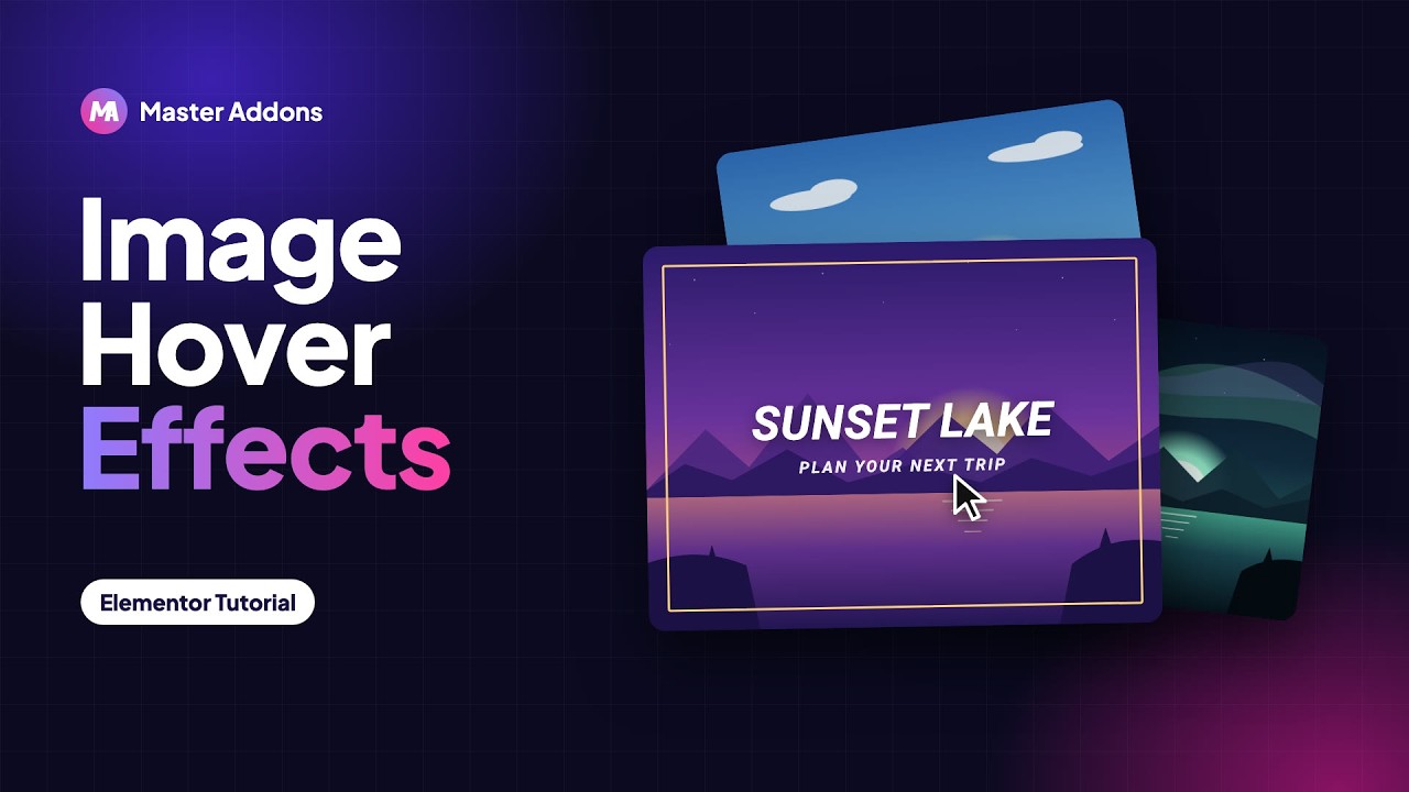
Pick an effect, choose what the click does, and style each layer to match your design. What you end up with is an image card people actually stop on instead of scrolling past. The video below walks through the whole thing, shows every animation, and the setup takes a couple of minutes.
What Are Image Hover Effects?
An image hover effect is an animation that fires when someone moves the mouse over a picture. Instead of staying flat, the image reacts. It can zoom, blur, change color, or slide a text panel into view. The most common kind is an image overlay, where a title and description appear as text over the image. You will also see them called image rollover effects or photo hover effects, and they all do the same thing: take a plain image and make it read as “there is more here, click me.”
You can build all of this by hand with custom CSS. That means writing the transitions, getting them to behave on mobile, and going back into the code every time the design shifts. The Master Addons widget handles it visually inside Elementor, so you get simple image hover effects without opening a code editor. If you want to see the rest of the toolkit, browse the Master Addons widgets and extensions or the Elementor animation features.

30 hover animations, 8 of them free
First impressions happen on hover. You get a library of CSS animations that bring your title and description in smoothly, so the text arrives instead of just popping onto the screen. Apply any effect with one click, then cycle through them in the editor until one suits the image. I usually try three or four before settling, since an effect that looks great on a wide landscape shot can feel off on a tight portrait crop.
- Fade and zoom: the image fades or scales up while the text fades in.
- Slide (up, down, left, right): a caption panel slides in from any edge.
- Push and reveal: the image shifts over to make room for the title and description.
- Float and shine: a small lift and a light sweep across the image.
- Eight effects are free: Lily, Sadie, Roxy, Bubba, Romeo, Layla, Honey and Oscar. Pro adds 22 more, from Marley to Duke.
- Runs on CSS: the motion stays smooth because it is not leaning on heavy scripts.
- Quick to test: swap effects in the editor and see the change right away.
Image hover effect examples
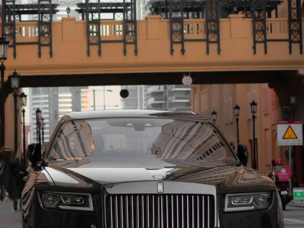
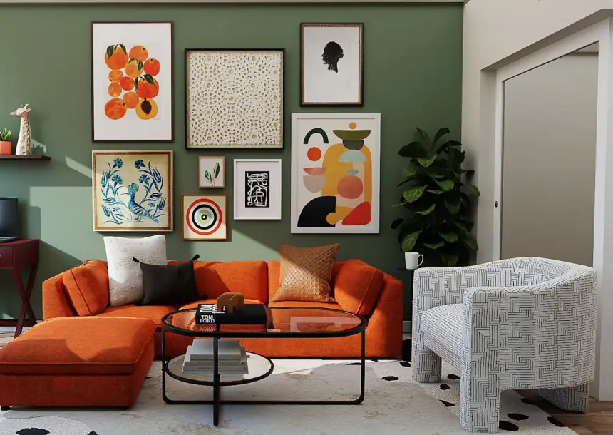
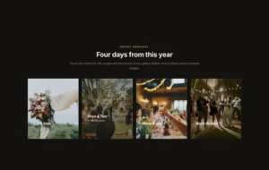
Move the pointer over each card, or tap it on a phone, to see the effect. These eight are the effects that work without Pro, and every card is a live Image Hover Effects widget.

Ella & Sam
Somerset · June
Lily

Greece
11 days
Sadie

Main floor
Cardio and machines
Roxy
Ghost
12,400 miles
Bubba

Cliff House
4 bed · EPC B
Romeo
Gallery Wall
Bristol · 2025
Layla

Starters Nine dishes
Honey

Outerwear
87 pieces
Oscar
All 30 image hover effects
The Hover Effect dropdown lists 30 effects by name. Every one animates the title and description over the image, and they differ in how the overlay, the text and the image move.
| Effect | Needs Pro | Effect | Needs Pro |
|---|---|---|---|
| Lily | No | Julia | Yes |
| Sadie | No | Goliath | Yes |
| Roxy | No | Hera | Yes |
| Bubba | No | Winston | Yes |
| Romeo | No | Selena | Yes |
| Layla | No | Terry | Yes |
| Honey | No | Phoebe | Yes |
| Oscar | No | Apollo | Yes |
| Marley | Yes | Kira | Yes |
| Ruby | Yes | Steve | Yes |
| Milo | Yes | Moses | Yes |
| Dexter | Yes | Jazz | Yes |
| Sarah | Yes | Ming | Yes |
| Zoe | Yes | Lexi | Yes |
| Chico | Yes | Duke | Yes |
Smart Linking and Popup Content on Click
You decide what happens when someone clicks the card. Point it at any URL with a standard link, or, with Pro, switch the action to Popup and keep people on the page. The popup is not limited to text either: set Content Type to Saved Section and it pulls in any Elementor template you have already built. That turns one image card into a doorway to a full bio, a product spec sheet, or a contact form, and the visitor never leaves the page.
- Two click actions: send traffic out with a link, or keep people on-site with a popup (Pro).
- Real templates in the popup (Pro): show an image, text, or a full layout from your library.
- Tease, then tell: the image is the hook and the popup carries the detail.

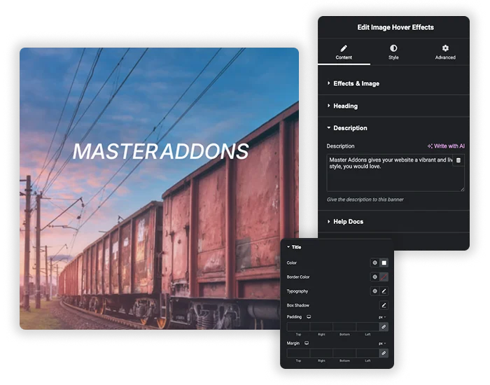
Text over image: title, description and overlay styling
You control how the card looks down to the detail. Upload your image and set its opacity and filter separately for the normal and hover states. Add a heading (pick the right HTML tag so it helps your page structure) and a description, then style each piece on its own with its own colors, type, shadows, and spacing.
- Separate title and description: style each one so the hierarchy reads clearly.
- Image filters: the grayscale-to-color trick on hover still looks good and is a one-setting change here.
- Card frame: background, borders and box shadow, plus rounded corners and padding with Pro, so it sits right in your layout.
Elementor hover options vs the Image Hover Effects widget
Elementor’s own Image widget has hover settings in the Style tab: Opacity, CSS Filters and a Hover Animation such as Grow or Pulse. They change the picture itself. They cannot put text over the image, which is the gap this widget fills.
| Elementor Image widget | Image Hover Effects widget | |
|---|---|---|
| Opacity on hover | Yes | Yes |
| CSS filters on hover | Yes | Yes |
| Hover animation | Presets that move the whole image | 30 effects that animate the overlay, title and description |
| Text over the image | No. The caption sits under the image. | Title and description on the image |
| Text that appears on hover | No | Yes |
| Click action | Link or lightbox | Link, or a popup with Pro |
| Swap to a second image on hover | No | No. Use Advanced Image for that. |
Image Hover Effects at a glance
The main facts about the widget in one table.
| Feature | Image Hover Effects |
|---|---|
| Hover effects | 30. 22 of them need Pro. |
| Text on the image | Title and description, with an HTML tag from H1 to H6 for the title |
| Click action | None, a link, or a popup (Pro) |
| Popup content (Pro) | Text, an image, or a saved section, widget or page template |
| Image settings | Opacity and filters, set separately for normal and hover |
| Second image on hover | No |
| Touch screens | The first tap shows the text. The second tap follows the link. |
| Needs | Elementor and Master Addons |








How to Add Image Hover Effects in Elementor?
You can have a working hover card in under two minutes. No CSS, no shortcodes.
- Install and activate Master Addons, then edit any page with Elementor.
- Search the widget panel for Image Hover Effects and drag it onto your layout.
- Upload your image and add a title and description.
- Open the Hover Effect dropdown and pick an animation. Eight are free and 22 more come with Pro.
- Set the click action to a link, or to a popup with a saved template if you have Pro.
- Style the title, description, and container, then publish.
One thing worth doing before you publish: preview the card on a phone. Hover does not exist on touch, so check that the tap behavior makes sense (more on that in the FAQ). For every setting laid out in order, follow the Image Hover Effects documentation.
Where to Use Hover Effects on Images?
- Team grids: name and role on hover, then a full bio in a popup on click. Here is how to build a team members section.
- Portfolios and galleries: a project title and a “View case study” link over each photo.
- Service cards: a short description and a link through to the service page.
- Product showcases: tease the product image, then open the specs in a popup.
- Blog and category tiles: a hover caption on image-led navigation.
For more ways to put text and pictures together, read 25 Elementor text-over-image techniques. Related image widgets include the Image Carousel, the Filterable Image Gallery, the Image Hotspot widget and the Advanced Image widget.
Frequently Asked Questions For Image Hover Effects
Will these hover effects work on mobile devices?
They are built for desktop, where there is a mouse to hover. On a touchscreen the effect usually fires on the first tap to show the content, and the second tap follows the link or opens the popup. So plan for two taps on mobile, and make sure the text stays readable once it shows.
How do I create simple image hover effects without writing CSS?
Drop the Image Hover Effects widget on your page, upload an image, add a title and description, and pick an animation from the dropdown. That is it, no CSS. The widget writes the CSS for you behind the scenes, so even a fairly involved hover card stays easy to put together.
Can I open a team bio or product details in a popup on click?
Yes, with Pro. Put the name in the Title and the role in the Description, set the click action to Popup, and choose Content Type: Saved Section. Build the bio as a template in Elementor and select it here. Click the photo and that full layout opens in the popup.
Are all 30 image hover effects free?
No. Eight effects are free: Lily, Sadie, Roxy, Bubba, Romeo, Layla, Honey and Oscar. The other 22 come with Master Addons Pro, along with popup content, rounded corners and padding controls. The title, description, link and image filters all work in the free version.
How do I show text when someone hovers over an image in Elementor?
Add the Image Hover Effects widget, upload the image, type a Title and a Description and pick a Hover Effect. The text stays hidden until the pointer is over the image, then animates in. Elementor’s own Image widget has no setting for text over the image.
Will many animated image cards slow down my site?
The effects run on CSS, so a handful on a page is no problem. What actually slows things down is image weight, so compress your images first. Once you are past 20 or so cards on one page, turn on lazy loading and the first paint stays quick.
Can I use different hover effects on different images?
The settings cover one card at a time. To mix effects, add a separate Image Hover Effects widget for each image and set them up independently. That is how you get a gallery where the cards do not all animate the same way.
What is the benefit of a "Saved Section" in the popup over plain text?
Saved Section is a Pro option, and it gives you the full Elementor editor inside the popup. Instead of plain text you can add images, buttons, columns, videos, or forms, so the popup looks like the rest of your site rather than a bare text box.
How do I zoom an image on hover in Elementor?
For a plain zoom, select Elementor’s Image widget, open the Style tab and set Hover Animation to Grow. In the Image Hover Effects widget, several effects scale the image while the title and description come in.
Can I change the image on hover?
Not with this widget. It keeps one image and animates the overlay and text on top of it. To swap to a second image on hover, use the Advanced Image widget and turn on Display Hover Image.
Trending Elementor Widgets & Extensions
Build sophisticated websites in less time.
Glassmorphism
Container Extras

Patterns
![Master Addons Post/Page Duplicator extension for Elementor: MA Duplicator row link in the WordPress Pages list creating a Landing Page - [Duplicated #128] draft](https://d1asvmc6qcowgk.cloudfront.net/wp-content/uploads/2026/09/15102930/post-page-duplicator-768x403.webp)
Post/Page Duplicator